TY1SK – Spring Tasks

Design Ideas and process

I believe my most successful task was the photoshop tasks, I tried a few including Combining multiple images, using select and mask tools, changing the image in the background and combining black and white with colour. My most successful task was using the select and mask tools to combine an image of a busy street and elephants to create a single image of the elephants walking along with the people. I started by overlaying the elephant image over the street image then selecting the marquee tool, clicking select, select and mask, then using zoom, the quick select tool and refine edge brush tool to cut out the elephants then resizing them to fit on the street.

Overlay elephant image onto background image
Choose select and mask
Enlarge the image
Use quick select tool and refine edge brush to cut out elephants
Final image
Combining images
Select and mask
Combining black and white with colour

Software Tutorials

For the illustrator task I used tutorials that warp text into custom shapes, how to change text, size and colour. They helped me to learn simple skills and ways to manipulate text into shapes and further on. To develop my illustrator skills further I would like to look at more advanced ways of manipulating text and more creative ways of combining them. To develop my learning for letter logos, I developed my understanding of ways in which to form them and create them in order to give me a wider range of outcomes (https://www.youtube.com/watch?v=TQUrVwzMWXE). For the photoshop tasks I used tutorials to select areas to remove a background, how to use layers and masks.They helped me to learn skills I had either not yet tried or wanted to recap over, I was able to create images that I was happy with. I feel to improve my skills on photoshop I need to be more ambitious with my designs and really push myself. I watched this additional video/ tutorial on using a layer mask, which I found helpful in teaching myself the steps to the final product (https://www.youtube.com/watch?v=yQsYziKvx9c) For the Indesign tasks I used tutorials on making tables and flyers and also learnt how to make a hyperlink for my files. To improve my skills I should watch more tutorials and practice making more flyers as well as other layouts in the software and broaden my knowledge to the differences they oppose. I watched a video on flyer design to give me more inspiration for design and visual flare within a flyer layout and how I could make my design stand out (https://www.youtube.com/watch?v=3aT66tMPx5s). I’d like to develop all my skills further on Illustrator, photoshop and Indesign by pushing myself more, watching more videos and practicing more varied and previously learnt skills.

Design Resources and articles

To develop my design ideas I looked at a broad range of articles, examples and step by step guides to create outcomes that challenge my skills and broaden my knowledge of the softwares. From Learning about layout in indesign adobe articles (https://www.adobe.com/uk/products/indesign.html?mv=search&mv=search&sdid=LCDWTLJX&ef_id=Cj0KCQiAmpyRBhC-ARIsABs2EAqKbPv8AiQ16zLNVnNYKe7KJWemY80ndBuxbQiQrS9TB4PHASLvsaAj5uEALw_wcB:G:s&s_kwcid=AL!3085!3!520877072614!b!!g!!%2Bindesign!1422700472!55325978309&gclid=Cj0KCQiAmpyRBhC-ARIsABs2EAqKbPv8AiQ16zLN-VnNYKe7KJWem-Y80ndBuxbQiQrS9TB4PHASLvsaAj5uEALw_wcB) which encouraged me to really test how layouts can best be used for certain information, to looking at Pinterest for examples of letter logos for inspiration, this creating ideas in my head of the type of designs I could create (https://www.pinterest.co.uk/pin/832814156079697545/) And finally looking at step by step guides for photoshop to create contrasting images that can tell a story, the step by step guides were helpful in allowing me to take my time, have visual examples to follow and refer to, being a visual learner these are a lot easier to follow (https://helpx.adobe.com/photoshop/how-to/black-and-white-with-color-photo.html)

Learning across the module

Throughout the module I have improved with my knowledge of all software, enjoying some creative freedom on photoshop, whilst seeing some encouraging signs for myself that I’m growing more confident with the likes of InDesign and Illustrator, with a strong understanding of what each software can be used for and what its benefits are, as seen in my quiz result going from 90/150 at the start of the module to 120/150 at the end. On photoshop the use of may tools has enabled me to grow in confidence about what I can do and where I can go with my designs, whilst on InDesign my knowledge of character and paragraph styles, layouts and tables are encouraging in broadening my understanding of the software and how it works. Illustrator also enabling me to focus on some key issues I has, such as the manipulation of letters, along with the basic tools. I also experienced using adobe after effects where despite colour not playing on my side in the final uploads, the use of transitions and learning the software was an enjoyable experience. Overall it has been an enjoyable module that has encouraged me and enabled me to grow in confidence.

TY1SK – Edan Podcast Project – Photoshop Task

Design Ideas and Design Process

When developing my Podcast covers, I wanted to create designs that used all components of image, type and exploration to create a slick, professional looking design with visual flare. When starting this task I was already pretty comfortable using photoshop but I really wanted to push myself and give myself challenges, such as a podcast cover that I had never done before. For my first Design I really wanted to explore the idea of sound waves and how they move linking this to the use of a microphone in a podcast, I then imported a microphone to lay over the top of the image as an eye-catching centre piece, experimenting with colour and coming to a conclusion that white stood out the best. My first design was my chosen design as I felt it has strong links visually to what a podcast is and looked the most similar to the examples I had seen. My second Design explored a more simplistic approach having the image set as the background for my text, I used the hue and saturation tool to play with the colour of the image, whilst also looking at the way the text should be displayed and adding in logos such as the Spotify, bringing in image being a skill I had previously struggled with knowing how to do. My final Design incorporated more of a typographic stance, using only words to build up my design other than a blue box to allow the text to stand out, I again looked at the layout, the colour and hue and saturation as well as the text type.

Above – Final Designs 

Above – Development Screenshots

Software Tutorials

The software tutorials I used helped me develop my designs because I was firstly able to see the way in which they look which helped me to come up with my own ideas based off of the designs that I looked at when searching up ‘Podcast cover design’. I also watched many YouTube videos that did not just show these successful designs but the process in which was used to make them, something that really helped me when making and developing my design. An important new tool for myself was the used of grids, these allowing my work to correspond to a grid format and therefore have a layout that was even mathematically correct. Within this project as a whole I feel that I’ve only just scratched the surface of the designs I have the potential to develop but by watching more videos like the one I did I feel a can really push myself in photoshop from now on. Whilst there are many skills that have been highlighted to me during this task, as I stated on my troll board I’d like for myself to experiment with more typefaces as well as using the tools for images experimenting more with the colours, hue and saturation, black and white, posterise and invert tools to really bring the podcast cover image to life. By watching more videos I feel I can learn more ways of creating visually pleasing pieces that look carefully made with a slick finish.

https://www.youtube.com/watch?v=nQHIc0-fFdY

Design resources and articles

When looking at design resources and articles the first thing I noticed was the abundance of examples there was to show podcast cover design, from images to websites to articles on a specific one it was a really insightful way to learn about the best ways to design a cover and how to make the most successful design. The additional resources I looked at where images, books on podcast design looking at how they’re made, why they’re made and the key features to them. As well as this I looked at many ‘how to guides’, by looking at multiple I was able to come to the conclusion of the basic principles that they all shared and the individual style that each one explored. I also looked at many articles that discussed podcast cover design and how they’re best portrayed, the best layout, dimensions, looking at ‘Competition’ for inspiration and ideas, how to keep it consistent with your other designs creating a brand identity for your podcast and what features really matter.

https://blog.spreaker.com/9-steps-making-great-podcast-cover-art/

New York Hotels

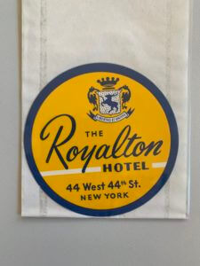
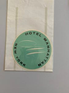
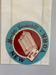
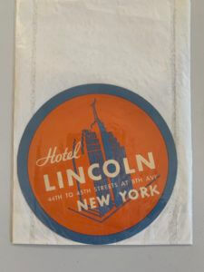
When looking at the collections highlighted along by Emma was clear to see that there were some interesting and intriguing items, the ones standing out to me being the New York Hotel logos. Vast arrays of colour, combined with their simplistic image is a common part of all of their designs which builds a logo that is crisp, clear and interesting whilst being simple and informative, a balance within these designs that I found particularly intriguing.

Whilst all the designs shown convey the standard circular shape, an image and the name, they are still all unique in their own ways when looking at the typography, layout and colours.

The Royalton Hotel uses a san serif font for all its typography other than the name of the hotel itself, emphasising the hotels importance of highlighting the hotels name and making it stand out so customers or passers by become familiar with the name. Hotel Manhattan on the other hand is much more simplistic, a stylish ‘M’ as the image along with a san serif font on a coloured background, the anomaly in the 4 examples as there is no inner circle, no secondary colour and no secondary typography.

The other two designs are a little more adventurous with two colours working harmoniously together, a building silhouette as the image and the combination of a san serif font and a secondary more brush script like font. These designs are all successful in their own right but when looking at a hotel sign the second example despite being quite minimal is not necessarily my preferred design but I find the others too crowded with information, the second design has the image in the centre surrounded by text which is much easier to read compared with the other examples.

Custom surfboard


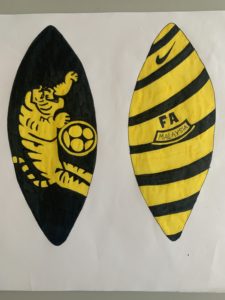
During this task we were asked to discuss with a partner three interesting, unusual and extraordinary facts about ourselves. My partner Liam’s three facts were, that he loves football and that it is one of his biggest passions, secondly he was born and grew up in Malaysia and finally he has a keen interest in surfing. When thinking upon what I could design for his ideal gift there was one idea that immediately stood out, a surfboard. Developing this further to incorporate his passion for both football and surfing, I researched football in Malaysia and the design of the national teams kit. Taking this into my design I used the badges tiger for one side of the board and the stripes of the kit along with the FA Malaysia part of the badge on the other side. This design is ideal for the receiver as it explores his heritage and his passions and therefore would be a meaningful and unique gift.