Fox Design
When beginning this project I had some difficulty curating ideas for my logo. I had tried various methods to gain some inspiration such as creating mood boards, quick sketches and filtering through others’ logo ideas on Behance.
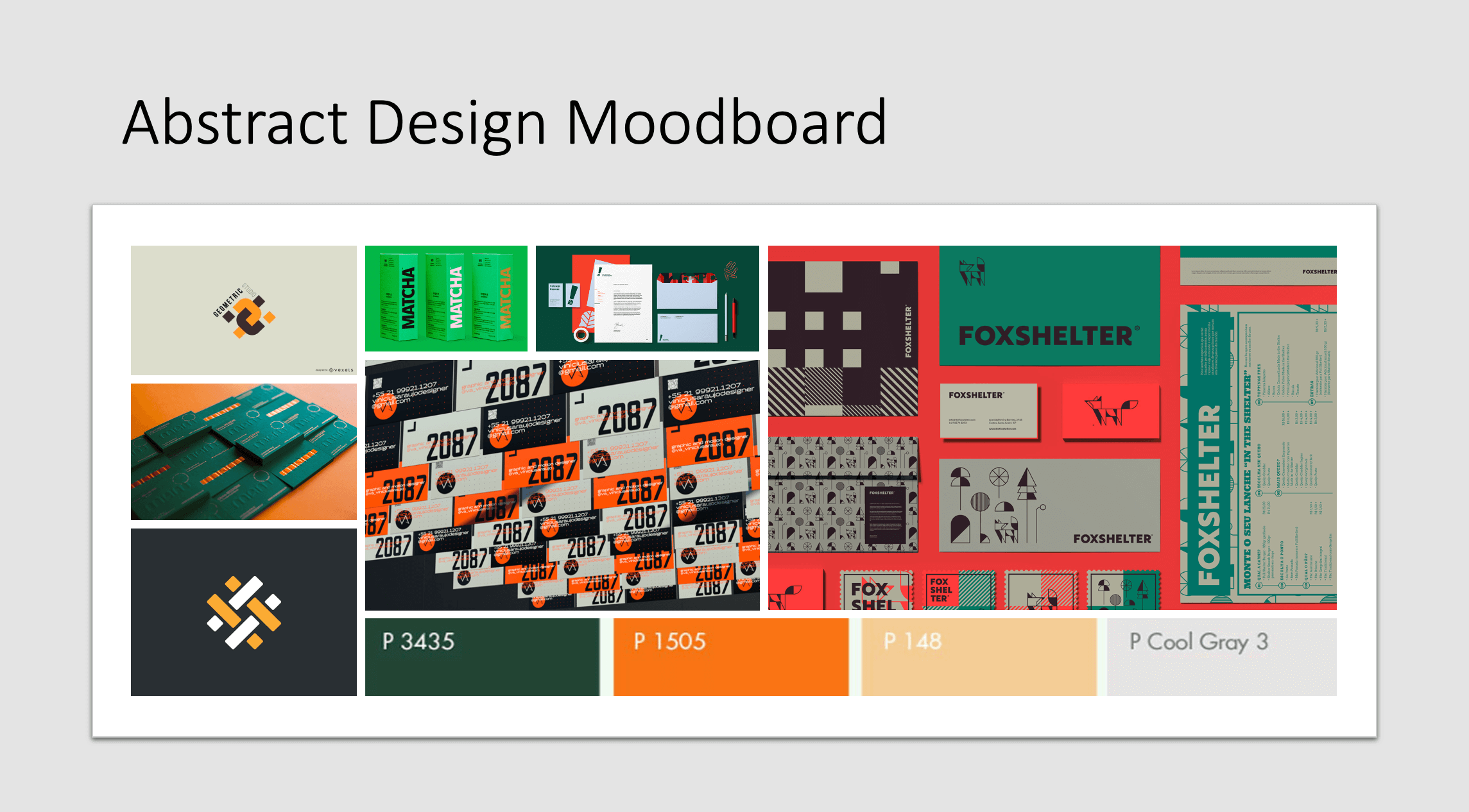
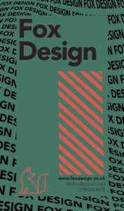
After this research, I decided on a colour theme and what aesthetic it would fit into. the choice I made was an abstract mix of deep forest green and a high contrast orange. In the first few hours, I could only muster up one idea for a logo design. the idea was that the letter F from my initials starts before the letter D and crosses through the middle of it. It took me quite some time to create as I was a little rusty in using adobe Indesign as it had been a while since I hadn’t done any projects like this. In the process of making this first draft of my logo, I realised how much of a challenge it was to mix my colour theme into my design. I considered changing my colour theme but I saw some great examples of the use of my colours and was determined to get a product using these colours. (see the use of colour in mood board)

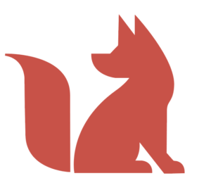
so I know now that the colour theme is not going to be my problem, now I can focus on what I can do to fix my design. After experimenting with the pen tool and getting myself familiar with Indesign again I decided I would attempt to draw a fox to use as part of my branding. And on my first attempt, it came out perfectly and exactly how I wanted it to be.
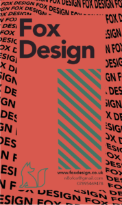
After I had my fox it was very straightforward from there. I started experimenting with how my name looks and how I can make the fox look back over behind him at my name. I even decided to add in some defining features that would make my brand recognisable if it was commonly seen on high streets etc…
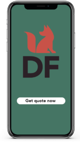
After I was happy with how my logo would look I decided to implement it onto some business card designs and an app interface to get a feel for how my logo would represent itself to the user.
I even asked some fellow students what their thoughts were on the design. from their feedback, I tweaked sizes of fonts to better match the premium feel of my brand.
Kitchen cleaning elephant
My ideal gift for my partner is an elephant that is trained to clean the floor next to the sink! my partner has an incredibly annoying habit of spilling water all over the floor when he washes his dishes! And everyone in the flat walks into the puddle and end up getting wet socks. so this elephant is trained to suck up the puddle and put it into the sink. i decided on this idea as my random word was an elephant. No more wet socks. (:
A walk into madness
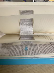
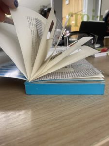
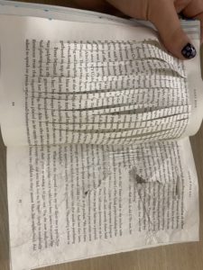
When assigned this project I wanted to turn my book into a series of immersive chapters that makes the user feel as though they are at one with the story character. I wanted to make the user feel lost and feel like they have lost a sense of clarity. My first decision was to create a stairway leading into the story labyrinth. The stairway is to act as an introduction for the story and it gives a good idea to the reader about what they are getting into. After the reader has completed their venture through the first chapter they will be met with a portal into a deep state of loss. After the portal, I decided to give the reader some pages of clarity. I wanted the reader to feel like some sense of clarity was restored because I thought it would give them false hope into believing the loss of clarity is over. Though of course, it isn’t over. Immediately after tricking the user, I threw them into a state of absolute chaos. On the left page, I used my crafting knife to make twenty vertical lines through the paper. This makes the page incredibly hard to read yet you can still make your way through the text, just like the character would find it hard to navigate a labyrinth. On the right page, I used my nails to scratch at the page and I crumpled up the page. This had the same effect as the incisions, though it portrayed how things become blurry and distorted in your mind. and finally, we make it to the last two pages of my experiment. You find a patchwork page mixed with aged and new book paper. This is supposed to be a metaphor for how time can become mixed up and lost in a labyrinth.
Overall, I was happy with how my experiment went. If I had a second attempt I would experiment more with 3D aspects of my book as I found it to be quite immersive which would entice more readers to use my product.
Simon says no?
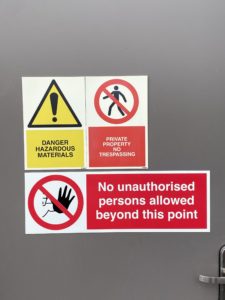
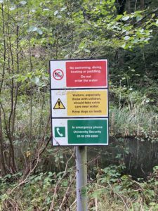 When tasked to explore the university campus looking for use of typography in a 3d environment, I decided my focus would be on caution signs and what they have in common
with each other. It took no time at all to find a sign of interest as they can usually be found everywhere. The first thing I noticed after finding a few signs was the use of the traffic light colouring system as shown in this image on the right. The red signifies a blunt stop sign, it is to act as a harsh message to stop anyone from doing what the message says. Though when we look at the yellow sign we can see that yellow signifies a caution message. It is less brutal than the red text though it gives a warning to the user rather than an order. And finally, green light. showing a message for advice the green light does not give any orders or warnings. It is to provide help if you were to need it.
If we compare this image to the next, we can see some similarities. Maybe not with colour but with the font used. There seems to be a universal style that these signs follow. From what I can gather these signs all use a bold sans serif font like gill sans. This is a very effective font to use as it is extremely easy to read. its legibility couldn’t be better