Background
Andrew Mangham and Emma Aston from the Classics department at the University of Reading anranged for an exhibition presented in the Madjeski Gallery at the Reading Museum, showcasing works of painter Paul Reid and sculptor Eleanor Crook. This exhibition looks at the ‘the biological and artistic meaning of diversity and difference, and the vital role that history plays in our understandings of the dynamic working of natural history’.
Restated brief
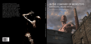
The brief was to design a catalogue entitled In the Company of Monsters: New Visions, Ancient Myths for the exhibition presented in the Madjeski Gallery at the Reading Museum and to design and send this to print in time for their exhibition by the 25th August 2023 (dated decided on towards the end of the project). The catalogue will showcase feature short essays from experts in ancient history, literature, fine art, and gaming as well as images of paintings and sculptures by artists, Paul Reid and Eleanor Crook.
deliverables
- Design of front/spine/back cover
- Identify images by Paul Reid to create a front cover with presence.
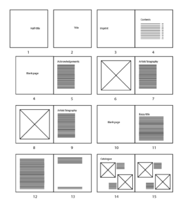
- Design of front matter including:
-
- Title page
- Table of contents
- Acknowledgements
- Foreword
- Layout of 6 x 1000 word essays including provided
illustrations - Illustrations for decoration and for essays as
requested/suggested by client - Layout of catalogue of artworks on display, exact
number of artworks and images thereof to be
provided. Details are: title/date/medium
-
Design process
Research
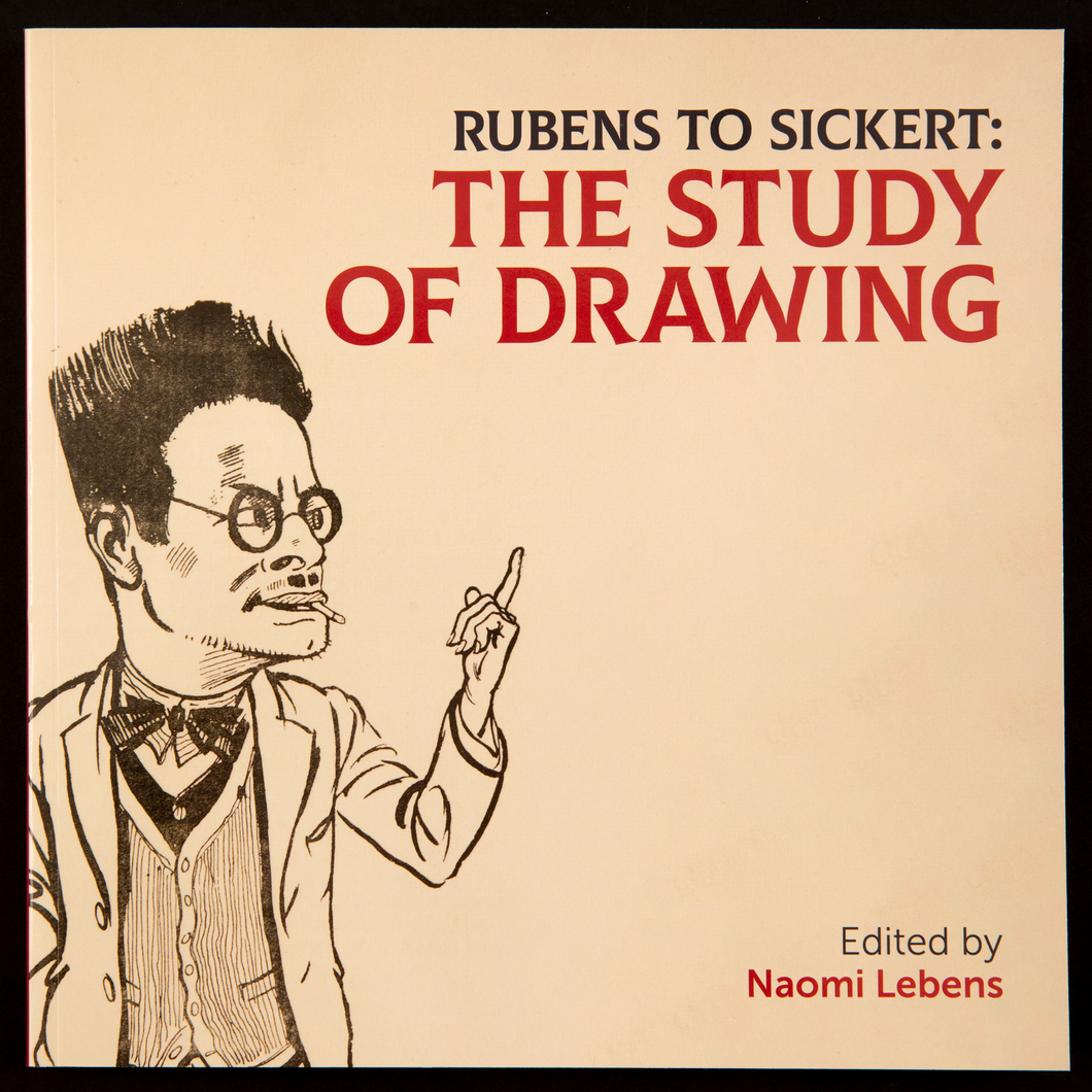
In our initial meeting with the client we found that the aim of the catalogue was to create a catalogue that will effectively showcase the the paintings and short essays. The layout should assist the reader in way-finding in the exhibition.We began by looking at Rubens to Sickert: The Study of Drawing, a previous exhibition book as our client said they would like the catalogue to have a similar design and format.
Ideation
inside pages
We began by researching what similar catalogue books had done for their page composition. After looking at ‘Rubens to Sickert: The Study of Drawing’ we kept our book in a square format as well and kept some of the same composition like keeping all text on the left with a wide margin for references.
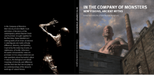
Cover
After meeting with our client we learnt that would like to have the painintg ‘The Cyclops’ by artist Paul Reid who is an artist featured in the catalogue and the exhibition.

Digital Painting
We designed two possible cover ideas, proposal 1 following the themes of the inside pages where it used the same typefaces and alignment and proposal two was a little more experimental using a a more gothic typeface to link more with the topic of the catalogue. After the meeting the feedback was:
- Proposal 1:
Likes the serif typeface as it gives a professional quality to catalogue
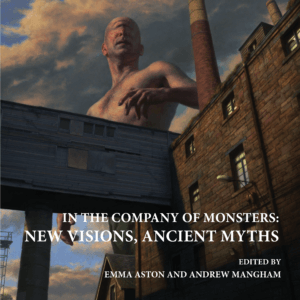
- Proposal 2:
Likes that the original image wasn’t edited and kept to the correct brightness

- Overall:
Wants the cover to match the seriousness of the pages inside the catalogue.
We decided to continue with proposal one as it was the most liked by the client as it still kept elements from the inside of the book and seemed like it was all part of the same catalogue.
Design development
Typography
Cover
At this stage, Richard had graduated and left and I worked on continuing with this project. I had continued with proposal one but following feedback, the typography and alignment of the inside pages had changed and so I changed the text on the cover to match the inside pages.
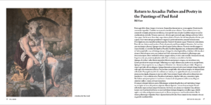
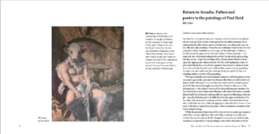
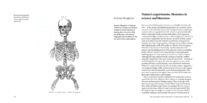
Inside pages – Essay
Following feedback, I worked on two different page compositions for the essay portion of the catalogue. Layout one still continued with the long text block on the right side of the page with a wide margin and with the facing page image left aligned. This layout had a lot of white space and made the pages look asymmetrical and a little empty. Layout two used the margin space for the essay author’s biography which helped to fill the space and had a reduced line length for the body copy. The facing page image was now smaller and aligned with the author name on the following page. This layout had better flow and so I chose to continue working on this design.
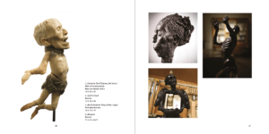
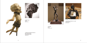
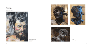
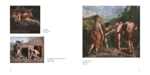
Inside pages – Catalogue images
I received the images towards the end of the project but as I had a basic page layout plan, I placed the imaged according to it. I quickly realised my planned layout wouldn’t work as my layout had squared images. I changed my layout so that bigger images would have their own page and grouped smaller images where I could so that the images weren’t too spread out. I felt that layout two had better flow to the pages and continued with designing this version.
Final stages
I received an unexpected and sudden deadline of a week left to complete the catalogue. During this week, I had to work on completing the catalogue images section. This was a little difficult as I didn’t have all the images till halfway through the week but once receiving them I was able to place them into my planned layout. Through this week I also worked on finalised the cover of the catalogue and carried the decisions I made on the cover through to the title page.
Reflection
We regularly communicated with a clients through teams calls once every fortnight and received relatively quick responses which was helpful during the designing stage as we weren’t waiting on the clients response. However, we had been brought into the project long before we were needed as when we had joined in March, the client didn’t have finalised copy until September and the images for the catalogue images till towards the end of the project. We received a lot of positive feedback after the catalogue was printed and it was well received.