Overview
True Food Organics, originally named True Food Co-operative, is a zero-waste, organic food and grocery store based in Emmer Green, Reading. It is run by volunteers from the local community and they have been encouraging others to choose a more sustainable lifestyle since 1999. With their decision to rename their store they decided it was time for a complete rebrand to bring their store more up to date.
Deliverables
A logo that is scalable so that it can be used in numerous places including:
- A storefront
- Tote bags
- Website
- Receipts
Design Process
Client meeting:
To start our process, we met with our clients to introduce ourselves and get to know them better so we could figure out what they were looking for.
The clients wanted a logo that was:
- Circular as they felt this represented the sense of community in their store
- A 70s/80s themed colour pallet
- Illustrative
- Sense of homegrown food
Research:
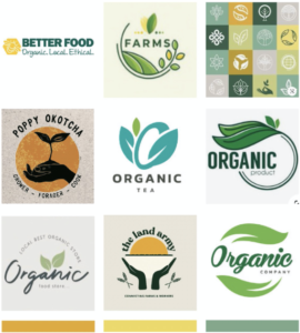
We began our research by searching for existing organic branding, particularly in a circular shape as requested by the client. This was to help guide our ideation and ensure we were creating a logo that stood out. Most of the existing branding contains a leaf which is very typical in representing organic brands and is also what was in the client’s existing branding. Because of this, we wanted to ensure that we came up with concepts that did not include a leaf as we wanted to find a new and memorable way to represent organic brands. However, we also understood that it is a very recognisable symbol, so it should still be explored. We put a small mood board together that also included a potential colour pallet for their brand. We sent this over to the client when we sent our restated brief to make sure we understood exactly what they were looking for. Once the mood board and restated brief had been approved by the client, we started the design process.
Initial sketches:
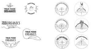
To start, we created some simple designs by hand and on illustrator that incorporated the brand name and some imagery. We split this so that Yasmin was looking at trying to find a new and inventive way to use leaves in the logo and Hannah experimented with other elements such as hands and other fresh produce. After feedback from the other teams who attend the Real Jobs meetings and our supervisor for this project, we were advised to experiment more and develop our ideas to a near-finished stage before sending our ideas over to the client.
Developments:
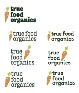
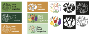
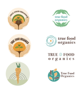
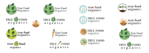
First, we developed the ideas we initially came up with so that colours had been applied and text had been set. The feedback from our supervisor was that some of the ideas were more like illustrations than a logo so we went back and simplified them so they were more like icons. We also ensured each illustration had text along with it. We experimented with the layout and hierarchy of the text and how they could work in relation to the illustrations. We were initially unsure if the ‘organics’ part of the company name was on the same hierarchy or lower on the hierarchy as ‘True Food’ as you can see from our experiments below. It was later decided that it was best to keep them on the same level in the typographic hierarchy. Our supervisor liked the carrot design and the leaf design but we were advised to experiment with simplifying them. She also asked us to experiment with a couple of new ideas as she felt we were not quite there yet with a solution. These experiments can be seen below. The carrot again was a strong contender and we liked the bold serif typeface that we had found but it was decided that the illustration style and typeface did not match. So we were now tasked with finding a way to of making them have the same aesthetic. The collection of hand-drawn illustrations in an ‘o’ shape was also well-liked since the sketchy style helped get across the idea of organic and homegrown that the store represented. It also had the circular shape the client was looking for.
Further exploration:
There were 3 concepts we decided could be suitable logos for our clients from the previous experiments. The first was a bold, 2D carrot illustration. [fig. We thought this would be a great option for clients to see that was a little bit different to what the other logos look like and shows the client another direction they could go in. We were undecided on whether the carrot should be leaning against the text or sitting upright. Since both worked well, we thought it would be best to present both to our supervisor and client. The 2 circular concepts we went with were a solid ‘o’ shape made up of illustrations of vegetables and an ‘o’ shape made up of fresh produce but also symbols that represented the store sold such as shampoo, toothpaste and the classic recycle symbol. For the solid ‘o’ shape we experimented with a range of illustration styles including simple outlines and solid 2D shapes.
Final logo concept:
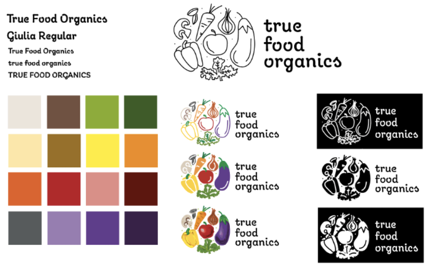
After developing our designs and with feedback from our supervisor, we decided on the hand-drawn vegetable logo with the typeface Giulia. We settled on this font as we felt the handwritten style it had, fit well with all of the hand-drawn illustration styles we had produced. To send to the client, we produced a large colour pallet as many colours were used in the vegetables and this gave the client a wide range of choices. As well as the 2 illustration styles, we showed the client the logo in black and white as well as colour so they could get a sense of what a single colour could look like as well as multicoloured.

Reflection:
As this was the first time either of us had been tasked with creating a logo and completing a Real Job, we felt that our outcome was effective and fitted the brief the client gave us. However, once we sent it to the client, their feedback was that, although it did fit their brief, they were unhappy with it and did not feel involved in the design process enough. This was unfortunate for both sides. Miscommunication between ourselves and our supervisor on what was appropriate to share with the client is what lead to this outcome. Although we did try to keep in contact with the client to reassure them that we were working on the project and that we were waiting on approvals but it is clear we should have done this much more often. We apologised to the client and then put together a PDF showing our whole design process to see if they were interested in picking up an earlier concept. We also tried to reassure them that this was not intended to be the final design and changes and feedback were expected to be made. There was unfortunately no response. While this was not the outcome we wanted as we both felt we worked very hard on this project, it has taught us a lot about working with clients. Next time we will ensure we have a range of ideas to send to a client and keep them involved in all design stages. Although there was a real sense of disappointment, it has created a motivation for us to learn from this experience and try again.

