

Redesigning Odeon
Brief
Joby Carter is a signwriter and fairground artist who owns Carter’s steam fair and he set up a competition whereby as the contestants we had to each present a brand that we had reimagined in a fairground font using signwriting techniques and show the idea as a square PNG file, 2000 x2000px. The format / medium could be whatever we chose. The aim of the project was to move away from typographic uniformity and create our own letterforms in eccentric fairground styles.
Schedule
The deadline for this project was 6th December, when Joby would work with our tutors to decide on winners, so this gave me only a few weeks to complete the project from the beginning. I decided to use the first week to research and then to come up with a more developed design each week until the deadline, before which I would create my final design by hand.
My idea
I researched into lots of different logos that I thought were uninteresting and boring, and eventually came across the Odeon cinema logo. Cinemas are supposed to be exciting places to go with friends and family for entertainment purposes, much like fairgrounds and circuses, the main purpose is entertainment and fun. Cinema logos should persuade someone to go and watch a film and evoke the kind of fun that fairground typography gives off, however the Odeon logo doesn’t really do this. It uses a sans serif typeface with rigid angles, creating quite a serious look for the brand that doesn’t scream fun for anyone.
I wanted to rebrand Odeon using fairground inspired typography due to its purpose for advertising a sector of the entertainment industry which should theoretically be the most fun and expressive with its logo typography. With this project, my aim was to bring back the fun and excitement into Odeon’s logo.
Research
After deciding on Odeon, I did a bit of background research into the logo. Odeon was founded in 1930 by Oscar Deutsch. The first logo they used was designed by Deutsch himself around this time. Cinemas during this time period were given a commonplace art deco red and gold design on the inside, which was designed by architect Harry Weedon.
1930–1997
![]()
Wolff Olins created a new look for Odeon in August 1997. Camden Parkway was the first cinema to receive the new look. Instead of a red and gold livery, the cinemas were repainted blue, black and silver. By 2002, all cinemas had been given the new look.
1997–present
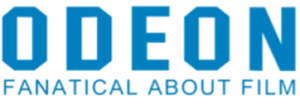
I felt that this new logo didn’t give Odeon the exciting connotations that it deserves as a cinema, and the blue certainly didn’t feel appropriate, I felt like I could make it much more exciting.
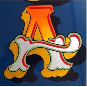
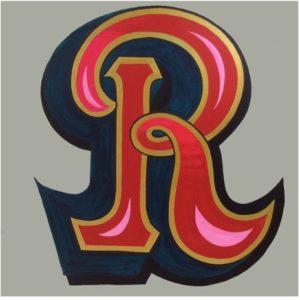
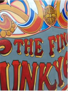
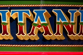
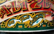
I also looked at a lot of examples of fairground art and signwriting so that I could adopt the correct style for my own rebrand. Here are some of the examples I found for inspiration. Some things I noticed were the common colours of red and yellow, the extra swirls and flourishes on letter forms, 3D effects, often heavy weighted letters, and that they used all capital letters.
Visit to Joby Carter’s workshop
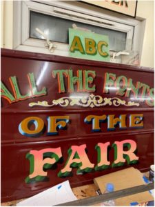
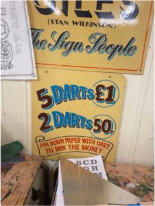
As part of the contest, we got the opportunity to go and visit Joby’s workshop and he showed us round while we were able to look at lots of pieces of his work which I found really inspiring.
![]()
![]()
![]()
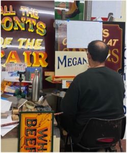
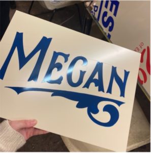
Joby even did some demonstrations of sketching out letterforms for us, and he also picked out one name to do a quick painted sign for, and he picked mine! He painted my name is swift, smooth motions onto dibond material which I had never seen been used before. I liked how he painted my name on a slight curve and the scroll beneath the letters gave it a lot more personality.
Design process
My design process consisted of weekly sketches and paintings which eventually developed into my final sign lettering.
Week 1:
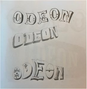
I sketched out three ways to present Odeon in fairground inspired fonts using different angles and curves to create different effects. I liked having a 3D shadow on the letterforms as it really made the word pop out more.
![]()
Week 2:
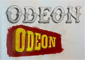
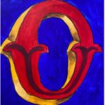
I did another two sketches and turned one of them into a painting. The first sketch I based off the Tuscan alphabet as I liked the fishtail flourishes. The second sketch I chose to draw on a perspective line with a vanishing point so that the letters appear to be getting further away. I liked the yellow on red as it really contrasted and made the letters stand out quite well. For this one I used the Playbill alphabet as inspiration which I thought was very appropriate due to its historic use in the 19th century for advertising theatrical shows on printed posters. This links very well to the concept of a cinema, so I chose to use this style going forward. I also tested a small painted sketch of an O using blue for the background and a Tuscan O, but this didn’t feel the right vibe for a cinema.
Week 3:
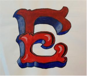
This week I painted a developed version of the previous style, trying to refine the letterforms more, and I tried adding a scroll which was inspired by the scroll that Joby added to his painting of my name, however I concluded that this style of scroll didn’t fit the same energy of the letters. I also painted an E with fancy flourishes and tails, but didn’t feel like the colours and style gave as much impact as my previous style, although I wanted shadows on the letters to be thicker so they overlapped more.
Week 4:
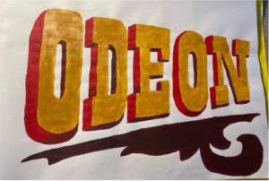
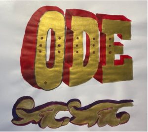
For my developments this week I bought some gold paint to replace the yellow that I had been using, because I noticed that gold featured a lot in fairground art and I thought this could be quite impactful, I loved the shine that it gave to the letters under the light. After having feedback last week, I changed the shadows around so that the letters were sitting flat, and you could see the top and the sides instead of the bottom of the letters. I also added some small circles to each letter after seeing this in lots of sign writing. I tested a different style of scroll that I thought contrasted but fit much better with the letterforms, and a dark purple red that I used for the darkest shadows of the letters. Finally, I tested a black outline on the O but didn’t like this as much.
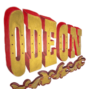
Final submission
My final submission for the competition was based off my last practice but with more accuracy and refinery. I used more accurate vanishing points to make the letters more coherent in their 3D states, and created my own scroll, which was based off one of Joby’s examples, but with some extra flourishes. I used some dibond which James helped me source from the department because when painting on paper, it often created ripples in the painting. This was a material I had never painted on before, and as I was using acrylic paint I had to do many layers of paint each time but it created a shiny finish and I was really pleased with the finished sign.
Evaluation
Overall, I think I did a good job of rebranding the Odeon logo using fairground typography to make a more impactful and exciting logo that actually represents the company a lot better. I thoroughly enjoyed being able to go back to physical drawing and painting instead of working digitally and found the art of signwriting challenging yet enjoyable. It has made me really appreciate fairground art much more, having previously been unaware that it was all done by hand. I wanted to stay away from doing anything digitally throughout this project so as to stay true to the art of hand-lettering, as I felt like doing anything on my laptop would feel like cheating when people like Joby Carter do absolutely everything by hand themselves. Due to doing everything on physical paper, I realise my design may not be the most crisp and have a perfect finish, but when I visited Joby’s workshop I admired the small mistakes and discrepancies that you could sometimes notice when looking closely because they reveal the work of the artists hand and show just how difficult it really is and I felt like these inconsistencies had a certain beauty to them. I learnt that hand-lettering is not about trying to make every letter the same, what makes it special is that every letter is different and you don’t have to stick to any rules of typography, it creates a unique opportunity to be experimental and expressive with letters.