
Introduction
Gifted Boutique is a small Community Interest Company, who raise money for four children’s charities in Reading by selling donated designer and high end high street clothing mostly through online platforms such as our website, Depop and eBay. Our client came to us in hopes we could shine a new youthful light on his next drop. He wishes to advertise his boutique in such a way that appeals to a younger audience and one way of doing this is to feel more present on social media as a way of gaining more attention and in turn, donations. He wanted us to come up with a completely fresh and engaging agenda for the next drop and it does not have to fit any previous, set colour schemes or aesthetics – in fact, it was to be very different. As a team, we worked together to achieve the wants and needs of the client. The client truly wanted us to explore our creativity, with no boundaries or preconceptions. The only specifications we were to bare in mind were as follows:
- Ensure the collaboration with students is clear
- Be funky, youthful and dynamic
- His previous photos lacked a ‘human touch’, so this was one thing he wanted to change
Deliverables
- Depop photos of at least 6 items (1280px x 1280px)
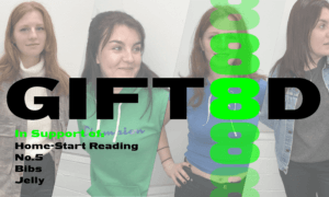
- Facebook cover photo (820px x 312px)
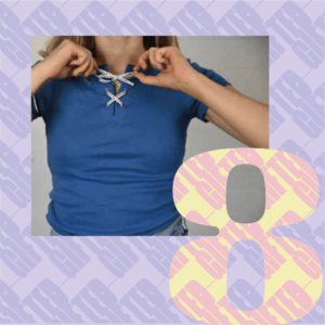
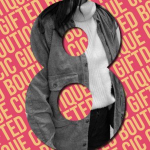
- Hero images instagram (1080px x 1080px)
- Website hero images (2000px x 1200 px)
- Promotional animation video
Aims
- Advertise the brand
- Be inviting new customers and donations
- Create a completely different concept
- Appeal to a younger audience
- Add a ‘human touch’
Target Audience
Most of the clients consumers tend to be younger women but he also wants to appeal to:
- Students
- Younger people
- Sustainable advocates
- Facebook users
- Located in the reading areas
Research
We made sure that before we started anything, we would familiarise ourself with the brand itself – looking at their socials such as their website, instagram, Depop, facebook etc. While doing so, we analysed the use of their type and colour but found this to be quite inconsistent at times but this is because each drop has it’s own identity. We definitely felt that the brand identity was missing a form of human touch considering its values are very closely related to the communal feeling of people.
Design Process
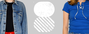
We started the process by splitting up – we decided to brainstorm upon our own ideas and concepts. The client was very open to any ideas, and so we thought we would initially present him a range of ideas for him to pick and choose what assets he liked from each to get a better idea of what avenue he wanted us to go down and what he was drawn too.
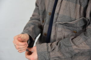
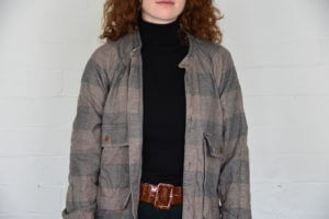
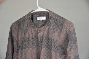
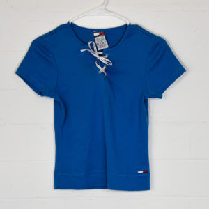
Initial photography
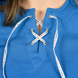
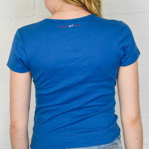
Following on from this, we decided to kick start with our own photos. These photos were not aimed at being the best, but instead to give us a better idea of what we aim to deal with in our future designs and start getting more comfortable with what was to be done.
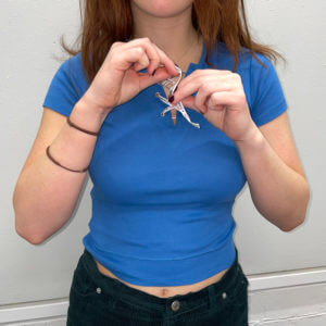
Following on from some initial photos, we created some more authentic designs.
Initial ideas
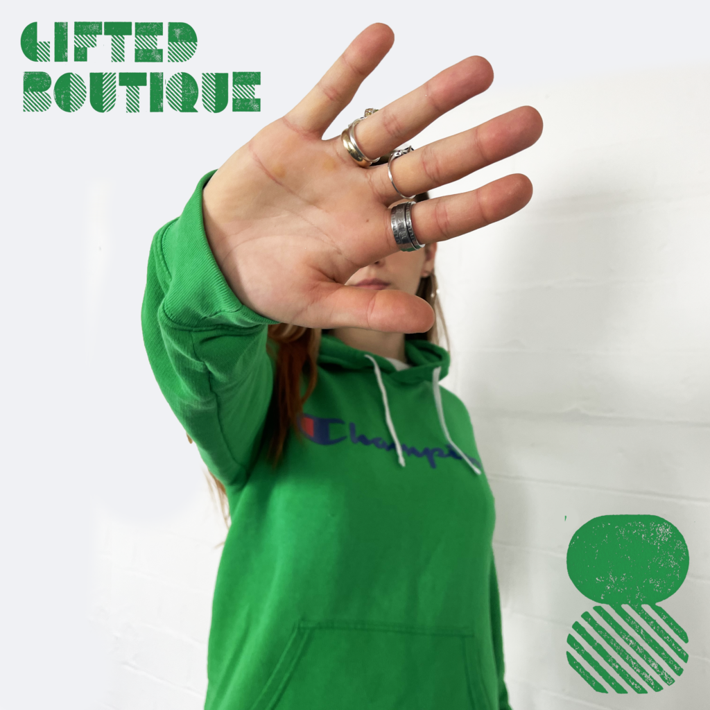
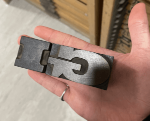
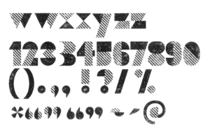
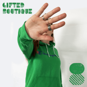
The client stated in the initial brief that a less professional and more edgy/youthful approach was needed, hence his decision to come to the University to have students design the output. Because of this, we focussed on trends and colourful images that would help the brand match the current styles present on Depop and instagram. One trend that we desired, and when presented to the client he was thoroughly interested, was the use of woodcut lettering. The client wanted it to be an obvious collaboration with students and the university; So we felt this approach to be youthful and fun, while remaining true to our design backgrounds and aspirations. We contacted teachers and upon our own knowledge, we’re on the hunt for a suitable typeface to use within our designs.
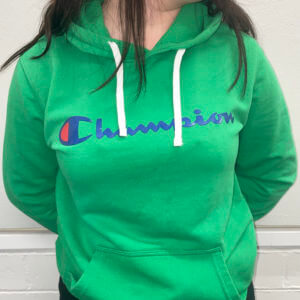
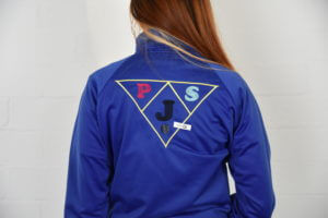
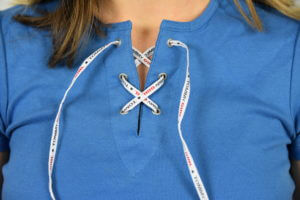
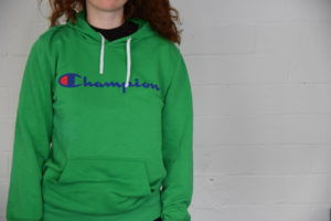
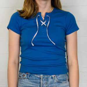
Developed photography
In our second photoshoot, we felt much more prepared. We got hold of some much better equipment and made sure to get better angles of the clothing, as well as a wider variety of photos to play with.
Final Deliverables
1. Depop photos of at least 6 items (1280px x 1280px)
2. Facebook cover photo (820px x 312px)
3. Hero images instagram (1080px x 1080px)
4. Website hero images (2000px x 1200 px)
5. Promotional animation video