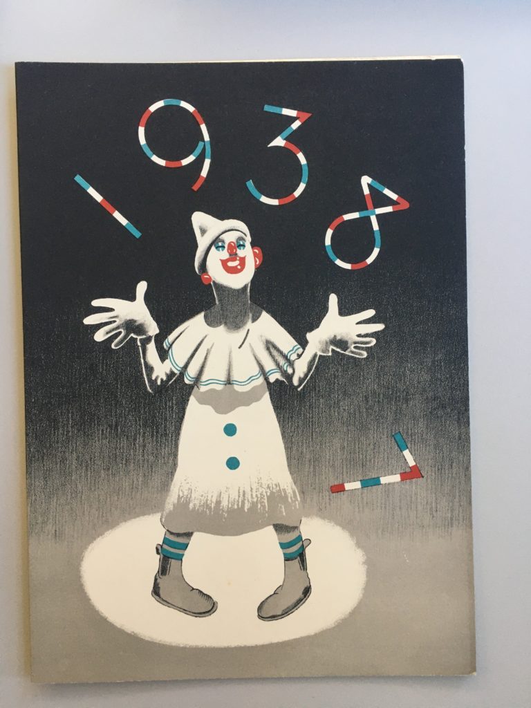
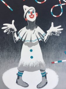
 For this mini brief I’ve chosen to write about a menu for New Year’s Eve 1937 at The Ritz. This particular item grabbed my attention with its print design’s minimalist use of colour, and hints of Art Deco style. The gradient in the background shifts the viewer’s focus to the face of the clown and the type by giving the upper half of the design higher contrast between dark and light. The arch in the ‘1938’ frames the clown nicely and draws together the focal points of the image further. The design successfully conveys the theme of celebration which is appropriate for the occasion.
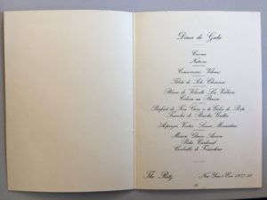
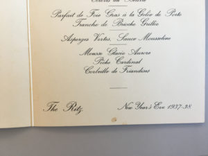
The fun outside cover of the menu is juxtaposed, on the inside, by a formal choice of typeface which matches the prestigious image of The Ritz Hotel. Rules are then used to break up the separate dishes on the menu — this is especially helpful seeing as the highly embellished ascenders tend to slightly obscure the lines. The layout is very simplistic and the items on the menu are ordered in a way that gives the body of text a diamond shape which is an elegant stylistic touch.