Reading Film Theatre Listings
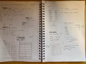
I started off this project by drawing up small sketches of my initial layout ideas, I’d quickly decided that I’d have the main heading left aligned at the top of the page and then the contact info at the bottom, deciding this early meant that I then had a determined space for my actual content of the page, this allowed me to appropriately size the rest of the page properly.
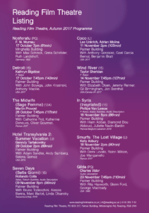
I’d also focused on my layout for specifically each block of information, my idea was to keep this page with as few rules and lines and boxes as possible to allow it to read easy and feel breathable almost, this meant my layout for the information had to be clear and consistent between each section.
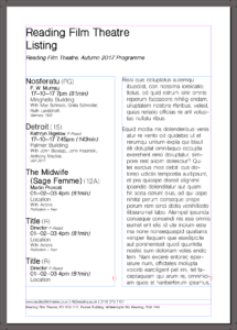
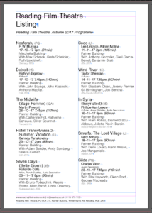
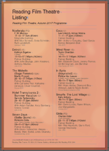
I started by creating the general layout and the columns, then created a template for the format i’d decided on for the information. I found doing it this way that as i went along and input all of the information i was able to adjust the sizing appropriately when i input new information and i learnt what the spacing and sizing actually needed to be as i went along. My main focus was to keep a systematic format for each section so that once you’d read one section of information you’d be able to understand all of them, this proved awkward in areas such as “Hotel Transylvania 2” where the name was extra long and required 2 lines, this led to me deciding to use an ‘outdent’ for the main title of the film, further separating the sections but meaning that names that spanned over 2 lines were still just as readable as any other while not taking up an obnoxious amount of space horizontally on the page.
Another of my steps was creating a background, since my goal was to create a format of bolds/italics/sizes/lines to break up the information in a block into understandable sections this meant that my choice of colours was free to use for the background graphic, using a mesh gradient i created a purple and orange background which wouldn’t be overpowering to look at but gave it a friendly feeling still rather than a blocky full colour background, next for this i decided to add in lighter sections of blurred circles attempting to tie into the theme of cinemas with a pseudo lens flare effect on the background. I created this is illustrator and then placed it into the indesign document.