

Brief
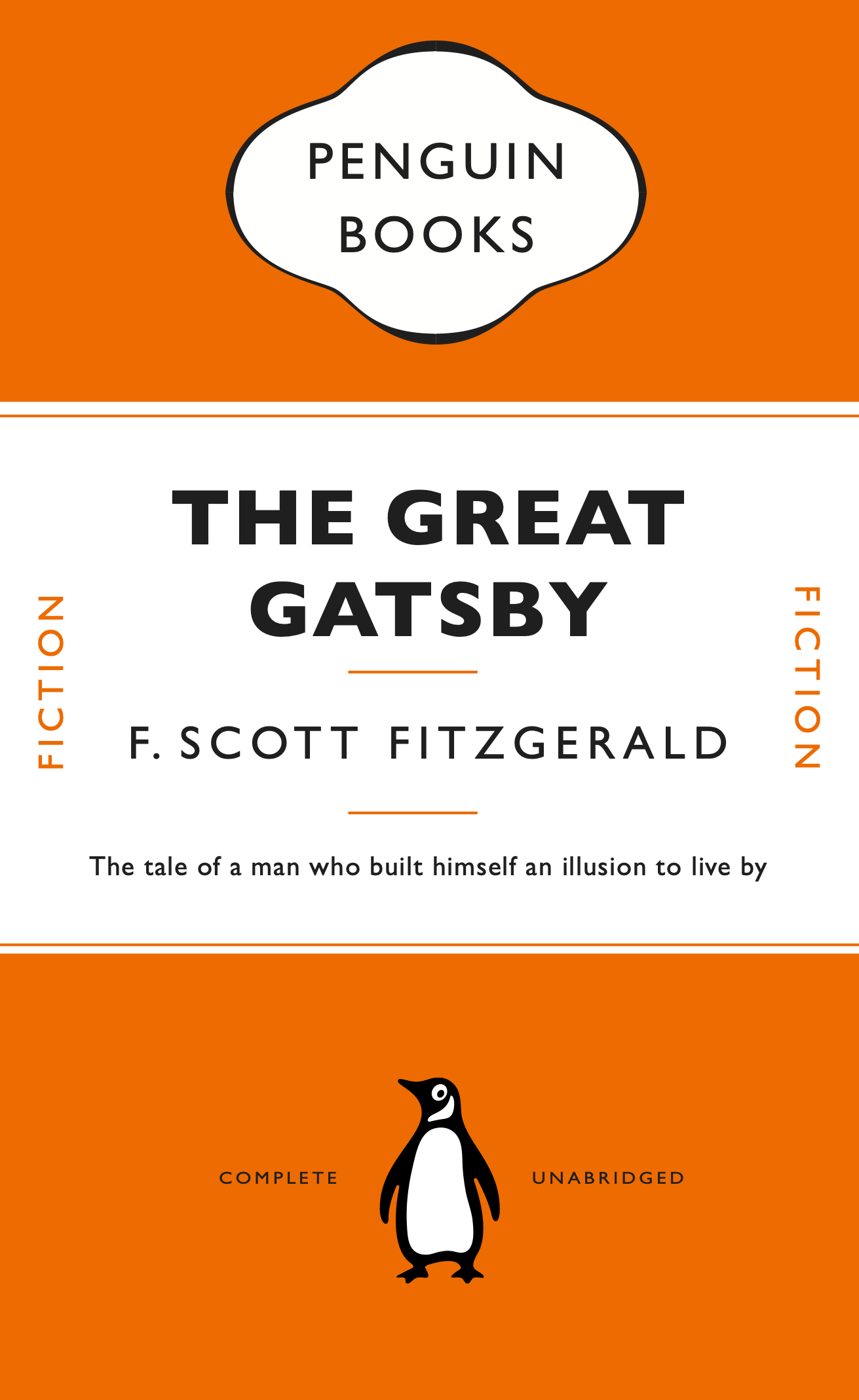
Complete the Great Gatsby cover we began in class, ensuring that, as much as possible, every detail is a match for the photograph we are copying. There is no need to ‘distress’ the paper. If you like, have a go at changing the colour of the book (perhaps use another well known Penguin colour) and change the book title and author to something else, to prove that your file is robust.
Once you have completed part 1, select another book and author – ideally something you have enjoyed or which means something to you. Something you know well. Inspired by the David Pearson’s Penguin cover for 1984, or both other artists or designers whose work you enjoy, create a new cover for your chosen book that:
-
- Sticks to the basic rules of your first classic Penguin
- Introduces new elements, or alters existing elements to create something funny / witty / insightful / relevant to the content or nature of your chosen book.
Process
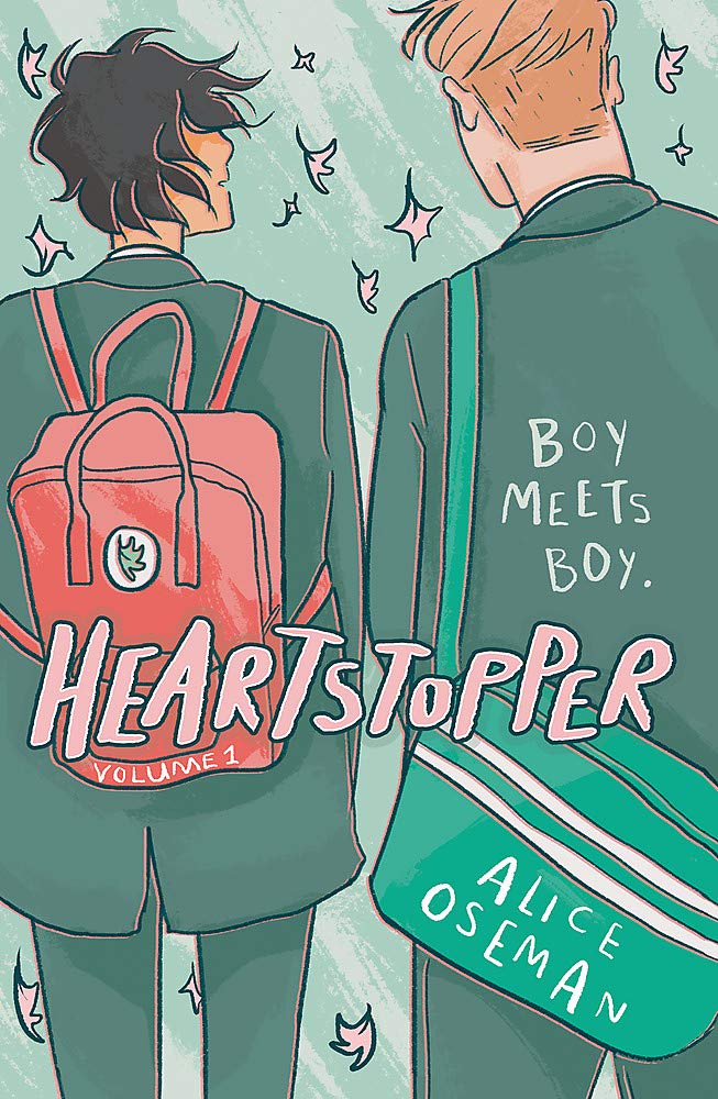
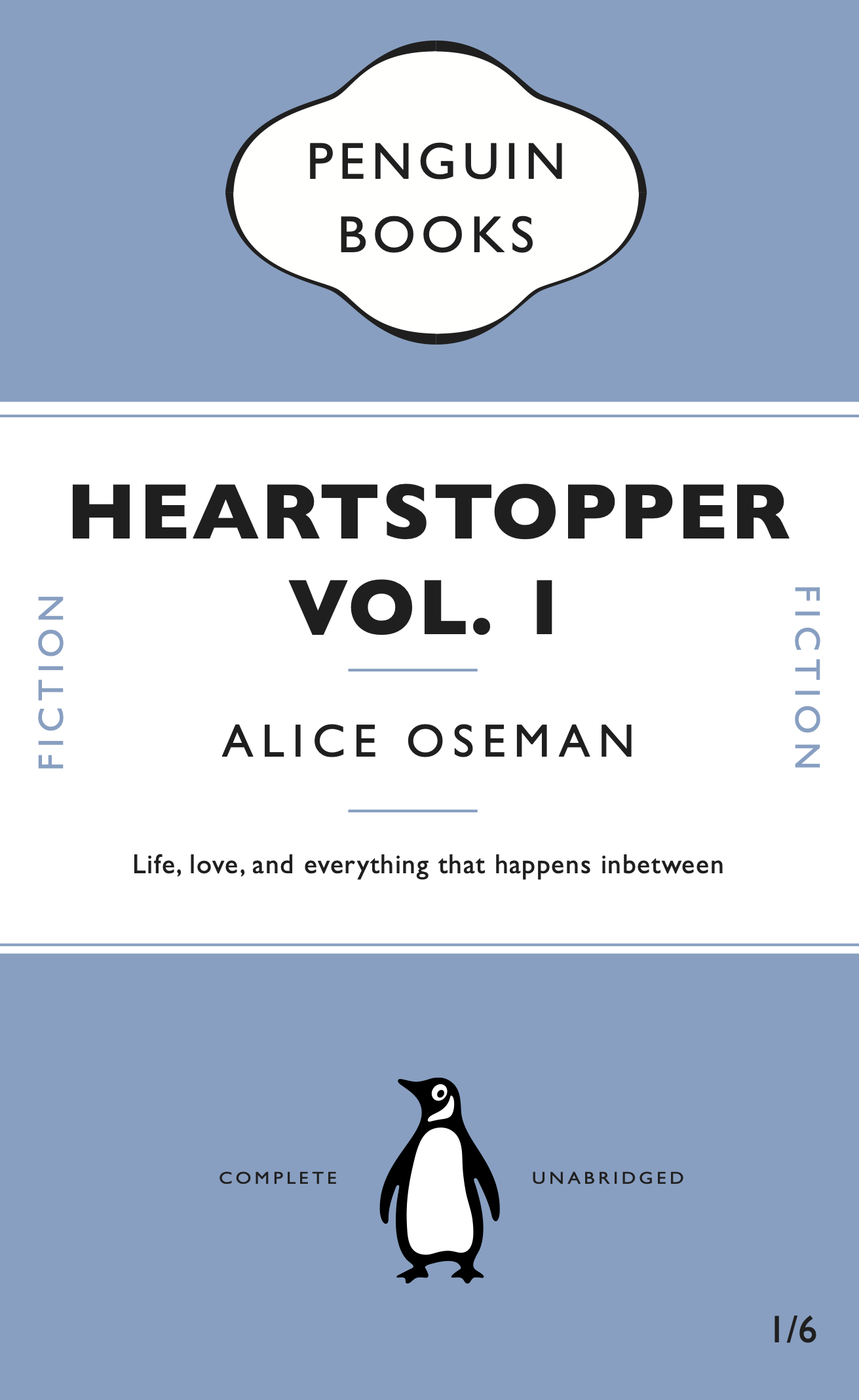
After finishing the initial penguin book cover tutorial, I decided to have a go at changing some different elements of the book to see if I properly understood how the mechanisms in Indesign we learned worked and how to use them. For example making my own style sheets and making the cartouche again were especially good ways to see if i remembered how to make and use them, instead of just copying the tutorial. For the alternate version, I decided to make the cover for ‘Heartstopper Vol. 1’ by Alice Oseman. As the original is illustrated, I wondered how it would look as a penguin cover which is much simpler.
PDF’s for the two covers:
The Great Gatsby 01 Heartstopper 02
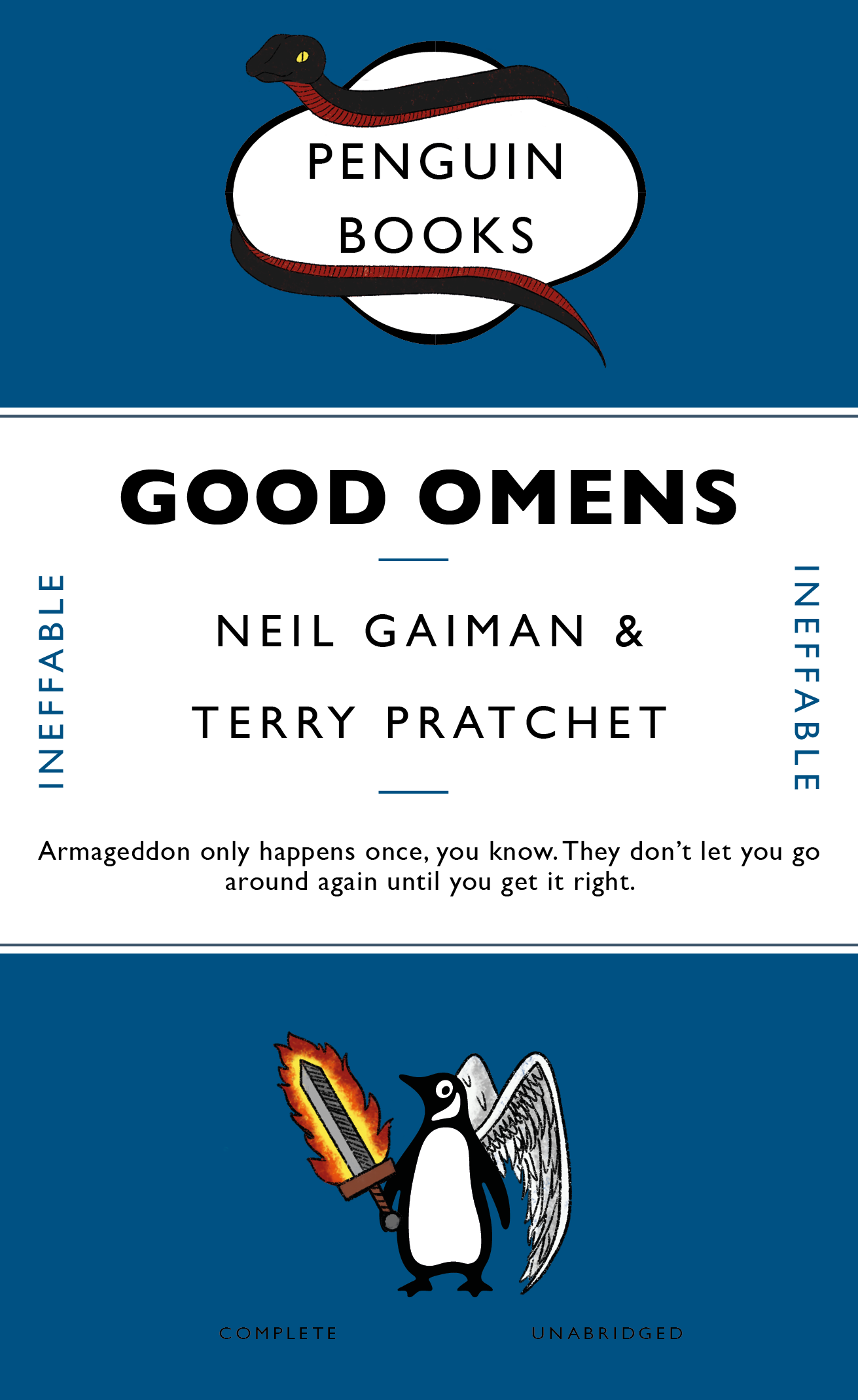
For the second part of the brief, I decided to use the book Good Omens by Neil Gaiman:
“[A] somewhat fussy angel and a fast-living demon — each of whom has lived among Earth’s mortals for many millennia and has grown rather fond of the lifestyle — are not particularly looking forward to the coming Rapture. If Crowley and Aziraphale are going to stop it from happening, they’ve got to find and kill the Antichrist (which is a shame, as he’s a really nice kid). There’s just one glitch: someone seems to have misplaced him. . . .”¹
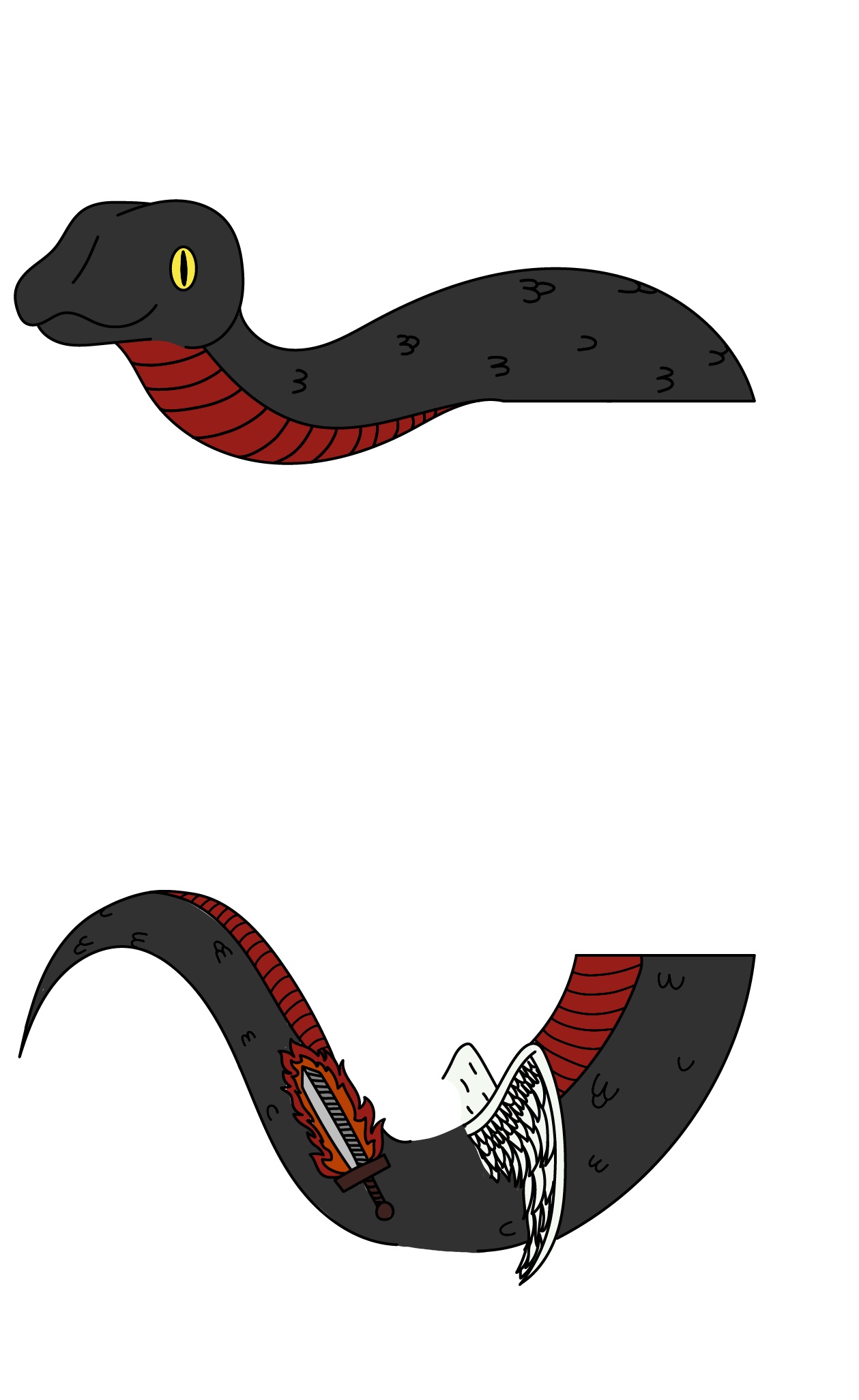
In the book, the demon Crowley is often portrayed by a black and red snake, while the angel Aziraphale is usually only shown with wings to identify his true identity; another common motif for Aziraphale is his flaming sword. As these are the most commonly known portrayals of the two characters, I thought that including these would be the best way to make the cover more interesting while tying in the theme of the book.
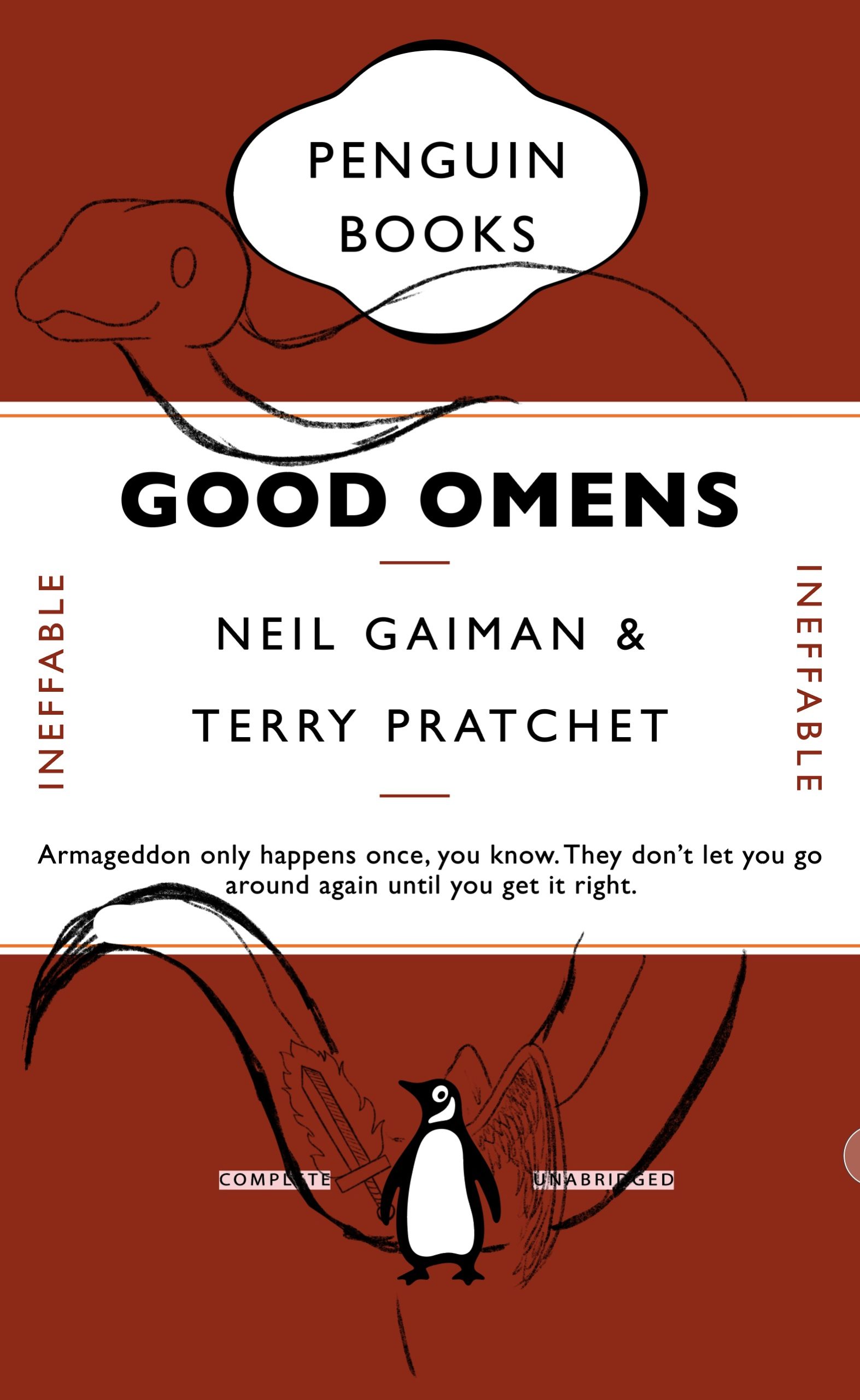 I started by altering the details of the cover such as the title and author, as well as the small words on either side of the cover. After changing these main elements I took a picture of the altered cover and began to sketch the snake, angel wings and flaming sword over it. I decided to put the snake around the middle banner of the cover, as though it was coiling/hanging over it, and used the wings and sword to decorate the penguin. After sketching it out in Procreate, I transferred it to Illustrator and traced a clean, smooth outline using the pen tool. To make the colouring process easier, I took it back to Procreate and coloured it using a monoline brush to create flat colours. I saved the finished illustration as a PNG to make it transparent and placed it in InDesign.
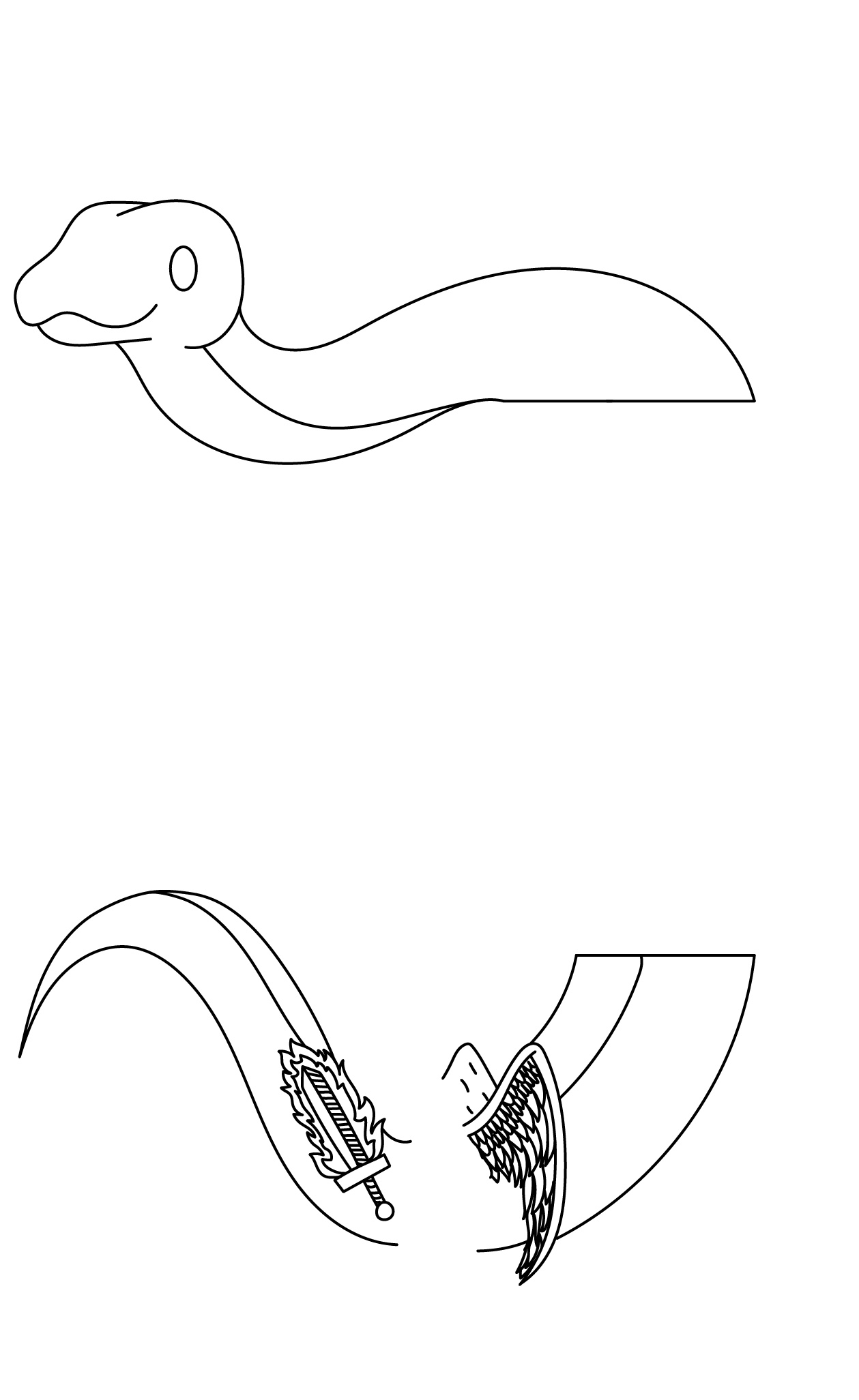
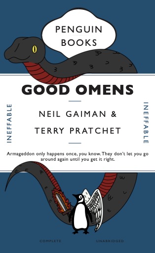
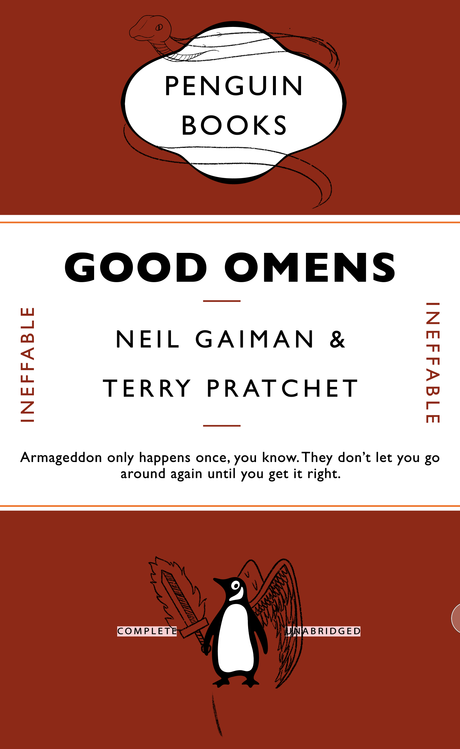 However drawing the snake hanging over the banner looked too imposing and didn’t mould well with the rest of the cover’s components, whereas because the wings and sword were smaller to be added to the penguin, they fit in. For this reason, I thought about making the snake smaller so it blended in well – the only problem being its placement. Going back to my initial idea, I thought about having the snake wrap around something, but wasn’t sure about where to put it. After confiding with some peers, I decided to make it go around the cartouche. I thought this was rather ironic, having the representation for the demon at the top, and the angel at the bottom.
Again I sketched it in Procreate, but I decided not to trace it in Illustrator; after the first attempt of the cover, the smooth lines and flat colour looked somewhat out of place and too modern for a classic cover. So I made the decision to use a textured brush from Procreate and drew an outline that looked more like a pencil drawing or rustic print. I was much happier with how this looked, to took it forward and began to colour it; similarly to the outline, the flat colour didn’t merge well with the aesthetic of the cover, so I coloured it with a charcoal textured brush, making the colour slightly speckled and not entirely even. I was much happier with this result as it looked more fitting for a classic cover, and the added illustrations were balanced in their placement. For the main colour of the book, I settled for a deep blue that still allowed you to see the outlines of the illustrations and created a good contrast with the warmer colours used.
 Reflection
Overall I really enjoyed this project as an introduction to using Indesign and it covered a lot of the main features that we will use in future tasks, while still allowing us to have some creative freedom and explore with it. Doing this project also made me understand why working with peers is very important – if I hadn’t confided with the people around me, I wouldn’t have been able to complete this project to a higher standard. Furthermore creating this cover made me think about how to develop something that already looks ‘finished’ even further and how to introduce a new theme, in this case the book’s premise, into something that already exists, and how to tie the two together. I think this project helped me make a confident start with using the InDEsign software, and developed my critical thinking skills.
Final cover PDF: Good Omens 03
¹taken from https://www.neilgaiman.com/works/Books/Good+Omens/