 When tasked to explore the university campus looking for use of typography in a 3d environment, I decided my focus would be on caution signs and what they have in common
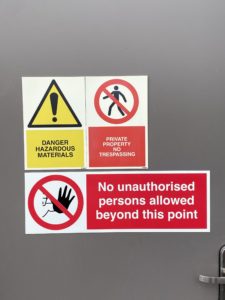
with each other. It took no time at all to find a sign of interest as they can usually be found everywhere. The first thing I noticed after finding a few signs was the use of the traffic light colouring system as shown in this image on the right. The red signifies a blunt stop sign, it is to act as a harsh message to stop anyone from doing what the message says. Though when we look at the yellow sign we can see that yellow signifies a caution message. It is less brutal than the red text though it gives a warning to the user rather than an order. And finally, green light. showing a message for advice the green light does not give any orders or warnings. It is to provide help if you were to need it.
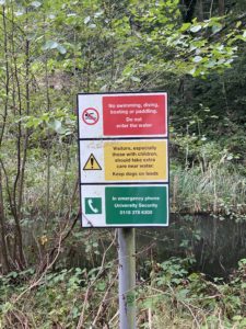
If we compare this image to the next, we can see some similarities. Maybe not with colour but with the font used. There seems to be a universal style that these signs follow. From what I can gather these signs all use a bold sans serif font like gill sans. This is a very effective font to use as it is extremely easy to read. its legibility couldn’t be better