
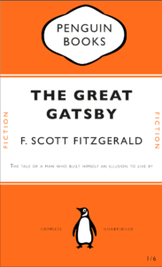
This is my Penguin book cover created using James’ online tutorial. I used Gill Sans font instead of the Gills Sans Nova font James suggested in the video. Unfortunately I had some trouble inserting the small orange lines upon and below the authors name, therefore I had to miss out this step however I enjoyed doing the rest. I enjoyed learning about paragraph styles and thought this video was a good introduction to InDesign, a software I had only previously used once. If I could change anything about this cover, I would change the cartouche at the top of the book. I think I could have rounded the black a bit more instead of leaving it a little pointy.
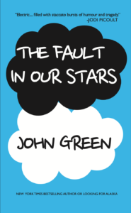
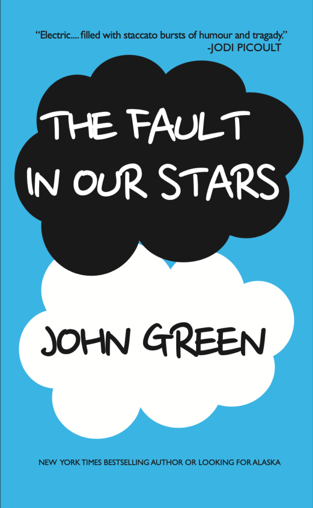
For my second book cover I chose John Green’s ‘The Fault in our Stars’. I chose this book because it’s such an iconic cover that everyone knows. This book design was also similar to the Penguin one as it involved creating circles to build up the cloud, similar to the cartouche from the Penguin book, a step i thought i needed to improve on. Unfortunately, I could find an exact match to the font used on the original cover which is chalk styled. So instead I went for a similar child-like style to try and fit the theme.