
Background
In their second term, Part 1 students take on a website project where they are given the logos and brand guidelines in order to help them concentrate on the UX aspect of the project. The brief for this real job required two sets of brand guidelines for local businesses to be created to be used in the Part 1 project. This was a hypothetical rebrand and the businesses included Berkshire Black Business, Readifood, Mobility Trust, and The Mustard Tree. We were allocated one business and were then able to choose the second business we created guidelines for. For each rebrand a colour, white, and black logo had to be created alongside a choice of typefaces and colours. The aim of this job was to create realistic brand guidelines that were suitable for use on a mobile website. This project had a very quick turnaround of two weeks as well as tight deadlines for feedback within this period of time.
To allow this job to progress quickly, all communications were made over email and although research was required, there was no call for a trello board to track progress. The requirements for the job included deliverables of:
Item 1 Brand guidelines on given template for allocated business
Item 2 AI or EPS files for logo versions for allocated business (black, white-out, and full colour)
Item 3 Brand guidelines on given template for chosen business
Item 4 AI or EPS files for logo versions for chosen business (black, white-out, and full colour)
Process
Research
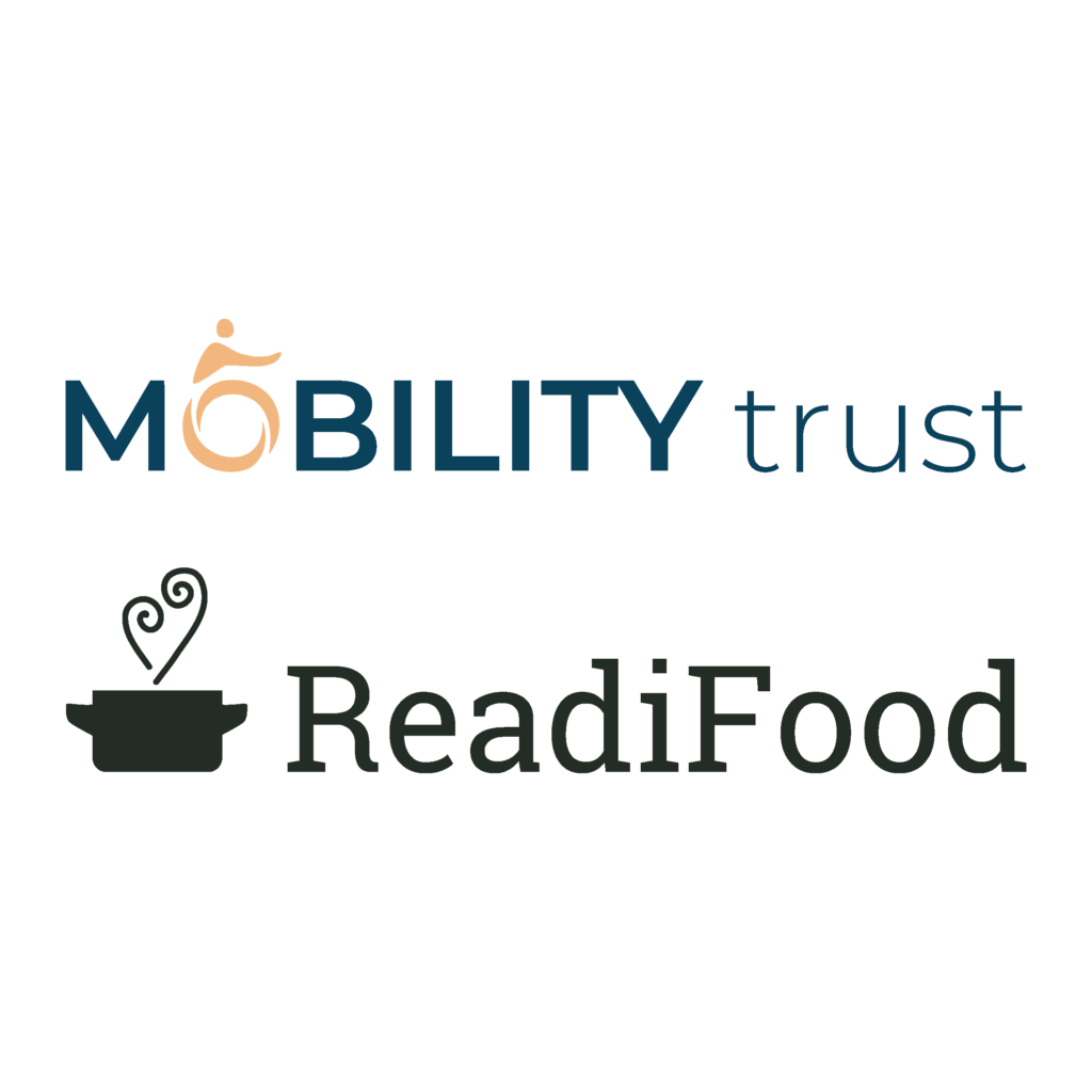
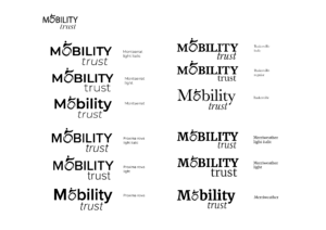
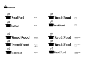
Although this job had a tight deadline, it was crucial that the research phase was not ignored. The job required research into the rebranding process of a major branding company and also research into the business that we would be rebranding. From this research it was clear that the logos needed to be easily scalable so thin strokes could not be used as they would become very thin when scaled up. The logos also had to be uncomplicated as they would be seen at a small size on mobile platforms. Researching into rebranding processes also gave insight into how elements of an old brand can be pulled out and made to work with the new brand whilst also keeping some recognisable traits of the original branding. I was required to design the brand guidelines for Mobility Trust and after researching the other businesses I also chose to rebrand ReadiFood as my chosen business. Mobility Trust is a charity that provides funding for mobility equipment and ReadiFood is a food bank run by Faith Christian Group.
Design
After completing research and having a plan for how I would move forward with the project quickly, I began sketching ideas for the logo. Although there was a tight turnaround for this job, I still felt it important to first complete sketches by hand before moving into Adobe Illustrator. This allowed for more ideas to be quickly sketched which was less time consuming than drawing them in Illustrator first. Doing this also meant that only the strongest logo ideas would be developed in Illustrator which, again, sped up the designing process. The aim for the Mobility Trust logo was to incorporate a vector wheelchair graphic with the name ‘Mobility Trust’ and create a clean, professional logo that would be trusted by the users of the business. The ReadiFood was able to use softer elements than Mobility Trust due to the caring nature of a foodbank in comparison to a charity funding for expensive equipment.
I pulled these sketches into Illustrator and began to draw the strongest ideas that would work well at the smaller size required for mobile websites. These ideas were presented for feedback and the logos that had the most potential were carried forward to begin working more thoroughly on the type that accompanied them.
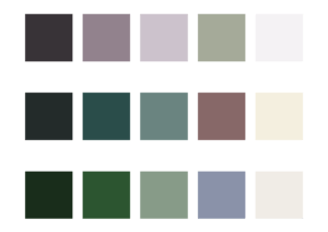
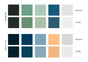
As this project had to be completed quickly, only one logo for each business was chosen to be developed further. Type was explored to see how effectively it could work with each logo. At this stage, colour combinations were also carefully tested and thought about. To match the serious funding side of Mobility Trust the use of blue was deemed appropriate but incorporated in this, a bright accent colour that could be used for call to action elements on a website. The colour choices for ReadiFood were chosen to use natural, warm tones that matched the nurturing aspect of the brand and created a caring feel.

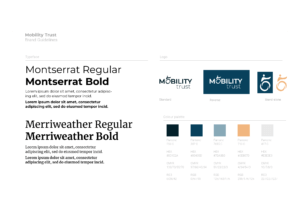
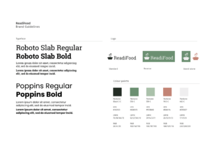
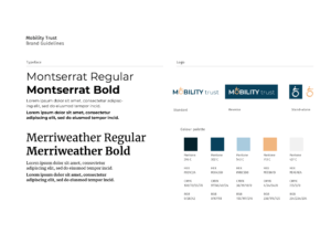
These ideas were presented for feedback using brand guidelines template. At this stage, an accompanying typeface had been chosen for each business using guidance from articles that discuss suitable typeface combinations for use on websites. The typeface choices of Merriweather and Montserrat for Mobility Trust worked well with each other and were versatile with many font weights. Merriweather can be used as a display or body text typeface and they also adequately complement each other as one is a serif and the other is a sans serif.
The colours for Mobility Trust worked well but the dark blue initially chosen for ReadiFood was quite dull and did not stand out compared to the green tones also chosen.Oswald and Poppins were originally chosen for ReadiFood, but the two sans serif typefaces did not allow for much contrast when used on a website.
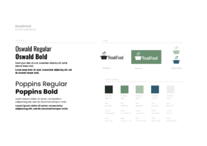
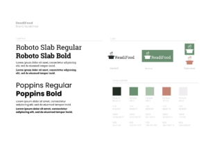
Following this, the ReadiFood guidelines were changed to use a muted red/light burgundy which contrasted well with the green and also worked well with the caring, soft feel that was intended when creating the logo. Roboto Slab was chosen in place of Oswald as it still complemented Poppins but provided a serif typeface for the guidelines and suited the style of the finished logo as previously the condensed look of Oswald sat slightly uncomfortably with the pot used in the logo.
Feedback
Unfortunately, my guidelines were not chosen by any of the current Part 1s to use for their websites. However, I received some general feedback from them and what they experienced when using brand guidelines created in past years. The general comments were that they chose to use guidelines based on their imagined suitability with the topic, such as pinks for a florist. They also found that it was useful having five colours that worked together well but also provided some contrast. An issue that also arose for a few of the students was logos having multiple layers or using thin strokes that did not size up correctly. This made it difficult for them to use as they had to edit the logos and try and fix them before they could be used.
Developments
I was able to develop my logos from the feedback provided to tidy them up and ensure that they worked better for their intended purpose. This included making the pot logo more balanced for the ReadiFood logo and ensuring that the steam rising from it was not too thin. The pot was previously very dominating and sat awkwardly next to the type. To correct this, I scaled the pot down and also edited the pot handles to allow the logo to feel more balanced. I made the rising steam into a more obvious heart shape as although this was a subtle feature it did not stand out clearly enough. I also ensured that the strokes for these were outlined to make them a shape which allows the logo to be resized without affecting the weight of the strokes of the steam, allowing it to be more adaptable.
The Mobility Trust logo received good feedback but I refined the use of the wheelchair wheel as the ‘O’ in Mobility to make it fit the shape of the ‘O’ in the typeface more accurately which allows it to sit more comfortably in place of the ‘O’. This also prompted rotating the person using the wheelchair in the logo to make them more fluent with the direction of the ‘O’ and the logo. I also slightly changed the tone of the light blue used to make it brighter. This contrasted better with the darker blues and was not as dull as the original blue. Another issue that arose was the logo being too deep to work effectively on a mobile format. This was solved easily by moving the ‘trust’ up next to ‘Mobility’ in the logo instead of below to create a long logo but one that was more suitable to fit mobile formats.
Guidelines In use
Although my guidelines were not used by the Part 1s, I used the colour scheme and one of the typeface choices for my own web project. I found that the orange worked really well as a contrasting colour and the dark blue was a really strong background colour that worked effectively with the off-white text colour. I did have to change the light blue that was first chosen to a lighter blue which is shown in the developed guidelines. The previous light blue was too grey and originally made the design feel boring as it blended in too much. Choosing a brighter, more sky blue elevated the design and created a lighter, more upbeat feel.
Reflection
The quick turnaround for this project did create some limitations to exploring and refining the designs. However, it also made me really focus on the project to ensure that I achieved a well thought through design process even in a short amount of time. I was unsure at first how I would manage to complete adequate research and come up with a variety of ideas in such a short timeframe but, although very fast-paced, I realised it was more than possible as I was able to do this whilst also completing work for other projects.
I found it difficult to choose colours without being able to see them used in practice and this was a limitation to the amount of time we had to complete the guidelines. If the timeframe was longer, it would have been really beneficial to experiment with different colour ways on a website mock-up to see how they would work together and complement each other. This was something I found when using the Mobility Trust guideline colours, myself and is a factor that I will definitely consider when designing in the future. Being able to refine the logos after the deadline was beneficial as it allowed me to look at them with a fresh perspective. I found that tweaking the smallest aspects, such as making the Mobility Trust wheelchair logo more round to fit the typeface, allowed the design to look more thought through and therefore work more effectively.