
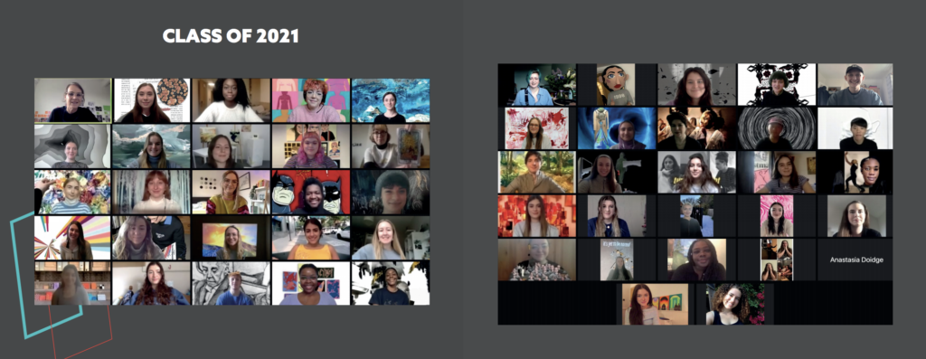
Background
Every year, the art department hosts two art shows for finalist art students: the Winter Cabaret and the Summer Art Degree Show. Both shows always have a designated individual theme and branding. It is a moment for the students to showcase their work and make important connections. We will work together with a committee of art students to create a branding that clearly showcases what their year was about. At the time this report was submitted, the job was not yet completed, but in stages of near completion.
Brief/restated brief
This real job included two large projects: branding, a website, and social media assets for an event in December and branding, a website, social media assets, and a publication for the 2021 undergraduate art degree show. Initially, the job seemed to be smaller with a website that would be updated between the December event and the degree show and an overarching branding. However, after a meeting with the client and later with the art students, this job included two separate events. Our job was to work closely with the art students to produce visual identities that they were happy with and believe reflected the visions they had.
The Art Degree Show committee had an estimated budget, dependent on grants and fundraising (generated from the December event for the degree show), which aimed to cover the cost of all deliverables:
- To create two sets of branding. One that represents a chosen theme by art students for their annual December event, and one that successfully encapsulates the fine art’s graduating class of 2020/2021.
- To design and create a website to showcase students’ work and the live stream for the December event, as well as create a separate website showcasing finalists’ work and their live stream for the degree show. These websites needed to successfully use the branding in the point above.
- To create social media templates that will promote the events by showcasing students’ work and communicating important information, such as the link, date and time. This includes Instagram posts, icons, and live stream backgrounds.
- To design and create a catalogue of student work for the degree show. As with the website, this also needed to successfully implement the branding. Despite the coronavirus, the intention was to print the catalogue, however, it also needs to be suitable as a PDF.
COVID–19
While this job already started during the pandemic, COVID-19 still posed several challenges. Our usual approaches to working with clients and in a group had to change. Instead of meeting face-to-face every week with the client and art students to go over work and discuss ideas, we held these meetings in Teams. Although this meant that we still had consistent meetings, our feedback was still compromised. It was more difficult to get responses from people behind screens than it would have been in an in-person setting. However, we worked through this, by following up with the students in a more informal setting when more feedback was needed.
Further, the nature of the exhibitions changed. The winter cabaret and degree show moved from being in the art department to being fully online. Usually, these events would require physical invites, posters, business cards, and other promotional materials. This year, the deliverables were narrowed down to social media assets, websites, and other digital media. However, the major publication would still be printed, but this also had to be available in PDF format for people who could not physically be at the degree show. While this might sound like less work, there was more emphasis on the importance of the website, what it looked like, and what it was capable of.
Allocating roles
As a team of four students, we knew it would be beneficial to split up the roles based on our strengths and what we wanted to learn. Charlotte was the only one in our team who had experience with making websites, specifically using Elementor on WordPress. However, Liselot wanted to learn these skills. So, for the Winter Cabaret, the roles were allocated to be that everybody would work on creating branding, and then the website would be made by Liselot and Charlotte, while Hiba and Shanzeh worked on the social media assets. For the degree show, the roles changed a little. Branding was still shared (at the end only one person made edits to assure there would be no file mixups), social media was allocated to Hiba, the brainstorming and planning for the publication was a team effort, but making edits and designing each individual page was left to Shanzeh, and the website was mainly Liselot’s job. Charlotte helped both with designing individual pages for the publication and with designing the website. However, the team is planning to get back together again to input all the content for each individual artists’ website pages. This way Shanzeh and Hiba get to learn about website building as well and the work will be done quicker.
The design process
Although this job was a two-in-one job, the design process for both was similar. However, by having two projects following each other so closely in time, we could apply what we had learned quickly. Our first approach assumed we would not need as much time to work on the branding. The schedule we had created and the client had signed off on reflected this. In the end, our branding took more weeks than we had planned, leaving us to create an entire website in less than two weeks. Although the winter cabaret had more of a time crunch than the degree show, we knew to expect to spend more time on the branding. Hence, we planned an entire term solely for perfecting the branding and how this would translate to the publication.
For the website, we figured out that less time was needed than we initially expected. Even though we worked overtime to get the Winter Cabaret website finished, we knew not to worry as much about the degree show. The first time around, three of us also had not used WordPress before other than to post these reports, meaning much time was spent on learning as well. For the degree show’s website, these skills only needed refreshing.
Themes
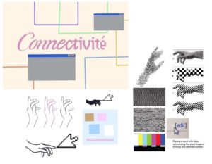
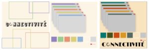
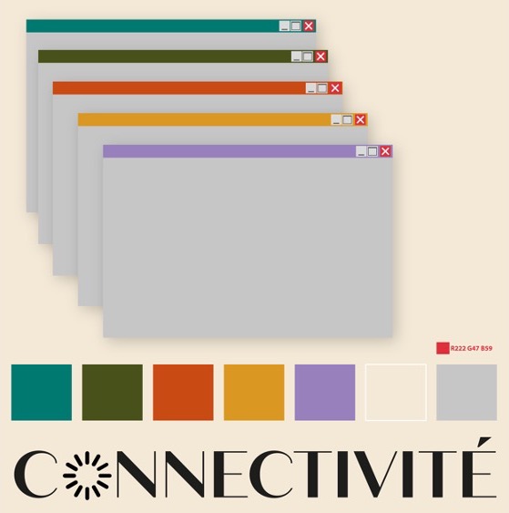
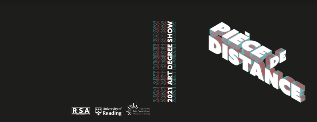
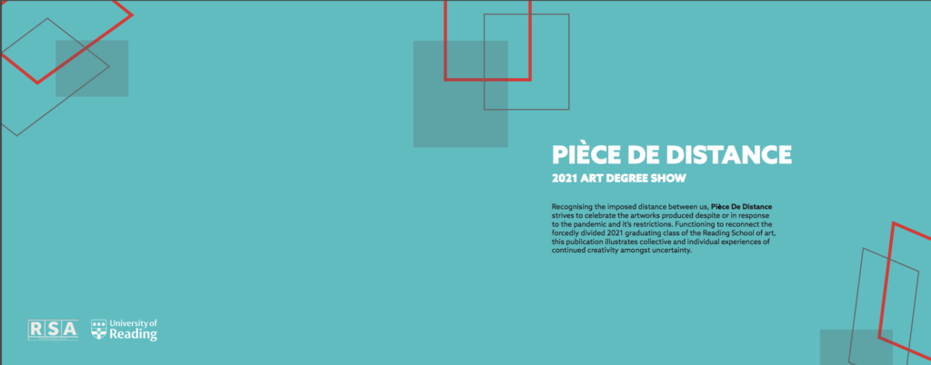
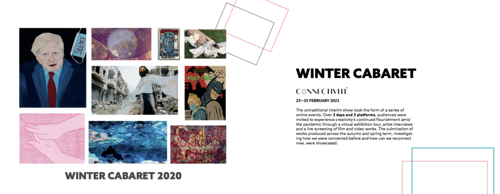
The themes for the events were solely chosen by the art students to best represent their year and work. To make both the December event and the degree show connect, the names were decided at the same time: Connectivité for the December event and Pièce de Distance for the degree show. They related both to how everything was online and at a distance the past year. Since Pièce de Distance is a play on pièce de résistance, the art students stayed within French-sounding names. For the design, we first focused on Connectivité, which was a mix of digital and renaissance. For the degree show, we made it its own event by having a complete opposite visual theme that focused heavily on technology and darker colours, meaning there was a contrast despite the unity. How we came to these visual themes is discussed below.
Research
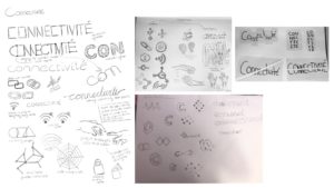
In order to fully understand the subject of Connectivite, we underwent some initial research into both the themes of connecting and the French Renaissance. This enabled a deeper understanding of each theme and some potential ways in which we could link these all together in a way that was fresh yet kept some of the historical Renaissance-style work which the clients wished to have. To keep our research organised and collated in one place, we created a shared Pinterest board that the art students could also add to, where we saved inspiration for several of our deliverables; the website, catalogue and the branding.
We applied this process to brainstorm ideas for the degree show. By which we researched the theme “Pièce de résistance” in terms of context and the ways we can modernise it. According to the Merriam–Webster dictionary, the phrase translates to “An outstanding item or event, the showpiece.”Which is an immediate reflection of what the degree show is about, presenting the students best work forward. Similar to the winter cabaret, this theme still had French connections but leaned more on the theme of distancing, which was fitting because of the current pandemic and social distancing rules. Shown below are our Pinterest pages we used to collaborate with the students to brainstorm our initial ideas, allowing the students to add their own photos in order to better understand their vision. We did this both for the winter and summer shows, focusing on each one individually. This meant that we could work efficiently and bounce ideas between the members in a way that was quick and easy to do.
Branding
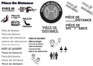
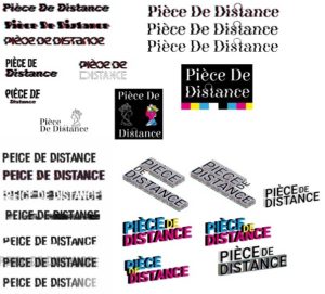
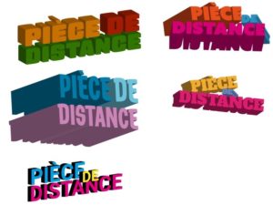
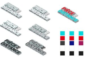
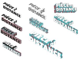
The branding for the events was based on the collaborative Pinterest boards with the art students. This way we could suggest visual themes and they could build on them as well as the other way around. It was clear that at the beginning of the design process of both the events, that there were many ideas. While the overarching theme of Connectivité was being connected digitally and in person, it still could be visually represented in different ways. The same was for Pièce de Distance, which was more about the distance. The design process for both of the events was very similar. We had a close collaboration with the art students due to our weekly meetings. Because of this, we were able to show multiple different directions we could take, narrow it down, and keep editing and narrowing it down further every week, which is shown in Figures 1–4 (for the winter cabaret) and Figures 5–9 (for the degree show) . Since the branding for the Winter Cabaret went smoothly, we knew that sticking to the process would also make branding the degree show go smoothly. One lesson for us after both these events, however, is to make sure to not show designs you are unsure of yourself (whether that is the logistics or the actual design), or else the client might fall in love with it.
Winter cabaret (connectivite)

Art Degree show (Piece de Distance)

Social media
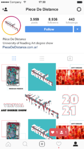
Because of the pandemic, the art students and ourselves were forced to adapt and switch to online communication. This shift applied to the promotional material of the events, social media presence became crucial than ever, in this case, the artists wanted Instagram to be their main social media outlet. For the social media pages for both the events, we combined both the students work with our branding to create a sense of cohesion among all platforms. The layout and size of elements within the logo were tested with the mockups to ensure that they were legible at any size required. The purpose of the Instagram page is to create a complete individual identity for the events. The profile picture for the winter cabaret was straightforward, unlike the degree show by which we struggled to scale down the logo whilst maintaining legibility because of the angle of type and 3D output. We simplified the logo for the social media posts, by choosing the key sports that needed to stand out along with the appropriate background colour. For the winter cabaret, we designed a specific set of posts to lie a complete image when viewing the profile (shown in the image below), this made the show’s feed visually appealing, however, it was not functional. Taking that into consideration, for the degree show the designers and students had separate posts that can be shuffled and published anytime, hence the Instagram posts were designed to be more flexible; creating separate filler posts and backgrounds for the images which can be posted in random order, shown in Figures 10.
Catalogue
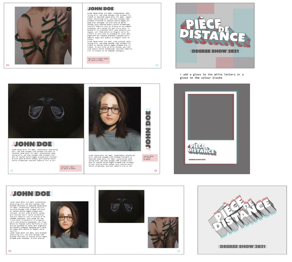
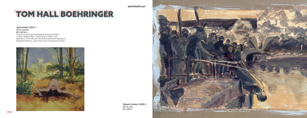
Since the Winter Cabaret was promoted digitally, we only designed a catalogue for the art degree show. This was unfamiliar territory, which required extensive research and experimentation. Luckily, we had enough time to understand the standard catalogue format and the rules that needed to be implemented, whilst exploring graphic treatments (on text, images and stock). Within the initial stages of design, we started with a traditional grid and page layout that held the contents; images and text. Which was developed into different formats and layouts that were later refined and the final layout was chosen by the art students, shown in Figures 11–12. In the next stage, we applied our branding on both the text and images, to see which works the best. This experimentation continued with the cover design, which required several iterations as the first few designs were not cohesive with the inside pages, shown in Figures 13–21.
Process
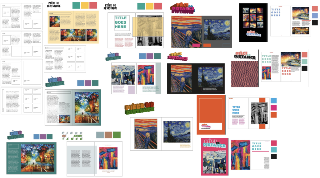
The overall feedback that we received was to simplify the imagery in order to focus on the students’ work and display the information clearly. It was challenging to find a balance between the students’ requests to focus solely on the images whilst also including the design elements of the branding. We eventually found a middle ground for stylising the title text while leaving the rest of the page clean and legible. Because of the simple design of the inside contents we created more visually engaging pages for the prelims. Using solid blocks of colour for the background and changing the alignment of text and shapes elevated the catalogue, overall creating a dynamic visual output.
Final catalogue
Website
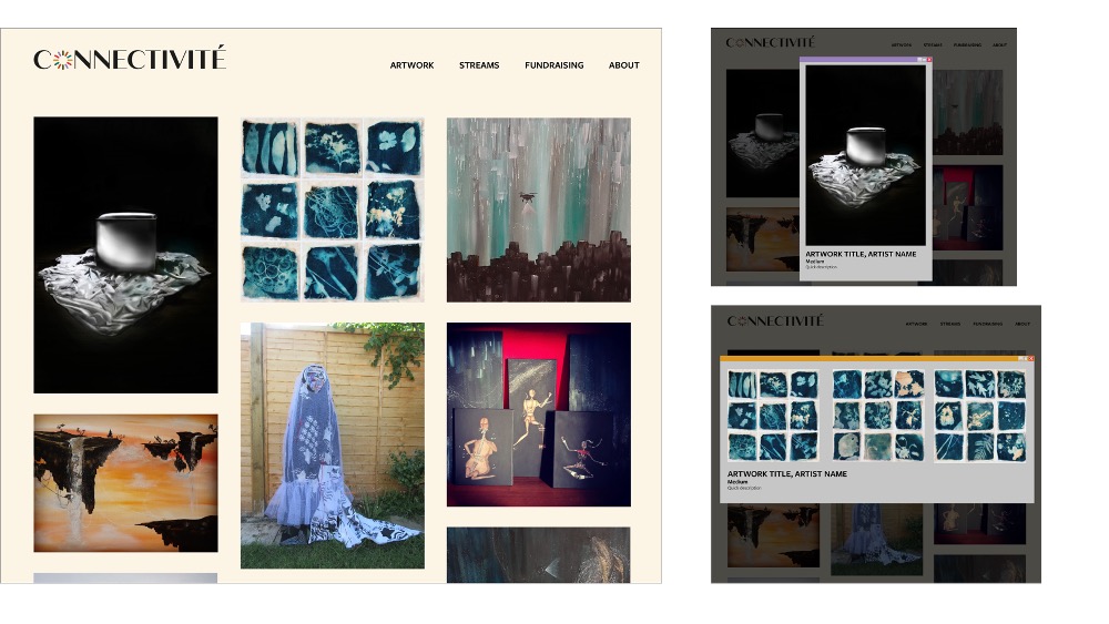
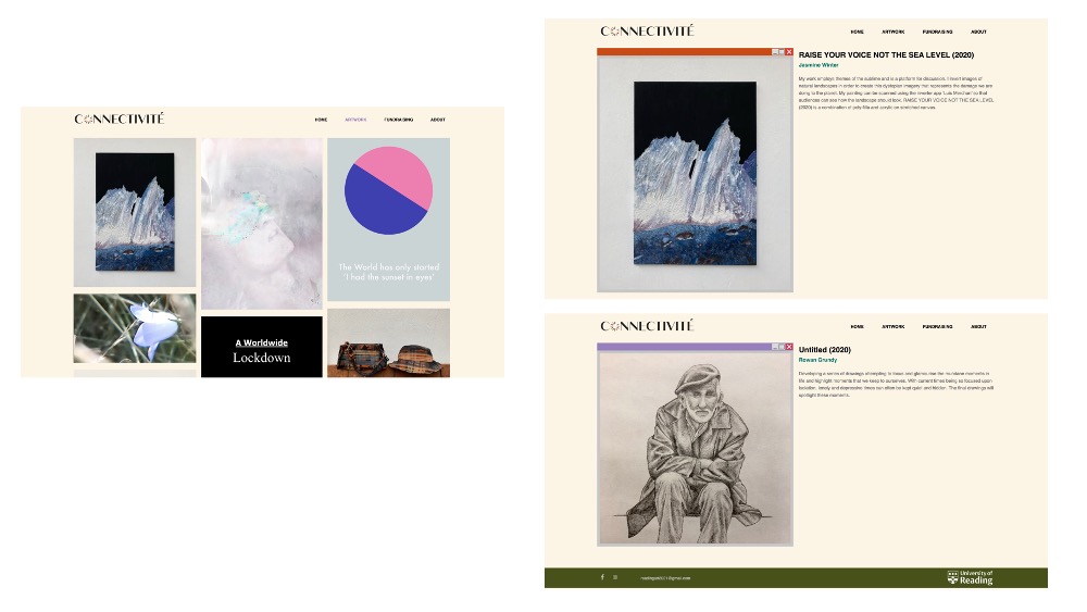
The website was created using WordPress. In our team, only Charlotte had experience with this. We were very lucky because this meant that she already knew about Elementor and how to use the basics. Before going to WordPress, we designed the website in Illustrator so we knew what we were working towards. However, it would have been useful to have a better look at what was capable with Elementor before we did that. We convinced the art students about our ideas and had clear visions of what we wanted just to later figure out that we could not make it a reality. These ideas were not far-fetched, so it was quite a surprise when we couldn’t figure it out. For example, we wanted images to open in a light box with a caption and extra information. However, the plugins would not allow us to add the extra information, meaning we had to work around it and create separate pages for each artwork. It was extremely stressful to have to figure out alternative solutions when we only had two weeks to make the website, but we did it in the end.
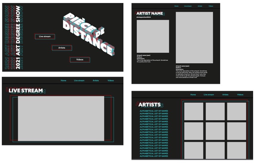
Because of what happened with the Connectivité website, we knew to better prepare ourselves for the constraints we would have. Although the art students had some great visions with 3D websites and moving elements, we knew this would not be possible with our capabilities. Luckily, they ended up liking our proposed design as well. While the website’s general structure was not as dynamic as everybody (both us and the art students) would have loved, we made up for it by applying the branding as much as possible and making it look as much as the catalogue we had designed and they loved. Further, we also made a GIF for the logo to give the illusion of a 3D aspect. It was all about compromise. Unfortunately, at the time this report was written, the website was still being made, so there might be more obstacles that came our way.
Winter cabaret (connectivite)
Art Degree show (Piece de Distance)
Reflection
Despite its challenges, this project was useful and eye-opening, as we were introduced to different media, particularly WordPress. It was also interesting to gain a true understanding of client budgeting, as many design choices depending on their funding, particularly print finishes. This emphasised the importance of a design that was realistic and achievable, with the resources available. This was also challenging because of the number of students involved, which naturally led to fresh ideas and feedback. This forced us to promote different ideas we favoured or compromise our designs to be more suitable to the range of students. By designing for two separate types of projects, the winter cabaret and the art degree show, this helped identify previous strengths and weaknesses in the project. This reduced any issues or mistakes in the winter cabaret to occur in the art degree show. By establishing a strong client relationship, ideas and feedback were shared more openly, leading to a more suitable and attractive project that the students favoured.