
We were joined this week by Bryn Walls, a designer with over 25 years of experience. Bryn has worked mainly in the publishing industry, across a huge range of titles. Throughout his career, he has been involved in both art direction and project management as well as ‘hands-on’ design work. With a catholic range of interests, from an active participation in stone carving and lettering; a love of non-functional, expressive typography; and a strong a interest in natural history, in the third Baseline Shift talk of this semester, he talked to BA and MA students about his career in words and images.
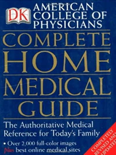
Bryn opened with a story about his first ever project at Dorling Kindersley in 1989, where he was dropped in at the deep end on a massive project. ‘The Complete Home Medical Guide’ was vast, with a team consisting of 35 members and a budget of £750,000 over more than two years! The difference in scope and scale of such work compared to typical university projects was immediately clear. But, putting those dramatic contrasts aside, Bryn found that many of the decisions he was making day to day were actually rather similar to the challenges that face student book designers. In today’s talk he chose to focus on topics that constantly engage anyone with an interest in book arts. Formats, pictures, and bindings.
Formats
‘Formats are an area that designers can have a lot
of input into.’
Bryn suggested going to different book shops, when possible, and looking at formats. Taking a look around, he said, one will hardly find any books in the typical A format. Formats such as A1, A2, A3, A4, etc. are best used in offices where people know what they are getting, books are always in slightly strange formats – having there own standard sizes, and a constant stream of non-standard experiments, too.
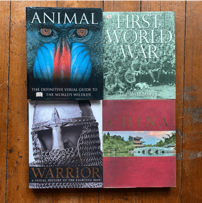
In some cases, the format of a book is slightly out of the designer’s control and more in the printer’s hands, largely because of compromises to keep production costs low. The book in the image below – ‘ANIMAL’, was one of the books that Bryn worked on in DK. It was a big seller and economics of it format (301mm x 252mm) made it incredibly cheap to print. It helped set a template for high volume, large format books at DK, where impact and profit could be productively aligned. The format is still in use today.

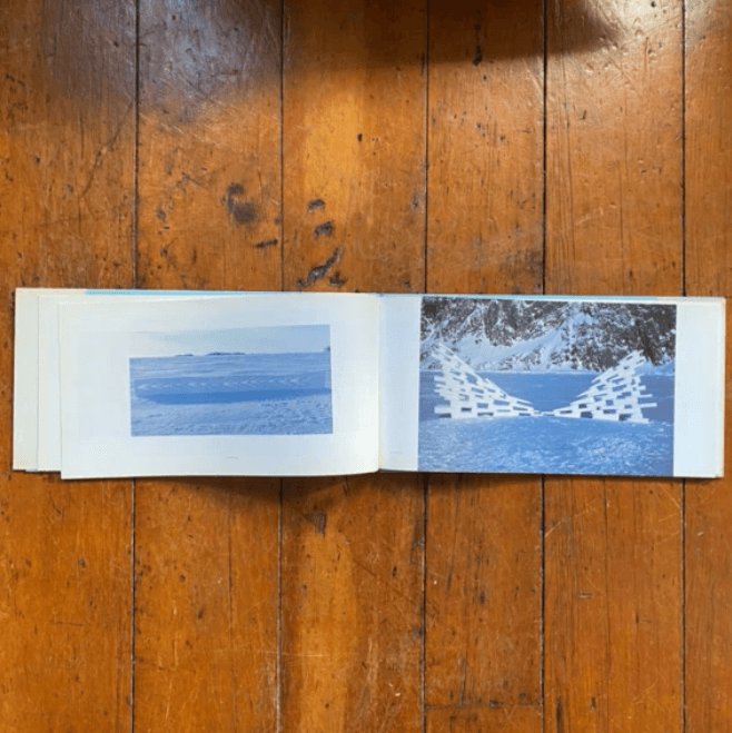
Bryn showed another book he worked on with a very large width (landscape format). It presents the work of Andy Goldsworthy – a range of beautiful natural sculptures. He showed the students that, when the book opens, it becomes very wide in order to present the viewer with the full beauty of the images. Bryn explained that different formats are appropriate for different purposes, and that the nature of the photography within a book was often a key driver.
‘Format reflects your content.’
Another example we saw was a book on rock climbing, where the format was based on climbing stacks on rock faces which resulted in an extremely tall and slender book. It reflects the fact that rock climbing starts from the bottom up, so the book has a little step by step sequence from the bottom to the top. A good idea when choosing a format and designing a cover of a book is finding a reason for choosing these specific details and connecting it to what the book is about.
Powerful imagery gives you options
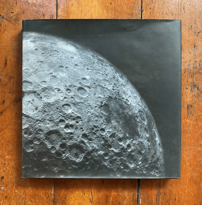
Everyone knows that books tend to have titles on the front, and again on the spine. But not every book go by these rules. When designing a cover, a clear title is usually assumed to be a virtue, but another of Bryn’s examples challenges that by showing that the right image can transcend words . A book that goes by the name ‘The Moon’ (see image below) perhaps doesn’t need a title on the front cover. The power of the single image is clear enough to show the title without even mentioning it.
Spines and bindings
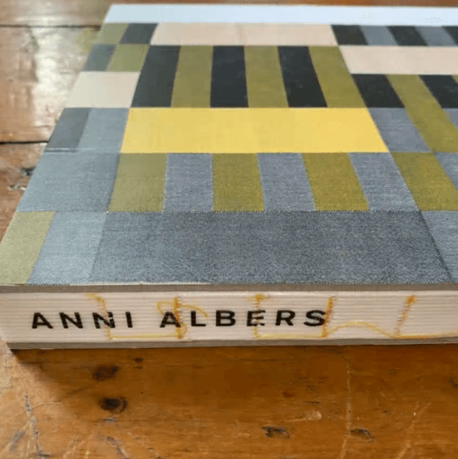
Another extraordinary format discussed in the presentation was an exhibition catalogue by Anni Albers, a textile designer. The uniqueness of the spine design helps it stand out on the shelf. Something different always catches the eye, so being prepared to question norms and test your concept against what surrounds it is essential. This spine also relates to the content, using a craft textured style and a light sewing effect.
Bryn’s favourite part of designing a book is the binding style. Bespoke stitched binding is often enough to grab the attention, allowing other aspects of the cover (in this case the illustration) to be simpler.

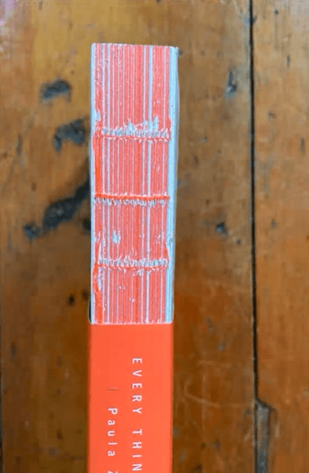
Another book with an extraordinary binding is this example by Paula Zuccotti; the images on the book are textured with finishes that relate to the title: ‘Everything we touch’. Zooming in, the binding style is inventive as it also relates to the contents of the book – the senses. Bryn describes this as a book with ‘rich design on the shelf’.
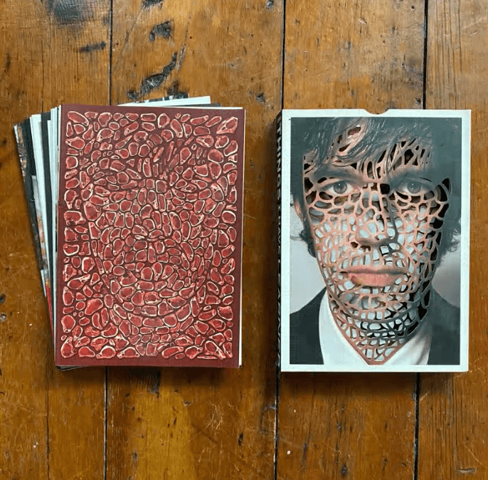
Bryn also included a unique cover packaging in his presentation. A hand-crafted and cut cover with impressive detail.
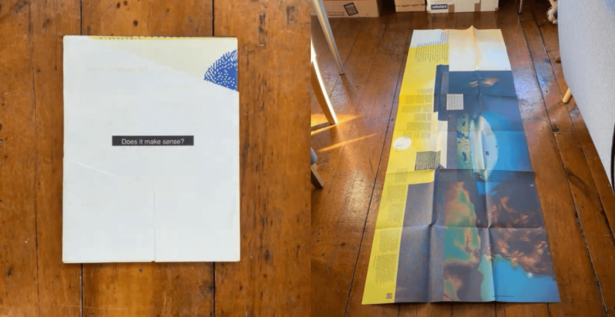
One of the most extraordinary formats Bryn presented in his talk, were the ‘Timothy McSweeney’s Quarterly Concern’ magazines, which use different styles and features to make their issues unique. One of the issues he showed was a whole magazine made into a poster format. The piece folds down to 42pp!
Reflection
Making bookshelves more inviting, more tempting, more exciting, is a part of a book designer’s job. The techniques presented today can inspire us to approach formats and bindings with careful concern for the content of the documents and the context in which the book will exist. But also with an aspiration to make a splash.
Originality and detail in formats, binding and materials, can make up for an eye-catching piece of work – something that can speak for itself, even without a title!
Students’ thoughts
‘I loved seeing the variation, creativity and respect for content in Bryn’s work. It made me think harder about a career in book design.’ – Part 2 student
‘I found the talk thought-provoking. Bryn gave us an insight into how book formats can reflect the content of a book, which I did not notice before. I believe it changed my perspectives on book design and binding – will keep in mind in upcoming projects!’ – Rio Ware, Part 1 student