In the final week of Autumn term this year, we were pleased to welcome Carl Middleton to Baseline shift. Carl is an award-winning designer, graphic artist and print-maker based in Somerset. We invited Carl to talk to us about his professional design practice and his letterpress work.
Background
About 10 years after leaving an art and design foundation incomplete and turning to civil engineering and carpentry, Carl realised that we wanted to return to design. He went on to successfully complete a foundation, a BA in Graphic Arts at the Cambridge School of Art and an MA in Typo/graphic studies at the London College of Printing. In 1998 he began working full-time as a self-employed designer, and founded the design studio Neat. Since then, he has worked on a large variety of design projects. He remains thankful for his background in construction as he believes it fuelled his interest in materiality and printmaking; he is less drawn to digital work.
‘I’m very interested in materials.’
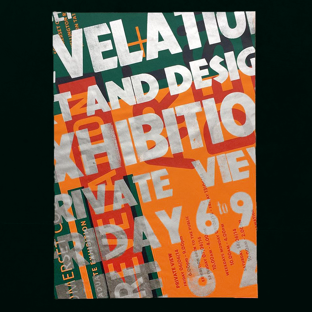
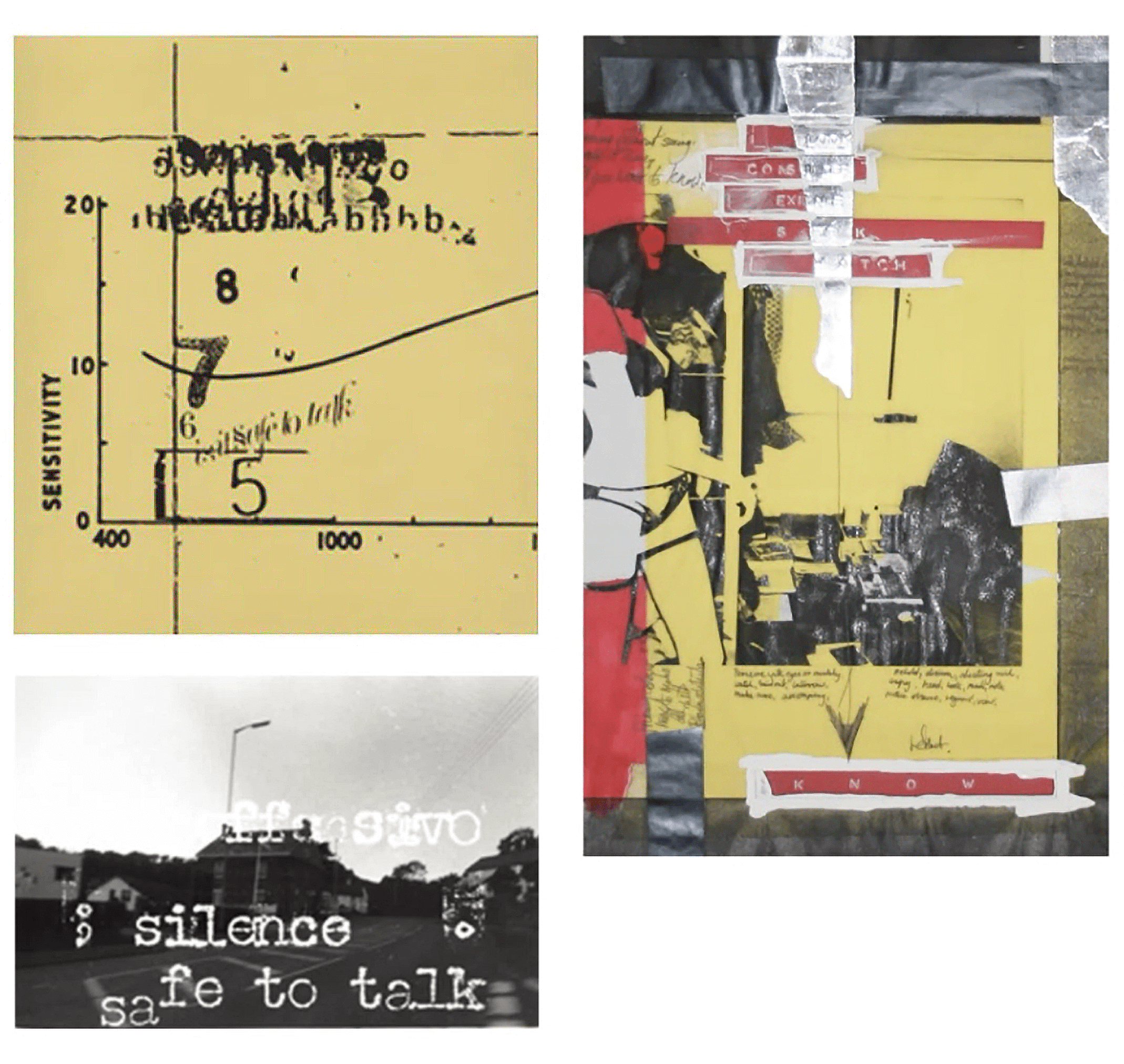
Throughout his studies as a mature student, experimental undergraduate work caught Carl’s attention, notably ‘found compositions’ such as letters found on the street whether intentional and unintentional. He enjoyed the material and 3D quality of them. He began to experiment with layering photocopied type on acetate on top of photography. He had access to a photocopier which could utilise different toners, which at the time was exciting, and he also utilised Letraset and Dymo tape. Subsequently, his work was a form of collage and hand manipulation, and remains so in some capacity today. Carl admires the designer Jonathan Barnbrook.
Some of Carl’s early student work.
‘I was afraid of computers… they were very foreign to me. The things I enjoyed the most were the photographic elements.’
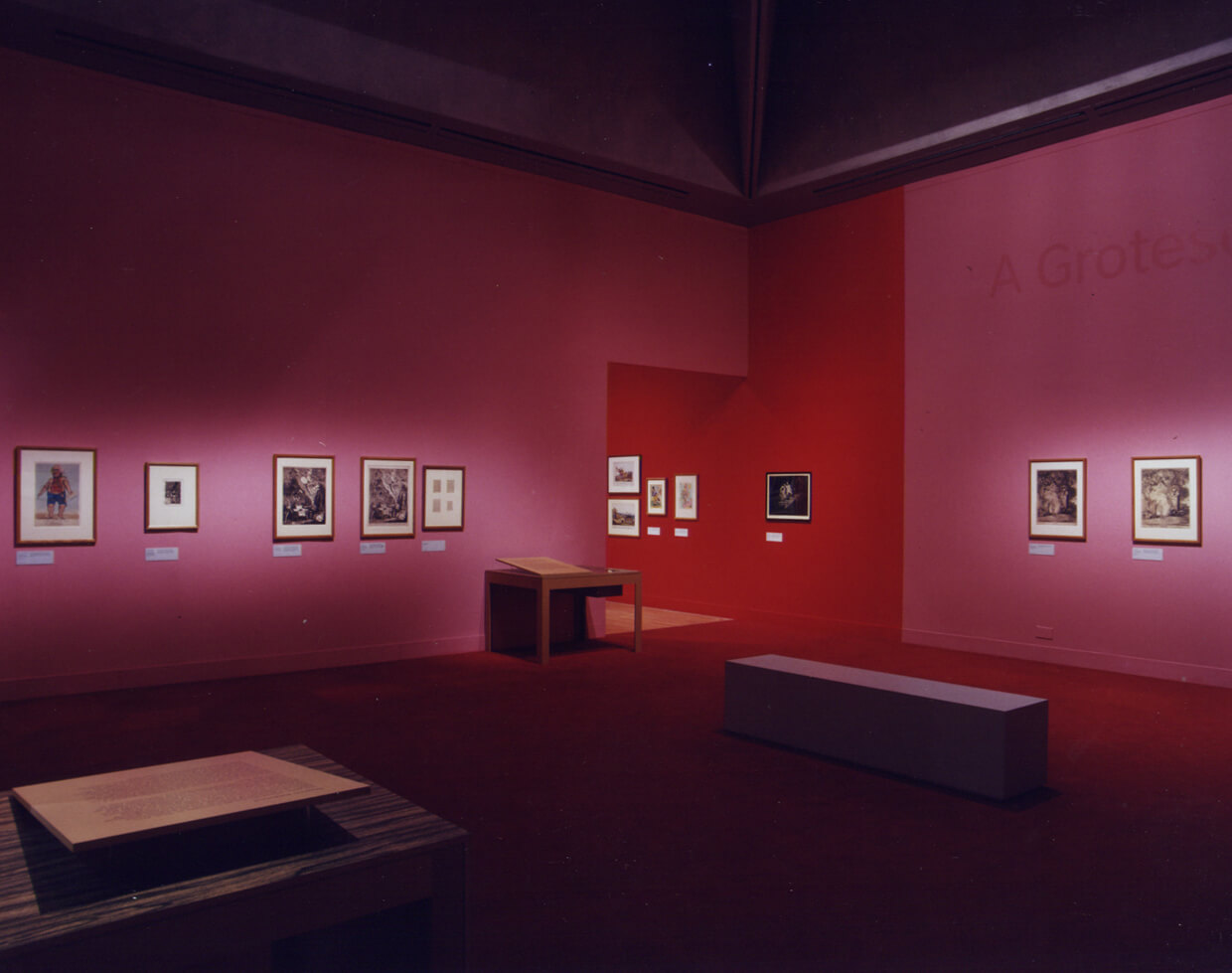
Carl has worked for a number of notable clients in different facets of design. His first work experience involved working with artists to design art catalogs. This was expressive and experimental work, but typographically reserved. He later got to work for the BBC and design graphics for Strictly Come Dancing, Top of the Pops and Little Britain. He also worked on exhibition signage, including for the Tate in 1999 just before the opening of the Tate Modern. Out of the many Tate exhibitions Carl has designed for, he only has one photo of some of them. He presented to us with a slide of blank images to illustrate the importance of documentation of your own work.
‘Record everything you do… back it up… you don’t know when you’re going to need it in the future.’
An image of an exhibition Carl designed signage for. He subtly applied large type to the walls (seen top right) in order not to detract from the artwork.
Designing type
Carl began to experiment with designing his own typefaces – initially individual characters, and then full alphabets – from an early stage in his design career, particularly once he had succumbed to digital technology. Today type is not limited to the printed page or black ink. It can be animated, 3D and dynamic. The possibilities of type interest Carl. A lot of clients also demand their own typeface as they want to have something that no one else has got. Although we get the opportunity to take on type design in Part 3, perhaps we don’t look to experiment with it often enough.
‘I’ve always designed type.’
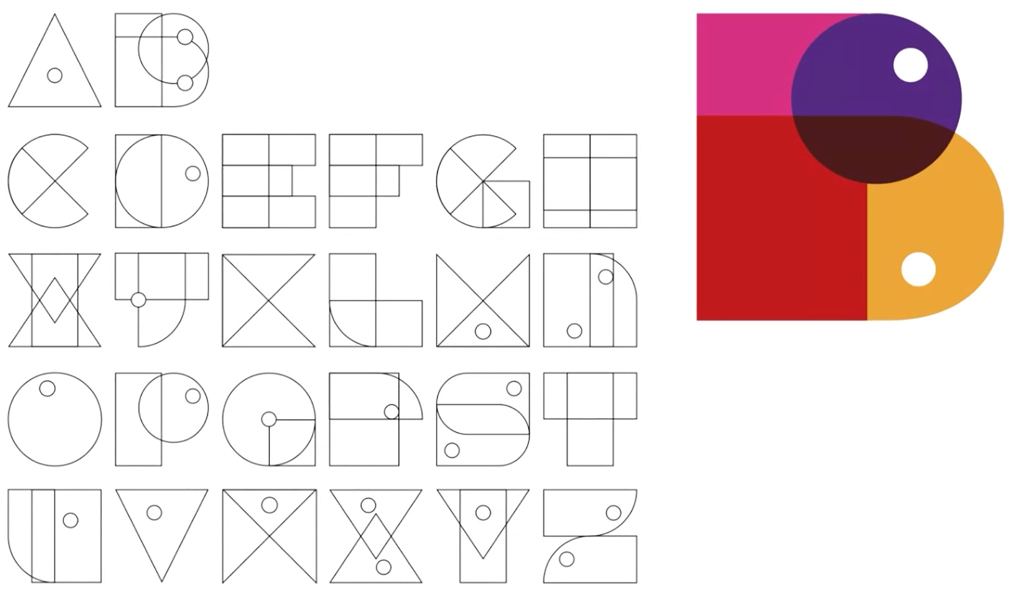
Carl got into designing type because naturally he would draw a lot. He used to buy graph paper as it was cheap, and this led him to designing modular typefaces. These are simple, quick and are usually monospaced; they’re not very complicated to create. With modular type, some letters may be legibly challenging, but it’s an easy way to try out type design on a basic level and to come up with a system. However, not every typeface needs strict consistency, and you don’t have to have a set of family criteria.
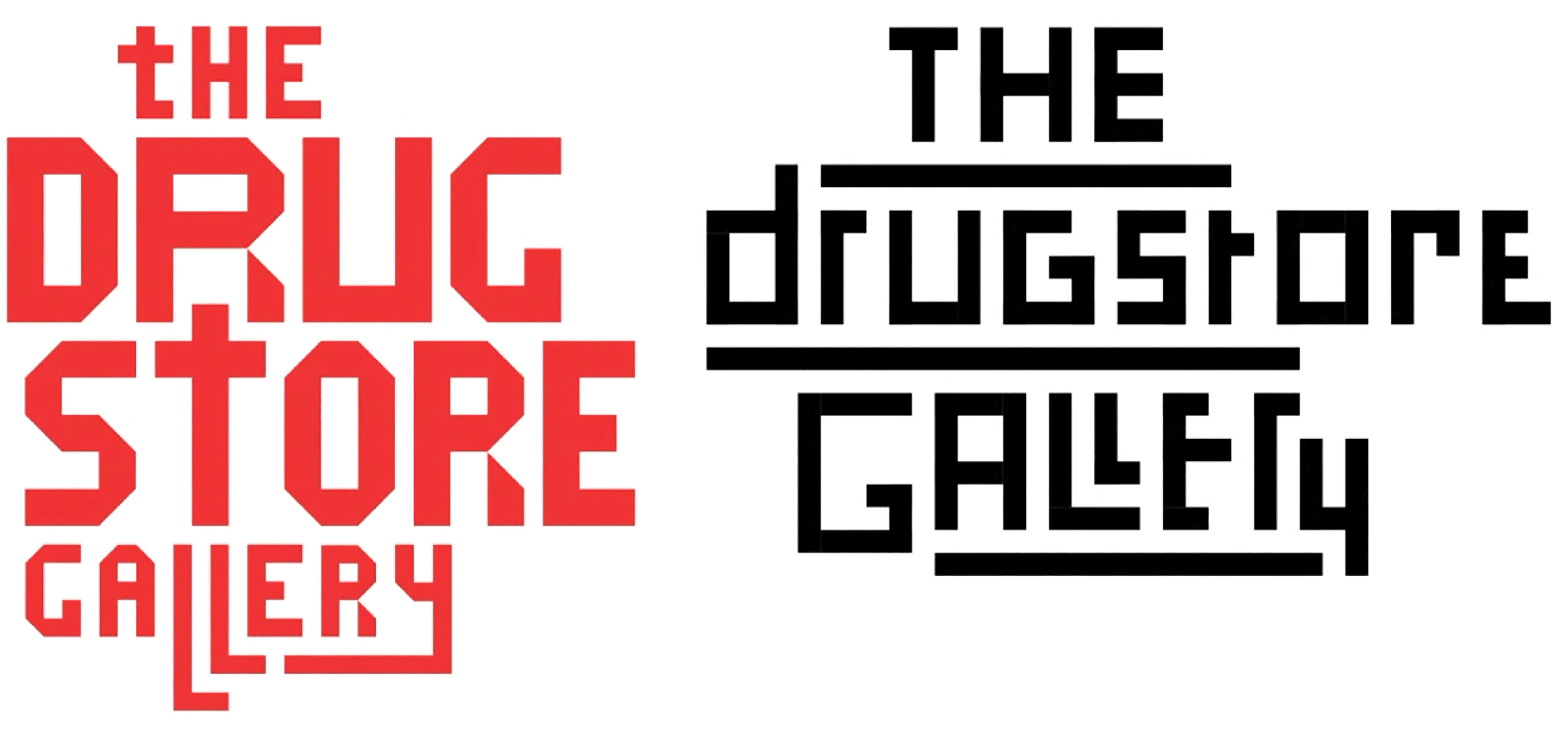
Draft type designs by Carl for a logotype for The Drugstore Gallery.
‘You can make a typeface out of anything… you can find it.’
Carl suggested that a great reason to design your own typeface would be for your business card. Many of us, at some point, will need business cards, whether we become freelance designers or not. You could try designing your own typeface for this, or simply write your name in an original way. To get started, Carl would suggest making a 26 page InDesign document with a grid, and just drawing As on the first page, Bs on the second, and so on. It might be easier to start out with uppercase characters. Simply see what you create, and if you can compile it into an alphabet.
A typeface designed by Carl.
Letterpress
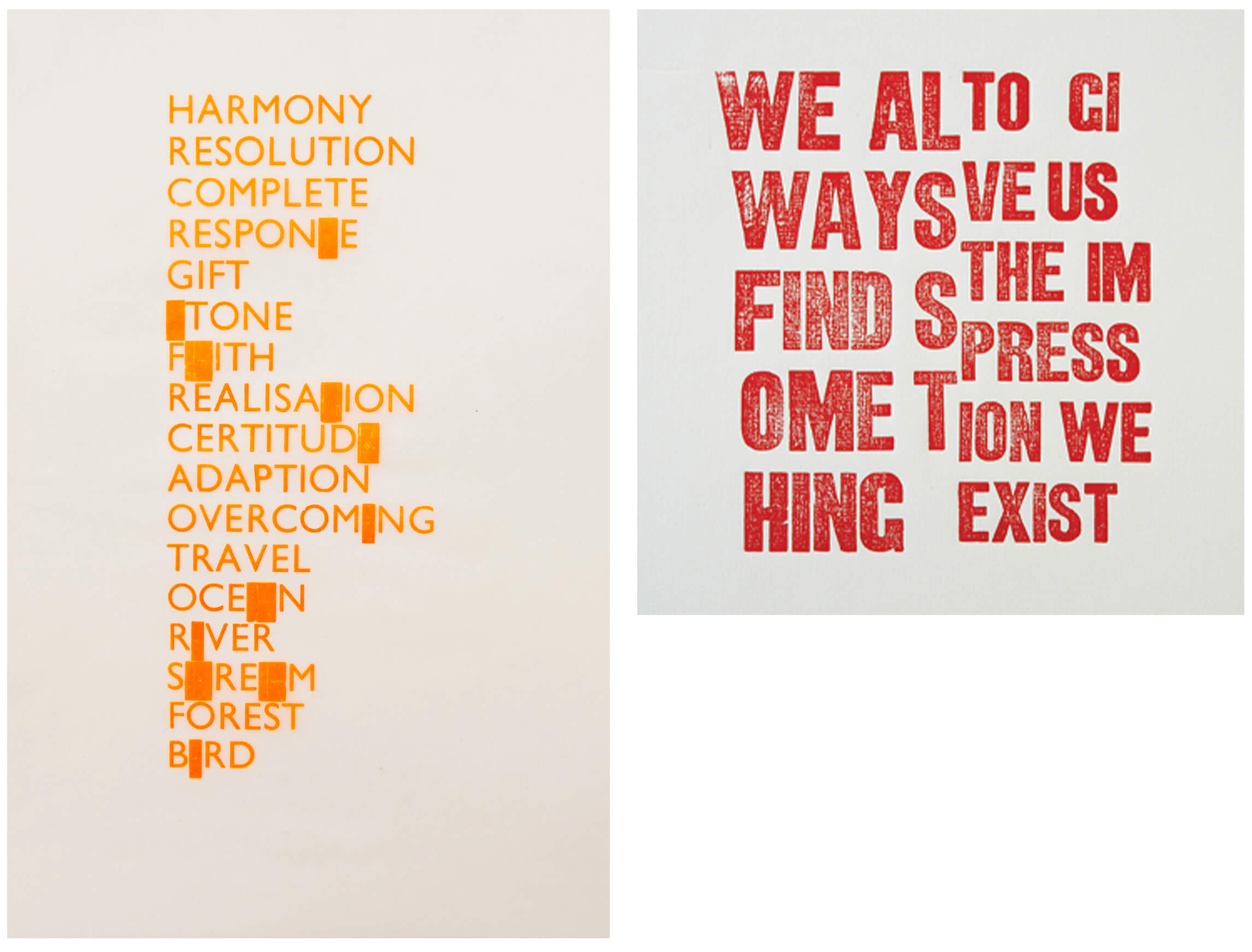
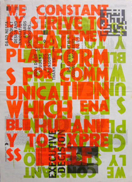
Carl is passionate about letterpress. He has established his own print lab, Studio B, where he owns a series of printing presses and collections of movable type. The physicality of letterpress poses some significant constraints: unlike in software where you can instantly adapt typeface, colour and point size, you need to physically have the specific typeface and characters that you need, and you need to have the copy before you can set and produce any kind of printed result. All space, both horizontal and vertical, also needs to be physically defined. These constraints may seem daunting, but they can make for more creative outputs. You can experiment with overprinting and layering type, and subsequently the opacity of different inks. Letterpress will surprise, as you won’t be able to properly see the result until you’ve printed it. Carl started to embrace using blocks or substitutes for missing letters instead of starting again.
Some of Carl’s letterpress work.
‘It’s really interesting to have a different relationship to the materials you use.’
Letterpress work by Carl with overprinted type.
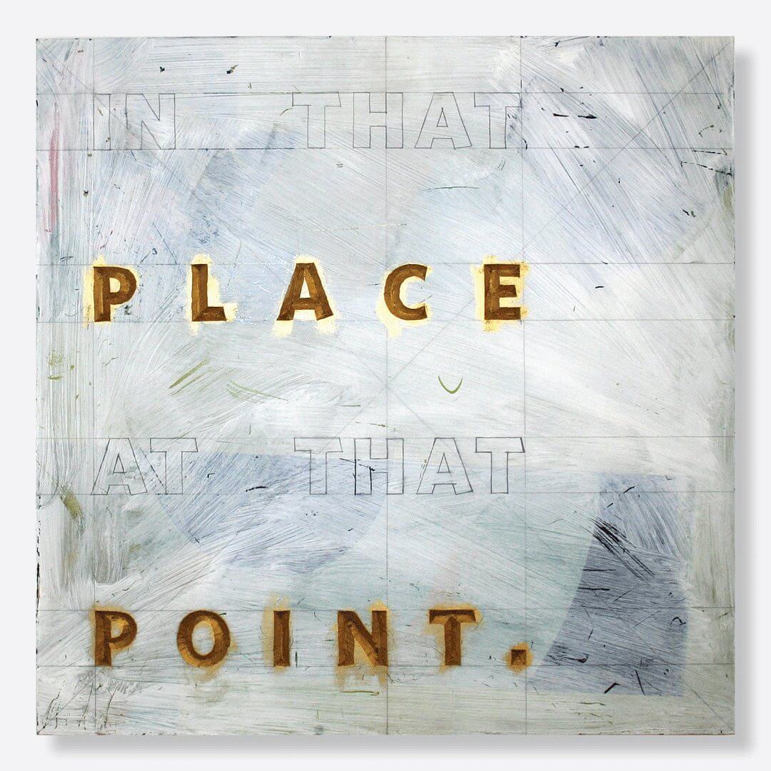
Letterform as art
Carl also cuts 3D letterforms into timber and applies effects to them such as gold leaf. This work falls somewhere between signage and information, and art. It highlights his interest in language. Being dyslexic, Carl often uses a dictionary; dictionary definitions of words have found their way into his work. Work like this may seem far from graphic design to us, yet it can be equally useful to examine and can inspire us. It reminds us to consider the physical qualities of our work and how they can work together with the language and content to better communicate the intended message to the reader.
Type carved into wood applied with gold leaf.
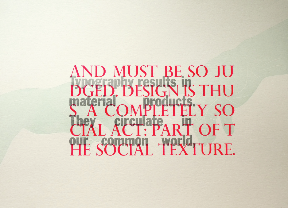
Some of Carl’s letterpress and letterform work is not so much graphic design, but more so art. It gets put in frames and hung on walls, and as such it is looked at differently to, for example, a poster. In these situations, Carl can afford to challenge legibility and create compositions of type which are difficult to navigate, because people don’t really need to read it. Having said this, such experimental approaches to typography can evidently work in the field of graphic design as long as control is sustained where necessary.
The definition of ‘in your dreams’ carved into slate.
Challenge yourself
Working with an artist, Carl was once tasked with designing a case bound book in both English and Mandarin. He had never worked with Mandarin before. The main difficulty for him was identifying where sentences started and ended. He also had to purchase a Mandarin typeface for about £300. However, Carl admired the challenge that it presented and found it rewarding.
‘I can set a book in English, German, Spanish… etc., but it was very interesting to set a language with different characteristics. It is nice to work outside of your comfort zone.’
Standing out
Standing out is evidently about doing something different from the norm, and it is something which aids communication. Carl suggested that people may be more likely to read a poster if it is spelt incorrectly, than if correctly. He also highlighted how, by simply using an upside down profile picture on Instagram, his friend stands out from everyone else.
‘We’re bombarded with information and it’s a challenge to make things work.’
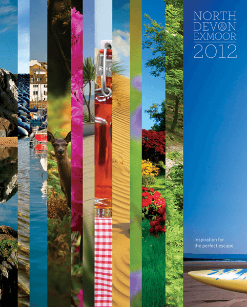
Carl was once given a cumbersome brief to design the cover of a tourist guide for North Devon Plus; the brief required the design to feature a large number of artifacts associated with Devon including the landscape, wildlife, surfing, etc. He thought that unless he gave them exactly what they asked for he would fail, and so he took the brief literally and designed a cover which indeed displayed all of the required elements via sections of photography. The client loved the end product, as stood out from other guides because it looked so different.
Carl’s North Devon Plus tourist guide cover.
‘At the end of the day, the audience is most important.’
Ultimately, be clear about your audience. If you are going to make things a little different or harder to read, then how much time are people willing to spend looking at, using or observing your work? If you are designing for a medical company, you might not want to interfere with the reading process as being clear about the number of pills someone should take is crucial. Think about whether your audience will be accepting of your work.
‘Why?’
Carl’s teaching in design education has made him step back and consider the fundamentals of his creative process. He stressed the importance of reflective practice. The question of ‘why’ is powerful, and he suggests that it should define the decisions that we make. Try to work in a reductive way. Consider why you have chosen the colours and fonts that you have. Could you communicate the same message with less? Don’t just choose the default typeface in the default setting. Choose a typeface applicable in every aspect.
‘Just consider what you do, and what value that process affords to your work.’
Reflection
From Carl’s diverse portfolio of work, it is clear that a career in design is not fundamentally restricting, but instead full of exciting possibilities. Unlike some, Carl doesn’t view graphic design as serious, and perhaps this is reflected in his work. It is clear that he is open-minded, as he can create things that appear on both ends of the spectrum: chaotic and structured, dependent on the brief, client and audience. If you’re struggling to find yourself as a designer, or are looking for inspiration, Carl suggests the following:
‘Go to lectures… read books… experience things that frighten you and excite you… just be open.’
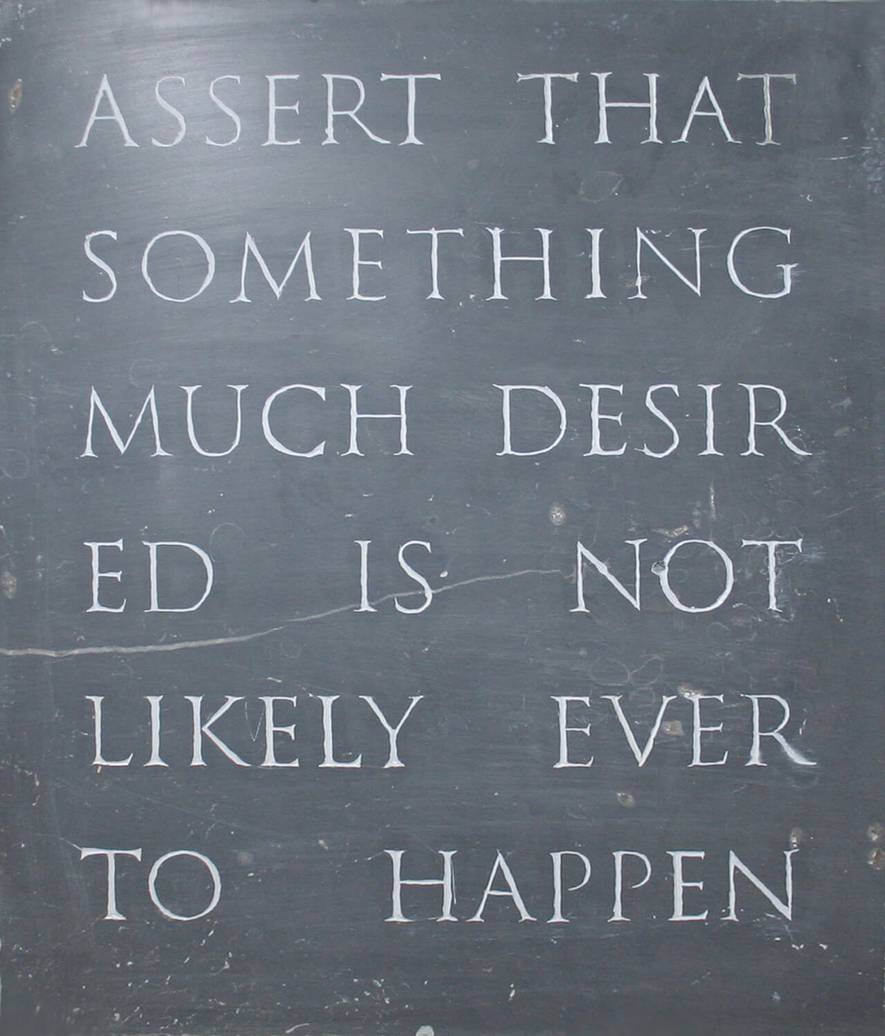
A Robin Kinross quote letterpress printed, combined with a lino relief detail from Michelangelo’s ‘Creation of Adam’.
Carl’s letterpress work is currently featured in the exhibition ‘Reverting to Type 2020’. Find out more here and be sure to visit if you can. And if you would like some further reading, Carl recommends the following books which were valuable resources to him as a young designer:
‘Process; A Tomato Project’ by Steve Baker (1996)
‘Typography: Macro+Micro Aesthetics’ by Willi Kuntz (1998)
‘Adult Comedy Action Drama’ by Richard Prince (1995)
Students’ thoughts
‘Carl has so much experience with so many different facets of design that it was a nice reminder that other careers outside of the digital are possible. The sheer amount of work he showed was baffling as well!’ – Robin Smith, Part 3
‘The diversity of work showcased was unbelievably amazing and so inspiring. It was so nice to learn about a designer’s career and how he stumbled upon opportunities to work on interesting projects.’ – Part 2 student
‘Loved the work shown. Interesting to see all of the work that didn’t serve a function exactly, more so that it ended up looking really fun, like the stuff with making the words difficult to read.’ – Part 1 student