
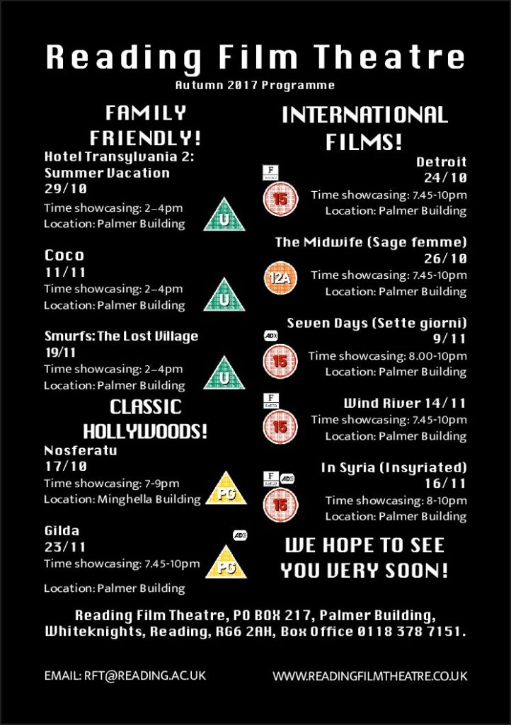
As part of this task, we were asked to recreate a cinema flyer using some information provided to enable us a better understanding about how it works in the professional world, when working with clients. We were given the opportunity to create our own categories according to what we felt was appropriate regarding our target audience. I split mine into three categories ensuring that the wording was fun and engaging just like it would be on a flyer. In these categories I put the films in order of the dates they were being aired to allow easy reading and navigation. I’ve used a san-serif typeface for similar reasons and to allow more of a modern feel.
I decided on black and white as a colour scheme to keep it relatively simple but I also felt like black was a colour commonly associated with cinemas and therefore fitted the criteria nicely. I’ve tried to create an order of hierarchy with the name of the theatre being the most important. The times of the movies are at the bottom of the criteria but i’ve done this because i thought the names of the movies were more important and if the consumer is interested in a movie they can easily see when and where it is below.
I’ve added the recognisable age certificates to not only add a pop of colour but too again, allow for easier navigation. One of the target audiences we were given was a family and so they would only be interested in the U or PG movies so they know where to look straight away. following on from this i wanted to create the same effect with the Audio Description and F-rated movies so I made sure to include to certificates for these.