
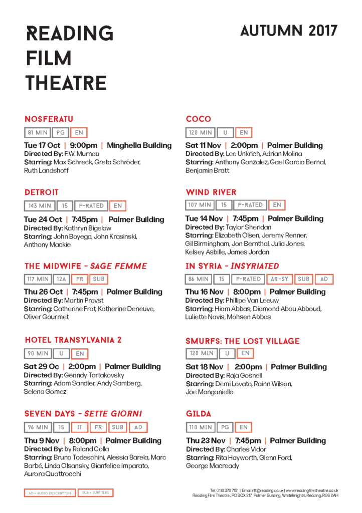
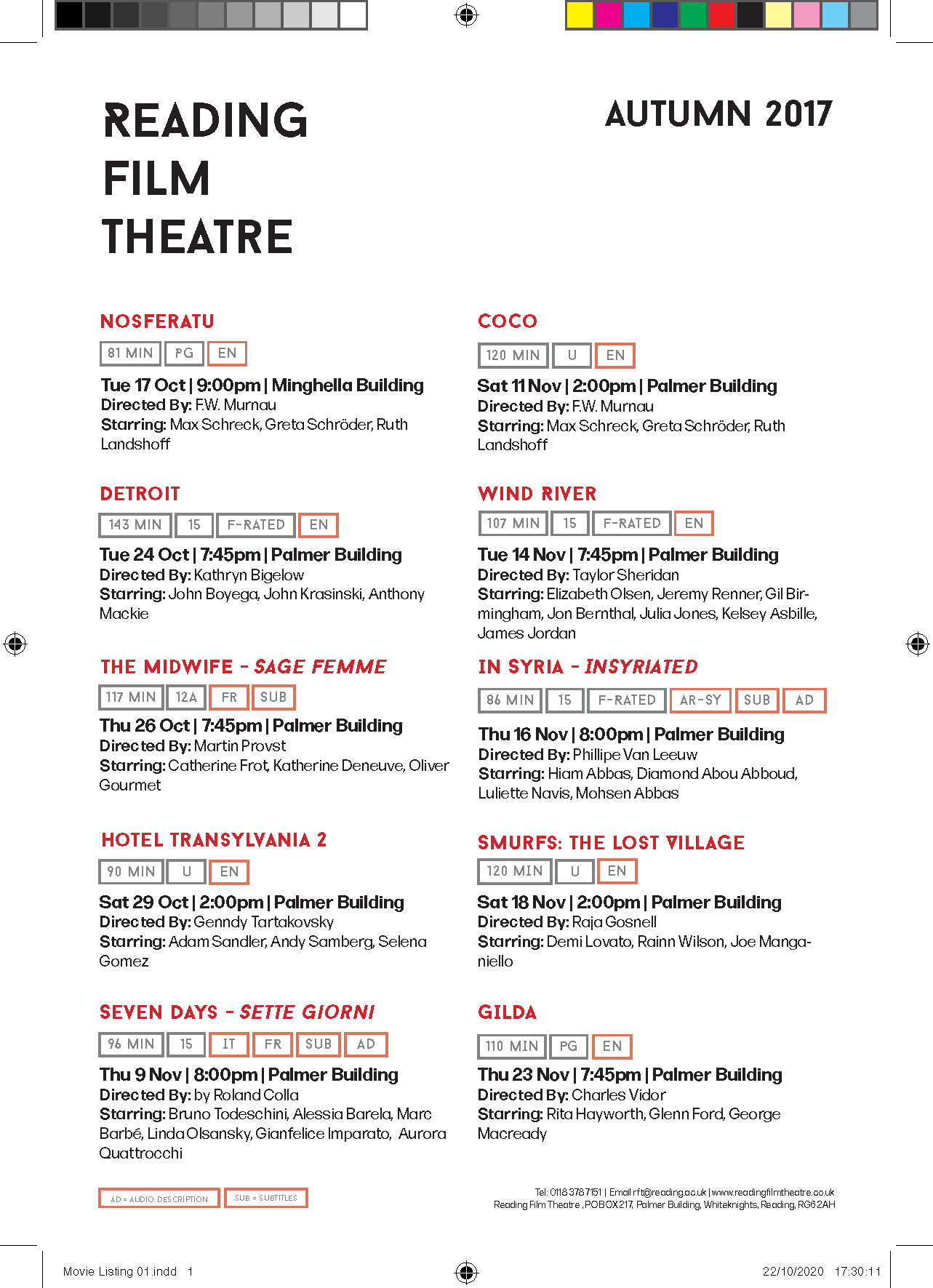
By far one of my most favourite ‘mini’ project we had so far. Unlike other projects, this one was all about arranging and organising information, which is something I enjoy doing and hoping to do more in the foreseeable future. At the beginning of this task, I received a list of movies and information that needed to be embedded stylistically. Having first looked at the sheet it was quite clear that there was a lot of minor ‘flaws’ that made the text difficult to read and comprehend. Ranging from various time and date formats to misused hyphens.
Due to the limited time given to complete this task, I had to work under pressure; however, having seen existing movie flyers and work of other students, I had an idea of what I wanted my outcome to look like.
My aim for this project was to create something simple, clean and organised. This gave me an idea to embed the key information (according to my judgement) in small boxes, staring from time to the age rating and any other extra information. While designing the boxes, I also wanted to highlight the language and whether the movie had audio description/subtitles. The reasoning behind my decision was that I thought these features affect the movie directly.
In terms of the hierarchy, It was important to me to tailor it to the needs of most adults. As a lot of us live a busy life or work, it was important to me to make sure that the time, date and place are clear and obvious, as it would be pointless for someone to read all the information about the movie, if they can’t attend it.
 Although the feedback I received was mostly positive, I introduced some changes in terms of space:
- added extra space between the vertical bars and the text, so that it is not mistaken for a letter
- changed the colour of the text, for further differentiation between the text and the vertical bars
- re-aligned the text boxes
- made sure that the names of the actors were not separated