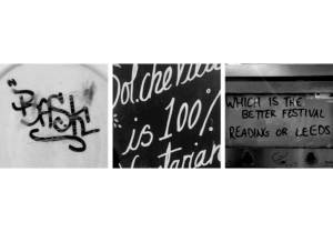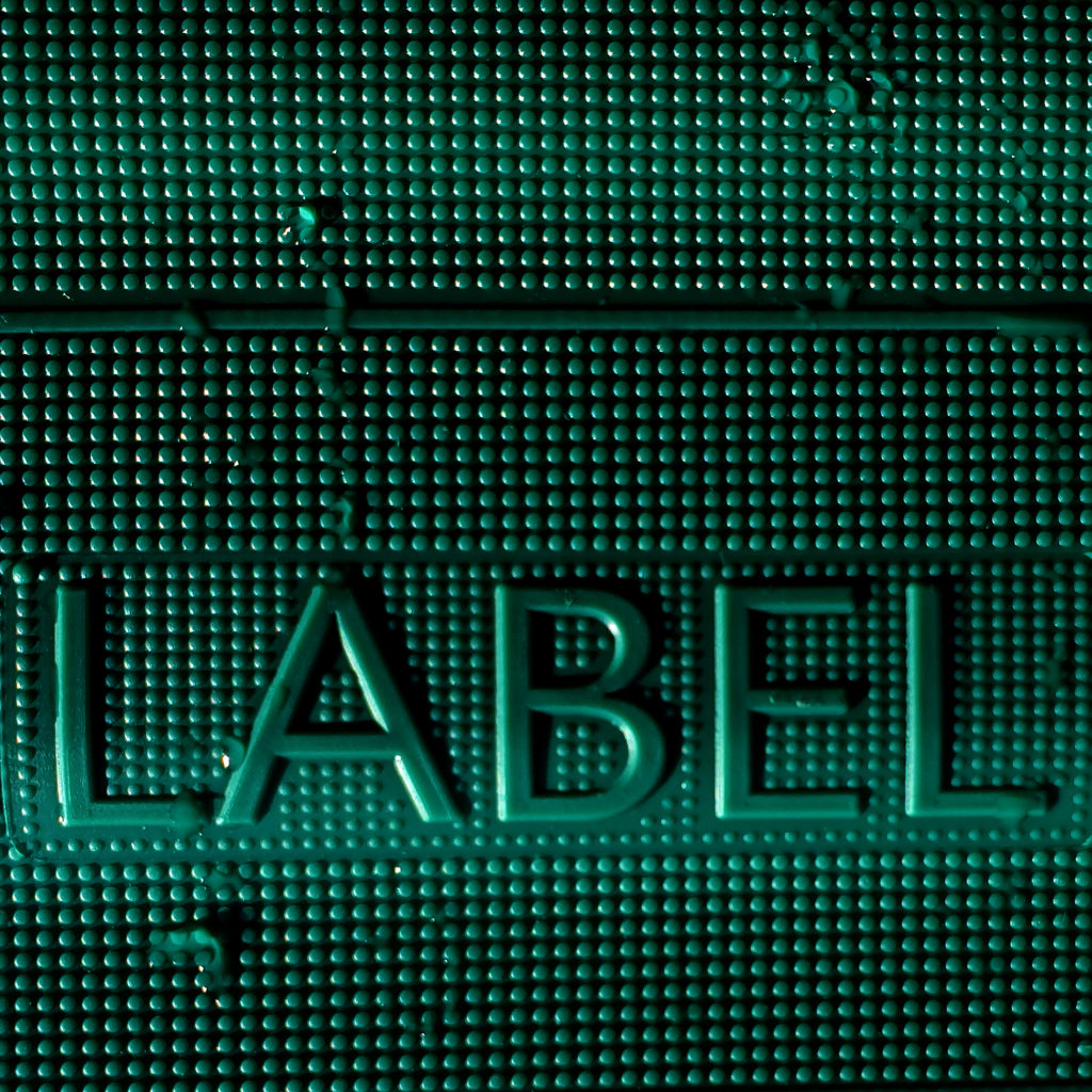
During the 2nd week of mini-projects I was honoured to meet Eric Kindel who presented me with the brief, that, unlike many others, involved going out and exploring real-life examples of eye-catching type around us. These could have been photographs of logos, singular letters/numbers, 3D type etc. Quite luckily that day the weather was quite good, hence providing us with good lighting and subtle shadows that accentuated any raised type.
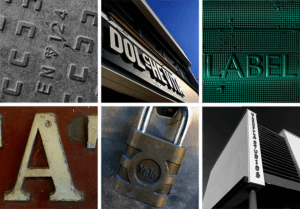 While outside I focused on finding hidden type, one that wasn’t visible straight away, or its features weren’t as obvious from the distance, as opposed to up close. I also tried photographing these examples of type from different angles, especially if it was raised, to see whether that affected how we see it. After we have taken the photos in the given amount of time, we were asked to produce visual collages based on the common similarities between the typography we have taken photographs of.
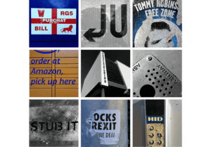 Beforehand, I edited any images I wished to use in this mini project via Adobe Photoshop, which allowed me to emphasise some of the features, and make sure that all images within the collage look visually similar to one another. In some cases, I have also straightened up the photographs, making sure that they have some logical perspective, and are overall pleasing to look at.
Working outdoors really reminded me of what it means to be a graphic designer. Having spent a year in London last year, I learnt that working from home is a challenge, as the best and easiest source of inspiration is the world that surrounds us. During this activity, I also consolidated my skills as a Typographer, as it taught me to explore and type that I haven’t paid much attention to in the past.