
In todays session I learnt how to recreate the format of the iconic Penguin Classic book series. I recreated The Great Gatsby by F. Scott Fitzgerald. I learnt how to manipulate the type of the cover as one element, experimenting with leading, type size, font and paragraph rules to replicate the aesthetic of the original copy. along the way I picked up on how to create Pantone swatches from classic covers and use them within shapes for the design.
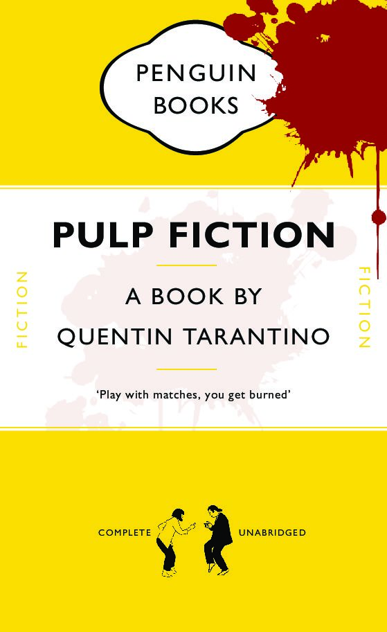
This came into effect when I had to adapt my remakes format into a new cover. I chose Pulp Fiction as Tarantino is one of my favourite directors. The format allowed me to change the name and subtitles whilst maintaining the same proportions. I decided to use a slightly dull yellow to represent the colour scheme in the movie title. I also imported elements such as the 10c sign and the silhouette of Mia and Vince dancing from one of the iconic scenes, which can be linked to the quotes I used from Vince in the last line of the sub-title. As a call back to the scene where Vince accidentally shoots Marvin, I decided to incorporate blood in the foreground and background by sandwiching them in-between the colour block layers. I adjusted the opacity in the foreground to show the characters trying to cover it up with Jimmie’s bed sheets.
The links above are of my original copy and my Pulp Fiction adaptation