
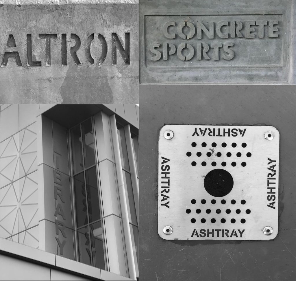
In this project I looked at lettering the environment. Specifically, I took pictures of the greyest, most uninteresting lettering that I could find. Minus the sign on the library, I think I’d rarely notice any of it. This is actually interesting though as particularly with “Altron”, this lettering seems to be in public view but the target audience isn’t necessarily the general public. It’s very unclear as to what the name “Altron” is, so it’s meaningless to most who will see it.
All of this lettering is at a different elevation to the surface it exists on, either being raised above , sunken in, or been punched through. This should make the words more prominent, but really they will me ignored almost all of the time.