
G A R A M O N D E X P E R I M E N T A T I O N
During the briefing of this mini brief, we were all asked to experiment with our own initials and transform them into a monogram.
Then, a question struck me. Why do we always tend to write monograms with uppercase letters? Many brand/companies prefer uppercase more than lowercase in their identity.
Is it due to our approach to grammar? Perhaps it’s the history? Or it just looks ‘nice?’
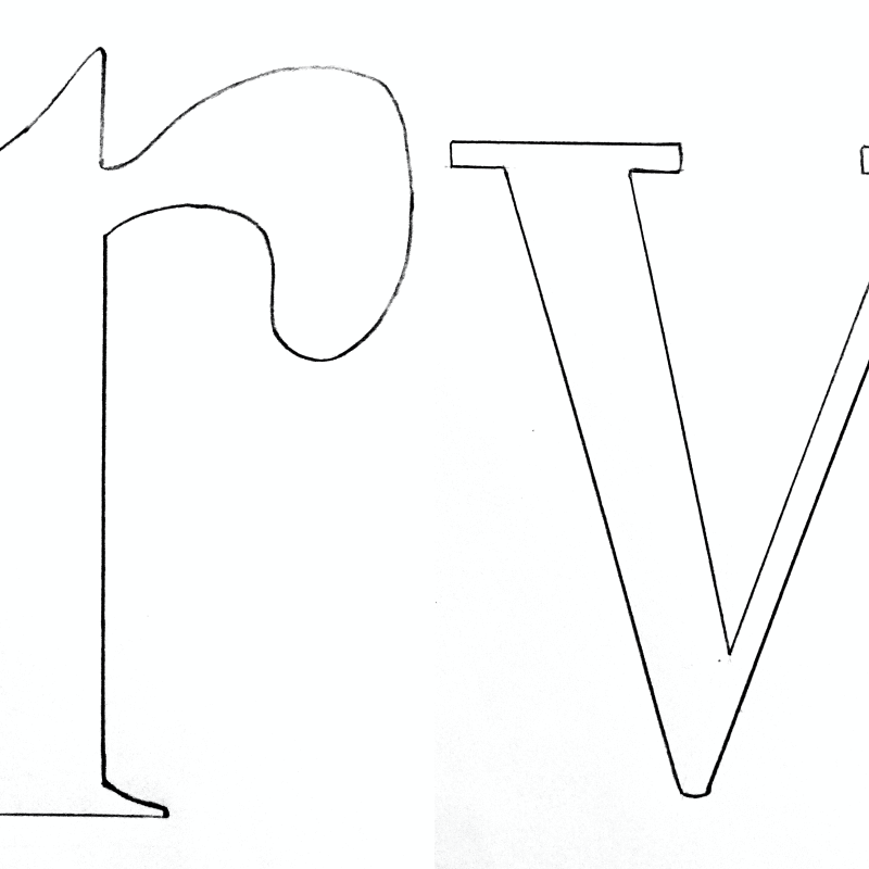
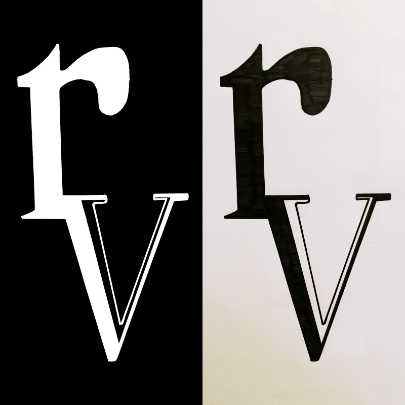
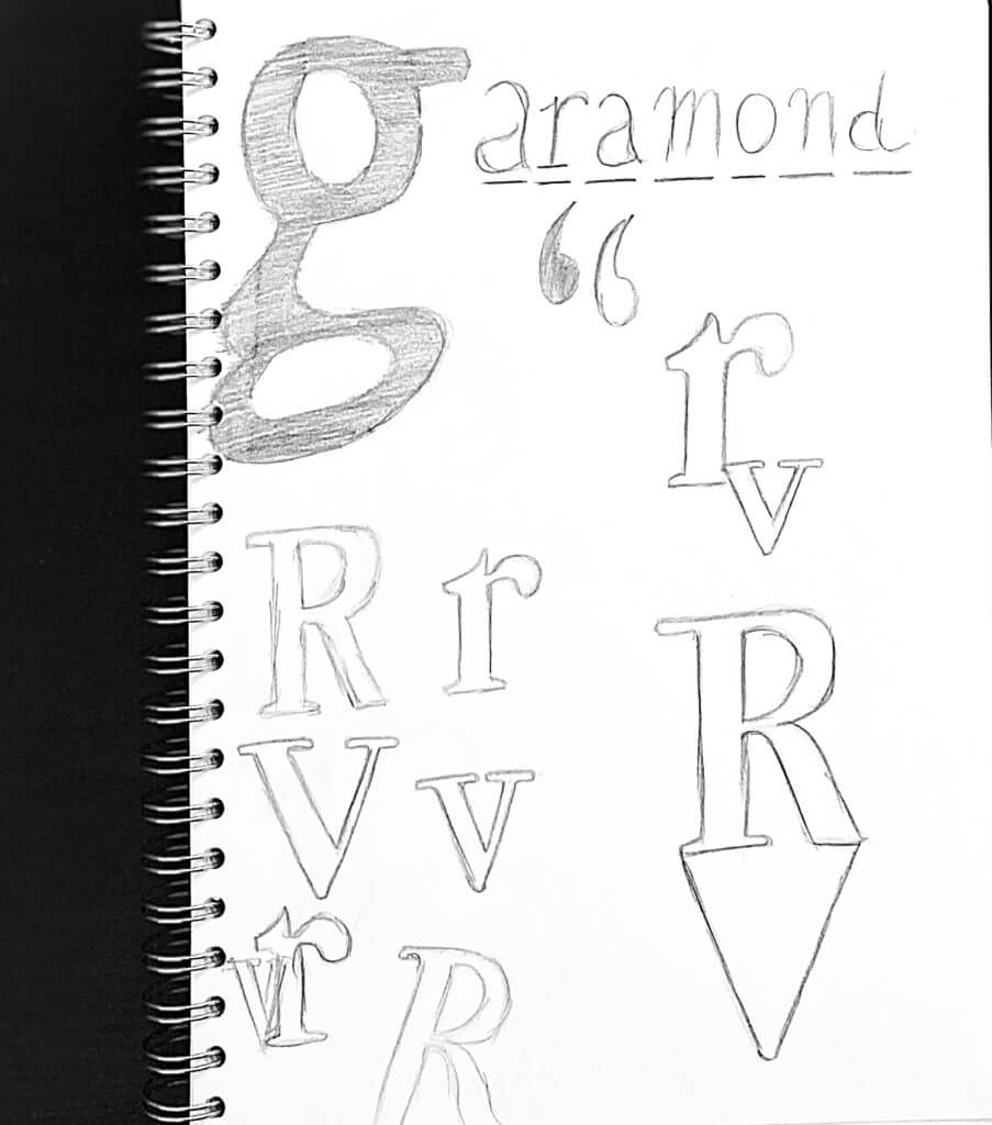
Keeping this as the core idea to my project, I began to draw out my initials (R and V) with lowercase letters, referencing the ever so popular Garamond typeface. Sure, it did seem very strange when I was sketching, almost inaccurate, but it also made me realise how deeply this concept resides within us. Subconsciously, our approach to grammar has enabled our minds to form this complex layer of psychology that instantly ‘corrects’ our approach to lowercase lettering, making it seem/feel ‘wrong’ if it’s(lowercase lettering) on its own (i.e no uppercase).
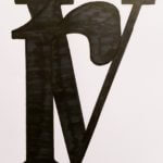
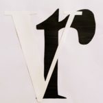
Along the journey of experimentation, I accidentally discovered the beautiful contrast that black and white offers, especially in lettering. This was also something that caught my eye, therefore I started to build the core of my project around the basis of ‘contrast.’
After much confusion, on terms of layout and placement of the letters, I looked back at my initial sketches and found an idea that I liked the best, because it had the potential to fulfil both of my main focuses.
This piece above, embodies the usage of lowercase lettering in monograms, yet also provides a beautiful balance of contrast between black and white. It’s simple and elegant at the same time.
After all, it’s enjoyable to break the norms that can sometimes bind us.