
"Can you help break the cycle?"
-
Background
The client is a Professor from the School of Pharmacy at University of Reading. She has written several papers on antipsychotic drugs. Antipsychotic drugs are commonly used to treat dementia patients for many years, however, there are dangerous side effects to its long-term and normalised usage (Gill, Almutairi, & Donyai, 2017). Therefore, this project will highlight this matter.
2. Restated brief
Aims
- To help the client increase the awareness and knowledge of the dangerous side effects of antipsychotic drugs used on dementia patients, to caretakers in care homes and families of the elderly.
- To help decrease the use and prescription of antipsychotic drugs.
- To help encourage future intervention and formal training to improve the methods of managing behavioral symptoms in patients.
The deliverable
The client expressed that they would like to see a deliverable that is visual, engaging, and communicates their findings in a way that is easier to understand and less ‘academic’. She also requested that the deliverable should contain a graphic storyline (of why the drugs are used on dementia patients) but by the end of it, focuses on the crucial part is the ‘bad effects of the medicine’ (antipsychotic drugs).
The client mentioned that the deliverables will be “disseminated to relevant groups”, which are the five care homes in Windsor region that the client had recruited (and is still recruiting).
3. Research
The first stage of the project is doing a research, in order to get an understanding of the topic. Reading the research paper written by the client as well as a readings from other sources helped this process of understanding.
What is dementia?
Dementia is the loss of memory, mental agility, understanding, speech and judgement which can lead to non-cognitive symptoms affecting on temperament and social behaviours amongst elderly people in care homes. To combat this, antipsychotic drugs are used by carers in care homes to treat patients when they become unmanageable and disruptive, as well as risking harm to others.
What needs to be highlighted?
However, here is the vital information that needs to be communicated to the users:
- Antipsychotic drugs are potent substances and powerful drugs, which is prescribed too frequently and indiscriminately by psychiatrists, carers in care homes and by the family of the dementia person.
- Antipsychotic drugs are dangerous as it can cause more harm than good to patients (Gill, Almutairi, & Donyai, 2017).
- For example, the patients will have common side effects, and could experience Parkinson, weight gain and even increase death risk and stroke if used inappropriately and without any limit.
4. Ideation
Most of the ideation for the design is generated through the client’s paper which includes a lot of illustrations (figure 1) that she had done prior to the meeting. It consists of graphic and illustrations that she had obtained from the internet, and from there I was able to see that she wanted to see a graphic poster with many illustrations. At the time, I felt really grateful as the client was very helpful in visualising her visions for the deliverable to me.
Below is the papers that the client had given me:
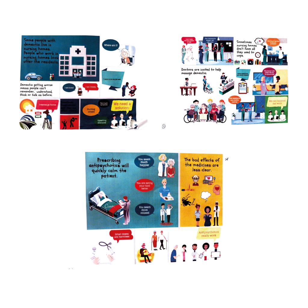
Fig 1 The papers given by the client gave the designer an overview of the visuals and the narrative expected from this project
From there, I tried to pinpoint the main elements in the paper, which are the elderly people, the caregivers, the nurse and the doctor, and pills. I also researched some graphic styles and also colours for the illustrations (figure 2), since the client has explicitly said that she does not have any set graphic style.
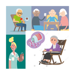
Fig 2 Ideation also includes researching for the graphic style for the illustration.
5. Sketches
From there, I sketched some ideas for the possible layouts and contents, and I did more research on the illustrations that could be included in the poster. Sketching is one of my favourite part of a design process. It allows me to visualise the content and the illustrations and how they could work together in one place (a poster). It also provides an insight about what kind of problems I would face. For example, in the middle of this project, I felt like my poster was too cramped, so it was suggested by one of the tutors that I need to plan more for the layout combining with the content and illustrations.
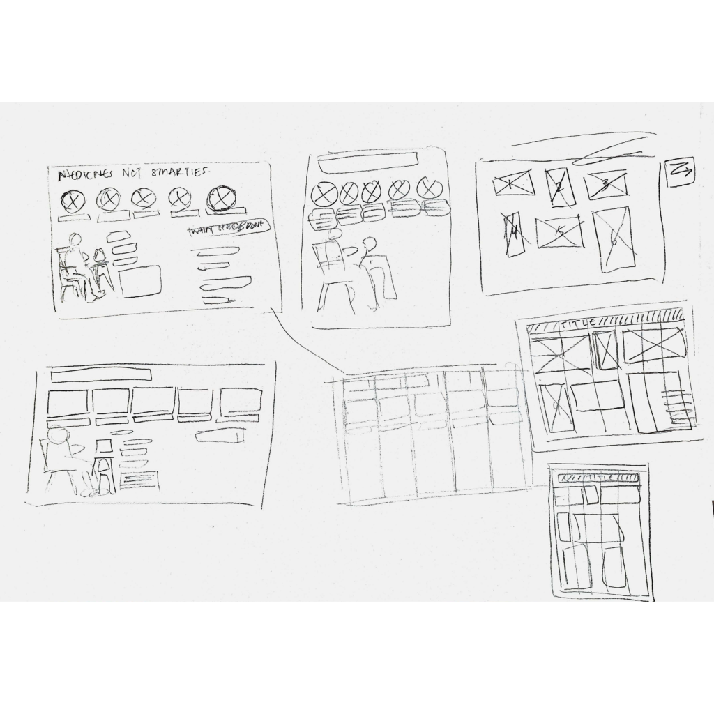
Fig 3 Sketch for the layout as part of the planning before designing.
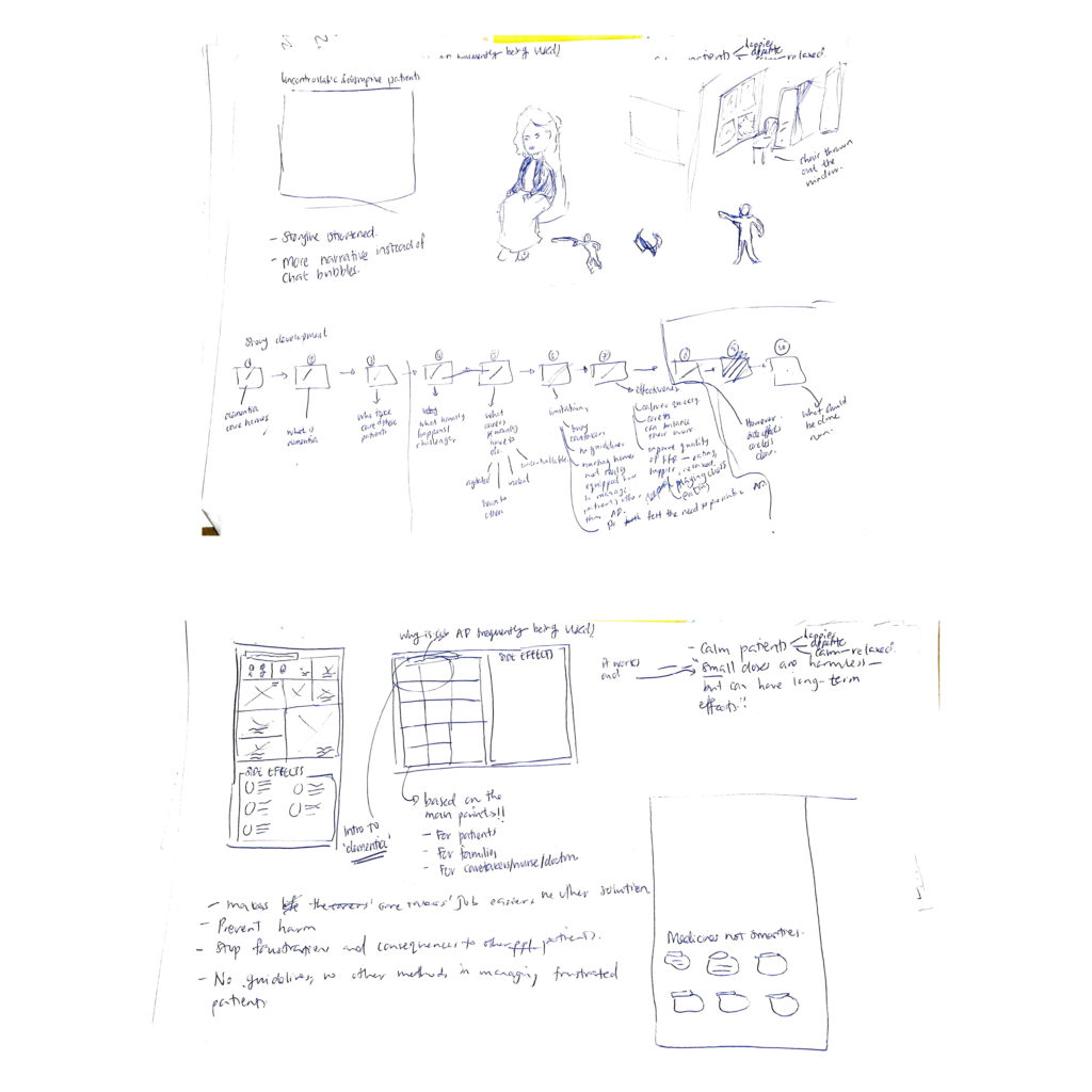
Fig 4 Sketch as part of the planning for the content and flow prior to designing in Illustrator
After a meeting where I first showed her the poster design, although the overall feedback was positive, the client expressed that probably I could add in an element where there is a ‘cycle’ around the usage of antipsychotics drugs, and how this cycle should be broken and as to not normalise its usage in care homes. Below is the ideation that I got from what I understood. However fortunately, the client’s colleague who had the poster had sent a photo of what ‘breaking a cycle’ looked like, and it really did help with the development of the poster (figure 6).
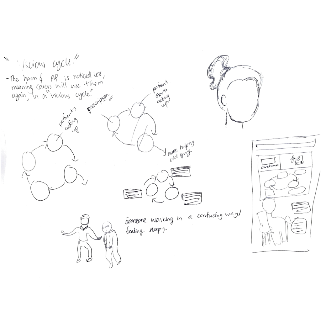
Fig 5 Sketch ideation for ‘breaking the cycle’
6. Design development
The poster went through a lot of iteration and countless discussions the starting from end of December to February. Frankly, I liked the 2nd poster (figure 6), especially the part where the elderly man becomes the centre of attention of the poster, and the way his hair overlaps with the box above him. However, due to addition information requested and many iterations later, I had to change the size and the pose of the elderly man in favour for the infographics box and the THINK box above.
Following a meeting with the supervisor, he helped me to refine the infographics data at the bottom.
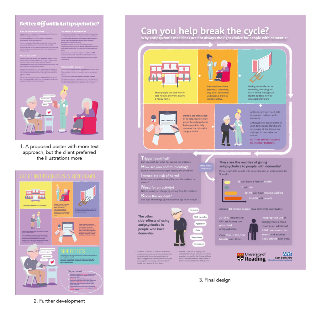
Fig 6 Poster design development, 1 as one of the first and 3 the final one.
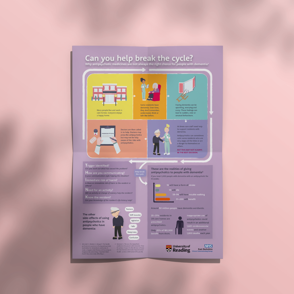
7. Final design
Below is the final design for the A3 poster. It measures 297 x 420 mm. From afar, the poster looked very colourful and you could see its title, ‘Can you help break the cycle?’.
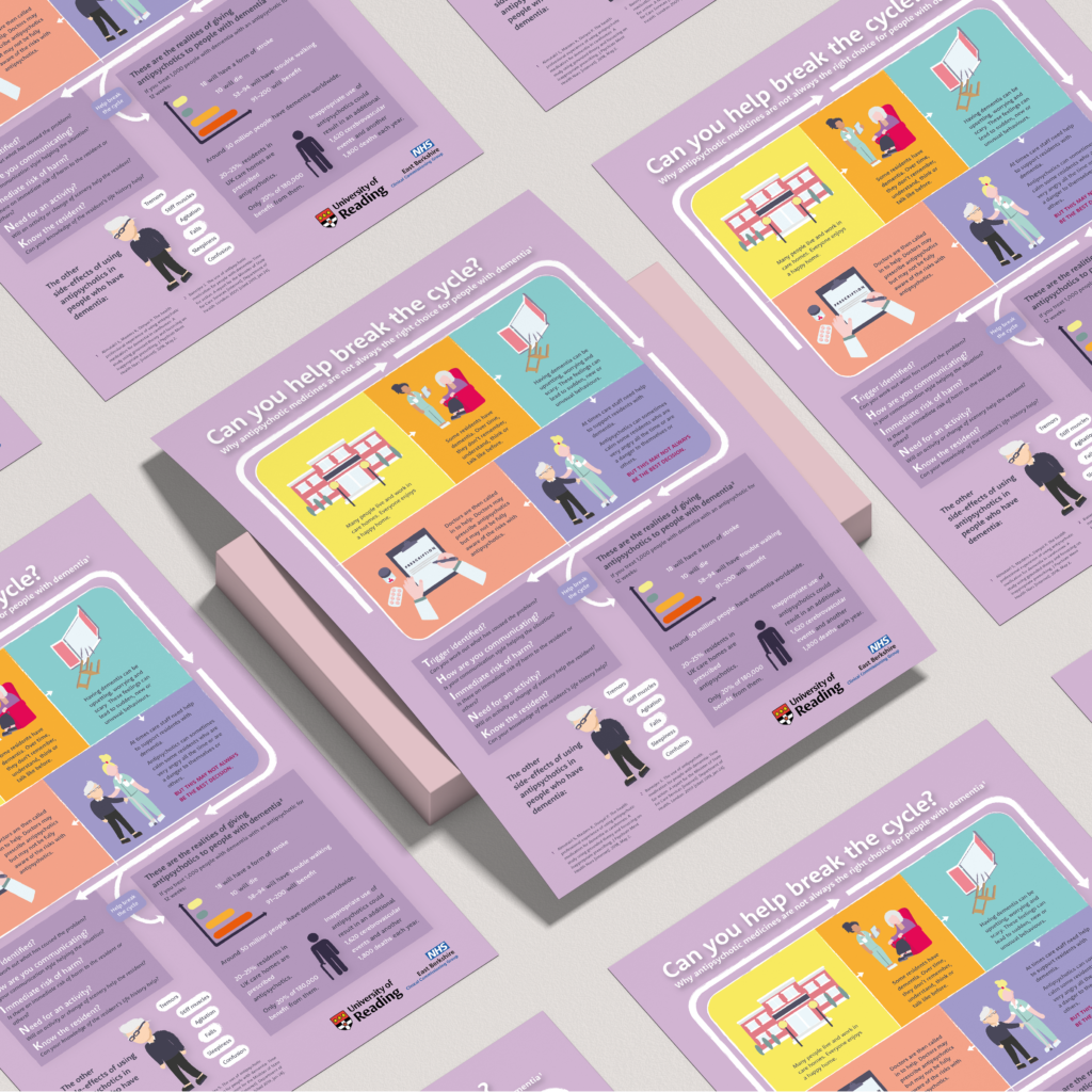
Fig 7 The final poster design
8. Reflection
As this is my first Real Jobs project that I have done as an individual, I have learnt a lot about designing for a client in a real world, and bearing the responsibility on my own.
One of them is that it is alright to ask opinions from others, no matter who–your friends, your colleagues, and especially tutors. They could be useful in giving the designer a set of “fresh eyes” especially when he/she has been staring at the design for too long that they missed details that are off. Learning is an everyday process, so we should not be too shy to ask for help especially when we need it. For example, the different colours on screen and on printed issue (which has been resolved thanks to a Real Jobs tutor).
I also learnt that between the client and the designer, some delays should be expected, and to prevent further delays, the designer should not be hesitant to ask and talk with the client so that the schedule can be met, as the client could possibly be busy due to other commitments. This project is simple and straightforward and it should have been finished quickly, but because of some delays in between feedbacks, it could not be helped. But what I did was contacting the client once or twice in a week to give them the updated and iterated poster design, until they all agree to it.
One important thing that I learnt is, when presenting different proposed designs for the deliverable, the designs should vary significantly from each other, so that this will give the client an opportunity to express what kind of design they prefer. My mistake was in using the “same illustrations” which are just changed into different layouts, as noticed and mentioned by the client in one of the meetings conducted.
For the future project, I should work more on improving skill for a poster, because I learnt that a poster can sometimes be simple with less details, but some posters requires more, for example this poster, and that needs more skill especially in organising the content. I figured one way to improve is to design more posters, but vary the topics in order to explore the kind of narrative and design it should have.
Finally and other than that, I found out that Trello is a great system for organising and managing the design process, especially about what needs to be done, and also WordPress which I’ve never used before and found it very convenient and easy to use to write a blog. All in all I find this project this project very interesting and felt so fortunate to work with a great client.