
Background
Rebecca Bullard, Associate Professor for the Department of English Literature at the University of Reading was looking to get a logo designed for her new start up business. The business, based online, is called Open Digital Seminar in Eighteenth-Century studies. Rebecca’s aim for this is to connect researchers of eighteenth-century literature from around the globe, in the participation of online seminar sessions.
Restated brief
An initial digital meeting with the client provided an opportunity to ask questions and build a deeper understanding of what was involved in the job. After all uncertainties were cleared, a restated brief was written and developed to facilitate the understanding and ensure that both the client and I had the same perception of what the project entails. In particular, the client requested a typography-based logo that could be used for just the initials (ODSEC), as well as the initials and the full name. This logo will be used on the WordPress website and across social media platforms, including YouTube, Twitter and Facebook. I was given the deadline of May 2020 to complete this by.
Aims
- Design a logo with wide appeal and high visual impact.
- Design a logo that is suitable for all formats mentioned.
Deliverables
- Logo for digital use (PDF files)
- Logo guidelines detailing application advice. (PDF File)
Research
The initial research for the job comprised of exploring current logos based around the subject of eighteenth-century literature. The client mentioned to look at the British Society for Eighteenth-Century Studies in particular for inspiration. This was beneficial as it showed how a similar logo, involving both initials and the broken-down word can be displayed in a logo format. In addition to this, it was also essential to conduct research into eighteenth-century typography, since this was the clients requested style of a logo. Through research of eighteenth-century English literature books, trends in typeface characteristics could be identified. It was clear that the typefaces utilised are all serifs that are wide in their letter form, with prominent serif features. Another pattern that was noted across the typefaces was capitalisation of words.
Figure 1. Logo for British Society for Eighteenth-Century Studies.
Furthermore, to provide more of an insight into the kind of logo that was expected, the client supplied me with two logos that she had previously designed online. Rebecca mentioned how the style of these logos was something that she preferred, but would like a design that is generally more polished and professional. These logos are seen in figure 2.
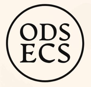
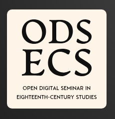
Figure 2. Previously designed logos provided by the client.
Design Development
From the information gathered and the materials provided, I was able to move onto the design stage of the project. Designing initially began with a few hand-drawn sketches of logo designs, using the common themes that were previously noted. The process of doing rough sketches enabled an exploration of multiple possibilities of configurations, formats and styles.
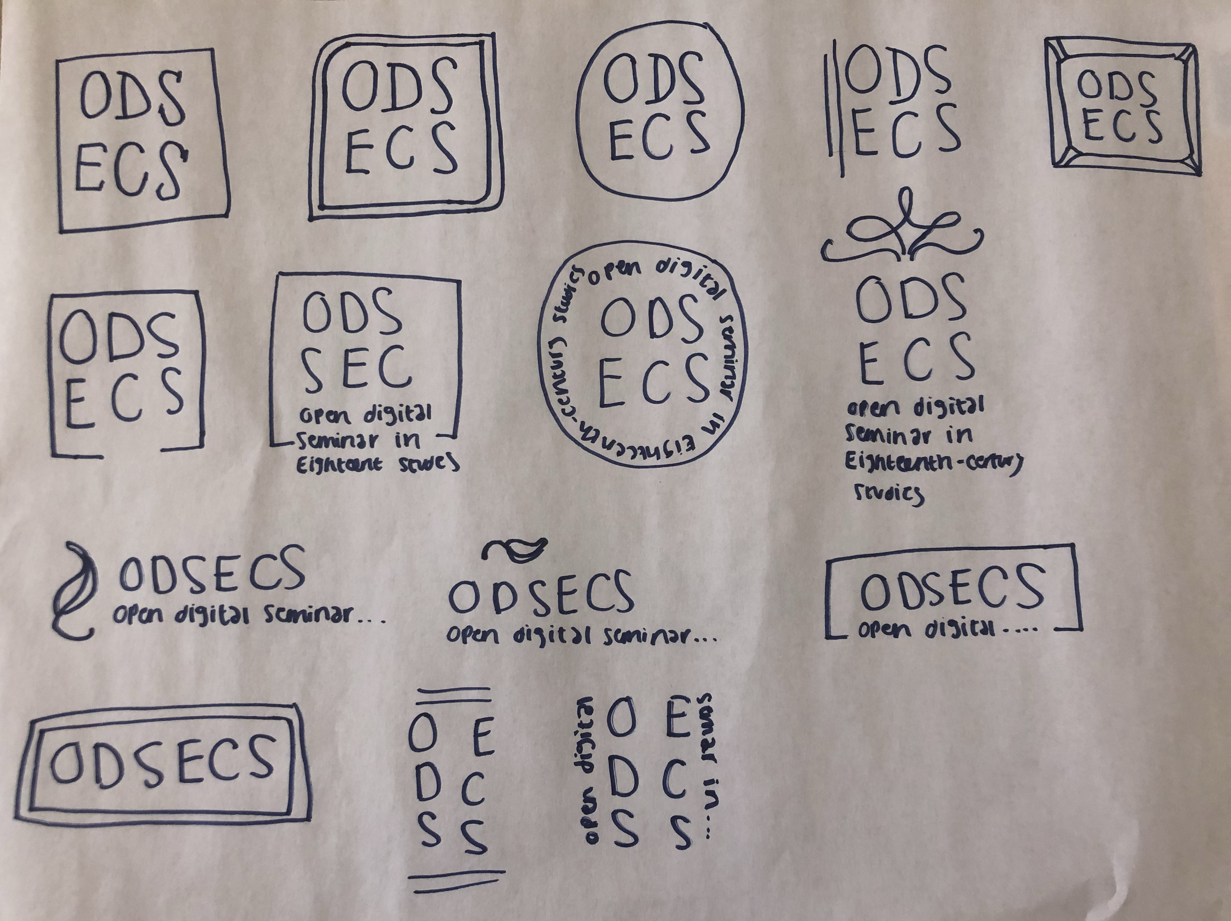
Figure 3. Sketches of logo concepts.
These sketches were then designed digitally to help visualise the logo more professionally on presentation to the client. The digitalisation of the sketches also enabled an exploration of differing typefaces, and a document to show the client to select preferences from.
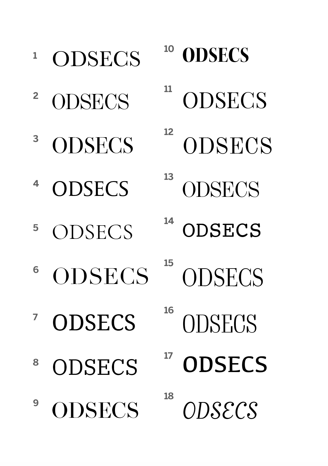
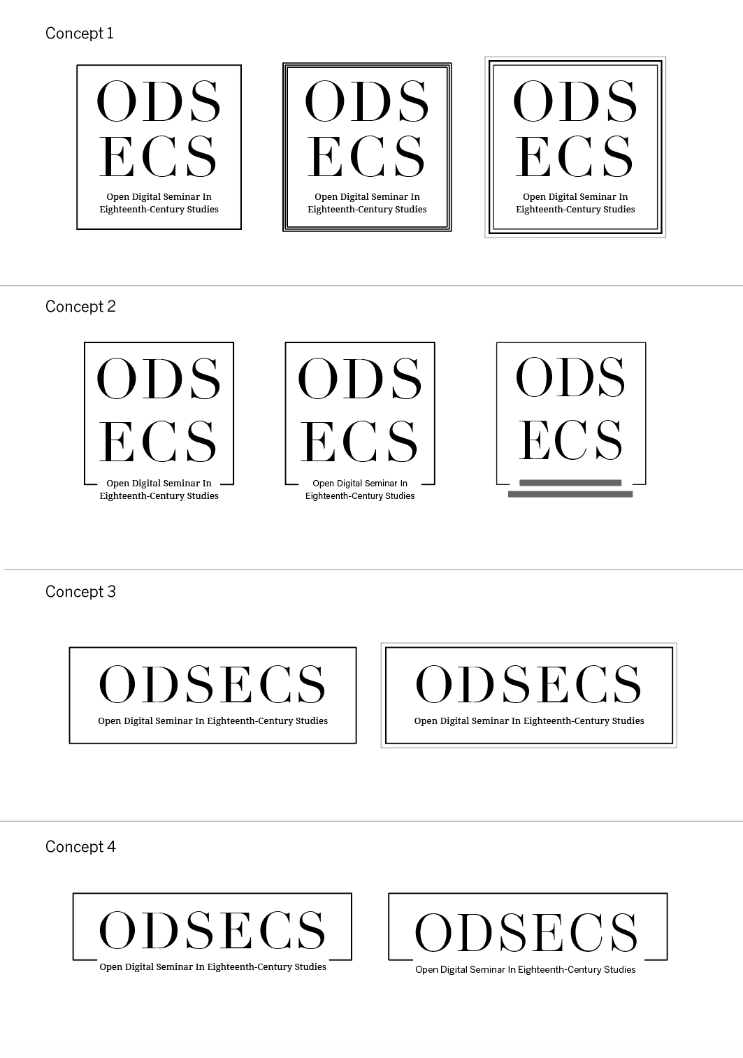
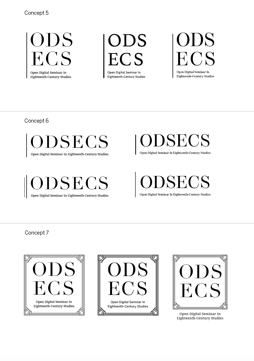
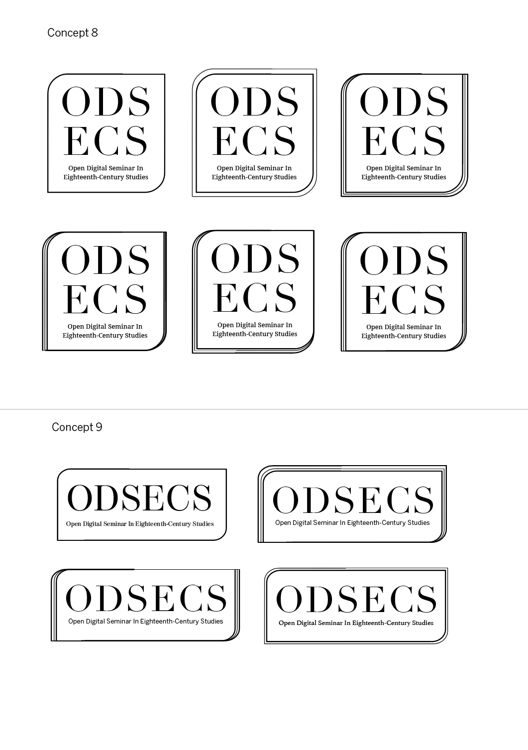
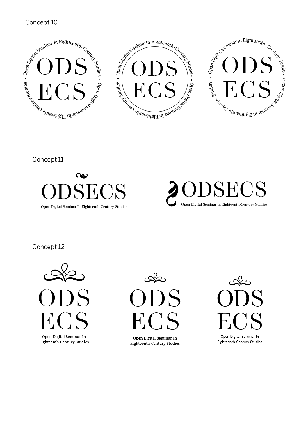
Figure 4. Logo concepts developed digitally
After sending the documentation of logo designs, the client responded with her two preferences. These were concept 2 and concept 6. The feedback given by the client mentioned that concept 2 nicely picks up on the idea of openness, whilst concept 6 appears both simple, distinctive and stylish. However, to develop these ideas further and to full-fill the client’s requests, it was suggested that these logos should be developed in a way that it suitable for being stacked, as well as expanded landscape way. Furthermore, the client also pointed out her typeface preferences as being 4 and 5. Therefore, after receiving this feedback, iterations were made to refine the logos concepts further and show the client how these two logos could be developed and how they could be formatted for her requests. The iterations made included differing typefaces, spacing and line weight.
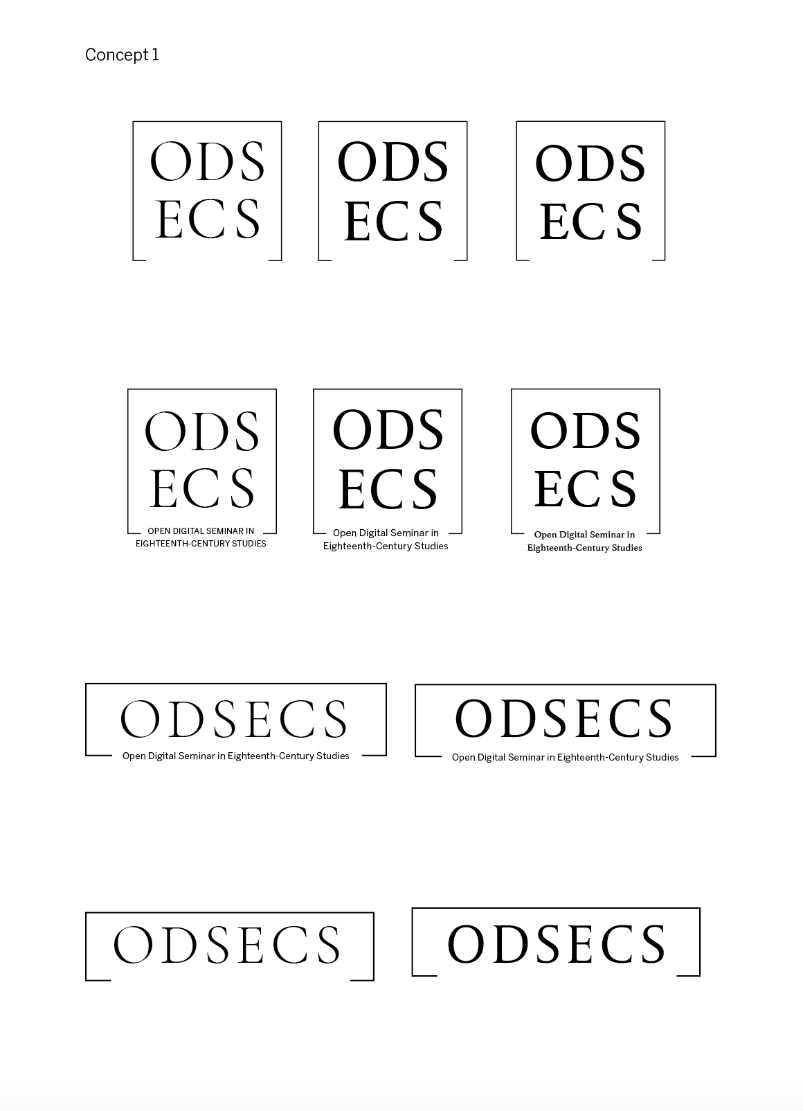
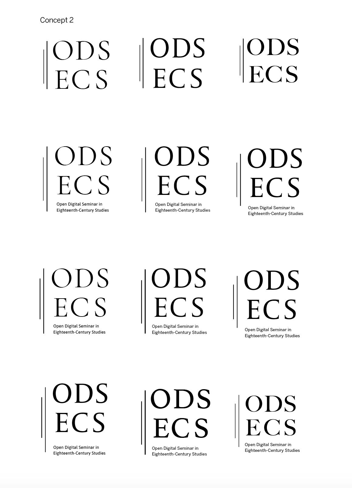
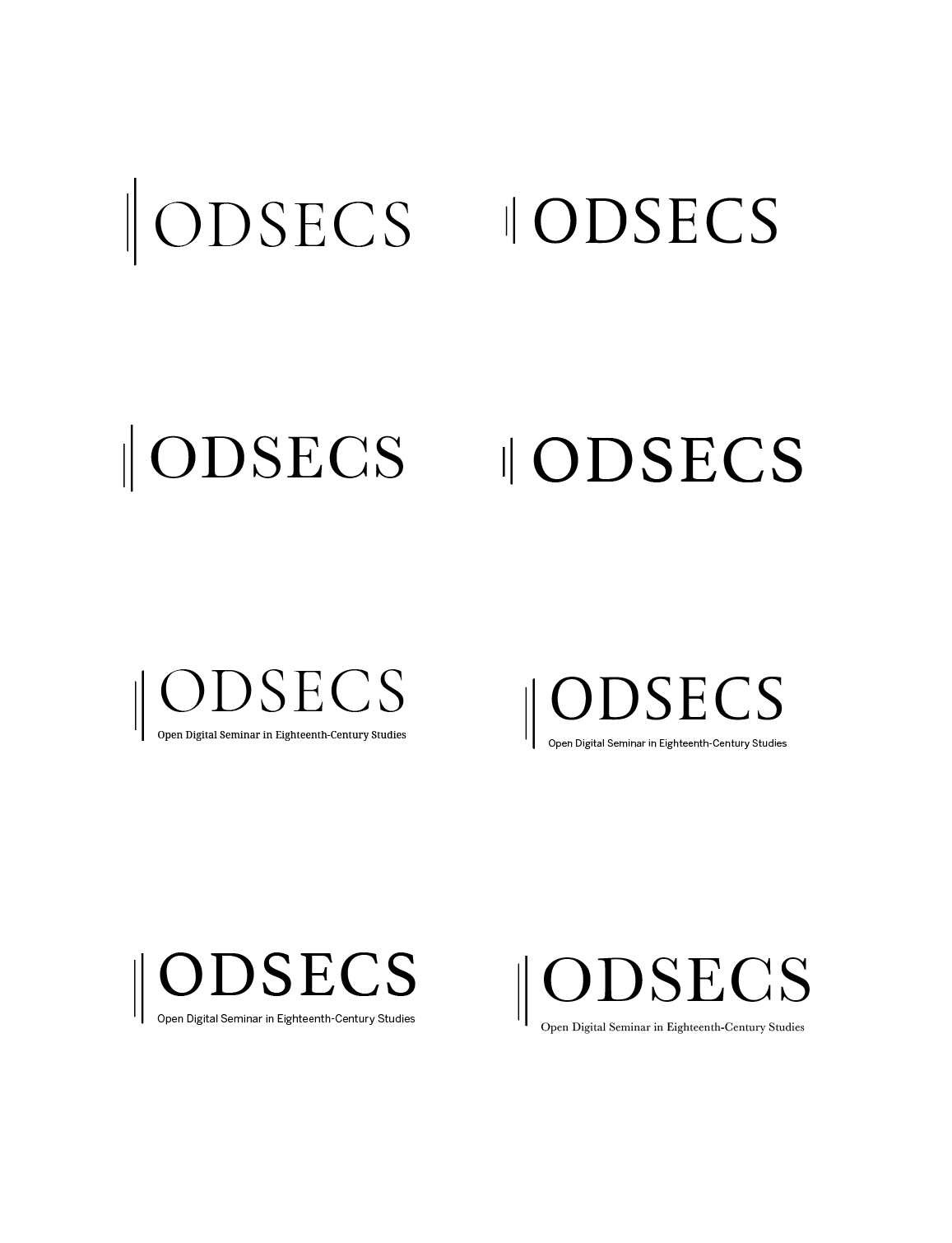
Figure 5. Two of the clients logo preferences developed
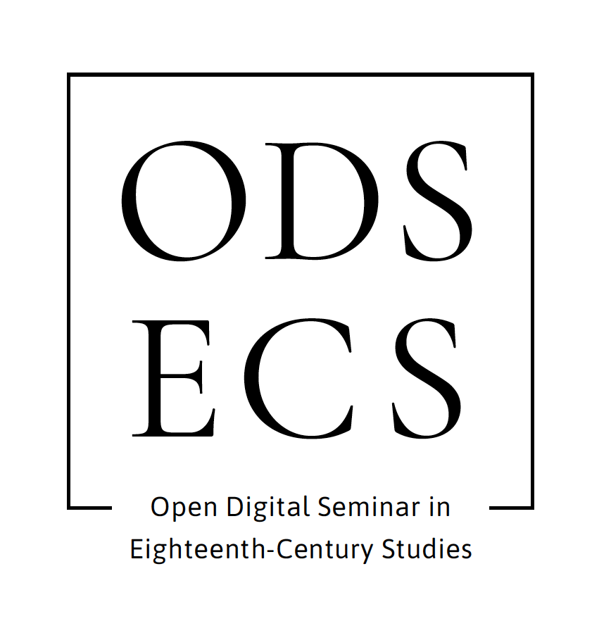
These were once again sent to the client for feedback. It was expressed by Rebecca that she had chosen the logo she would like to use to represent the business. This was concept 1, with the typeface used on the logos on the left. As the final logo had been selected, I then went on to present 9 colour concepts, when not in black and white. These colours were based on an image that the client sent to me (see figure 6). This image was intended to be used as key part of the branding on both the website and social media platforms. Therefore, it was crucial to use shades found in this image to be consistent and coherent with the other elements of branding.
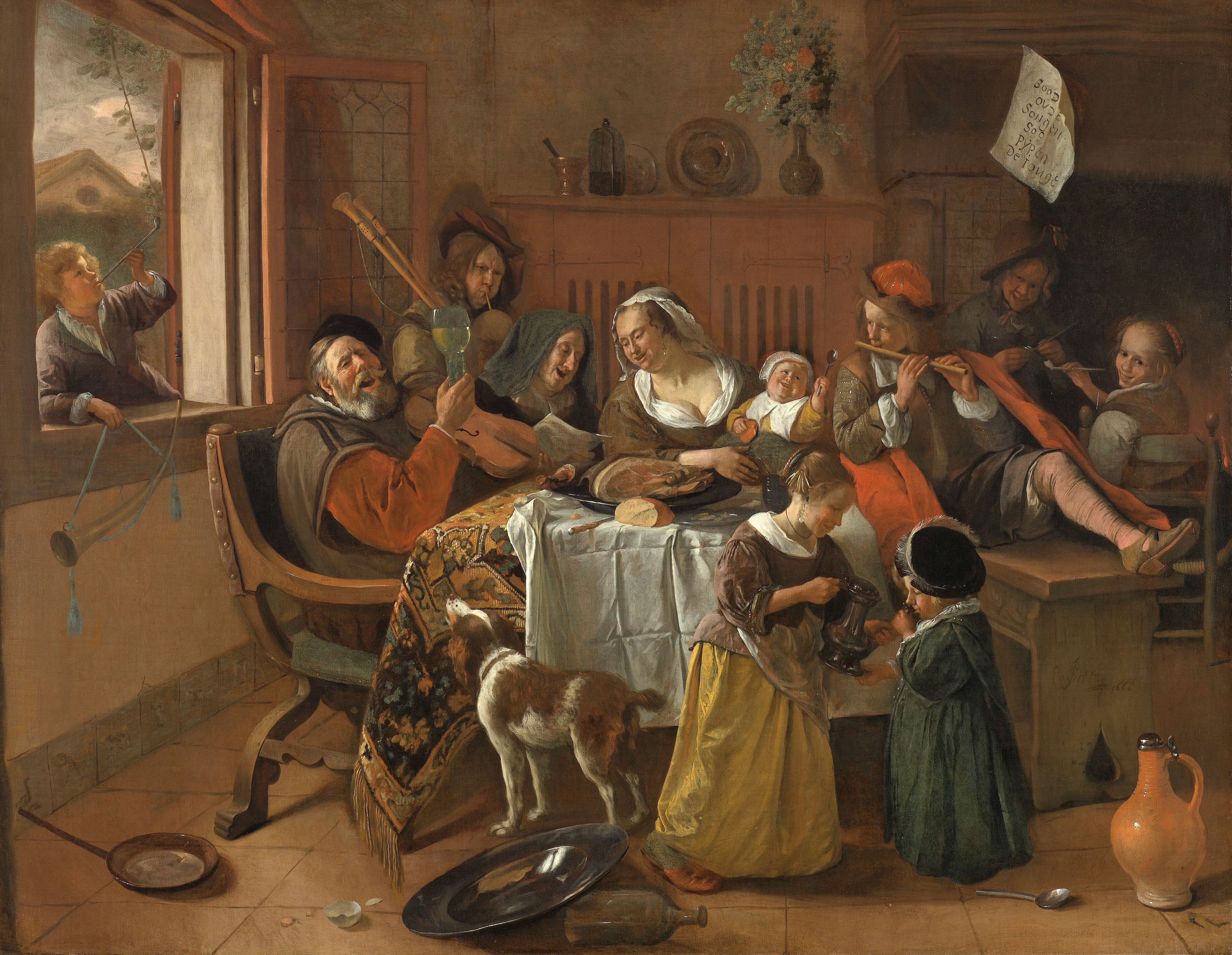
Figure 6. Image that the client sent to me as part of her intended branding.
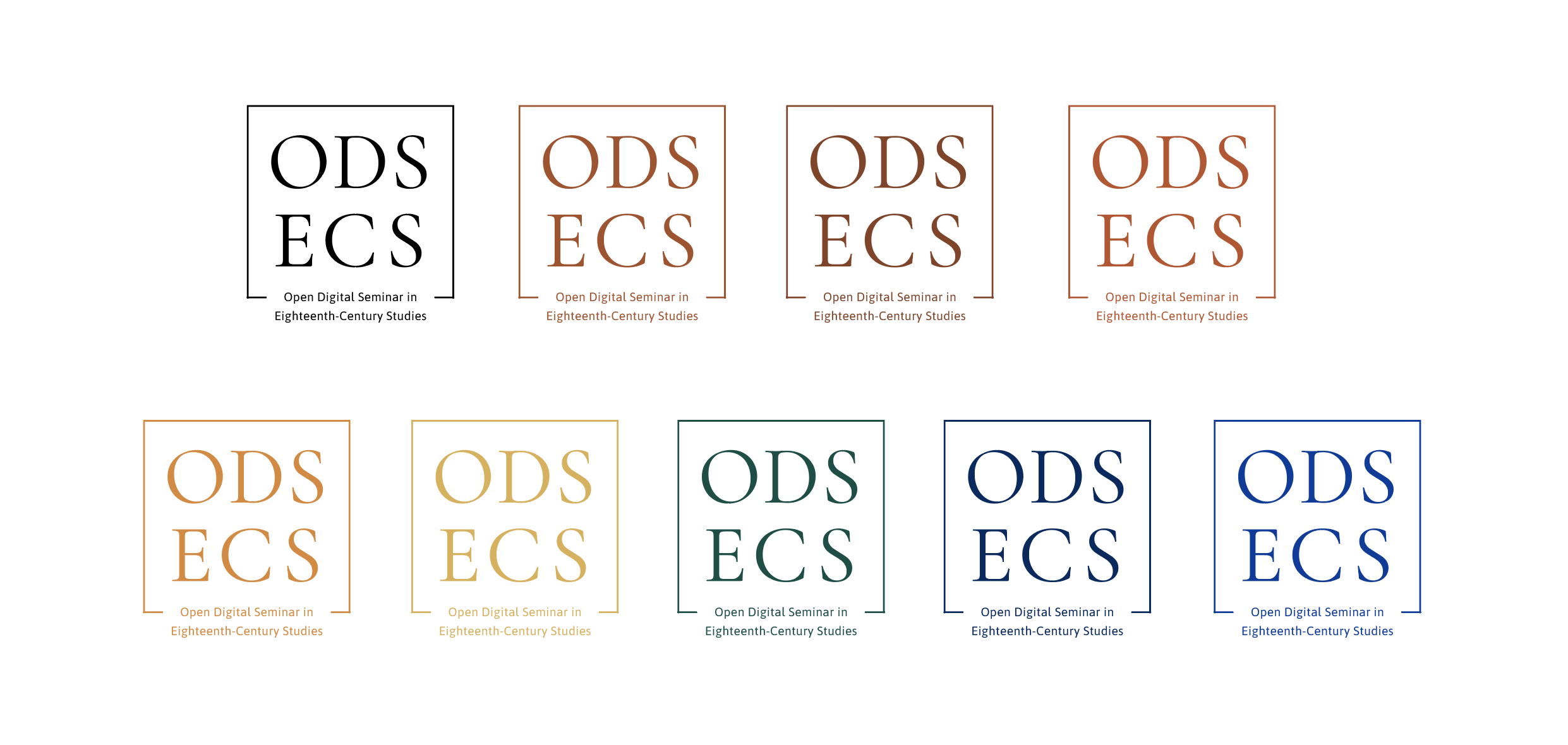
Figure 7. Colour exploration
The client expressed her fondness of the colour orange for one of the logo versions. Whilst this was a finalised colour, I was unsure about how she would like the colours presented, in terms of if she would like a background colour, or just a coloured logo with a transparent background that could be placed on anything. This was clarified in an email that stated the client would like a black text version, an orange text version and an orange text on a black background. The client also told me the exact different layout versions of the logo. This included the initials and full name as both stack and expanded, as well as just the initials (both stacked and expanded), without the lines. Removing the lines for the initials version of the logo seemed odd to me as this is one of the main features, that brings the logo together. However, as this was the clients demands, and she more more than happy with the results, I delivered the requests.
As the final logo concept and versions had been confirmed, I delivered to the client a short document detailing how the logo should be managed appropriately, as well as information regarding the typeface names and colour codes. PDF files were additionally sent the client. These were all sent at the same size, as the client had yet launch her website or social media, therefore did not know any of the size formats.
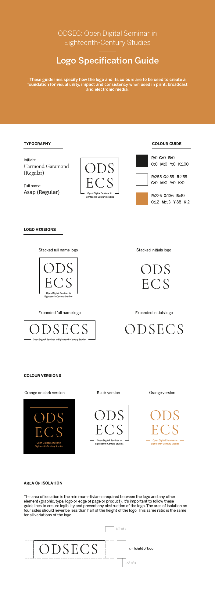
Figure 8. Logo specification guide
Reflection
Overall, I have thoroughly enjoyed and valued the opportunity of creating a logo to represent a new and up and coming digital business. The process from initial introduction to sending off the files to the client ran extremely smoothly as a result of Rebecca’s responsiveness and clear intensions. The project enabled me to really focus on the process from start to finish of designing a logo, and the differing approaches that can be utilised.
However, upon reflection, although showing computer aided logos initially appeared more professional and logical, I believe that it may have been more beneficial to show my sketched ideas first. This is because it may have developed more concepts and subsequent iterations.
I believe I have learnt a considerable amount about the relationship that can be formed between the client and designer and how this can influence perception of the design work produced. This relationship has enhanced my ability to retrieve information from a client and the importance of reaching out to clear up any uncertainties.