
Background
This blog post will be discussing a project which was carried out for the site management department and course at the university of reading. The clients were authors who had written a new textbook which would be used for the upcoming academic year. The clients wanted a more modern look to the textbook which was easy to understand and refer to as it would also be utilised as a reference book on actual construction sites as well.
Brief
The brief for this project included creating a textbook which included illustrations and tables. The textbook design should be colourful, modern and effective to use and refer to. Each illustration should be showcased alongside the text to ensure that each caption makes sense with one another.
Deliverables
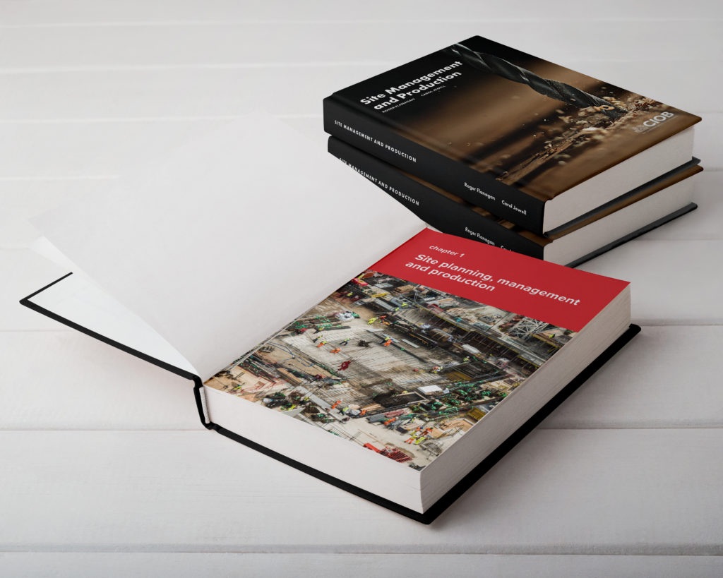
The proposed deliverables included a finished textbook including contents pages, chapter openers, body text pages and a front and back cover as well.
Design Development
Text design
The design process initially began with several client meetings whereby book sizes and formats were looked at. During these meetings, we went through several textbooks and different elements which the client wanted to include in the book itself. She was adamant in having a colour-coded system for each chapter as that would allow both would-be students as well as individuals utilising the book at construction sites to look through the book and arrive at specific sections fairly easily.
The book itself had already been written by the client on a word doc, which I was once looked at showed several hierarchies of information as well as a number of figures and tables which had to be edited. The document itself was over 200 pages without formatting. The design process began by taking a look at the several hierarchies which existed in the textbook. After speaking with my supervisor, I was suggested to work with a chapter with the highest number of typographic hierarchies.
For example, as seen in the images below, I began looking at the typographic hierarchy in several ways. I discussed utilising different colours for each level. For example, using red for 1.1, green for 1.1.1 and perhaps pink for 1.1.1.1. However, through several discussions with the client as well as my supervisor, we came to a decision that blue would be utilised for the sectioning system and would be a constant throughout the textbook, while the primary section heading colour would be red whilst subsequent secondary sectioning would be in green. This would create less confusion and more stability throughout the book.
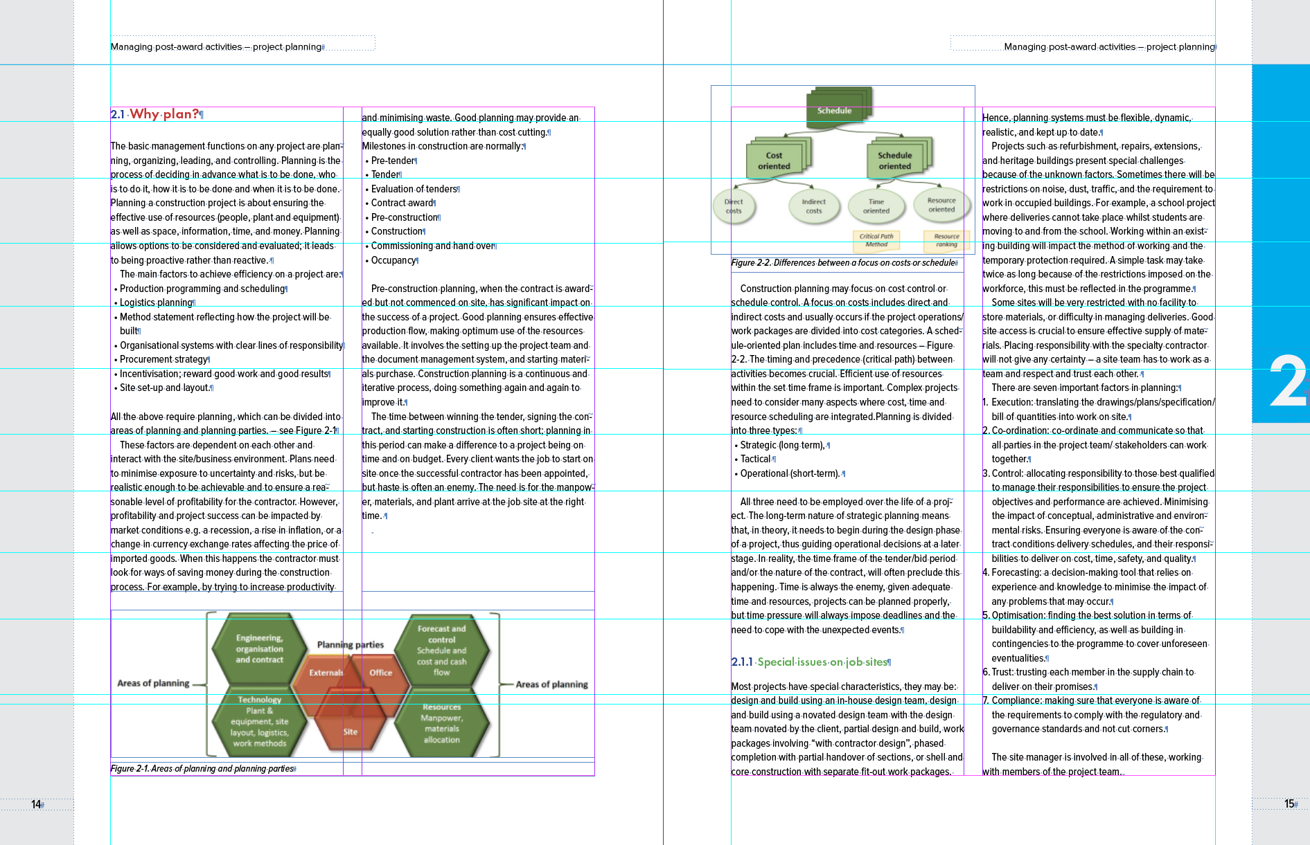
This part of the design process was especially a struggle as alongside deciding an appropriate hierarchy I needed to work with a very large document. Since this was the first large document I had to deal with, it included creating several chapter starters as well as colour-coded pages. Thought the course of the project, it became more apparent to me how there were several easier ways of colour coding including object styles. Throughout the project, while working with my supervisor, It also alerted me to the importance of the copywriter for projects, as there were several typographic errors throughout the document. This slowed down the fine detail processing of the document as I needed to go back and fix certain errors in the document.
Dealing with Image
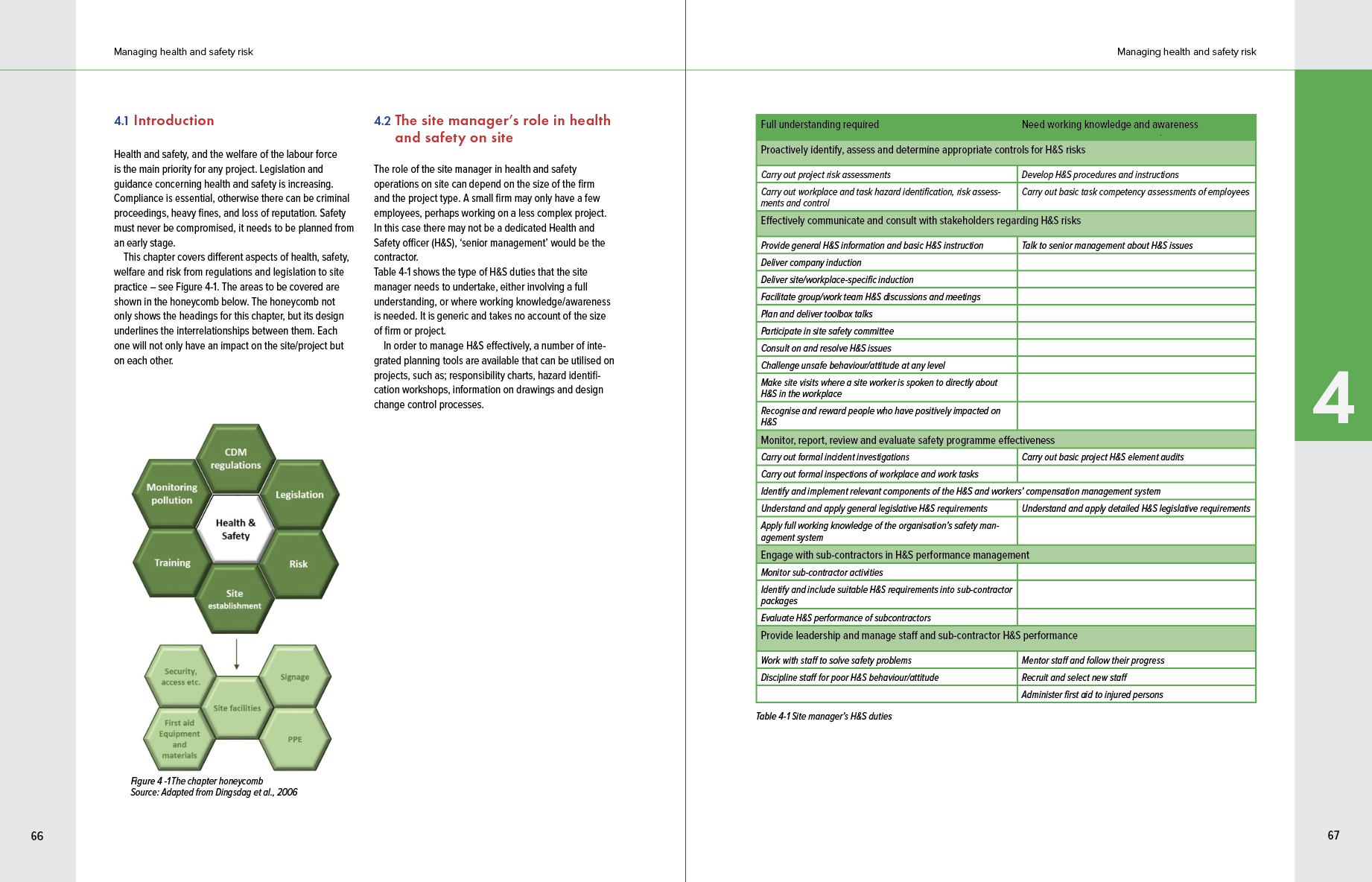
Throughout the project, several figures and images needed to be dealt with and recreated due to the low resolution of the images given by the client. As well as due to the 2 column nature of the textbook, the images not only had to be in the same spread as it is referenced in but also had to be different scales depending on its importance. For example, as seen below figure 4 was smaller then table 4-1, not only due to the difference in the amount of information but also from a users perspective, individuals would be more likely to look at the table more for important information, therefore requires more space.
Cover design
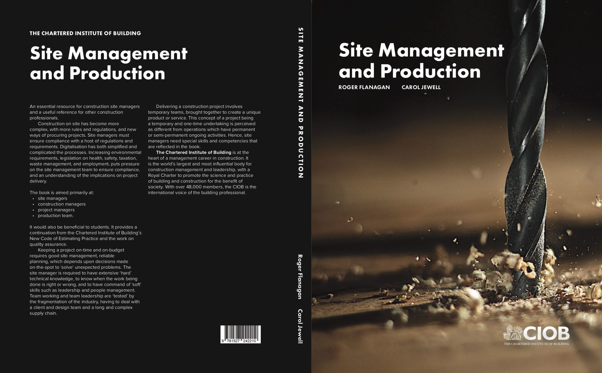
Once the text design had been finalised, we then went onto working on the cover page, I initially sent the clients several images which I believe suited the textbook and represented the textbook and what is included. The clients decided upon a very dynamic image of an automatic drill going through a piece of wood. This as a composition was extremely effective due to the dynamic nature of the colour and movement within the image as well. The typography followed the two-column grid to tie into the text pages. The same type of typography was utilised in front and back cover to create a cohesive cover as well.
Print and print finishes
Once the design had been finalised, I worked with my supervisor as well as Geoff to check the cost of printing and etc. I believe that this aspect of the project was where I learnt the most. During this project I worked with Geoff and had a crash course on how when designing documents, looking at the types of swatches and colours utilised truly impacts the print of the book. For example, ensuring knowing the difference between tints and opacity is extremely important as it could change the legibility of specific objects.
Conclusion
In conclusion, I believe that there is a medley of things I have learnt from working on this real job including ensuring that as a designer you outline the specific parts of the project you need to be done to ensure that you do not work backwards. This ultimately would have saved the project a lot of time. Alongside this, ensuring that the project is well organised is essential, especially when working on such a large project. This also saves time and ensures that you are not confused as a number of different iterations will inevitably be made.