
Restated Brief
As a team of four, we have been tasked with designing the promotional material for the Wynkyn de Worde Society throughout the year. As these deliverables are being made for a creative audience, the designs should be of a high standard and something the receivers will want to keep.
The outputs we will have been involved in designing include a series of booking forms, a letterhead template, a member’s handbook and menus. Each output is sent through the post (with exception of the menu which will be presented on the day of the dinner). This project is not limited by a budget, giving us the opportunity to explore different stocks and print finishes.
Designing
Booking Forms
The booking forms are created by different people of the team. As the illustrations and visual appearance of these are very different across the series, the same typeface (De Worde) has been used to create consistency throughout the series.
July
The July booking form was themed on a summer celebratory barbecue for the society’s 60th anniversary. This was not to be mixed up with the November anniversary or the previous booking form themed as a ‘Summer Outing’.
Since most of the booking forms before this used vector artwork, we decided that using watercolour as an artwork technique would give the booking form a fresh feel and contrast to previous work. Artwork was painted and scanned and arranged in Illustrator to achieve a seamless pattern that would divide neatly along the two folds as well as have perfect cutouts for the type.
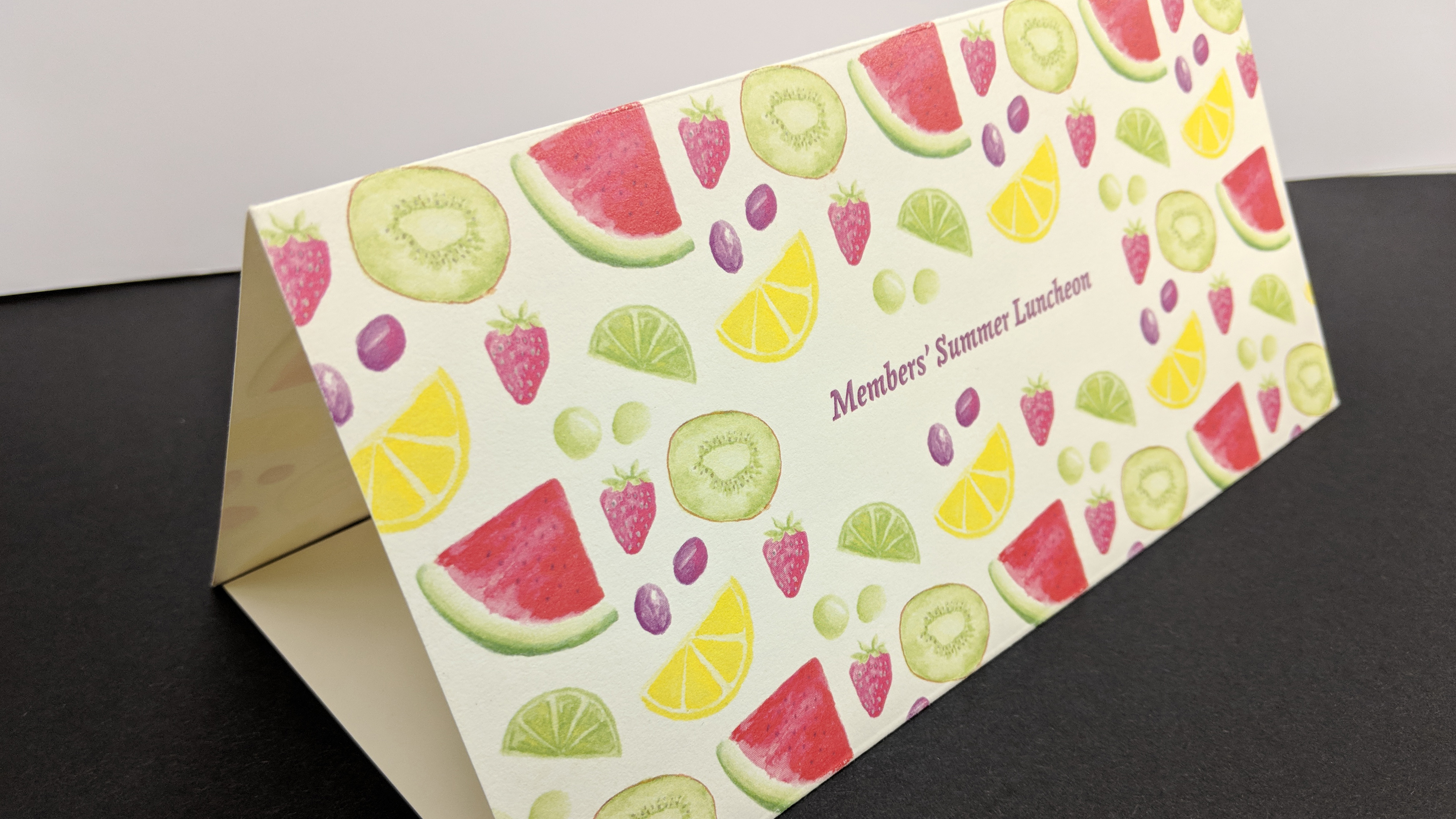
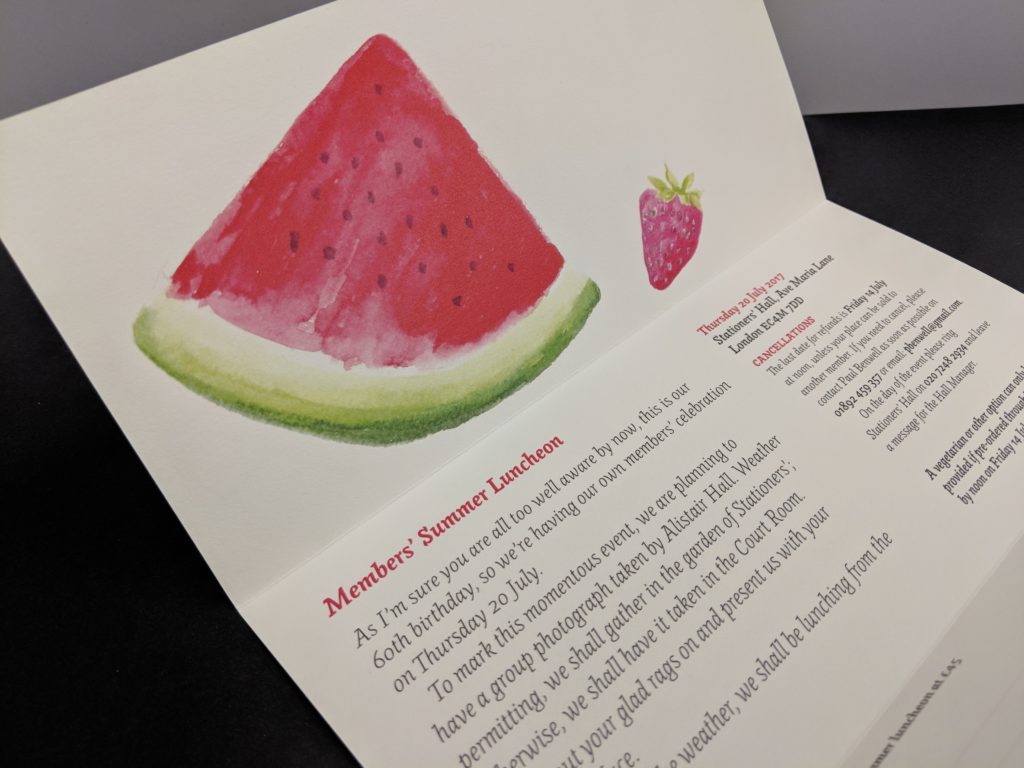
The inside of the booking form also features a single panel of artwork that reveals the watercolour paper texture. The sizeable difference between the fruits on the inside and outside created a dynamic and fresh design for the summer barbecue.
August
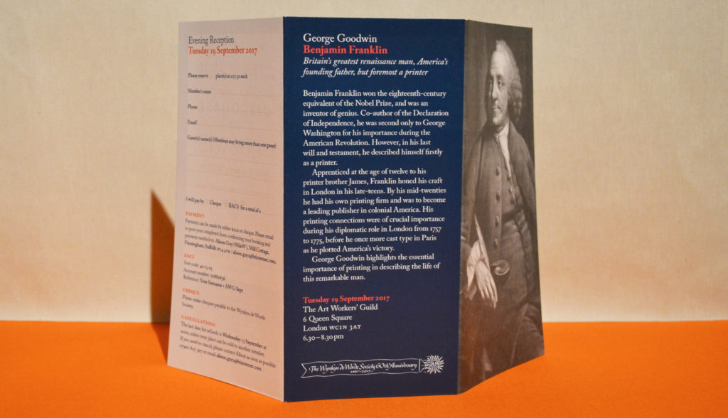
The theme for the booking form was Benjamin Franklin and his time as a printer. Although extensive research about Benjamin Franklin, and his opinion on printing, was conducted it was obvious by the end of the design process just how challenging it was to visualise his numerous achievements.
The form went through a series of design iterations, and the most simple design was chosen in the end. A picture of Benjamin Franklin on the outside and some images of his printed works on the inside. The most important lesson learnt from designing this form was not to overcomplicate ideas.
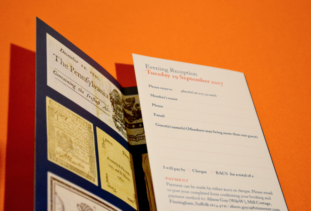 This was integral to appealing to an audience with strong and varying design taste. The cropping of images, not too loosely or tightly, was important when designing the form as it helped to retain the shapes of the objects in the images, but not to compromise the structure of the layout. Editing the levels in the images made them to print well on the paper.
A change in typeface for the whole form, was appropriate for the theme and, proved that the design template we had created for the form was versatile.
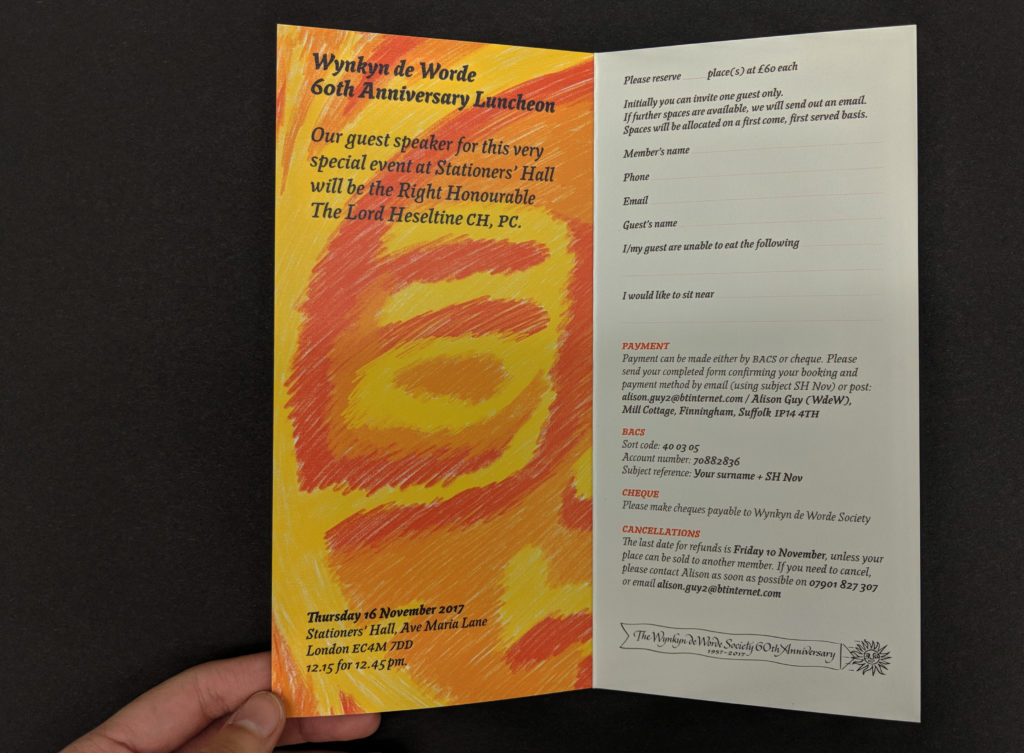
September
The September booking form was the last of the Real Job and celebrated the 60th Anniversary. This presented the challenge of differentiating it from the earlier forms whilst sticking with the existing format. The final design is a colour pencil artwork that features the current Wynkyn de Worde logo and a ‘6’, reading as ‘60’ when opened flat. The artwork was expanded on the inside panel creating a vibrant and punchy opening. This paired well with the keepsake and menu that had suns from previous years. We used two-thirds of an A4 for the last booking form due to the artwork’s dimensions, as well as the lack of content.
Menu
The menu measures 120 x 120mm and is a single folded menu. The design incorporated four different Wynkyn de Worde suns from past events, mirroring the keepsake that guests received.
These were made into a pattern with a cutout for the print and design credits. During the design process, we experimented with different colours and sizes of the suns and also considered using spot colours for printing. However due to time constraints, the menu was digitally printed on 160gsm paper.
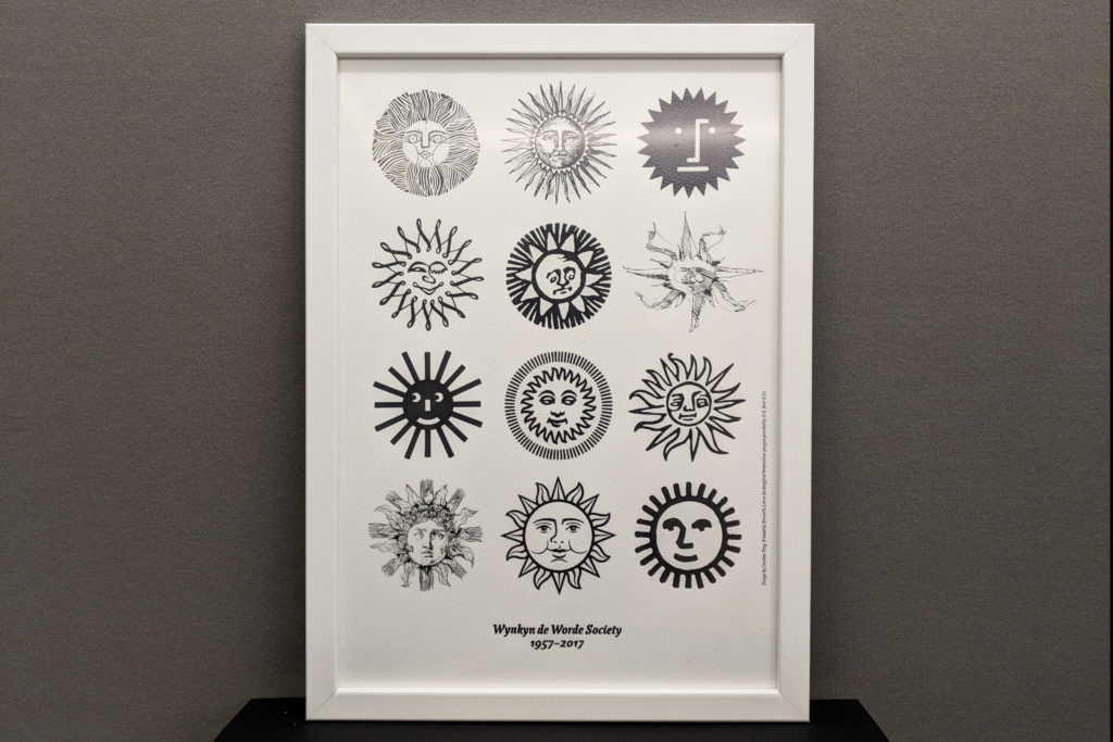
Keepsake
To commemorate their 60th Anniversary, the society wanted a keepsake that reflected their history as an organization. This was achieved by going through their archives and scanning unusual iterations of their sun logo and choosing twelve for an A3 poster.
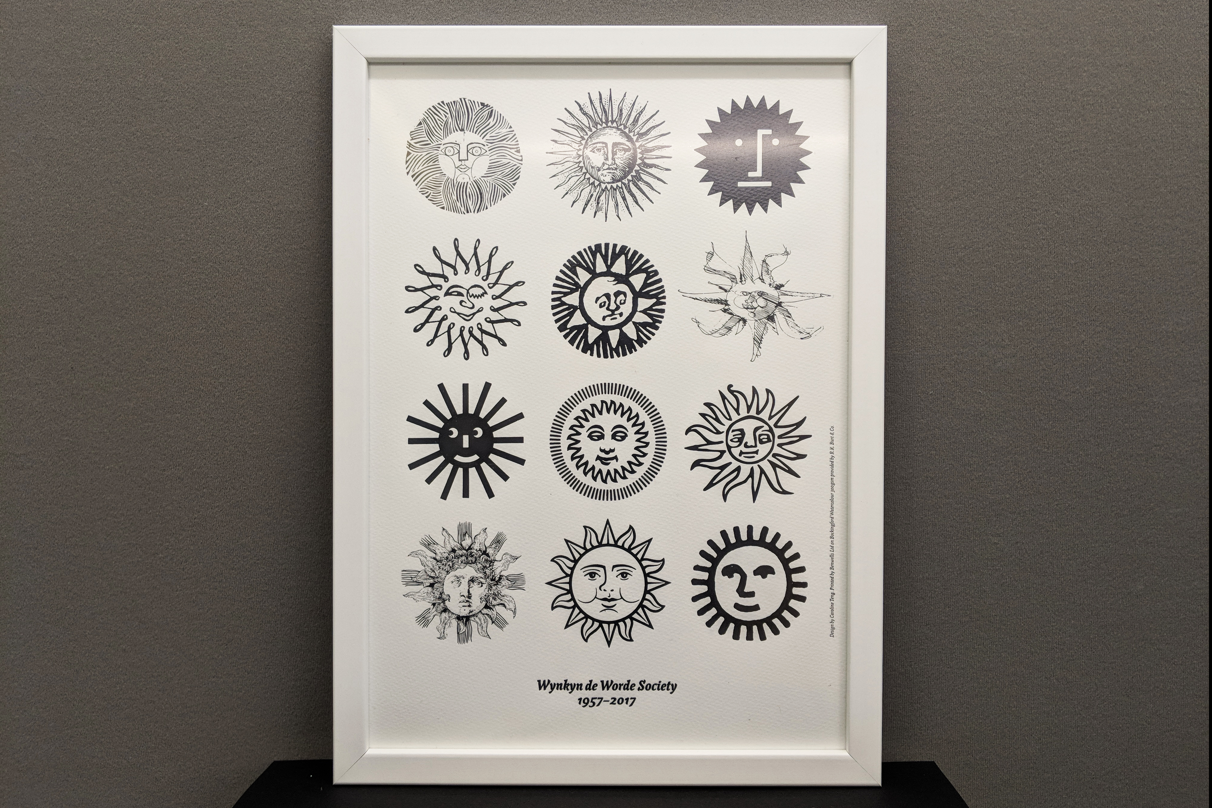
The poster did not have size limitations, but A3 was chosen as it is an easy size to frame and the aspect ratio works best with the layout. The suns were first arranged by “mathematical” values and later visually rearranged and balanced out. We also experimented with rainbow printing and mocked this up using gradients in Illustrator. The poster was finally foiled in black on Bockingford Watercolour 300gsm by R. K. Burt and Co.
Lessons
We learned both technical skills as well as soft skills during this Real Job. We shared files amongst team members as well as with Rob, our supervisor and client, which meant learning how to work with someone else’s documents. Through this we learned the importance and efficiency of having neatly sorted and labeled paragraph/character styles.
Another aspect of this project was learning to create a design concept and layout before receiving the copy. It was sometimes necessary to create booking forms that reflected the whole theme of the event rather than a specific idea within the theme. Our audience’s taste was also a challenge as designing for an extremely design conscious audience meant that our most obvious idea was not always the one our audience would appreciate.
By the tail end of the Real Job we had set up templates for the booking forms and only changed the necessary and relevant styles with each event. However, design is never a one-size-fits-all solution and typographic details always had to be looked over and refined according to how much copy we received.
Working as a team of four with Rob as our supervisor and client also taught me that picking up on subtleties of each others’ language contributes to better communication and better process overall. After a few months of working together, we had a grasp of how everyone on the team worked and communicated as well as their particular strengths, and this helped the design process and outputs.
The rare opportunity of working with the same audience over an extended period of time also meant that we became more familiar with the things they appreciate and find interesting. This allowed us to shorten the time needed to generate ideas suited to the audience.
Generally, it was said that members of Wynkyn de Worde liked the work we had done. However, given more time to experiment with a wider variety of ideas perhaps we could have created booking forms that were even more diverse in style than what we currently have.