
Brief
The Centre for Ephemera Studies at the Department of Typography and Graphic Communication planned an exhibition titled “A to Z of Ephemera” for their 25th anniversary. In addition to print deliverables such as posters, exhibition captions and decorative alphabet labels, the clients also wanted a simple visual system and a website to bring the ephemera to a broader audience and to create an online presence.
Deliverables
Our deliverables included high quality scans of the items, a website design, a consistency between print and online channels and assistance with setting up and design of the physical exhibition.
Initial steps
The very first stage of the project was to scan each item from the collections into an external hard drive. In order to preserve the intricate details of the objects, we had the scanning resolution set to very high (2400dpi). As a result, each scan took a minimum of five minutes up to 45 minutes to scan, process and save. Having both the A3 and A4 scanners running simultaneously really helped me completing the task much quicker. Most items were scanned in within the first three days after the project began.
Website process
We started by researching specific platforms we could use (Cargocollective versus WordPress) and the costs that would be involved with either one. Initially we explored basic dark and light themes that had features such as “You might like” and a “highlights” section. This was partially due to the assumption that we would customise an existing template, so I was working within typical website layouts and functionalities. Caroline was introduced to Mark Barratt, who would help with the website.
We were initially using Europa as a typeface for the entire website, but later realized that the two weights it had (Light and Regular) were insufficient to support the entire website as a whole. I switched to Open Sans as it is a clean, sans-serif GoogleFont that is easy to import into the website template, which also has enough variations to differentiate the information in the exhibition.
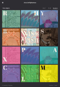
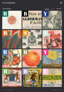
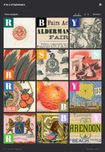
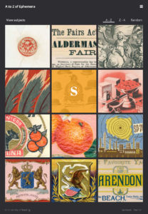
It became apparent fairly quickly after that, that a cookie-cutter template would not work for the website the client had in mind, so we started again, trying to come up with something more interactive and fun to use. We tested and mocked up the hover-states and visual appearance of the “Instagram-like” page that featured the items in an alphabetical grid. We also considered the use of decorative letters, colours (one, and many) in the website.
Using GoogleAnalytics with Mark, we decided on the full-width dimensions of the website based on the most common desktop browser sizes and also had insight into most-commonly used browser platforms.
During this time Kash also completed the bulk of the image processing and scanning – a total of nearly 200GB of data. We had also begun to think of the necessary cropping, exporting and resizing of images for the website and testing out different crops. The main challenges of this task was to make the objects on screen look as close as the ones in real life in order to give the audience an accurate impression of how the items look like in the physical exhibition. We had to take various factors into account such as the lighting of the environment and how the content would be displayed while adjusting the colour and the brightness and contrast settings as well as how these changes would look on different computer monitors.
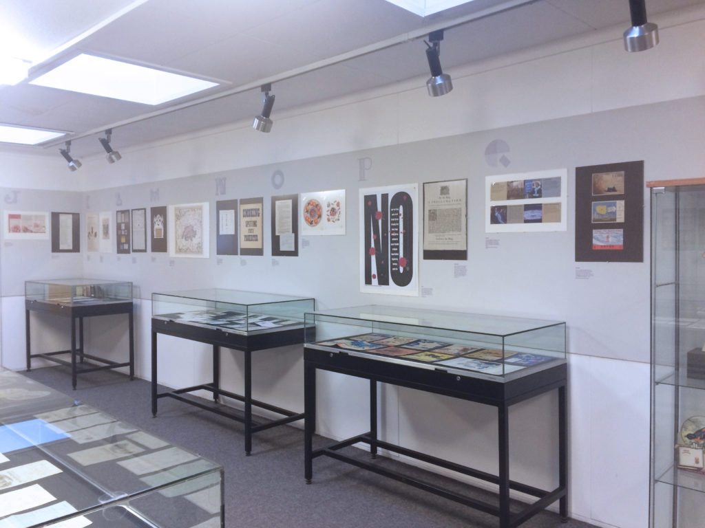
Exhibition design
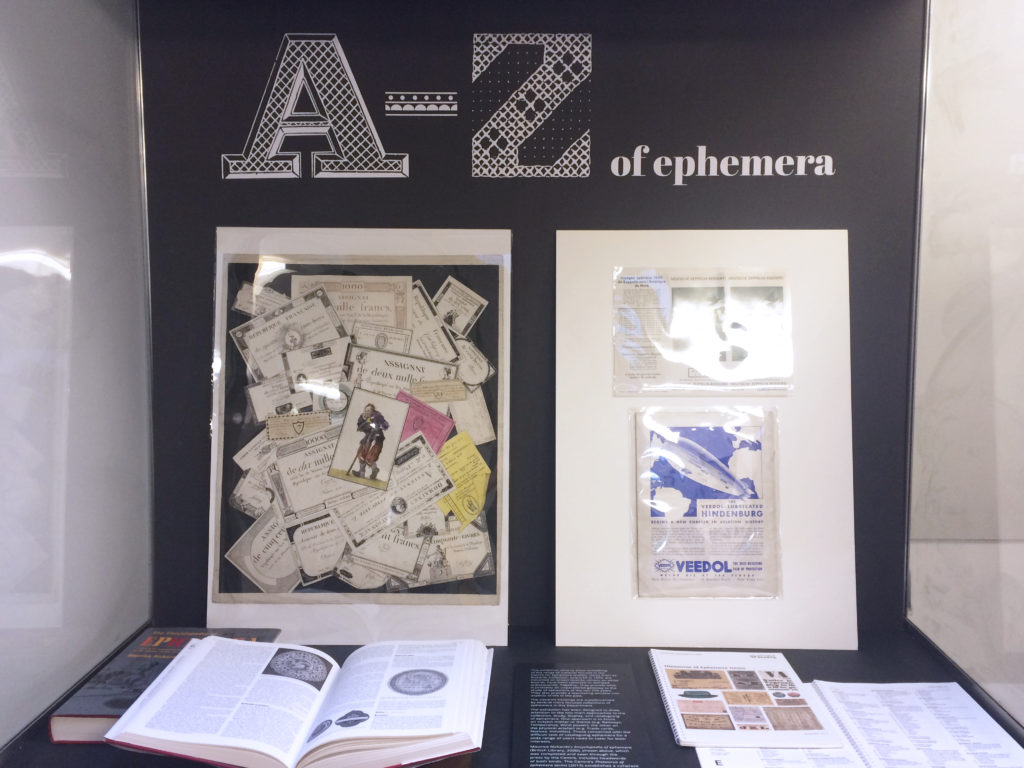
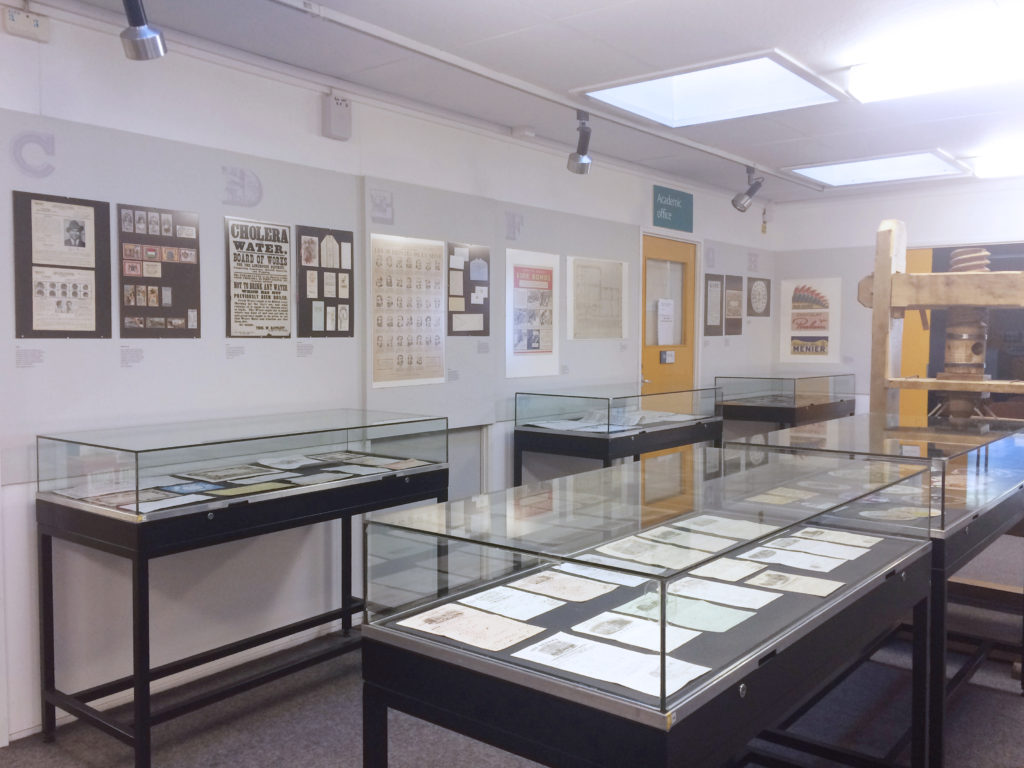
Finally, both Kash and I helped with setting up the physical exhibition. We helped Michael Twyman copy edit the captions, which were still not finalized. Several last minute deliverables were added including a video for the 40-inch TV screen, an A3 welcome poster and an opening poster to be mounted onto the side of the display case (113x59cm). Our final work for these last minute deliverables were based off Kash’s ideas and initial executions, as we worked together and shared ideas.
We decided to print them on self-adhesive vinyl, which looks more aesthetically pleasing than pinning paper on the boards. We printed a grey background colour matching the boards so they would blend in with the wall. Getting the accurate colour was not as easy as it seemed. Several colour test strips were printed in order to get the closest matching colour possible.
As the initial opening date approached, the website’s functionalities were stripped down to the minimum, providing a simpler user experience. The website required final fine-tuning such as including the dimensions of the objects, changing some of the navigational features, and including the decorative letters that we had installed in the physical exhibition.
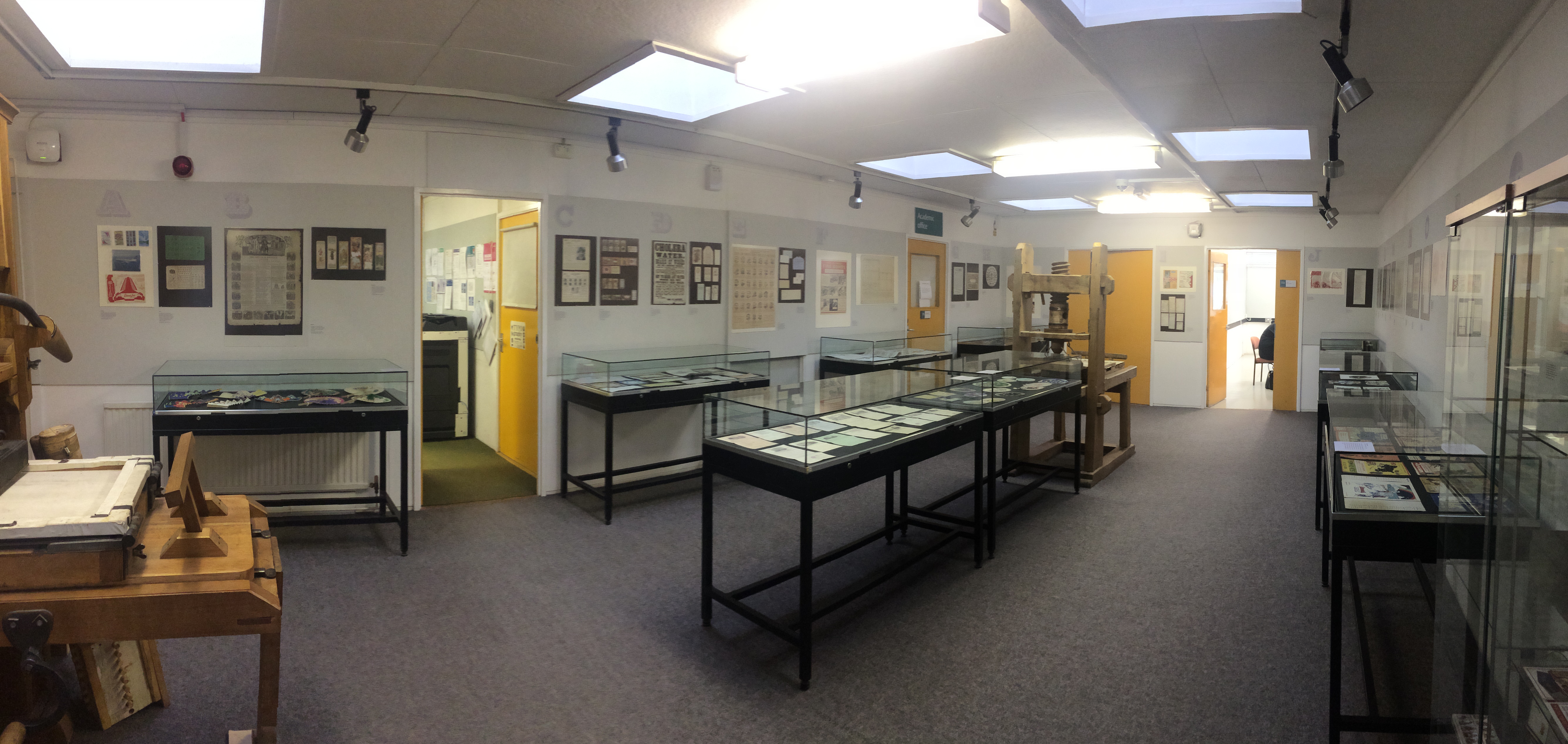
The design of the website and the physical exhibition and posters informed each other. The website determined the typefaces we used for the captions in the exhibition, the inclusion of the decorative letters in the physical display case as an opener was eventually integrated into the online experience as well.


Key takeaways
The exhibition overall was well received and the website brought a new perspective to the ephemera due to the high quality scans and the interesting crops. Additionally, the png format of images allowed us to play with the rough and imperfect edges of the items thereby bringing out the age and physical quality of the ephemera on the screen. The zoom functionality of the website also brings a new dimension to the experience that is not accessible in the physical exhibition.
Despite that, there were still several things we would like to change and correct. If we had more time, we would have come up with a new brand identity for the exhibition. The current monochrome approach does work well and consistently with the website, but it is not very effective in terms of drawing attention.
Working in a team with a partner who has significantly different focuses of the project forced us to clarify messages and think about what was really necessary for clear communication.
“I signed up to web design because I wanted to be challenged and to expand my portfolio. This Real Job was intimidating at times as I was thrown out of my comfort zone. But I am now more confident in my web design skills and communicating with a web developer. I also realize that much of my role involved communicating between the various stakeholders, while forming my own design opinions and decisions and including them into the messages at the same time. Above all, I realized that working with people who are passionate about the subject matter makes the work much easier and quicker as a whole.” – Caroline
“During the process, there were times when I felt overwhelmed by the conflicting feedback and sudden demand from the client and defeated and embarrassed by the blunders I had made. However, I believe these experiences will help me prepare for the real-life work environment where these situations would often appear. Working on a large-scale project like this one was great fun and I really enjoyed almost every second of it. It was fulfilling and rewarding and helped improve my technical and social skills in many ways. I now feel more confident of presenting ideas in front of clients and expressing my disagreement on some of the things they say. I must acknowledge the time and effort the whole team had put into this this task which led to the success of the exhibition, I would certainly not be able to achieve it all by myself.” – Kash