
In the third in a series of posts about artefacts in the exhibition ‘Material histories’ (now on in the Department), Rob Banham tells the story of Jan Tschichold’s history of the ampersand.
Jan Tschichold and the ampersand
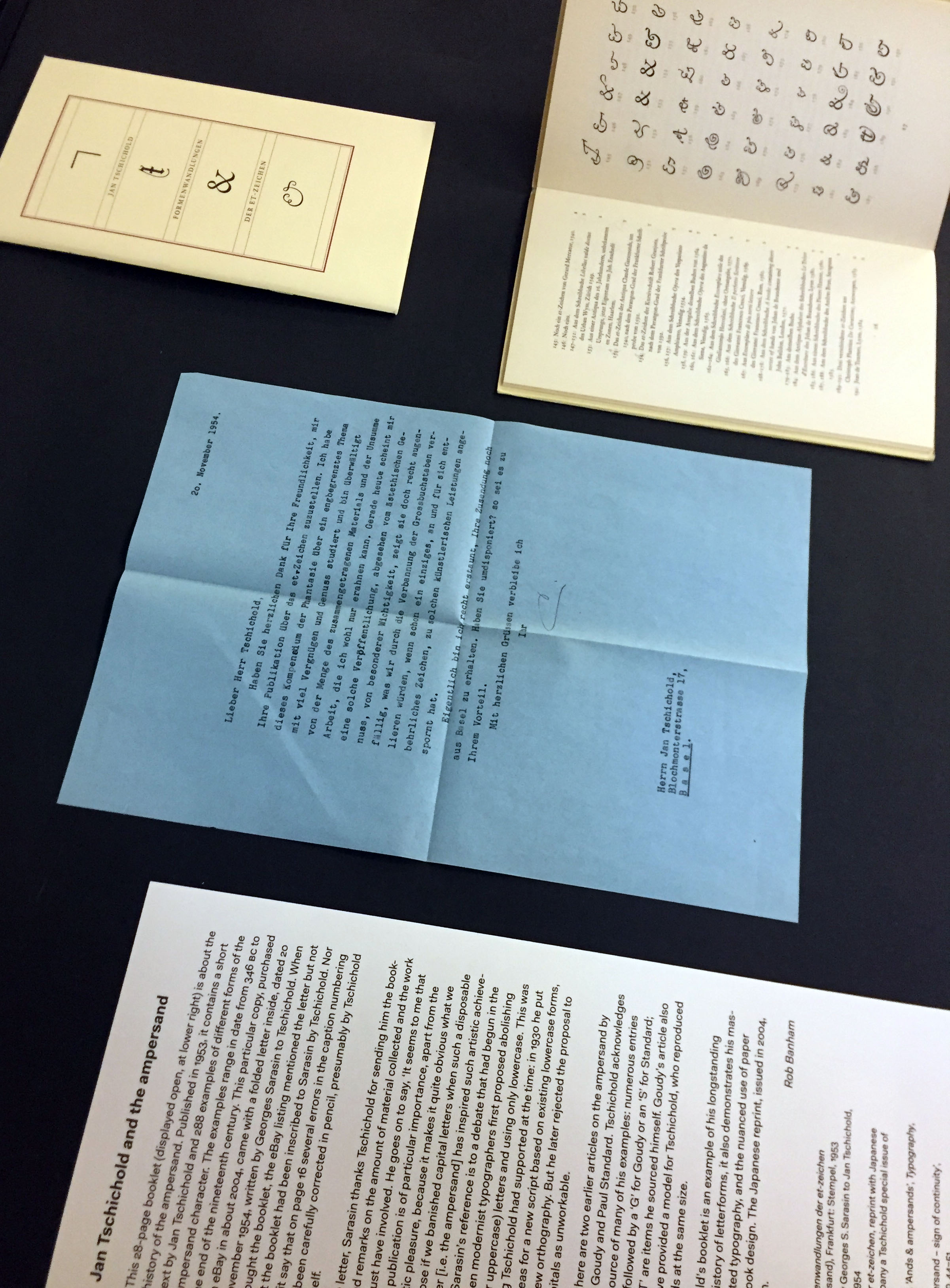
This 28-page booklet (above, displayed open at upper right) is about the history of the ampersand. Published in 1953, it contains a short text by Jan Tschichold and 288 examples of different forms of the ampersand character. The examples range in date from 346 BC to the end of the nineteenth century. This particular copy, purchased on eBay in about 2004, came with a folded letter inside, dated 20 November 1954, written by Georges Sarasin to Tschichold. When I bought the booklet, the eBay listing mentioned the letter but not that the booklet had been inscribed to Sarasin by Tschichold. Nor did it say that on page 16 several errors in the caption numbering had been carefully corrected in pencil, presumably by Tschichold himself.
In the letter, Sarasin thanks Tschichold for sending him the booklet, and remarks on the amount of material collected and the effort this must have involved. He goes on to say, ‘It seems to me that such a publication is of particular importance, apart from the aesthetic pleasure, because it makes it quite obvious what we would lose if we banished capital letters when such a disposable character [i.e. the ampersand] has inspired such artistic achievements.’ Sarasin’s reference is to a debate that had begun in the 1920s when modernist typographers first proposed abolishing capital (or uppercase) letters in favour of only lowercase. This was something Tschichold had supported at the time: in 1930 he put forward ideas for a new script based on existing lowercase forms, and for a new orthography. But he later rejected the proposal to abolish capitals as unworkable.
Also on display are two earlier articles on the ampersand by Frederick W. Goudy and Paul Standard. Tschichold acknowledges both as the source of many of his examples: numerous entries in his list are followed by a ‘G’ for Goudy or an ‘S’ for Standard; those with a ‘T’ are items he sourced himself. Goudy’s article also appears to have provided a model for Tschichold, who reproduced his ampersands at the same size.
While Tschichold’s booklet is an example of his longstanding interest in the history of letterforms, it also demonstrates his mastery of understated typography, and the nuanced use of paper and binding in book design. The Japanese reprint, issued in 2004, is a pale imitation.
On display
Jan Tschichold, Formenwandlungen der et-zeichen (Forms of the ampersand), Frankfurt: Stempel, 1953
Copy of a letter sent by Georges S. Sarasin to Jan Tschichold, dated 20 November 1954
Formenwandlungen der et-zeichen, reprint with Japanese text, issued to accompany a Tschichold special issue of Idea magazine, 2004
Frederick William Goudy, ‘Ands & ampersands’, Typography, no. 3, 1937, pp. 11–18
Paul Standard, ‘The ampersand – sign of continuity’, Signature, no. 8, 1938, pp. 44–51
‘Material histories’ presents graphic communication artefacts with a story to tell. The stories – the material histories – describe the artefacts in particular: what they are about, where they came from, their material qualities, their circumstances of production, how they were acquired, and crucially how they link to other artefacts, narratives and representations.
The exhibition continues until 11 November.