
Restated Brief
Job summary
Nicola Wilson is the author of the book Recommended! A book that
follows the Book Society and the literary influences that highly
influenced the reading during the interwar period. Wilson would like
ephemera such as: a bookmark, postcard and book plate to supply at
book shop visits during the book launch of Recommended!
Aims and objectives
- To create cohesive ephemera that reflects the nature of the book and
the time period that it focuses on, with some contemporary elements - To experiment with typography from the 1930s
- Find images through the collections to use/utilise in my work
Deliverables
- Bookmark
- Postcard
- Book plate
Qualities of deliverables
The user will need to be able to see a clear connection between the
content, book and the ephemera. They will also need to be able to read
the text displayed on all of the items.
Research
My research will consist of meeting Emma in collections to look at all
of the ephemera from the Book Society. I have also been supplied with
the manuscript so I can read it, so that I can understand the content
of the book further and what I need to be representing with my
designs.
Research
The research for this project was extensive. I contacted Emma in collections so that I could look at vintage bookmarks and bookplates. The research was extremely valuable as previously to this project, I had no idea what a bookplate was. I spent a long time sat looking through the archives of both the bookmarks and bookplates and photographed any that I felt would be appropriate to base some ideas off. It also was instrumental in the physicality of the deliverable, as I was able to feel the paper that was used then, to make sure mine was authentic as possible in comparison. Thee colours used in the 1930s were quite limited, and although the client wants to match the colour of the book cover, I may suggest slightly editing the colours of my deliverables to be more historically accurate.
Development
To start the design process was quite daunting as I soon realised that this would be a heavily illustrated project. I started with showing the client different sketches for possible designs for each of the deliverables. After client feedback I redrew some of the designs before digitising them (see in fig. 1-3). 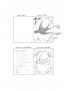
Figure 1: Sketch of design for bookplate.
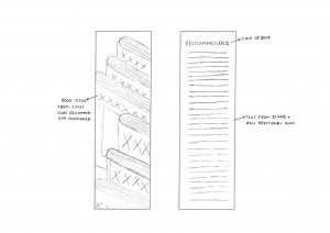
Figure 2: Sketch of design for bookmark.
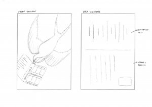
Figure 3: Sketch of design for postcard.
After digitising them in Illustrator I started working on different colour combinations to see which was most effective. I then test printed to ensure that the colours transferred well in print, so had to make some final adjustments. The final digital versions are shown in figures 4-7.

Figure 4: Outside of bookplate.

Figure 5: Inside of bookplate.

Figure 6: Front of postcard.
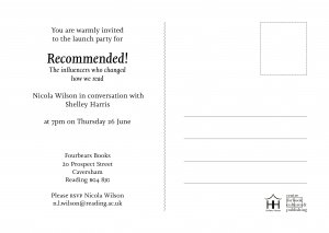
Figure 6: Back of postcard.

Figure 7: Front and back of bookmark.
Printed Deliverables
I made sure that my Illustrator files were vectors and all of the files were in the CMYK colour space to ensure the best quality for printing. During the production process there was a slight mishap with the printing, meaning that the bookplate didn’t fold exactly in half. I learnt that contacting the client and acknowledging this mistake shows your professionalism and care for the work, even when its now out of your hands. Otherwise, I was extremely pleased with how the printed deliverables turned out (see fig. 8-11).

Figure 8: Printed postcard.

Figure 9: Printed postcard (detail).
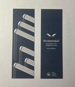
Figure 10: Printed bookmark.
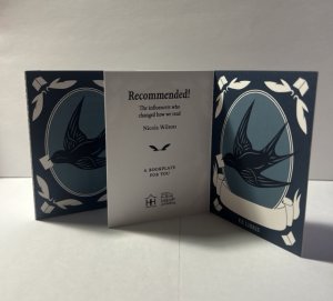
Figure 10: Printed bookplate.
Reflection
I really enjoyed this project, it was something completely different to anything that I had previously done. This real job was heavily illustration based and that through me out of my comfort zone , in the best way. I have grown a lot of confidence in my illustration skills and have learnt a valuable skill which I can utilise in the future.