Background
Our client Ilaria Mezzogori is involved with a Community Kitchen, a communal and social place where free community-based programmes are run so people can learn to cook, learn about their food habits and make their budget go further, all whilst breaking loneliness. Cookery classes range from basic cooking skills to mastering specialised skills, which anyone can attend.
This community kitchen (Community Cooking & Well-being Kitchen) is ‘the child’ of two social enterprises, ‘Empower to Cook’ and ‘Khepera’. These organisations reinvest any profit into the community. “Empower to Cook’ aims to teach basic cooking skills to improve the health and well-being of the local community. ‘Khepera’ focuses on vegan and healthy food education.
The company required a logo that reflects the idea of giving back to the community and environmental sustainability. The logo also needed to utilise the fixed colour palette of yellow and purple: a fifty fifty balance of the partnerships’ (‘Empower to Cook’ and ‘Khepera’) colours. The logo was created by Emma and Bethan.
Restating and understanding the brief
The brief was to create a logo that reflects the Community Cooking & Well-being Kitchen : giving back to the community and environmental sustainability, representing the two partnership companies (‘Empower to Cook’ and ‘Khepera’).
In the initial meeting the required outcomes were established:
- A logo
- Possibly a visual identity
- Possibly a social media presence
Within these outcomes there were certain fixed design elements:
- Colour palette of yellow and purple (partnerships’ colours) but these colours do not have to be the same shade as the partnerships’ colours.
- Circular design to reflect community
- Whole name of the company must be included (Community Cooking & Well-being Kitchen)
Our key objectives were to produce a logo that successfully raises Community Cooking & Well-being Kitchen’s profile as a company and to effectively reflect the partnership enterprises and their objectives.
These aims were measured by feedback from the client, regarding whether they were effectively promoting them as a company. To ensure an appropriate logo, visual mockups were utilised, using the signage size supplied by the client (2450x710mm). We would schedule regular feedback via zoom during the initial stages and then via email when finalising the logo to allow our client to share our designs with the rest of her team. Zoom meetings were also used to discuss any issues involved in the process.
Further through the process the required outcomes were changed:
- A logo
- Visual identity guidelines
Schedule
The original deadline for this project was 30th Nov, however we exceeded this deadline. This is mainly because the design process took considerably longer than we had initially planned for. Due to Covid-19, the deadline the client had originally supplied us with could be extended. Therefore, we prioritised producing a logo that fitted the client’s brief as much as possible. On reflection we could have been more efficient during certain parts of the process. The colour scheme of the logo was also a challenge which took longer to solve than we initially anticipated. However, the additional time we spent on getting this aspect of the logo right has proven beneficial.
Research
Personas
In the initial stages of the project we produced some user personas. Carrying out this process allowed us to identify who the logo would primarily be aimed at. After producing the personas we collectively produced a list of key aims of the logo. The main aim is to create a logo that reflects the friendly and welcoming nature of the Community Kitchen.
Partnership companies
We then researched the partnering companies to gain a wider understanding of their aims and programmes. ‘Khepera’ highlighted the high importance of wellbeing and nutritional support, as suggested by the name which translates to “transformation”. ‘Empower to Cook’ focuses on sustainability and accessibility. They target vulnerable communities to educate them about affordable but nutritious food. Therefore, we aimed to incorporate these key incentives into our logo design. We also looked at the colours used in the partnerships’ existing logos for inspiration.
Partnership social enterprises’ company logos
Existing community kitchen logos
Since neither of us had come across a Community Kitchen before, we looked at some pre-existing Community Kitchen logos. Formulating a mood board of these existing logos assisted our design process as it helped to highlight current logo design trends.
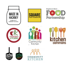
Moodboard of existing logos
There were certain trends we noticed:
- Friendly and fresh feel
- Presence of kitchen utensils
- Joining of lines/illustrations to reflect community feel
- Illustration style providing ‘home-made’ feel
We also looked at a selection of pre-existing logos that have yellow and purple colour schemes. Initially, the colour scheme felt quite limiting, however, after viewing existing logos and gaining feedback from our supervisor we focused on using purple and yellow shades from fruits and vegetables. We found that this produced a fresh feel to the logo as well as representing both social enterprises that make up the company.
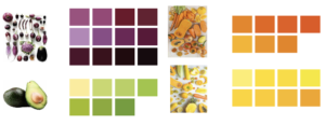
Colour shades inspired by fruit and vegetables
Design Development
Initial concepts
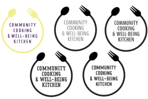
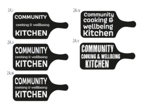
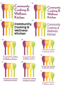
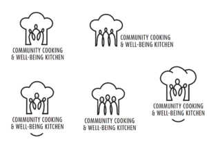
Initial design ideas
In the initial stages of the process we formulated four different concepts based on our research and input from the client. Creating these various concepts allowed us to explore different solutions and discover which work best. After having a meeting with our supervisor we selected our strongest two ideas to show the client and continue to develop these further.
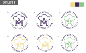
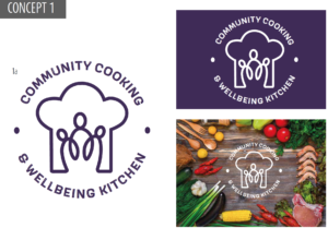
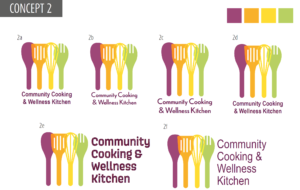
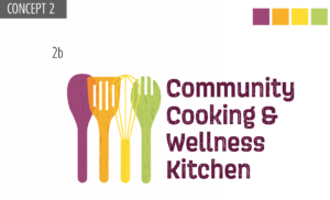
Design concepts shown to client
These designs presented the idea of ‘community’ the best and were two completely different approaches, therefore provided options for the client. ‘Concept 1’ utilises a chef’s hat and people connected together via a single line as we found that both of these trends were popular when conducting research. This ‘icon’ also represents the company’s objectives and name in a single image. ‘Concept 2’ uses a set of utensils that could also be representative of people, which overlap which also reflects the ‘connection’ and community feel. Our supervisor also suggested adding an element of texture to ‘Concept 2’ to reflect the wooden utensils, which we experimented with. Refining these logos to a standard which was suitable to present to the client took substantially longer than we initially had planned. Also, on reflection we should have been more efficient at communicating with our client at this stage, explaining the process we were going through.
Feedback from our client indicated that her and her team felt that ‘Concept 1’ represented them as a company the best. Therefore, we continued to refine and develop this logo.
Experimentation of type and image
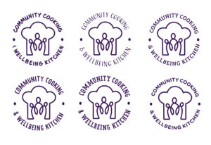
Experimentation of type
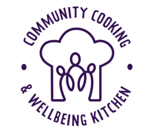
Final typeface choice
Once we had established the logo design to take forward, we worked on refining the details. We started by finding the appropriate typeface to complement the line drawing. We aimed to select typefaces that had ‘friendly’ and ‘homely’ connotations to reflect the key objectives. We made a collective decision with the client that the fourth typeface would be best. (As displayed above)
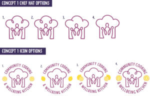
Experimentation of image
During the design process, we experimented with the placement of icons. These included lemons and leaves, however these did not work as effectively as we had originally anticipated. Therefore, after consideration, it was concluded that the icons interrupted the company name and disrupted the fluidity of the logo.
The style of the illustration was also experimented with, especially how the chef’s hat was drawn. The client’s preference was the fourth option with clean consistent lines.
Experimentation with colour scheme
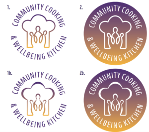
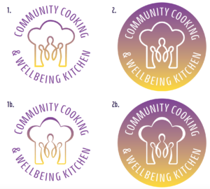
Experimentation of colour
As we progressed through the design process, the importance of having a fifty fifty purple and yellow colour scheme was highlighted. Since the Community Kitchen is ‘the child’ of two social enterprises (‘Empower to cook’ and ‘Khepera’) these colours needed to be presented equally. Therefore, we experimented with using a gradient to ‘blend’ the two colours together.
We also trialled using a combination of thick and thin lines for the icon, which the client preferred to the original.
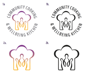
Experimentation of text colour
The challenge of achieving fifty fifty balanced colours remained for the text elements. As a solution we introduced a third colour of charcoal. This was selected as it compliments the shades of purple and yellow used. This was approved by the client.
We also introduced the idea of a single icon without text for uses where the text would be illegible at small sizes, which was also approved by the client.
Final Design
For our Client
The image below shows our final logo design for our client. With the restrictions of having the two colours, representing the two founding companies, equally shown on the branding the charcoal text was a good compromise. We have also provided a charcoal version for any instances they may have where only one colour is available. In cases of overlapping the logo onto an image or colored background we have created a white logo so legibility is not lost.
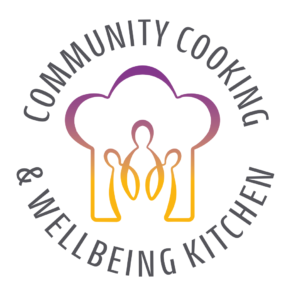
Our recommended design
In context of the restrictions of having equal amounts of only purple and yellow, the logos below are what we believe would work best with our clients desired brand. We recommended to our client, that if possible, that if another colour could not be added perhaps making the text all purple would be better than having it charcoal or black. This maintains their brand colours and ends up being a cohesive design. Along with this positive design, we recommended a negative logo design to place on any coloured or photographic backgrounds. The negative design creates positive connotations with Instagrams branding. However these two designs were not chosen by the client due to their colour restrictions to create an equal representing logo.
Reflection
Completing this real job took a lot longer than we both had initially anticipated. The deadline was extended partly due to COVID-19 as this meant the urgency for the completion of the logo was far less. This resulted in no ‘concrete’ deadline and on reflection we should have set our own personal deadline to be more efficient with our time. We could have also used the time between sending draft designs and receiving feedback from the client more effectively, which may have sped up the process. However, we believe that the extra time we have used for refinement purposes benefitted the logo in terms of meeting the clients brief.
Even though the process took a lot longer than we initially anticipated, the completion of the logo has provided us both with invaluable experience. Our communication skills have improved during the process, initially we were so focused on completing high quality designs that sometimes we would not update the client as efficiently as we should have. However, further through the process we ensured to update the client as much as possible so that she did not feel disconnected from the process.
The main challenge during the design process was ensuring that the colour scheme met the client’s brief but also produced a visually appealing logo. To find a suitable solution we had to experiment with finding alternative solutions and gain inspiration from existing logos. For example, logos such as ‘Instagram’ utilise a gradient in their logo, which in the case of our logo, means that the two colours work effectively together, without competing with one another and provides a ‘fresh’ and modern feel to the logo.
We believe that the logo produced has met the objectives of the ‘Community Cooking & Wellbeing Kitchen’. The integration of purple and yellow as a gradient represents the two companies but also reflects the idea of ‘Community’. Similarly, the single line forming the icon reflects the ‘community’ aspect as it provides the idea that everyone is together and connected when at their Community Kitchen. The icon could also hold connotations with the ‘sustainability’ objective since it is a continuous line drawing. We also feel that we have achieved a logo that is unique to the Community Kitchen but is also inline with all the current trends that we established during the research stage of the process.
Emma Lonsdale & Bethan Williams
