The Brief
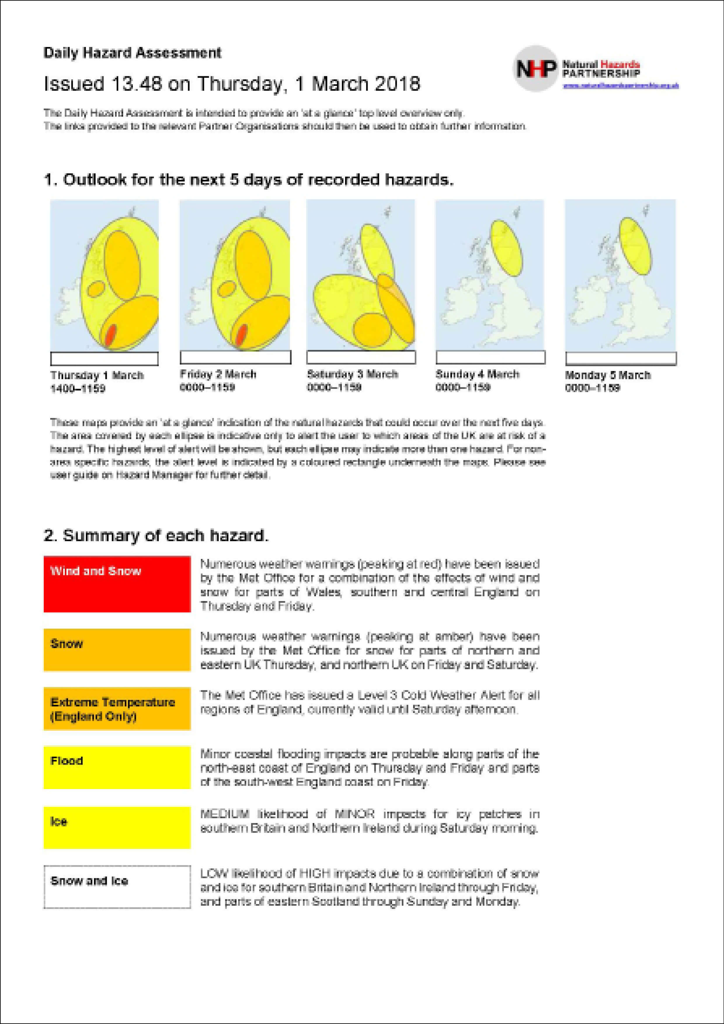
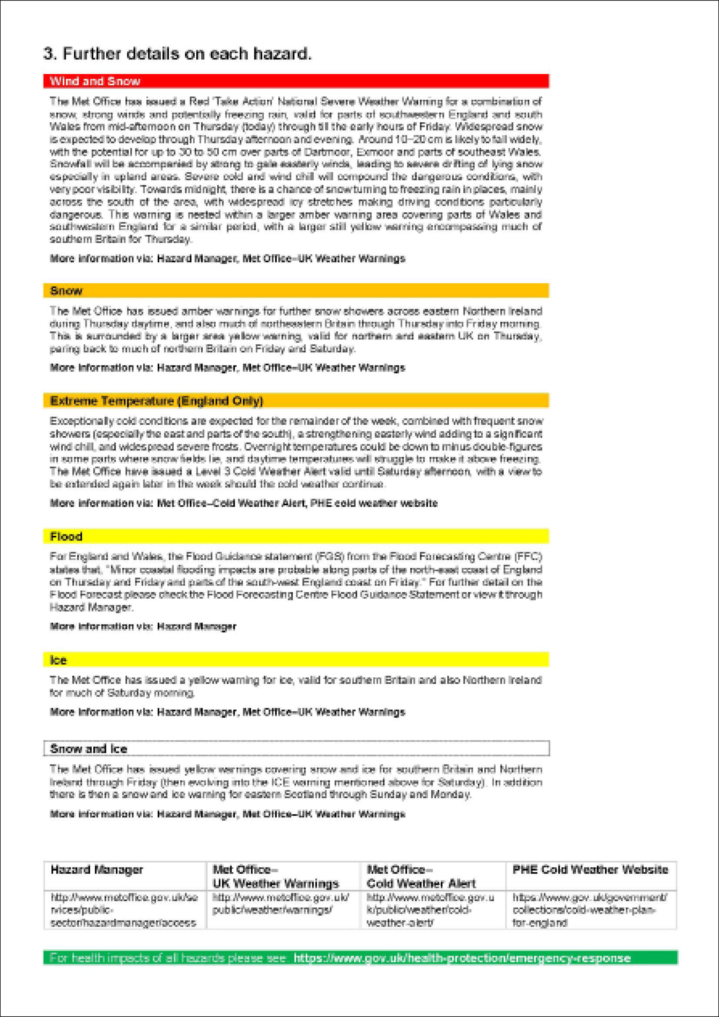
My third real job was to design the Daily Hazard Assessment for the Met Office, which is the national weather provider in the United Kingdom. As the headquarter is located in Exeter, this job was communicated and delivered via phone calls and emails.
The job aims to improve user experience with current user research and testing. As the final product is for future design referencing and the organisation has limited resources with this project, the goal is to create an easy editing document with Microsoft Word that could be edited by any employees.
The Client
The first client meeting was communicated via phone call, and it went well; we were able to understand a lot from the client side, most importantly, the constraints from the organisation as they wanted an approachable and clean design that can be easily edited by employees who did not study design.
During the process, our client has been changed twice. Our first client had left the organisation, and it was handed over to a temporary client. However, it was handed over again to a new employee of the organisation, as he needs time to adapt his duties, our schedule has been pushed back. Our clients were so nice that they were willing to accept our request to end the project as soon as we could in order to submit this as part of our real job submission, and we finished all the materials by early May.
The Process
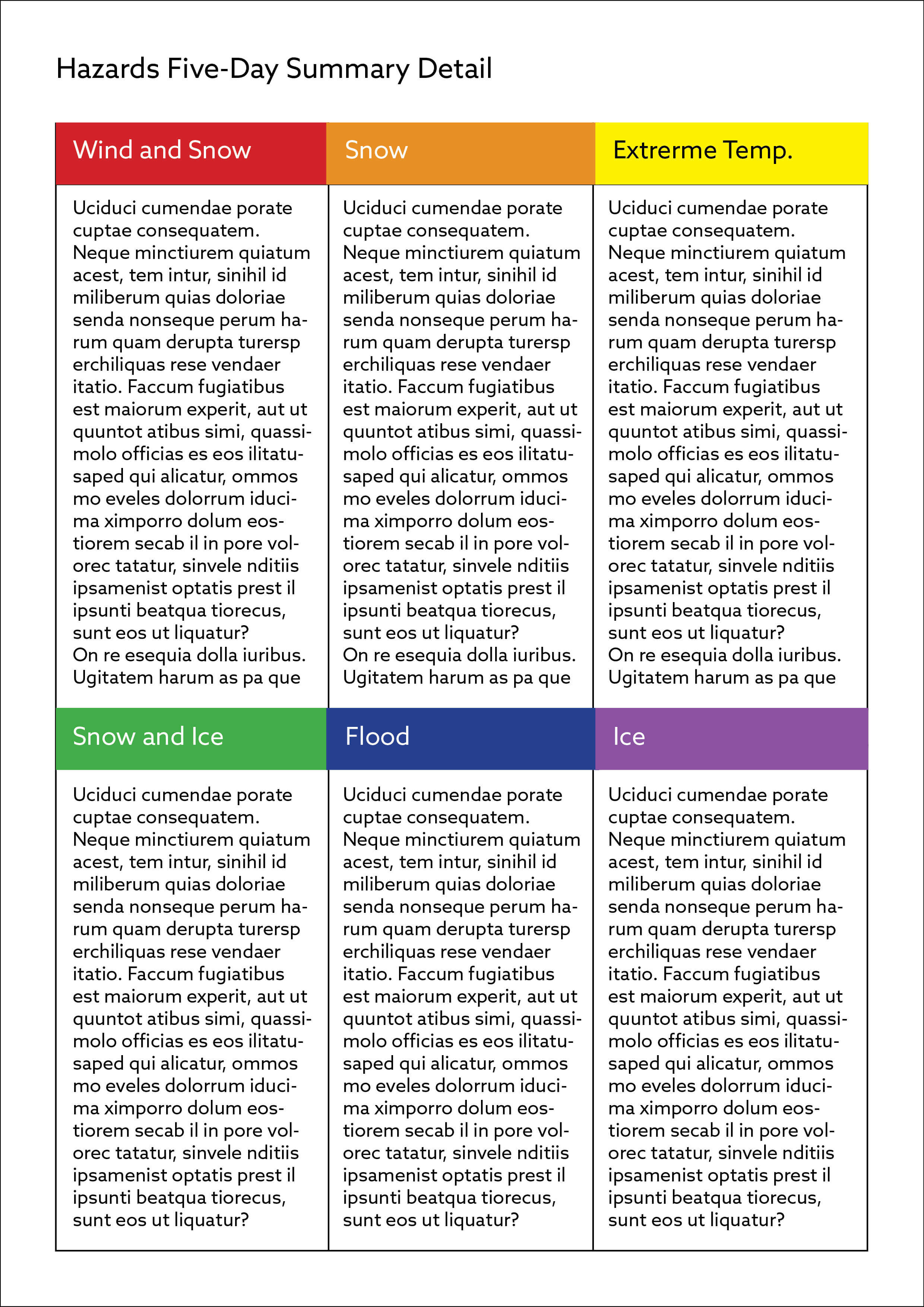
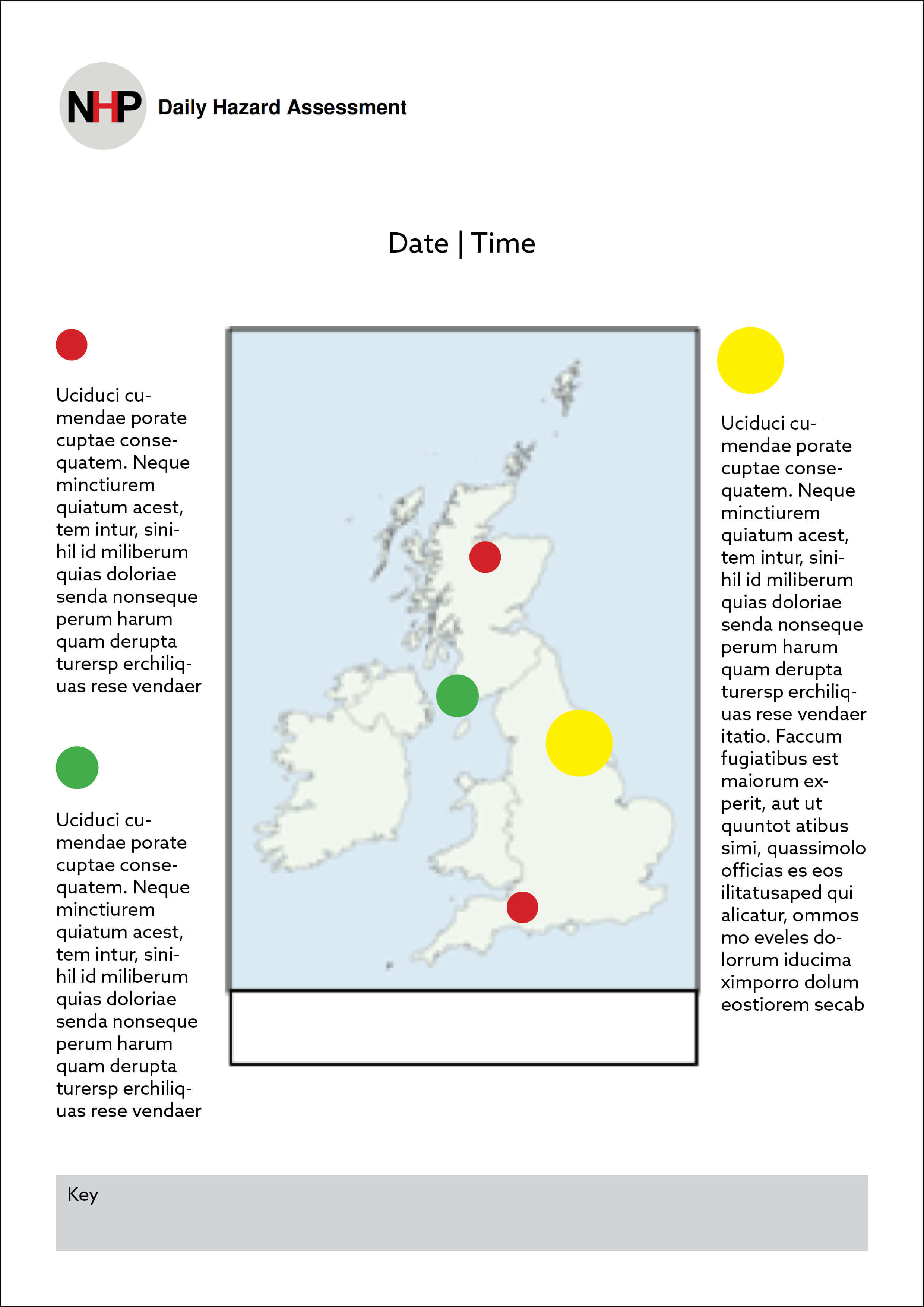
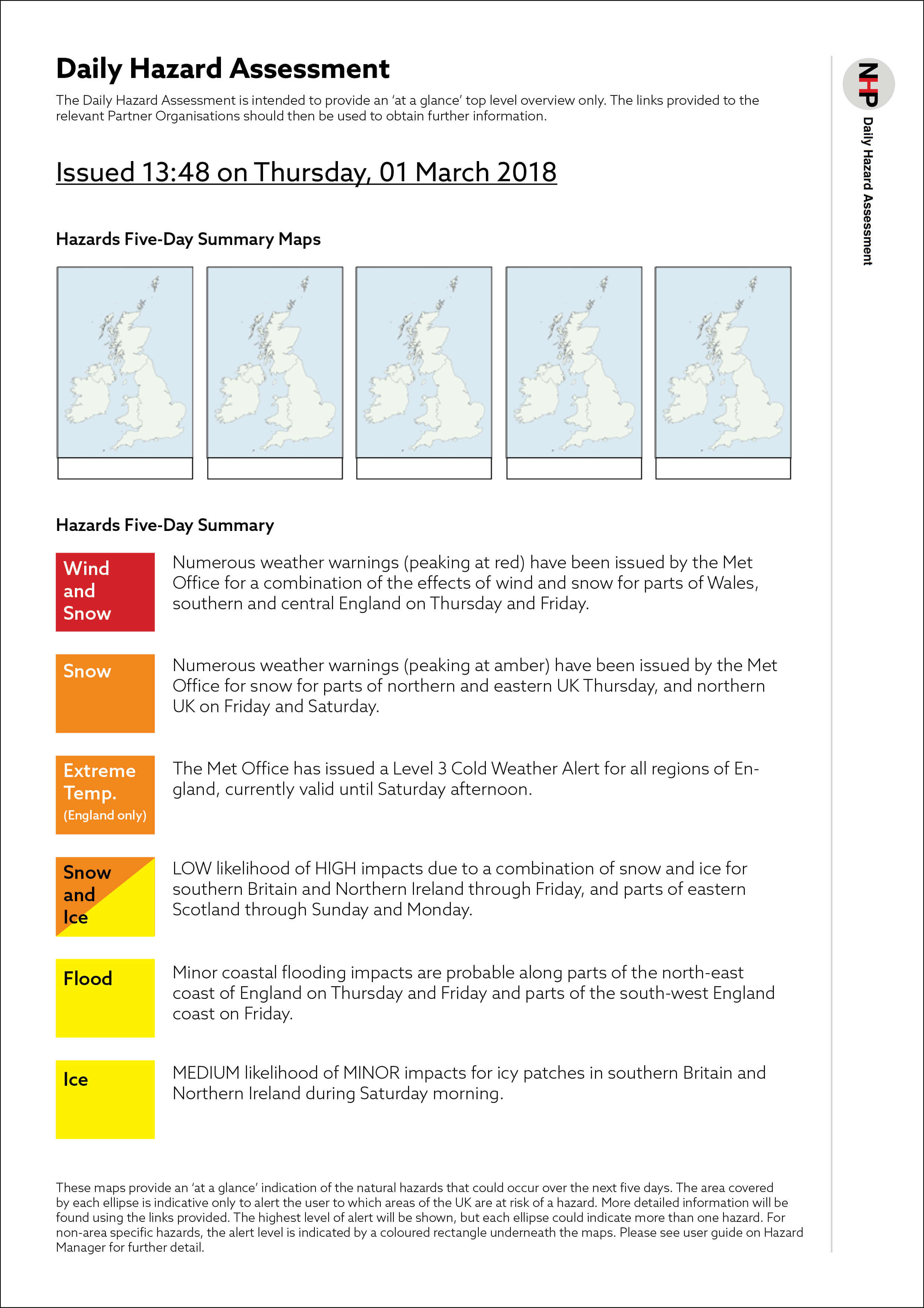
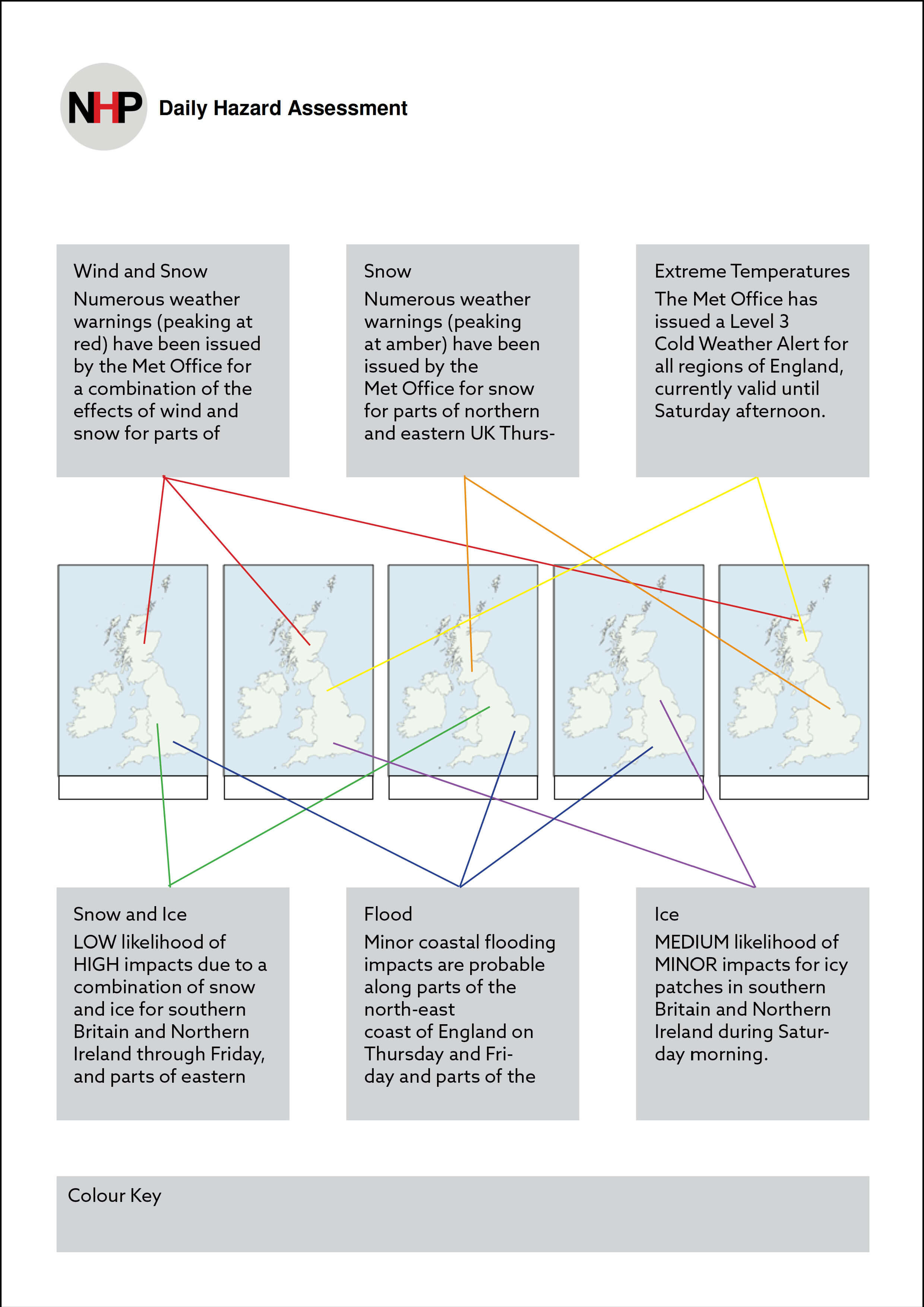
In the design process, we have first made initial layout sketches as the layout has considered the main issue to solve. With a clean and organised layout, it helps users to be able to identify their target information intuitively. At the same time, we had studied the user testing undertaken by the organisation. We have noticed the order of the information being seen, and the existing information order is not parallel. Therefore, we reordered them, starting from the maps, then summary and details, and ending with future issues.
We have tried complicated and fancy designs at first. However, we figured out the usability is lower with these concepts and layout. After discussing with our supervisor, we then focused on making the design as clean and clear as possible, with less decorative elements.
Afterwards, we have focused on refining the typographic issues, such as text length, rephrasing terms and copy editing. This is a new challenge for both of us as we were usually only correcting simple typographic issues like punctuation, readability and hierarchy with the provided text. We gave many thoughts on using the correct terminologies and erasing the unnecessarily needed sentences.
During the Friday real job meeting, we have also discussed our problem with our lecturers and getting comments from both our lecturers and fellow classmates. These feedbacks are useful as the document is for emergency use, which the first impression and intuition of the information are important.
My partner and I have consistently refining small details of the document in the later part of the project. As our client was happy with the layout and concept, we tried to refine the document as error-free as possible, in order to make the document to be used as smooth as possible.
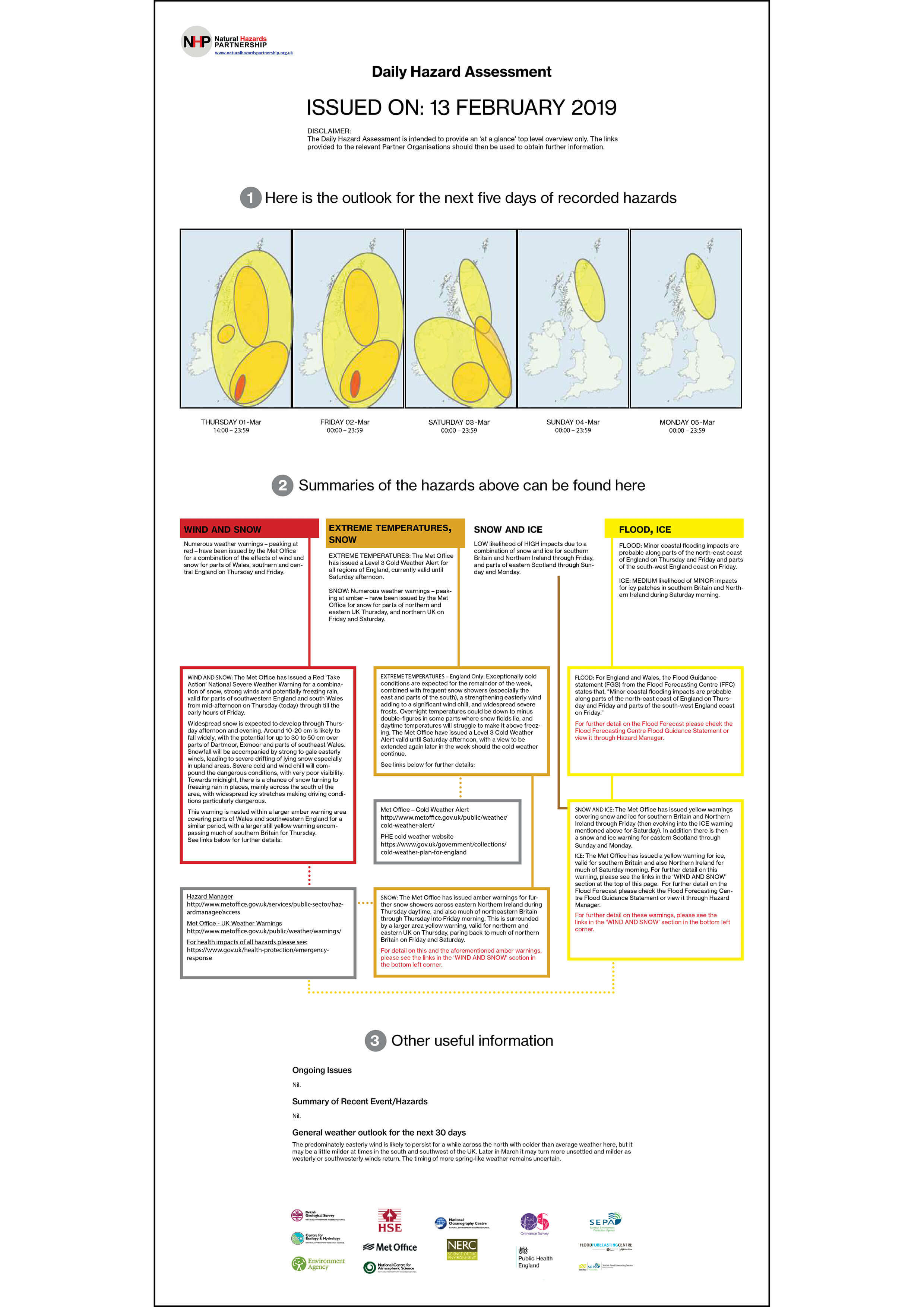
In early May, we have called our client for the final phone meeting. Our client has expressed his joy in receiving our design, which he thinks the document we created would definitely help and influence his team for future document design. He also stated the clearness and linkage between sections work well, while the way we ordered the sections are well considered.
Initial Ideas Examples:
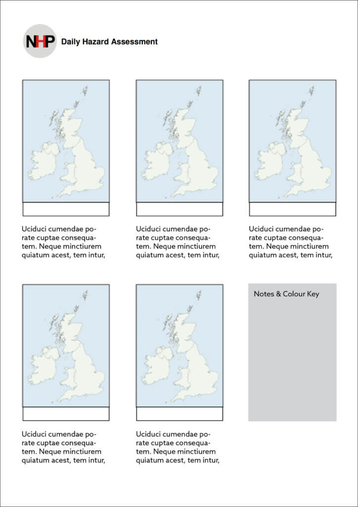
Developing Ideas Examples:
The Challenges I Faced
As this real job was promoted as a digital product, my partner and I thought it would be an app or website. However, we later figured out it is a word document that contains images made with powerpoint. Since we usually design fancy products with Adobe Creative Suite, this job is a challenge for us, as the aim of this job is to create a clean and approachable design with Microsoft Word.
Moreover, as we communicated via phone call and email with our client, sometimes we might not receive their reply as quick as we wanted. Therefore, I have learnt that we should approach our client proactively when we want a quicker reply, as they might have other duties to work on and lower the priority of this project.
The Experience I Gained
As we rarely use Microsoft Word as the tool to design, it is an exciting challenge for us. We had overcome it by the help from our supervisor and lecturer, Matthew and James. As images and text can be placed freely in Adobe Creative Suite, Microsoft Word has limits with this. This might due to the software’s target audience is the general public, while Microsoft aims to design the software with an approachable and fixed setup. Since most users used Microsoft Word as a text document, images have to be locked to prevent moving along with the text, while text should be placed in a table in order to create a less problematic file for our client for their future use.
Final Reflection
Even though there were many challenges during the process, I have learned a lot from this real job. For example, as our client is working in a big company, the volatility of its employees and department structure change are high. As a designer, we should expect sudden change and allow more time for them to give us replies and comments. In addition, the employees might have many duties to follow up; the priority of the project might be affected as well.
Final Design:
