Overview
Bethan Miskell is an artist who’s planning to open an online shop where she can sell her artwork. She creates pressed flower pieces that aim to celebrate the importance of plants or weeds that may be overlooked or not seen as typically ‘pretty’ but are considered to be ‘hero’ plants that are essential for biodiversity.
Our brief was to create a unique brand and logo for Miskell’s shop that can be used on multiple platforms such as her website and social media, to help promote and represent her business.
Deliverables
The original deliverables were to design a logo and a business card. However, we also suggested the addition of a ‘Thank you for your purchase’ card and a variation of logos such as a primary, secondary and social logo, therefore she would have a logo that fits multiple different formats.
Client meeting
To understand our client better and to introduce ourselves we had organised a meeting to help us learn more about the story behind our client’s artwork and the style/aesthetic she is looking for regarding her brand. We found out from the meeting that she wanted a cleaner and simpler typeface that was geometric in shape, meaning no curvy or script typefaces. Our client used words such as botanical and organic to describe her business and she directed us to a brand called ‘Hiedi Clover’ as an example of the style that she likes.
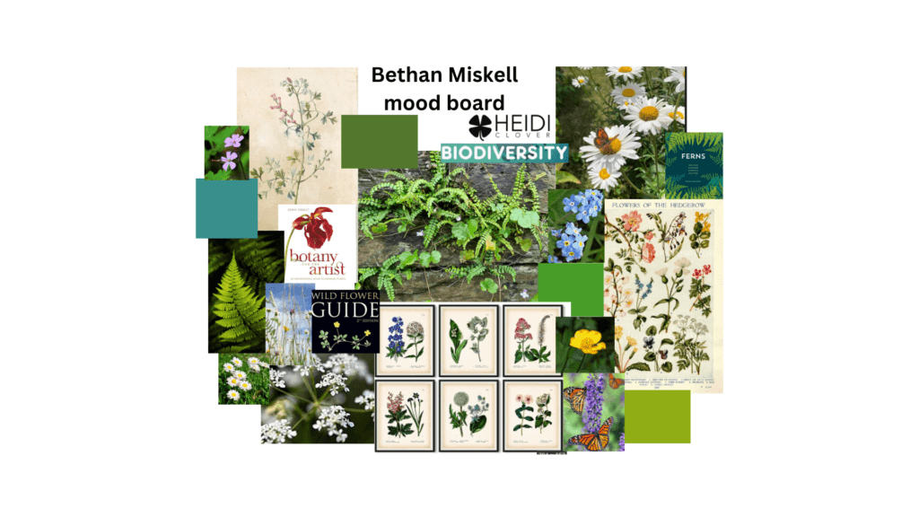
Our client also kindly sent us a mood board of plants, colours and aesthetics that she would like to be reflected in her branding (see figure 1).
Research and ideation
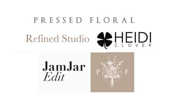
Our research started by finding existing flower press companies online and viewing how they branded themselves. We found most floral companies in general tended to use serifed fonts and italic typefaces (as seen in Figure 2) therefore, it was hard to find brands that used more geometric fonts as our client had described.
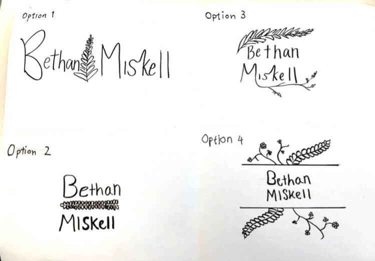
We then sketched a few ideas of designs for the logo and narrowed it down to four different options as seen in Figure 3. Option 3 and 4 seemed too decorative for our client and she stated she wanted a simple clean look; therefore, we focused on creating digital versions of options 1 and 2.
After seeing the kind of logos already out there we then looked through a range of fonts and narrowed it down to three typefaces that we felt suited our client’s style the most. We then combined the typefaces with the icon of the fern we created as seen in Figure 4.
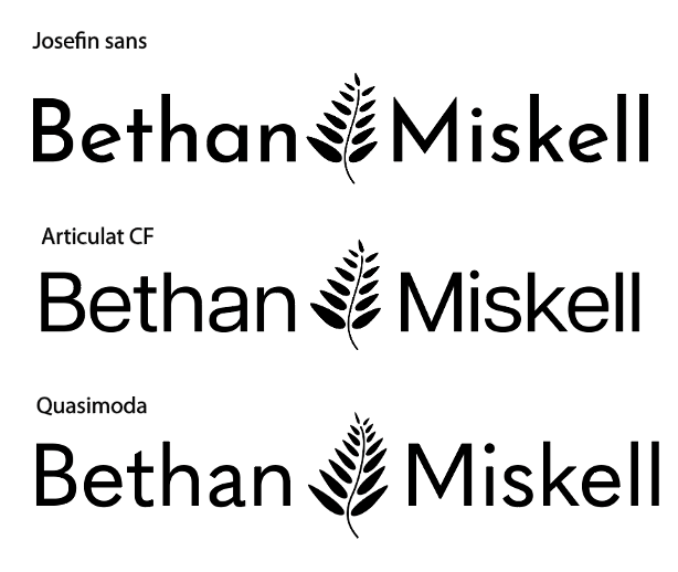
We then experimented with different layouts and illustrations (Figures 5, 6 and 7). The feedback from our client was that she preferred the Quasimoda typeface and the bolder designs, and both our client and supervisor reported that some of the illustrations were too light. We realised that for the logos to be seen from far away we had to make the strokes thicker for the illustrations and use a heavier weight for the typefaces.
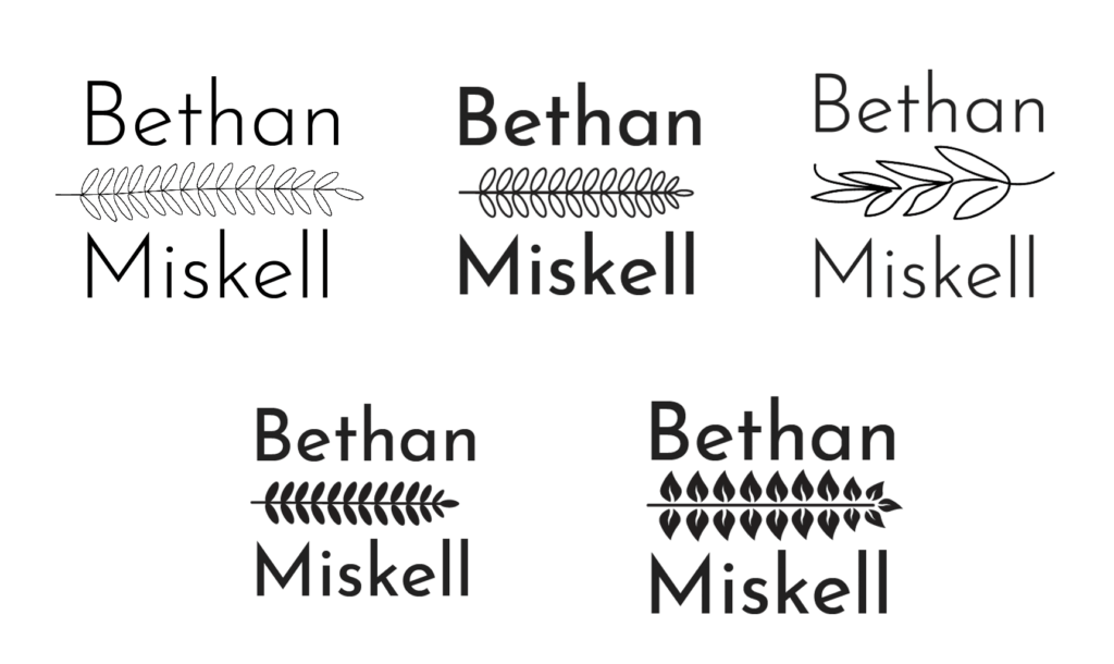
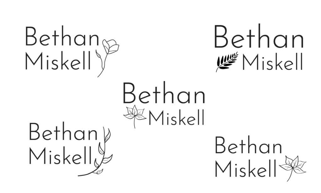
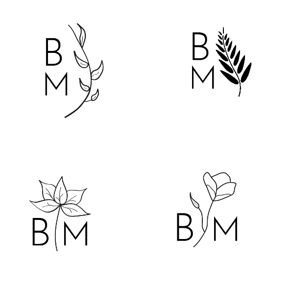
Our client also reported that she preferred the style of our original fern illustration rather than the other symbol designs. This feedback helped us focus on creating bolder and thicker designs.
Design development
My partner in this project, Karissa, created another fern illustration which we thought worked better as it was less rigid than the first design but still bold enough to stand out when scaled down. We created two versions of the logo, one with a filled-in illustration (Figure 8) and one with an outlined illustration (Figure 9).
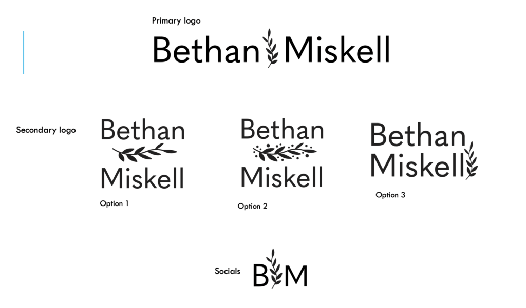
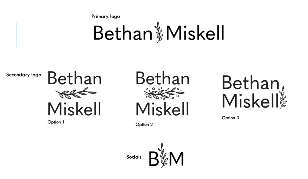
We originally didn’t have option 2 but when we showed our supervisor our designs, she suggested we add to the illustration in option 1 as there was quite a lot of white space in between the text and the illustration, which might create too much separation between ‘Bethan’ and ‘Miskell’. Therefore, to fill this white space we added a few dots around the fern as this was a design, we had seen before in a few botanical patterns we found during our research. We also provided a third option for the secondary logo to give our client another option to choose from.
Our client’s feedback was that she liked the new designs, but she preferred the filled-in illustration, and that option 3 would be the best option for her secondary logo.
Business card
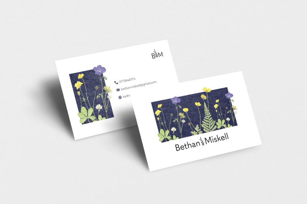
Once our client had approved our final logo designs, we moved on to developing her business card. My partner and I knew we wanted the business cards to have a botanical feel to match our client’s aesthetic, originally, we were planning to draw a few plants or shrubs to apply to the business card, but our supervisor pointed out that it might be better to include our clients own work so that it better represents her business. Karissa and I suggested this idea to our client, and she liked the idea. In our following meeting, our client kindly gave us one of her pieces which we scanned onto Karissa’s laptop and then we used Photoshop to cut out the pressed flowers so that there was no background, we then applied these cut-outs to the business cards.
After looking at a range of different business cards for inspiration we started designing our own. Our original design was very plain and only had her artwork on the card with her logo. It didn’t feel like a business card, so we decided we needed to add a background or another colour to add more depth to the card. We added a light green background (figure 10) and experimented with making some of the flowers pop out of the border (figure 11) we then added abstract shapes to the art (figure 12).
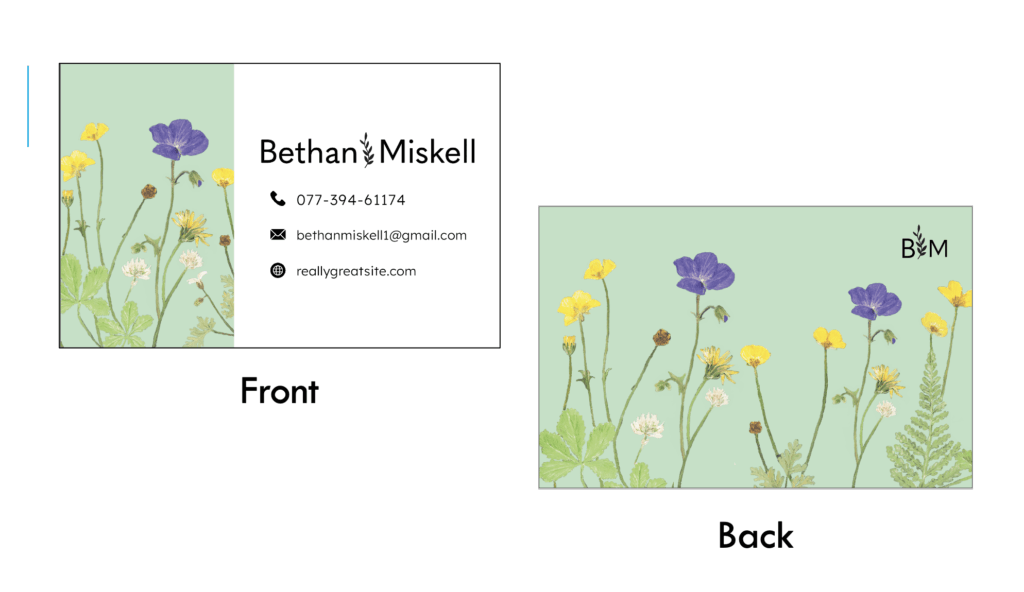
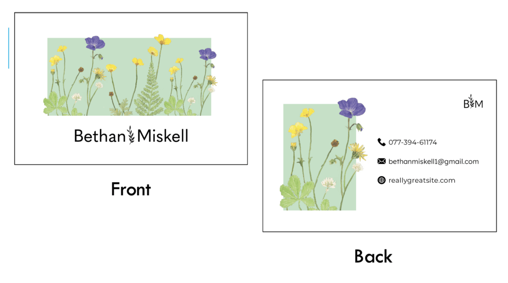
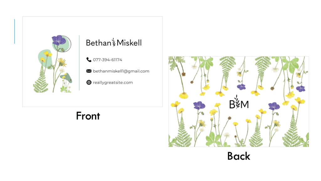
However, feedback from our client was that she didn’t like the abstract patterns, so we didn’t continue to add this element to the other business cards. We also realised that the flowers blended too much into the light green background so we decided to use a darker colour instead (Figures 13 and 14), which made the flowers stand out much more, we also thought this would match our client’s style more as she usually presses her flowers onto black card.
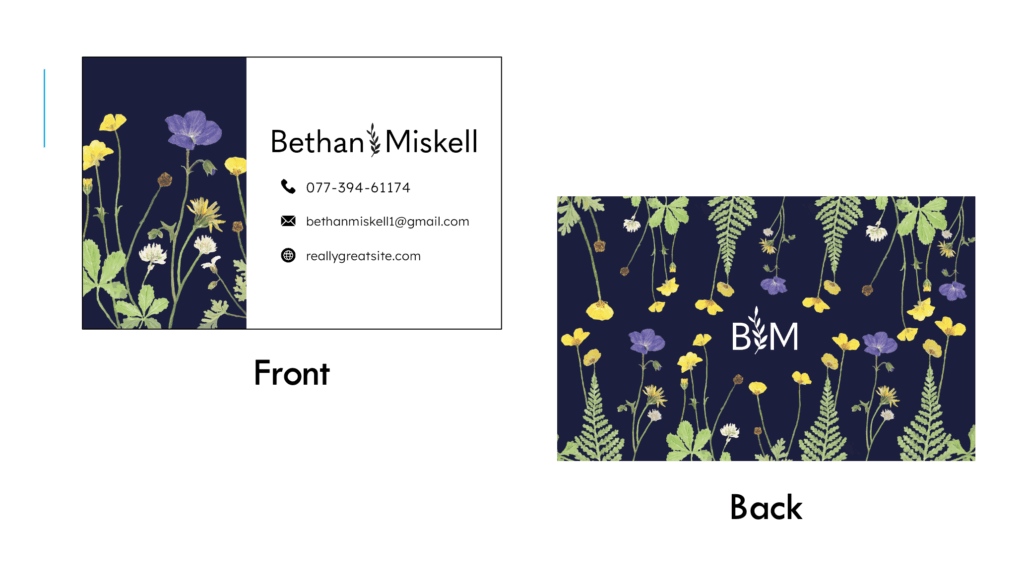
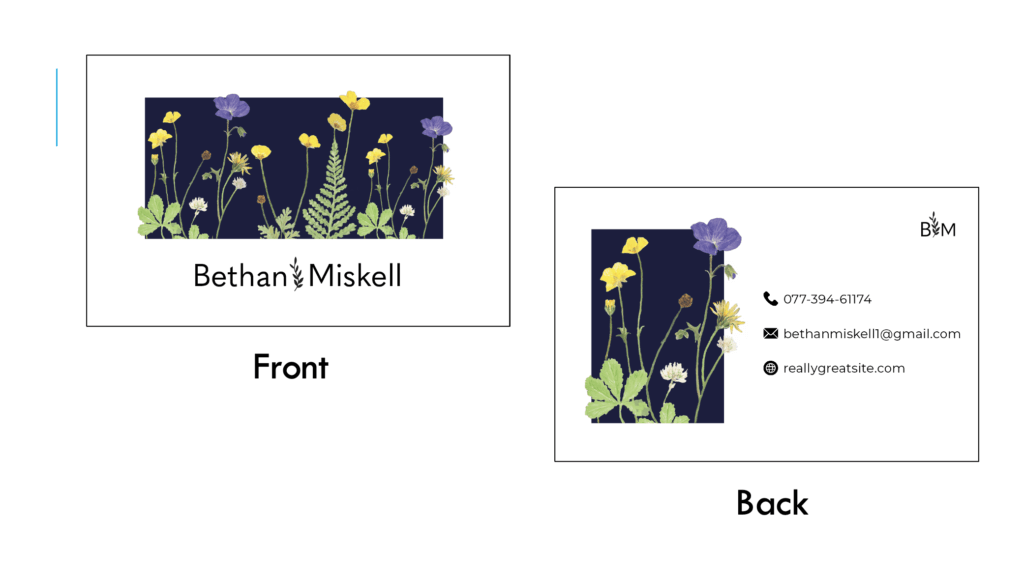
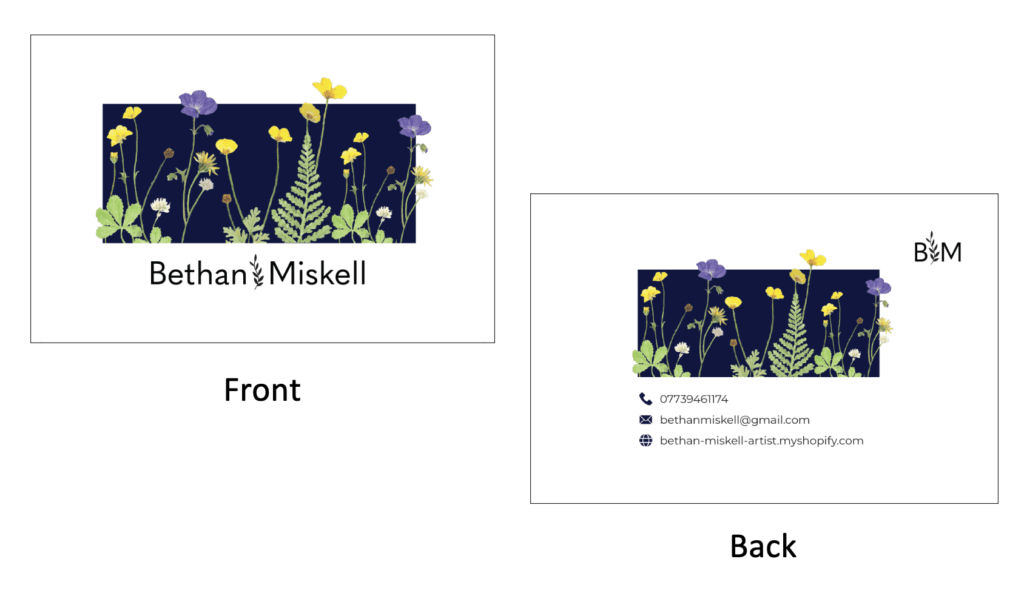
Our supervisor’s feedback was that the text was too close to the edge and that we didn’t need the dashes for the phone number as that is more commonly done in America not England. After making these adjustments we showed our client and she expressed that she liked the layout of Figure 14 the most. Our supervisor then suggested that we should adjust the layout of the back of the business card to match the front to give it a more uniform feel (Figure 15). However, after showing our client the change, she said she would prefer to continue with the first layout.
‘Thank you for your purchase’ card
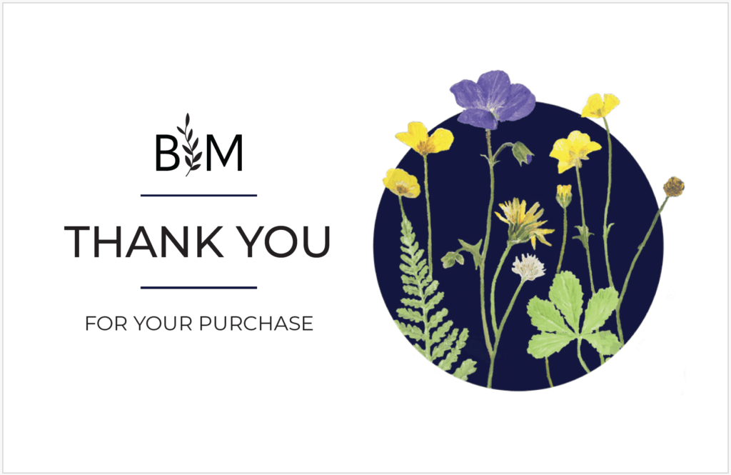
When it came to designing the “Thank you for your purchase’ card we wanted to ensure that we kept a cohesive style between the two cards to make it clear that they are part of the same brand. To achieve this, we continued using our client’s artwork, and the same typeface as well as colour. We used the typeface ‘Montserrat’ for the text as it was the most clear and complimented the brand’s typeface (Figure 16).
Reflection
Overall, I have learnt a lot throughout the process of this real job, especially around time management and the importance of keeping to the schedule. My partner and I met up regularly to work on the project, however, I felt we should have implemented regular meetings with our client as well, as this may have improved communication and potentially sped up the process a bit more. Although we surpassed the initial deadline I’m pleased with the outcome of our final designs and feel they have achieved what the client was looking for. I appreciate the feedback we received from both our client and supervisor throughout the process. I have gained a lot more confidence when it comes to professional communication with clients which is a skill I hope to be able to use and develop further in future jobs.

