Background
The Speech and Language Therapy Teaching and Research Clinic at the University of Reading is a clinic on the campus run under the NHS. They help children and adults who have speech difficulties, as well as providing student training to University of Reading students. The main purpose of this project is because the clinic has been around for 50 years without any visual identity …
Restated Brief
The brief for this project was to design a visual device which can be applied to digital and physical materials such as reports, websites, and letterheads.
During the initial meeting with the clients, I found out more about the clinic and their opinions on how it should be represented. We discussed any of the requirements / preferences they had for the visual device, which included:
-
- Ensuring the design appeals to both children and adults
- Create a visual device that works at multiple scales
- The full name will likely appear next to or underneath the visual device, not necessarily inside it
- The visual device must use the name in full – ‘Communication, Speech, and Language Therapy Teaching and Research Clinic’
- The visual device should not use acronyms such as ‘C STAR’
This meeting also helped to identify user needs, so that the design for the visual device is targeted to the audience of:
-
- Children (2–8 years old)
- Adults with speech and language difficulties
- Students on course / placement
- Clinicians and staff
- Wider public / families
We also discussed how the visual device should represent the clinic. Specifically, it should convey community, friendliness, collaboration, caring, feel approachable, and be clear.
Research and ideation
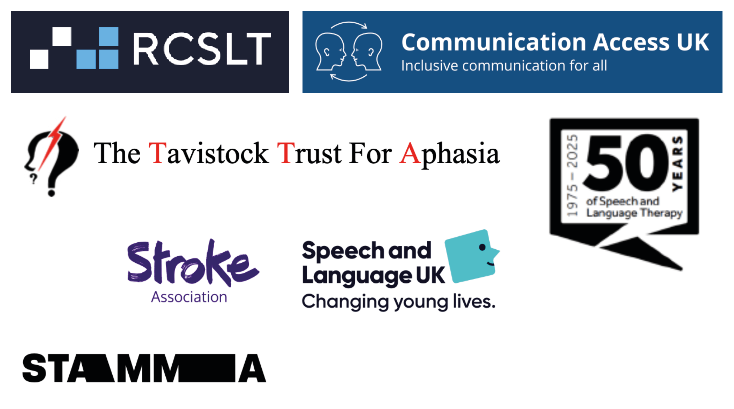
Research for this project was conducted within the clinic, as it is very specific to the University of Reading. I also had a look at other organisations within the same field (see fig. 1).
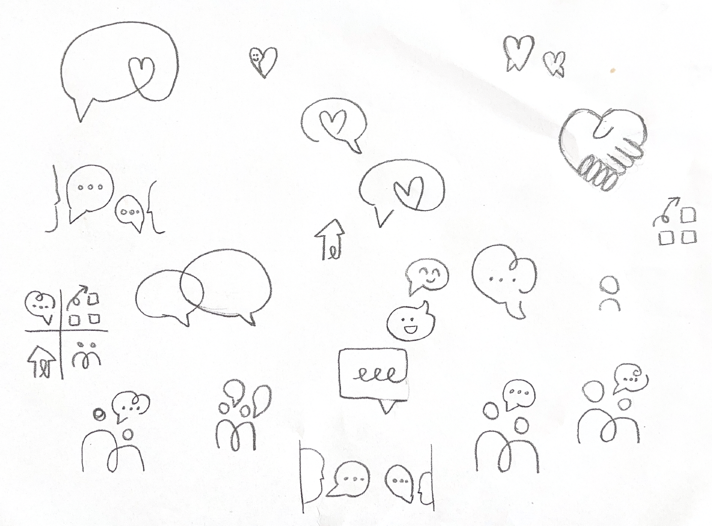
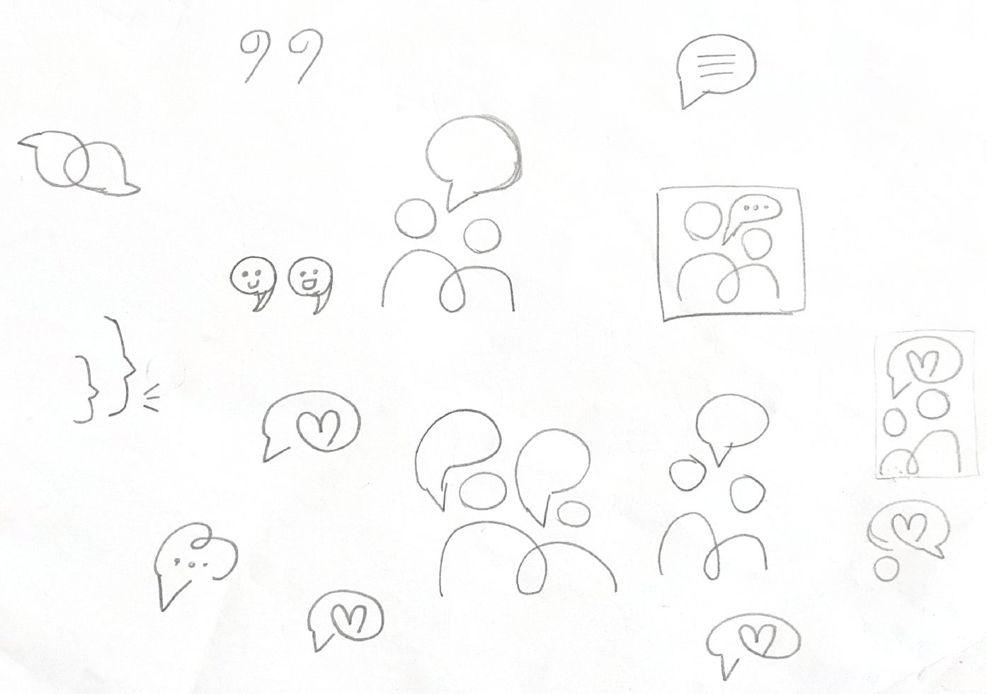
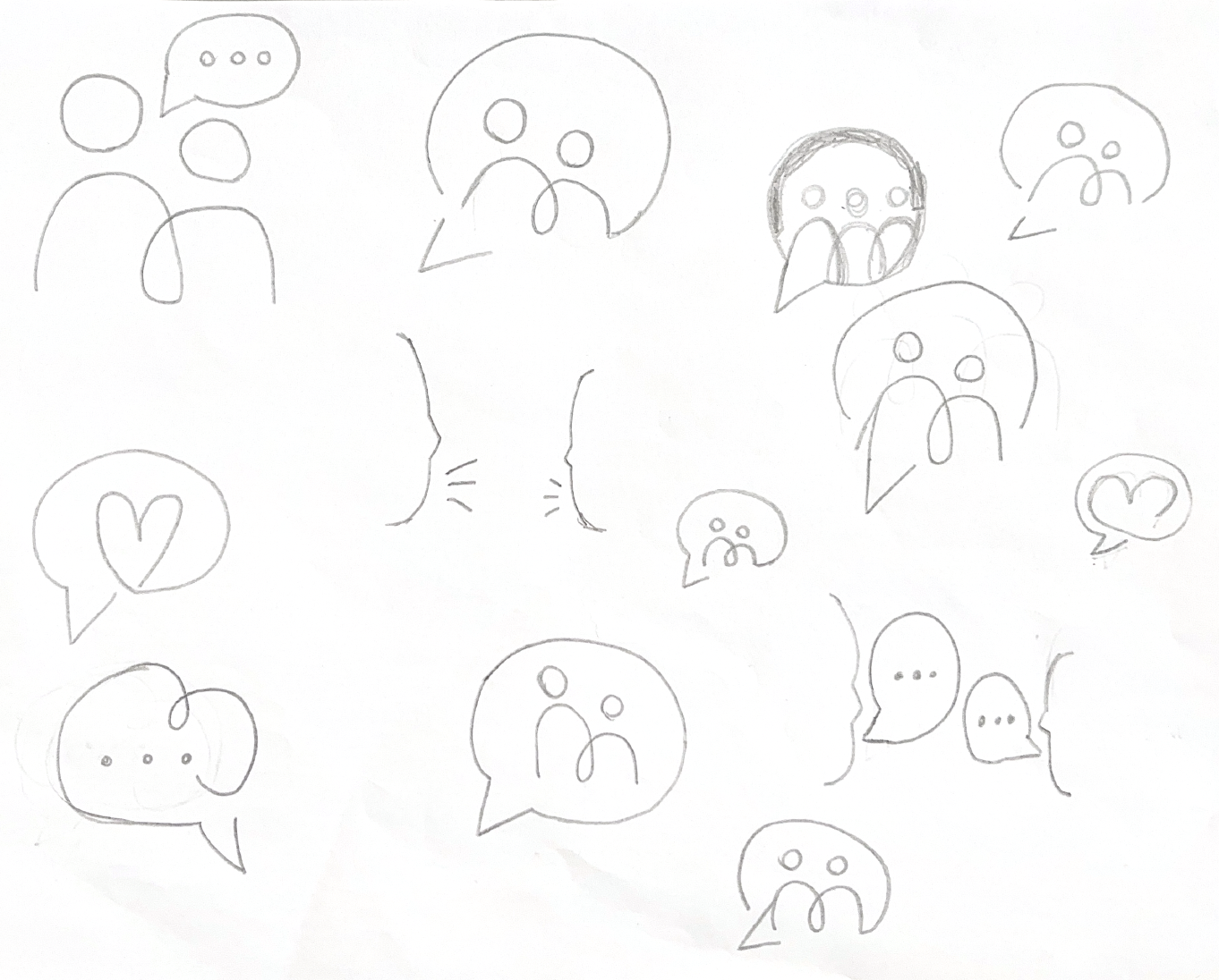
Following discussions with the clients, I began by coming up with initial sketches on paper, experimenting with different concepts taking into account the discussion with the client (see fig. 2, 3, & 4).
Design Development
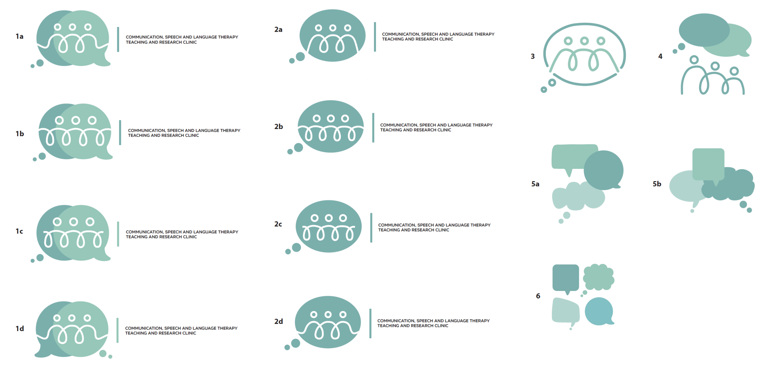
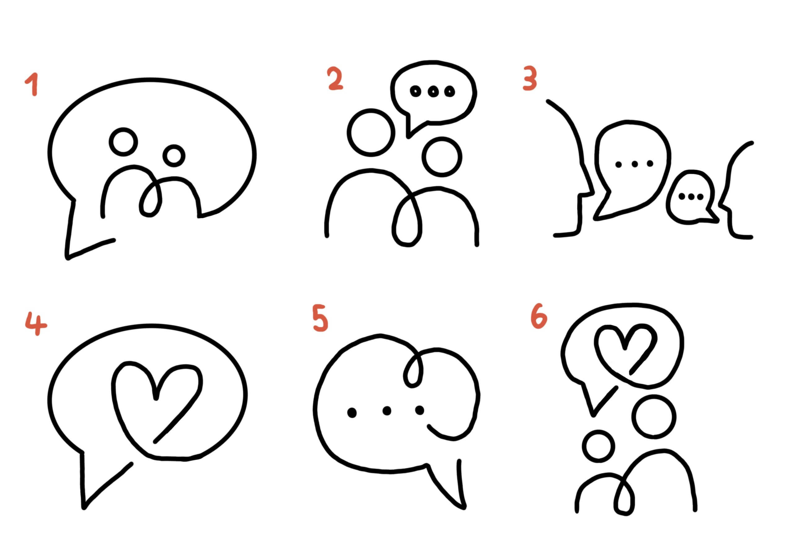
The initial designs were then refined digitally, where I came up with 6 designs to show to the client (see fig. 5). From these designs, the clients chose sketch 1 and 2 as the two to develop further. Sketch 3 was discounted because it may seem too much like two people (or a parent and child) having a conversation, and so it does not encapsulate the sense of community in the clinic. Sketch 4 and 6 was discounted because the use of the heart could convey relationship advice rather than speech therapy. Sketch 5 was discounted because it was a simpler design that the two which were chosen, and so they preferred others over this.
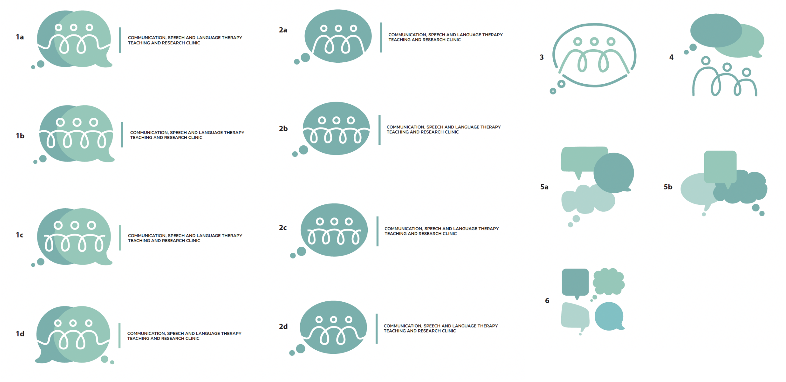
I then developed Sketch 1 and 2 further, adding colour and type. From these designs, the client’s favourites are 1a and 4, however further feedback from the rest of the client team will be given soon. From these designs, I will further develop the colour palette as the visual device need to sit alongside the UoR logo, so the colours should be complimentary. The type in this development is also not very legible, so this will be experimented with further.
Reflection
This project is currently still ongoing, and will be completed by the end of Semester 2.
Overall, there has been good communication with the client – they have given thorough feedback, enthusiastic about the project, and seem to be happy with the direction of the project so far. However, time between designing and arranging meetings could have been used more effectively. There was sometimes gaps between when the design was completed and when a meeting or email feedback could take place, and so this delayed the process.