
Background
The Craftsman’s House is a new small business which creates and renovates bespoke upholstery pieces. The brand is a sister company of an existing local furniture business, which produces items for the hospitality, office, and commercial sectors. The Craftsman’s House instead seeks to work directly with customers and offer the following services:
- Bespoke reupholstery of customers’ existing furniture items
- A range of second-hand items which the company has sourced and renovated
- The ability to create upholstered items to match customers’ furniture
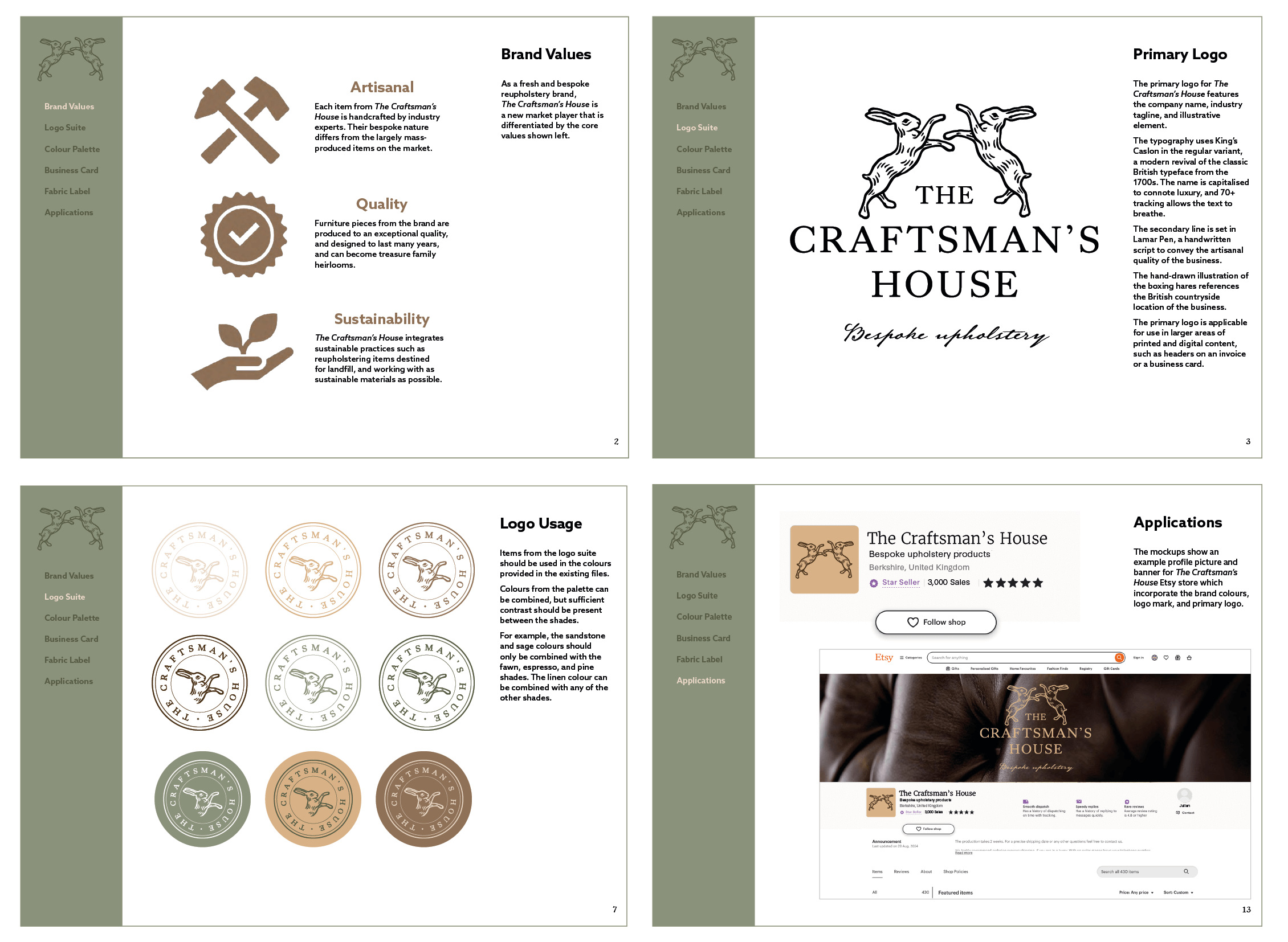
The company want to produce custom, high-quality pieces that will last for years and can become family heirlooms. Each item will be handcrafted by experts with forty years of industry experience, to offer an exceptional finish and specialist guidance. Sustainability is a core focus within the business, as their services preserve existing or second-hand furniture items, in addition to using sustainable materials where possible.
Restated Brief
To support the new business, this Real Job involved creating a cohesive brand identity which conveyed their commitment to producing artisanal, sustainable, and high-quality furniture pieces.
Creating flexible brand assets was critical to the restated brief, as these would be applicable when launching The Craftsman’s House via an Etsy shop, and later an online store. Furthermore, the branding assets would ideally be applicable to other print and digital spaces as the business grows, such as social media posts, letterheads, etc.
The client expressed that they would also be interested in deliverables which help to promote the new business and create brand recognition over time. As each item they create is unique and designed to last for years, incorporating a way for customers to recognise their products was a priority.
Therefore, we agreed on the following deliverables for the project:
- A branding system (including brand colours, typography, and a logo set)
- A business card to distribute to potential customers
- A fabric label to be applied to each piece of furniture
Research & Ideation
To develop a visual strategy for the deliverables, user personas were created to represent potential customers. This process identified how the deliverables could respond to customer needs, such as emphasising the range of different services offered, the company’s unique products, and conveying their longstanding industry expertise.
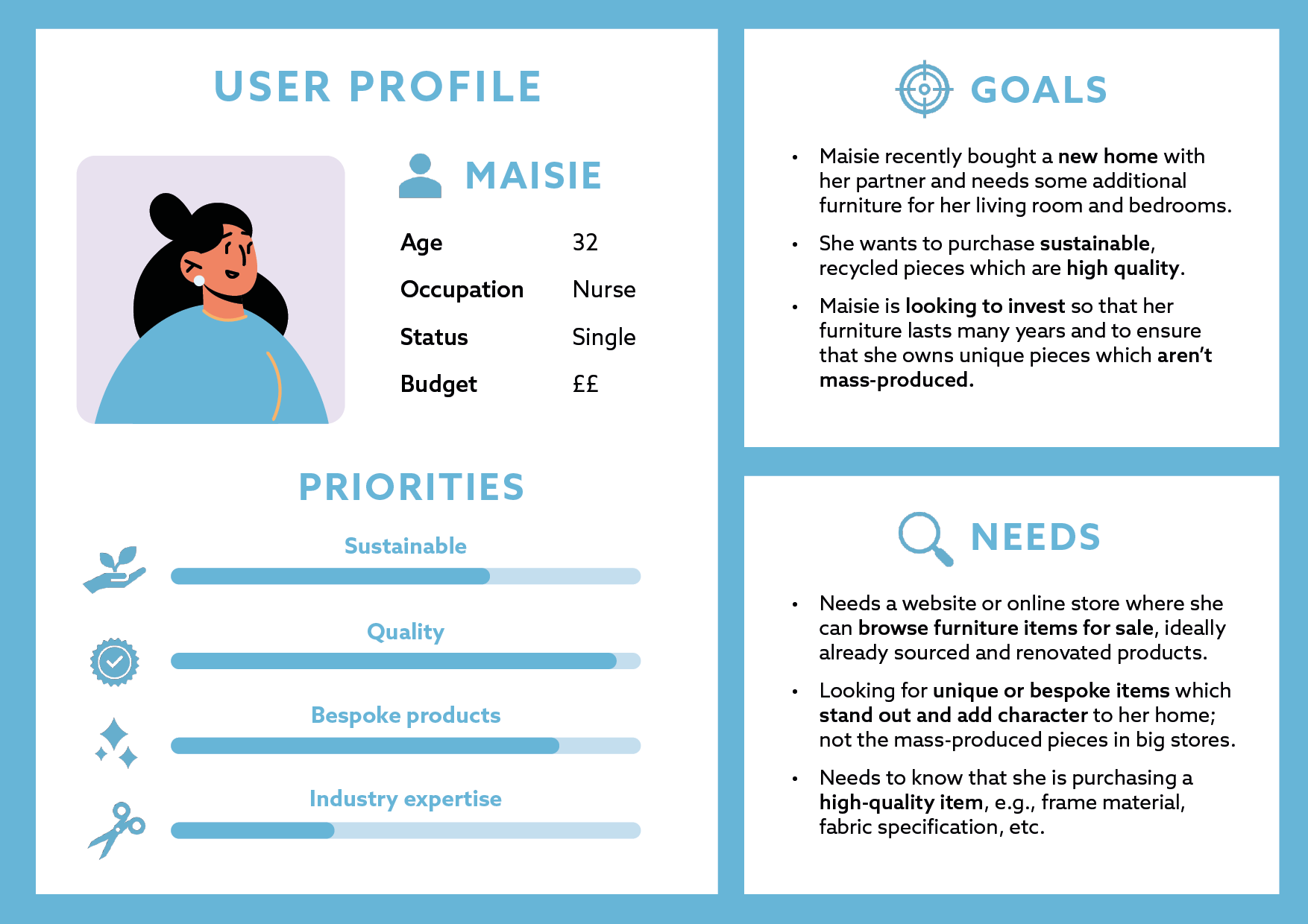
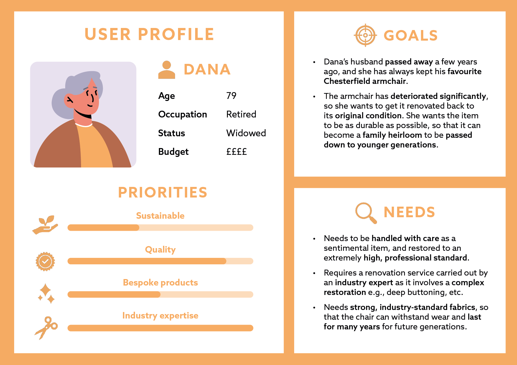
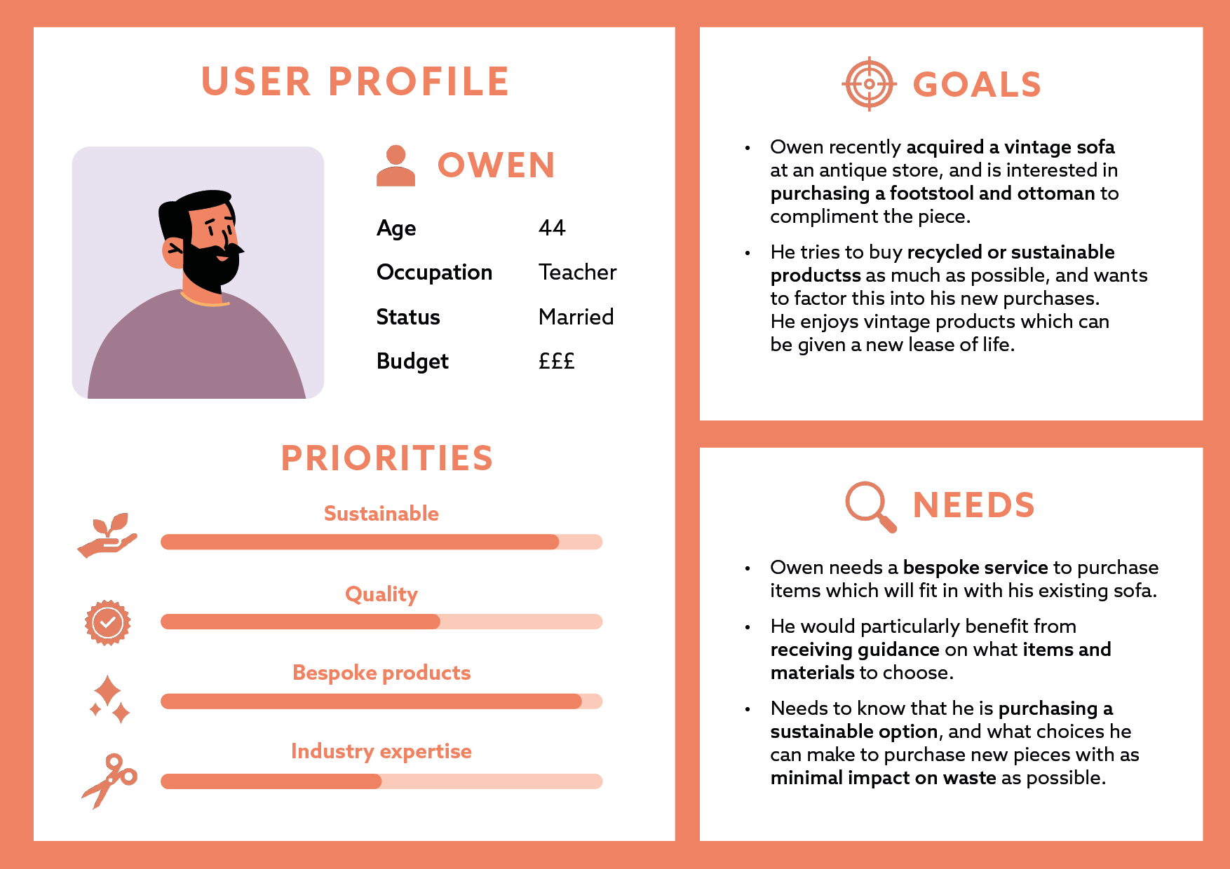
(Above) Three user personas developed to identify user needs
Conducting competitor analysis revealed that many existing upholstery companies overuse visual tropes such as sofas and armchairs in their logos, with often plain, sans serif typography. The logos struggle to separate themselves from one another and often convey corporate identities which creates distance from consumers. Conversely, the moodboard for The Craftsman’s House concentrated on curating a brand identity which highlighted their handcrafted products, and the personality of a small, artisanal business.
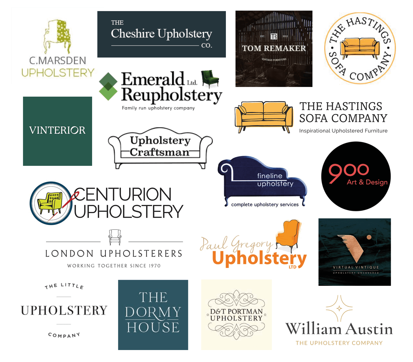
(Above) A selection of competitor logo designs , which often lack illustration or rely heavily on sofa and armchair imagery
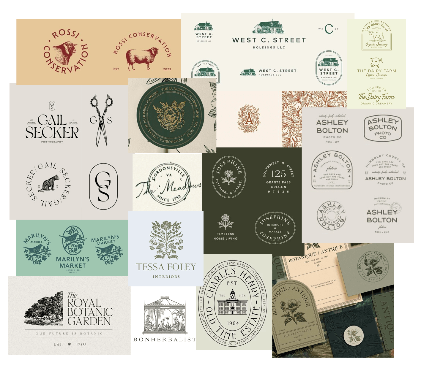
(Above) A moodboard reflecting the style and tone for the logo design and printed deliverables
To avoid the typical chair and sofa logos on the market, I created a mind map of different symbols that could reflect the industry and brand values of The Craftsman’s House.
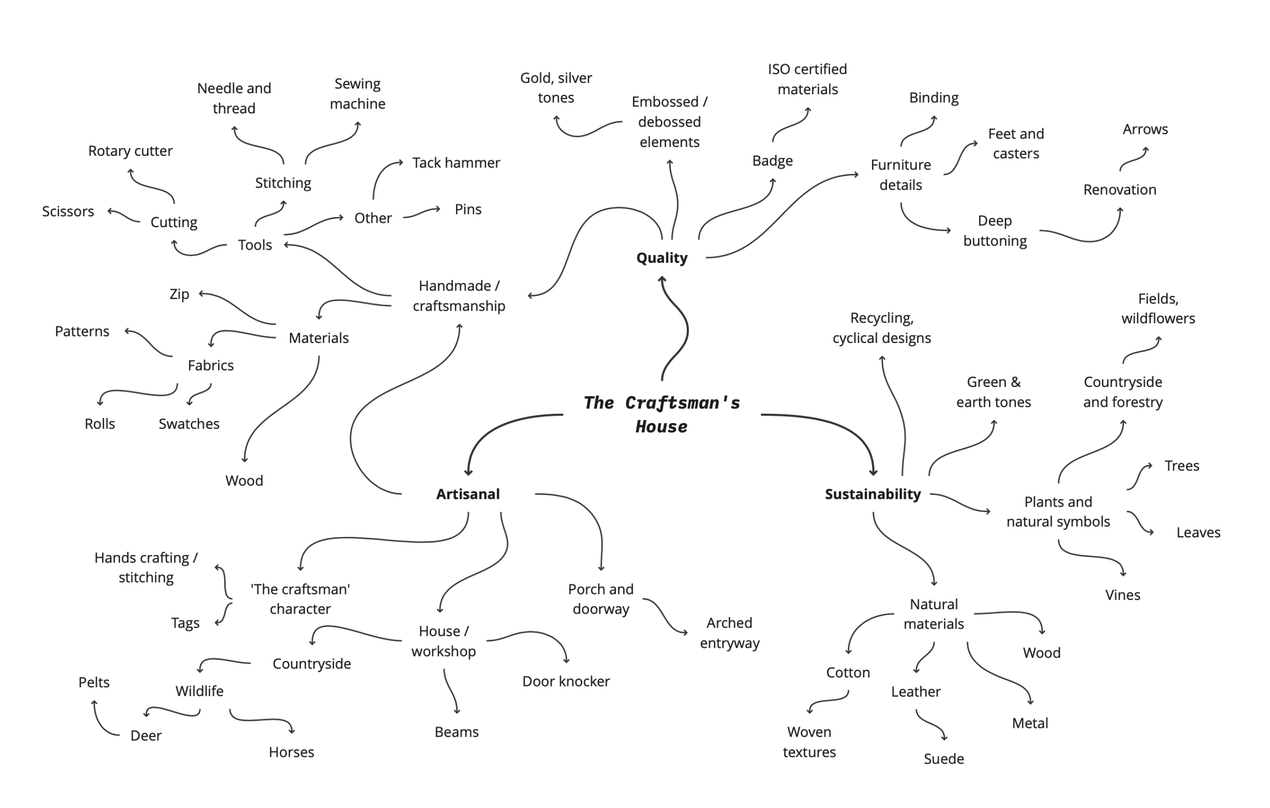
(Above) A mind map of visuals relating to the company’s brand values
The initial sketches shown below expanded these concepts by experimenting with typographic combinations, vintage border styles, and hand-drawn illustrations. Some symbols referenced the eponymous ‘Craftsman’s House,’ through a house, door, door knockers, etc. Others included upholstery tools (scissors, tack hammer, etc) or signifiers of the business’ countryside location, such as deer and hares.
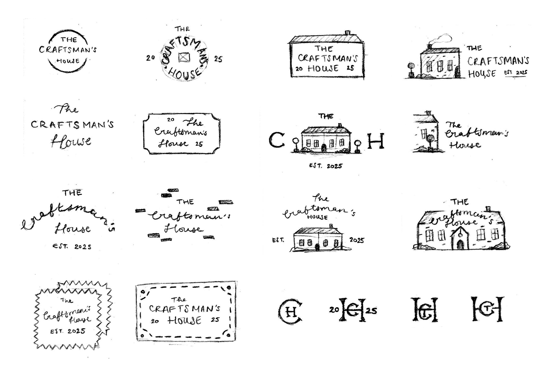
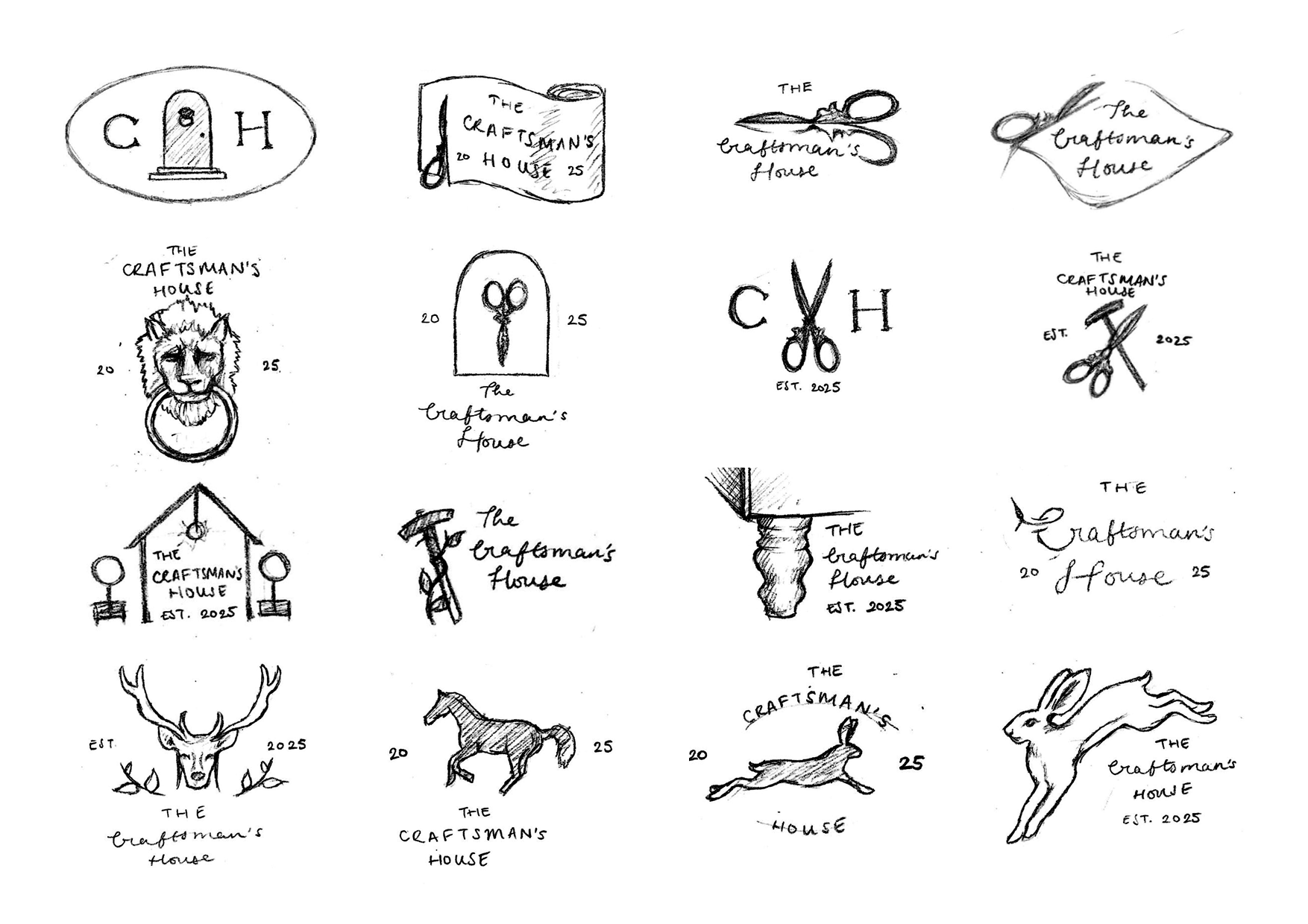
(Above) Initial sketches for the logo design
Design Development
When translating the designs into digital formats, typography was the first element to be developed. Various logotypes and monograms were made with script and serif typefaces, and combining both types helped to convey the handmade nature of the business, whilst also signalling quality.
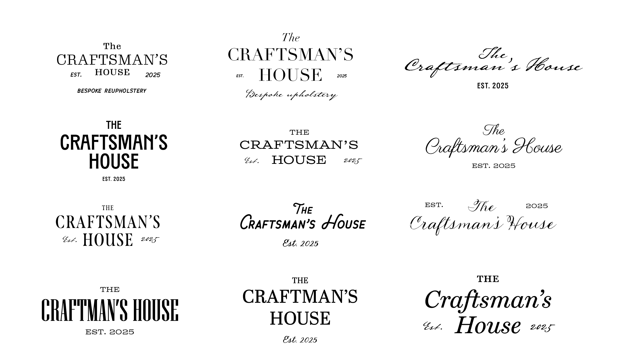
(Above) Initial experiments with typographic combinations
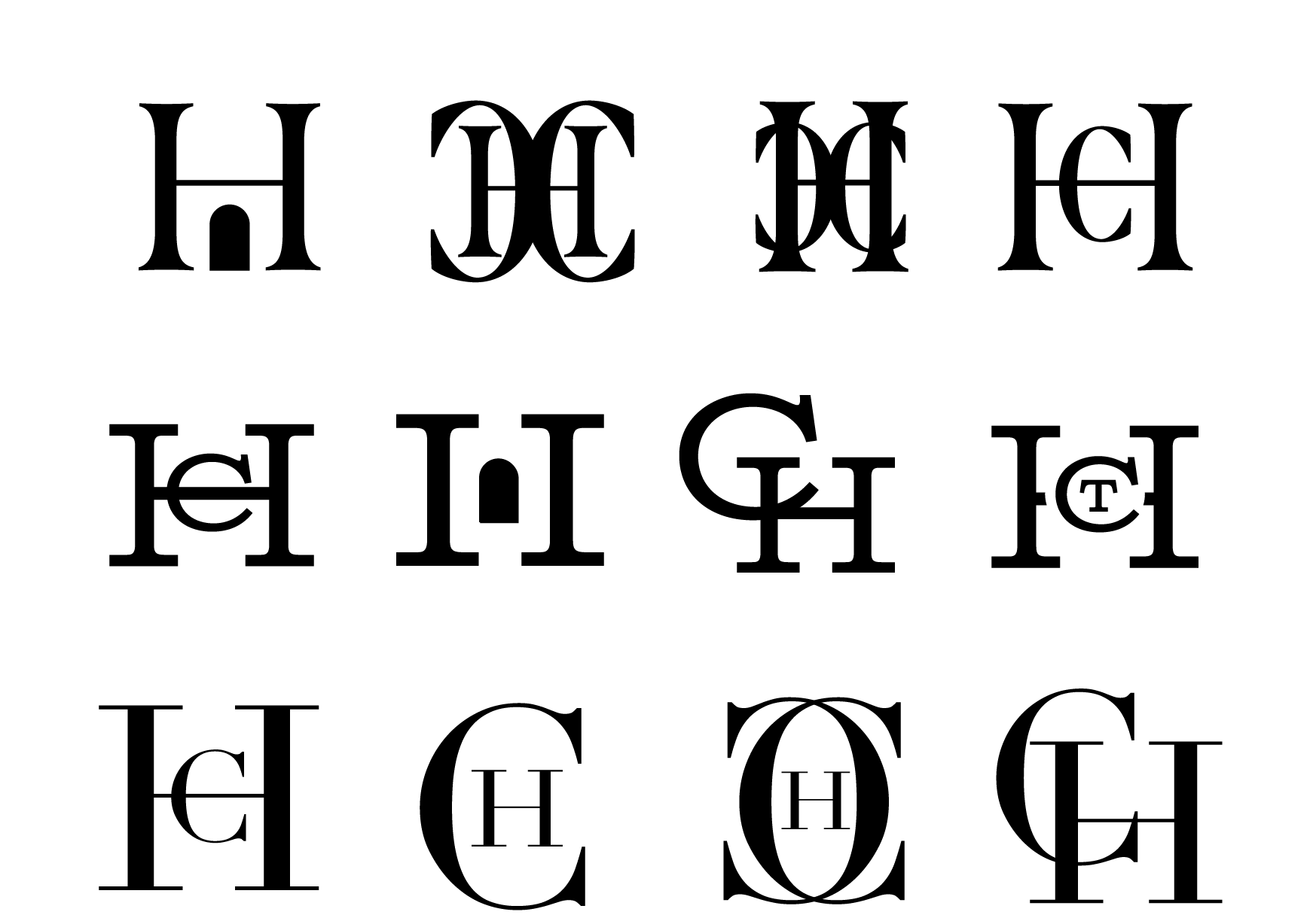
(Above) Initial experiments with monograms
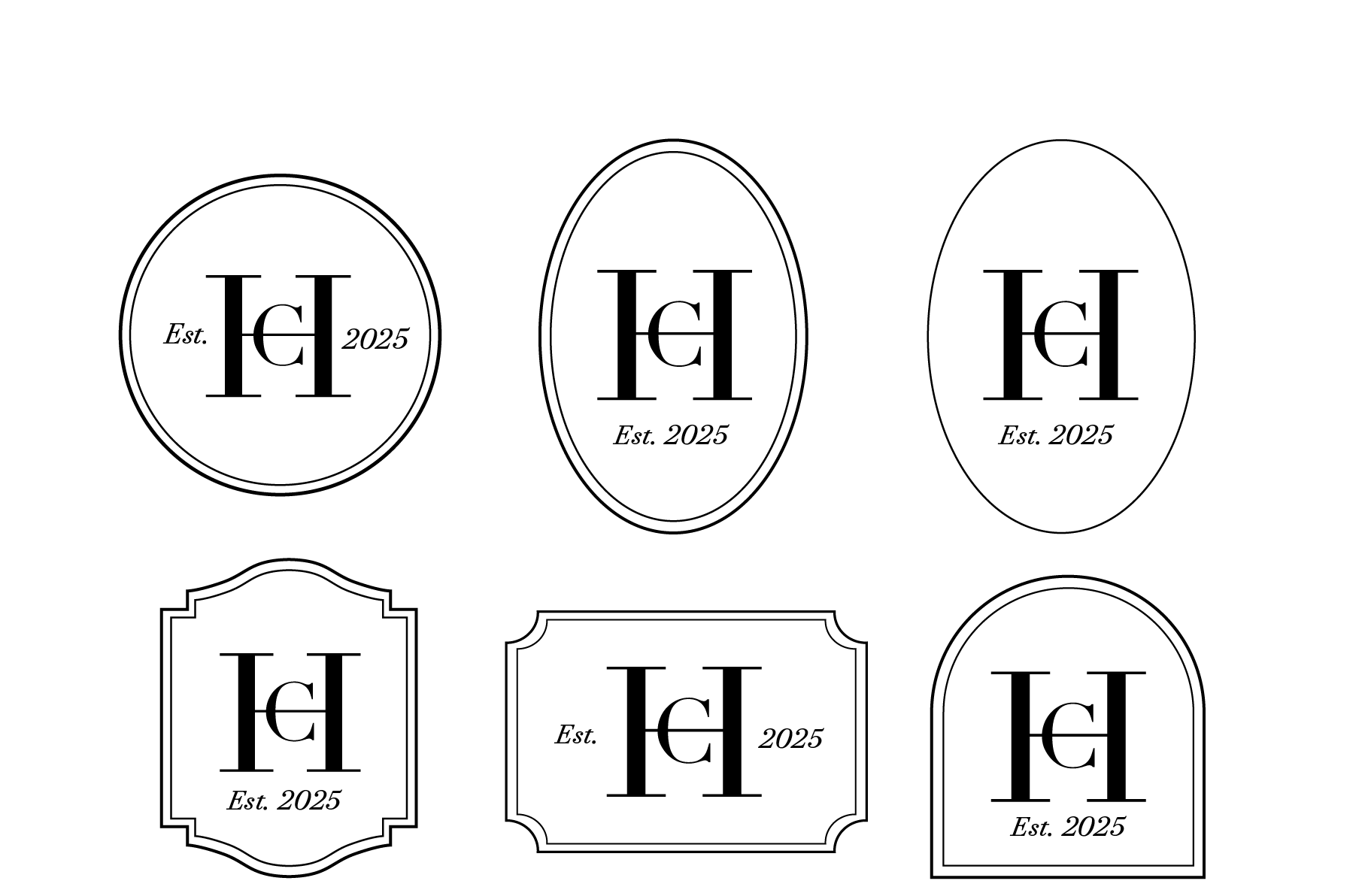
(Above) Initial experiments with vintage border styles
My supervisor suggested exploring classic British typefaces for the logo, which led me to setting the type in King’s Caslon, an Old-Style serif which originated in Britain in the 1700s. The supporting text was also set in Lamar Pen, a flowing script which references the handmade nature of the products from The Craftsman’s House.
![]()
(Above) The refined logo typography, featuring King’s Caslon and Lamar Pen
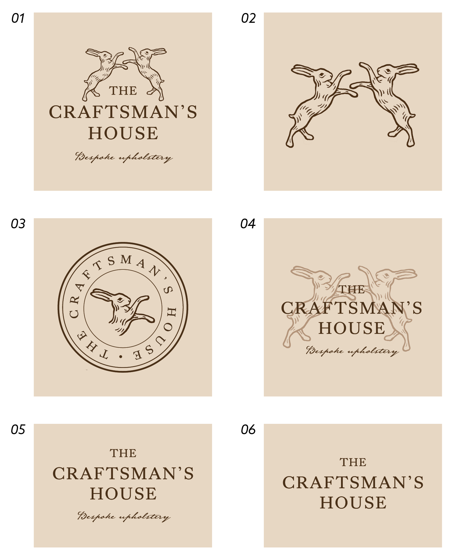
Matching the typography with an appropriate illustration proved more challenging, as vector logos (such as the deer and hare silhouettes below) proved too modern for the rustic style of the business. By contrast, my initial hand drawn illustrations of the door, lion door knocker, and upholstery scissors were too fine and presented legibility issues at small scales.
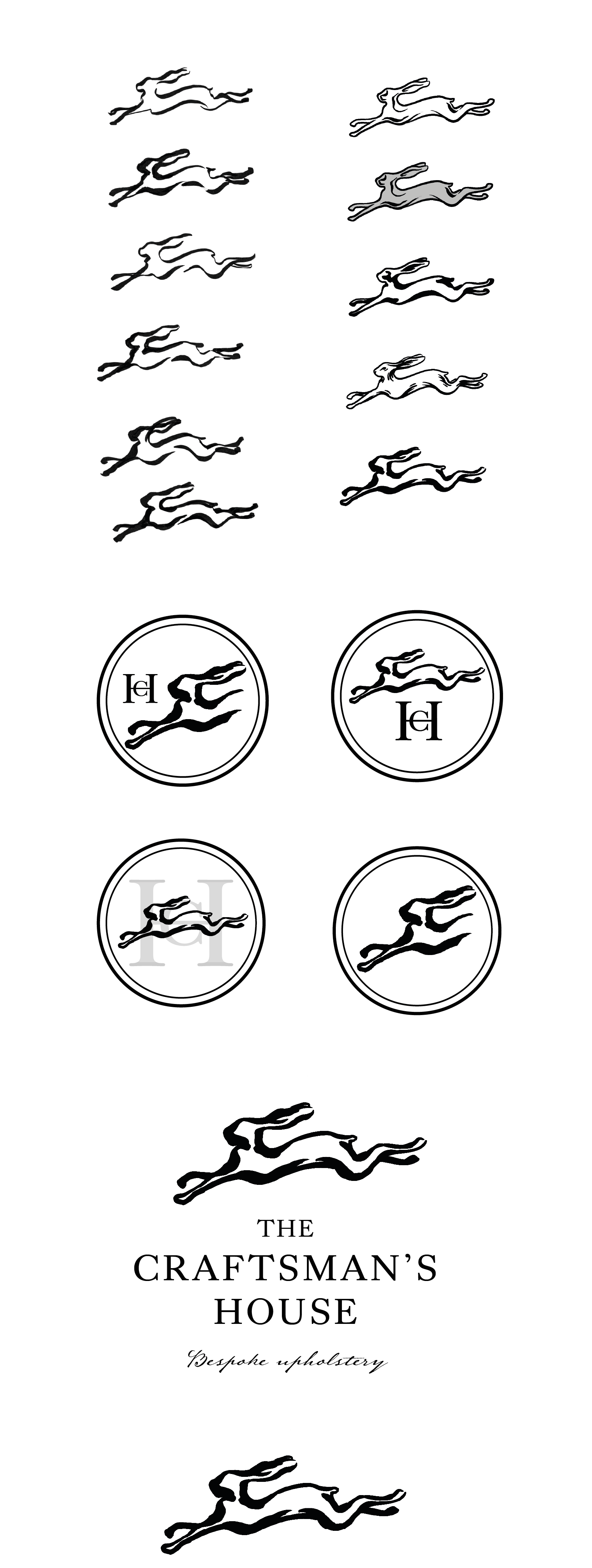
(Above) Initial vector logo designs
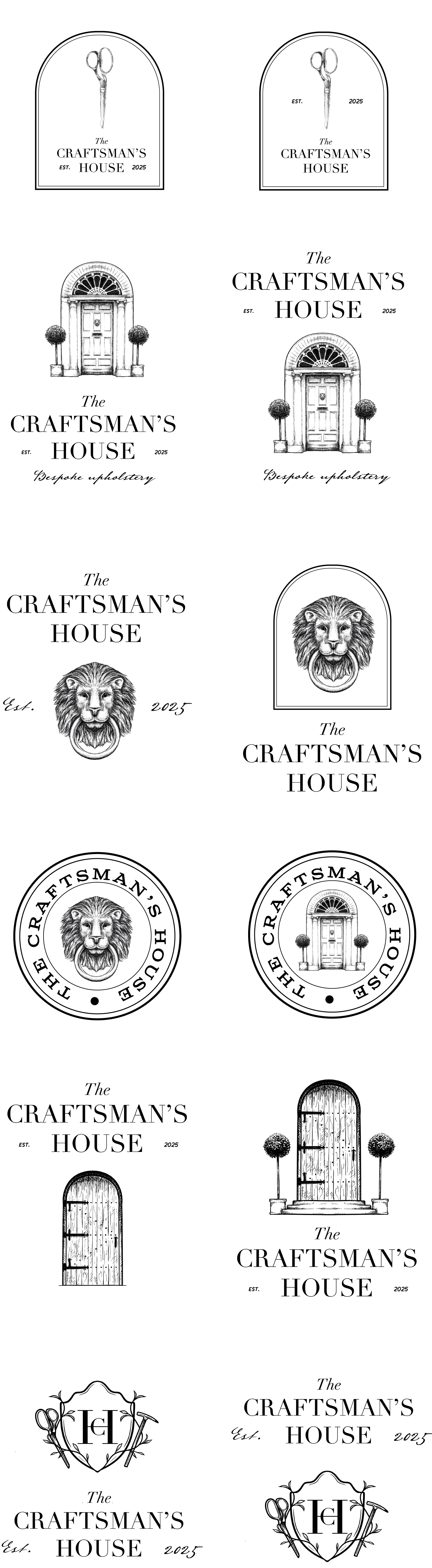
(Above) Initial hand-drawn logo designs
From discussions with my supervisor, I was able to rework the illustrative component and focus on more abstract visuals to spur customers’ imagination, rather than obvious motifs which were repeated in the logo name (house, doors, etc.). I found that designs with the hares were more successful, as they depicted the countryside location of the business whilst evoking quality and elegance.
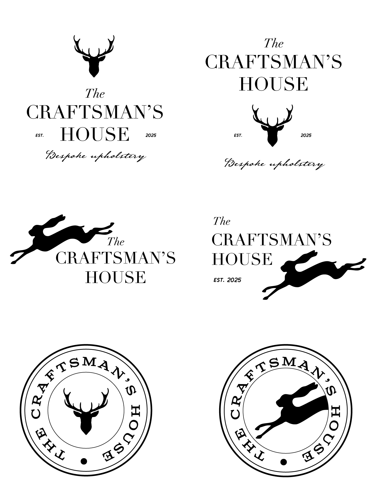
Revisiting the hare illustrations allow me to develop two distinct styles: one a looser, pen-like illustration (logo set 01), and the other a more traditional, line-based approach (logo set 02). In addition to the main logo, I experimented with a complementary emblem. By using circular borders, the designs mimic leathermaking stamps, which are closely linked to upholstery practices and reflect craftsmanship.
(Above) Development of the first illustrative style

(Above) Development of the second illustrative style
![]()
(Above) Refined logo set 01
![]()
(Above) Refined logo set 02
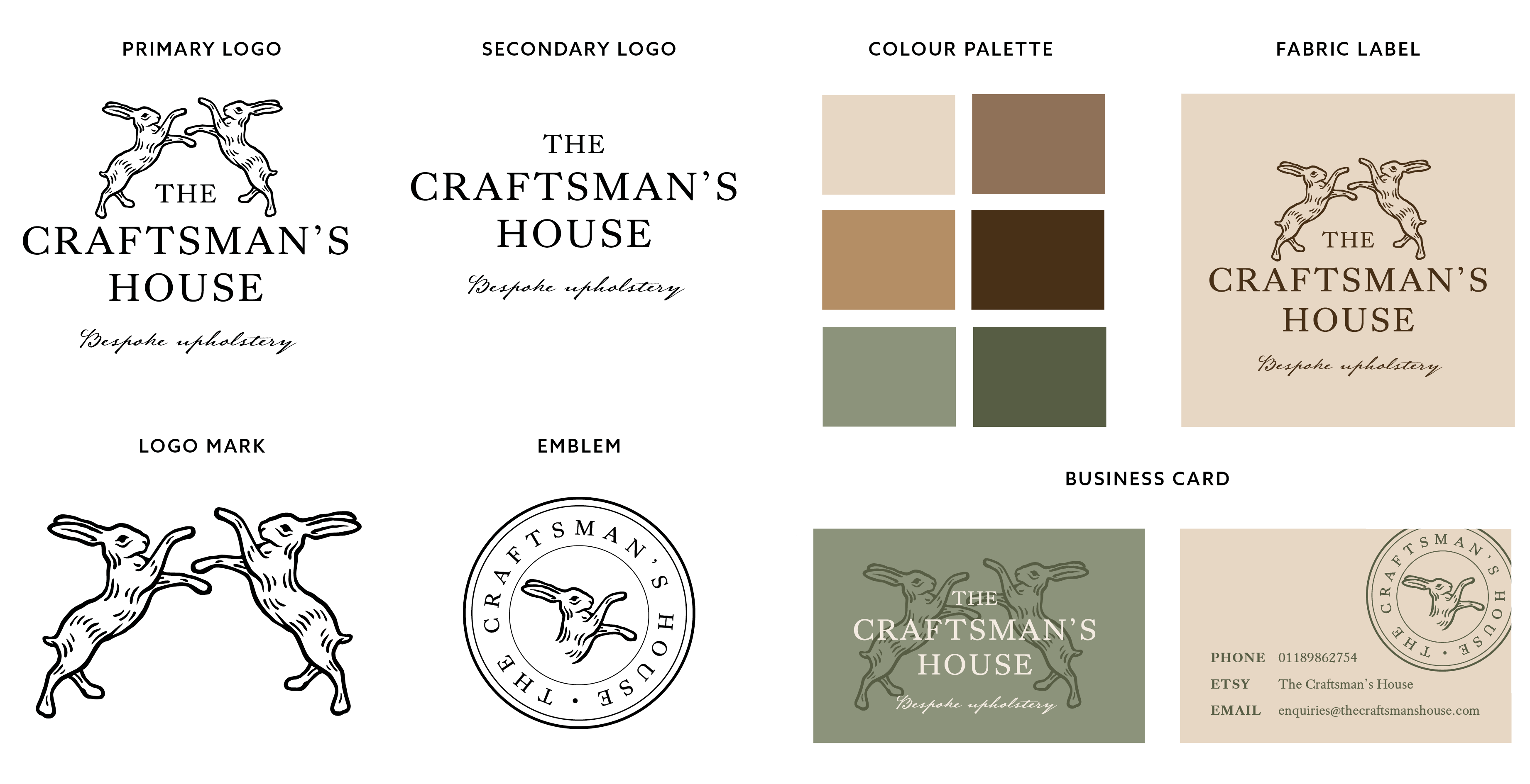
The client expressed a preference for second logo set, commenting that it conveyed a sense of heritage and therefore felt the most suitable for the brand. I additionally noted that the second logo set offered more flexibility for variations, as the linear style was more legible at small scales, or when cut in half and combined with other elements. With this agreed, I developed the following final logo set, offering different logo options for print and digital applications. For example, the primary logo would be ideal as a letterhead, whilst the simplified logo mark would suit the business’ profile pictures on their social media and Etsy store.
![]()
(Above) Final logo set
To support the logo set, various colour palettes were tested. The final colour palette includes mainly rich neutral brown shades, which convey a premium, classic brand, as opposed to a trend-led business. Moreover, the two subtle green tones in the palette reflect the brand’s focus on sustainability. Each colour in the final palette has sufficient contrast with black or white and can be combined with one another to offer additional flexibility.

(Above) Brand colour palette experiments
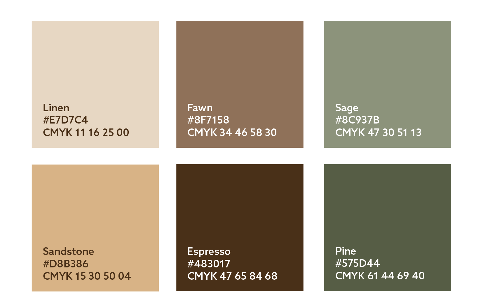
(Above) Final brand colour palette
Further Deliverables
The above assets were combined to develop the brand’s business card and fabric label designs. In the initial restated brief, the client had asked for a ‘thank you’ card to be supplied with each customer purchase. However, due to the brand only just launching, we agreed that a business card could be more appropriate to generate interest in the brand at this early stage.
With this amendment in mind, the client expressed an interest in the business card and fabric label using a variety of assets, as opposed to the same design over and over. Therefore, the initial business cards experimented with various combinations of assets, typography, and brand colours.
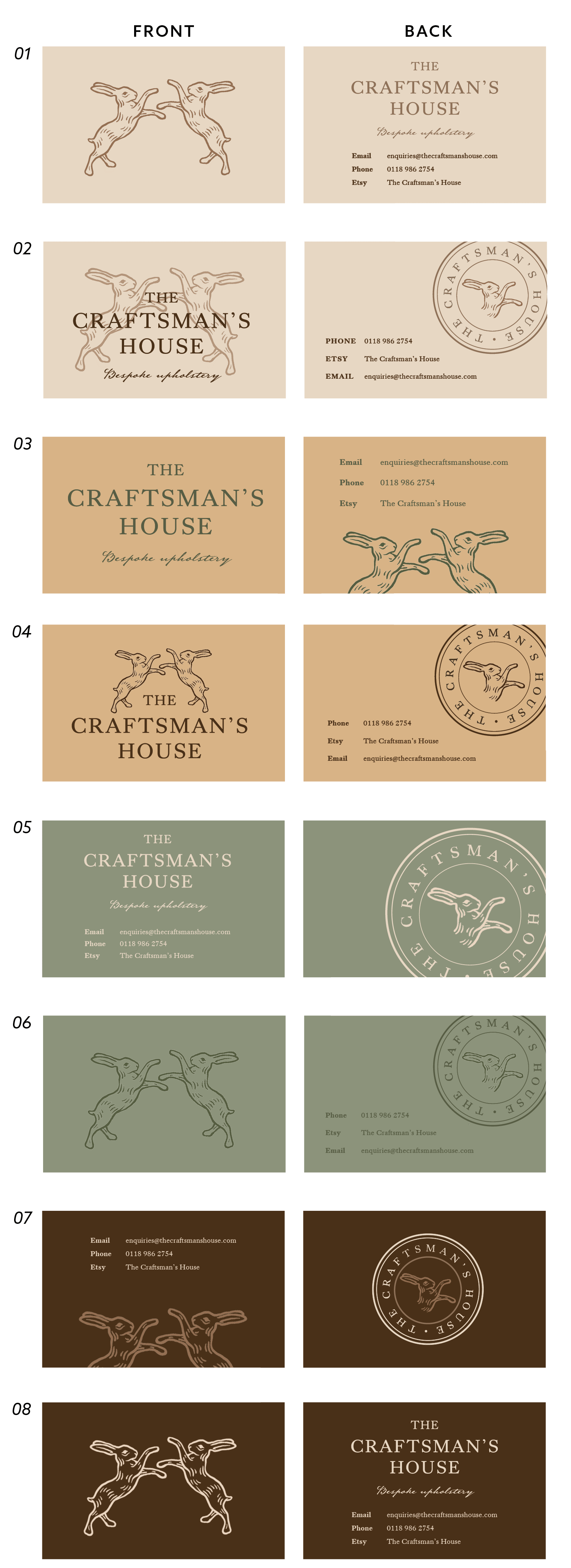
(Above) Initial business card designs
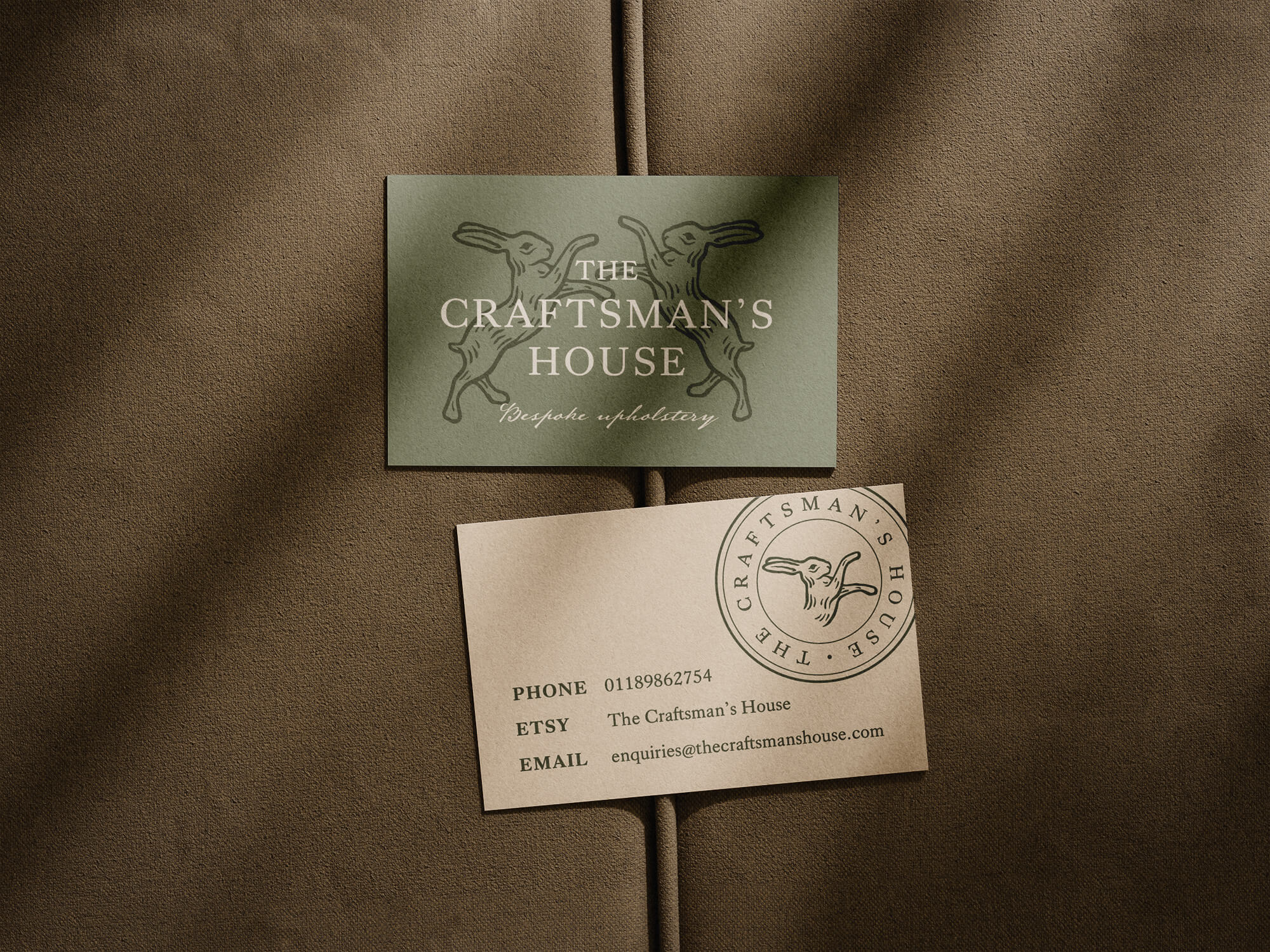
Despite the colours reinforcing the brand identity, the consistent colour on the front and back of the cards lacked contrast. Consequently, the revised designs incorporated a different background colour on the front and back to create more visual interest. This allowed the client to select the final design, which featured inverted green and cream shades on either side. The final deliverable also combined the primary, secondary, and emblem logo assets to add detail without appearing repetitive.
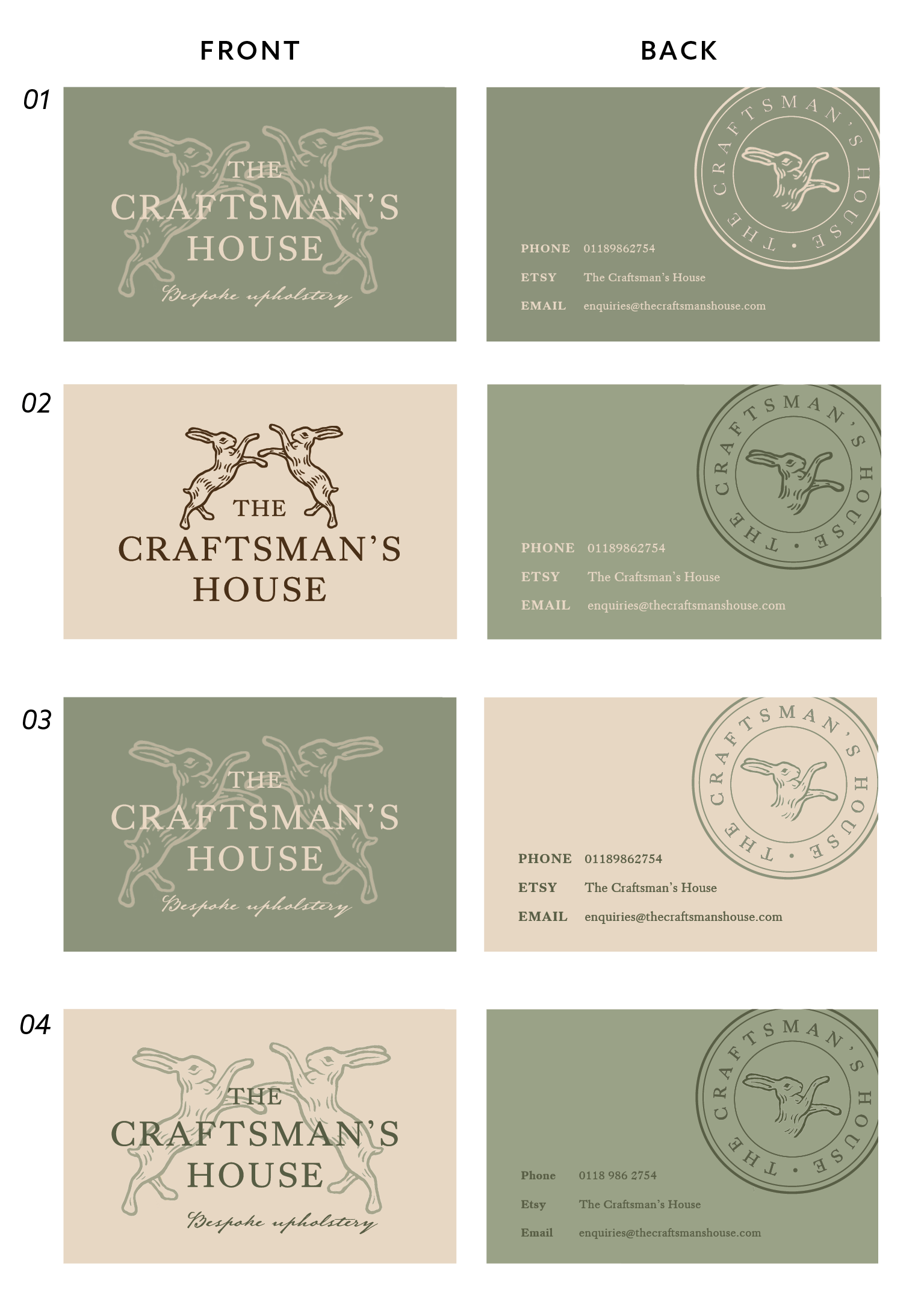
(Above) Business card design iterations
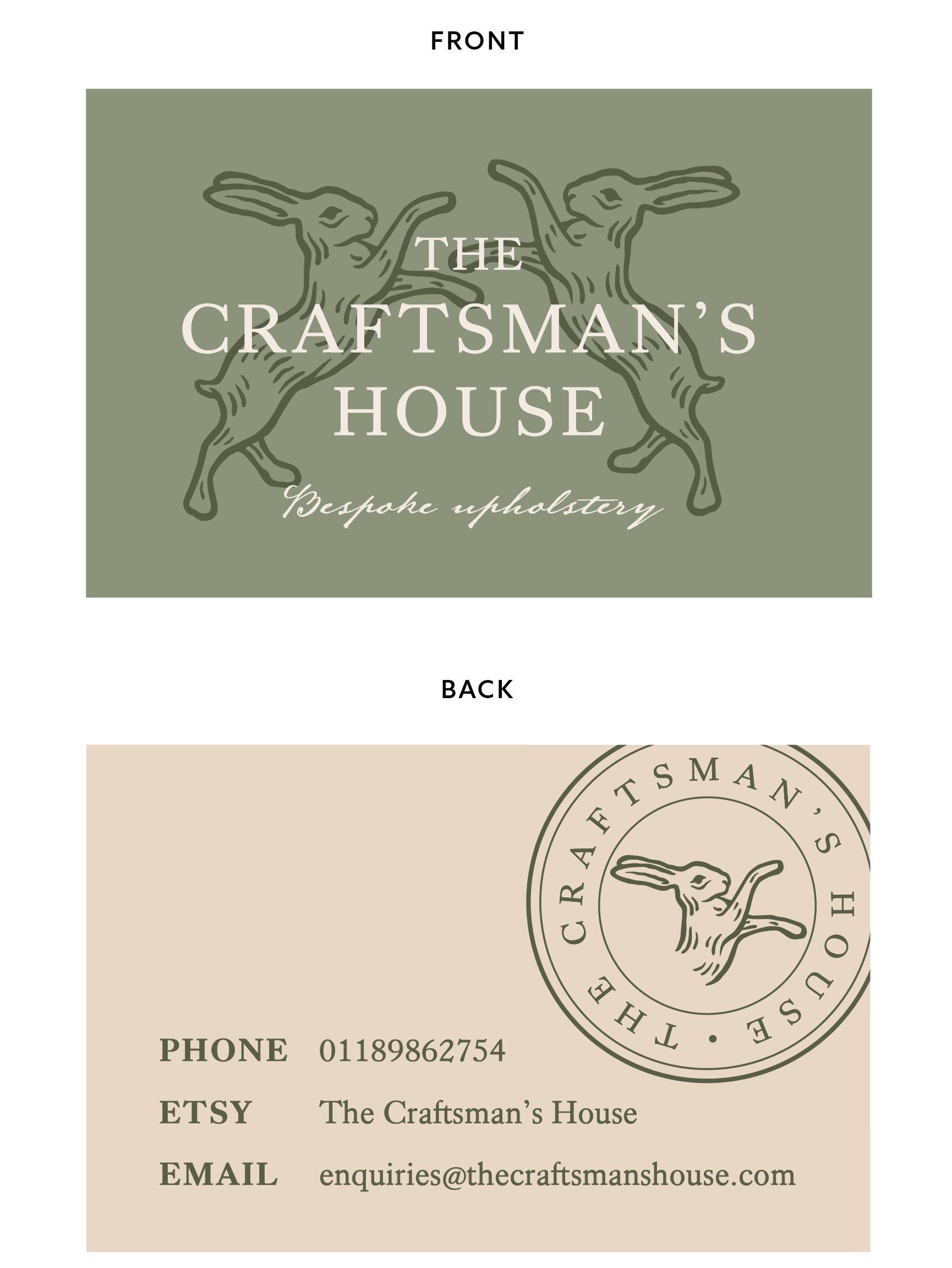
(Above) Final business card design
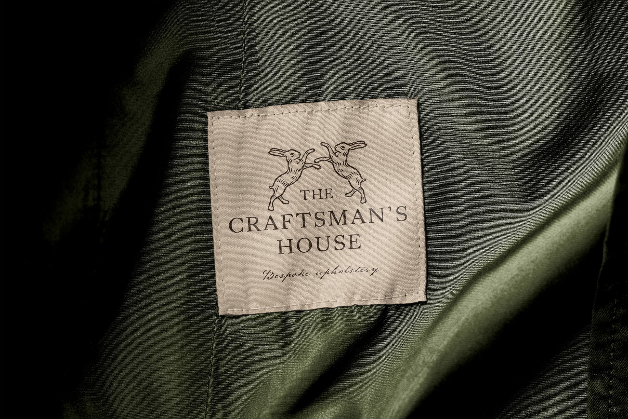
In contrast to the business card, the fabric label needed to adopt a much more minimal design. This was due to the fact that it would be applied to each furniture item, so ensuring that the label wouldn’t clash with any surrounding fabrics was a priority. Hence, the simple primary logo (design 01) felt the most appropriate solution, as an easy way to allow customers to recognise a furniture piece from the company.
(Above) Fabric label design options

(Above) Final fabric label design
Final Designs
In summary, each of the assets fits into a broader design system which can be combined in different ways as the brand grows. To support the client when using the assets, a set of brand guidelines were developed. Each component of the design system is referenced, with both a justification and suggested applications. Mock-ups were also incorporated to help the client visualise the final products (business card, fabric label, digital assets) in practice.
(Above) Final brand assets
(Above) Sample spreads from ‘The Craftsman’s House’ brand guidelines
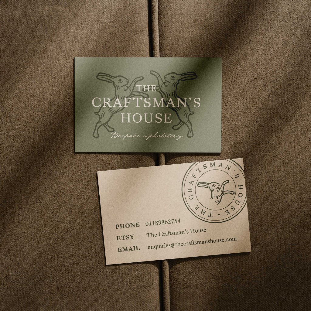
(Above) Mockup of final business card
(Above) Mockup of final fabric label

(Above) Mockup of brand assets being used on the Etsy store
Reflection
In summary, I found this Real Job to be a highly valuable experience. As this was my first official branding project, it was a fantastic opportunity to learn and follow the appropriate processes to build a brand identity from scratch. I found creating each of the assets particularly rewarding and appreciated being able to start with a completely blank canvas on this project. Whilst this required some research on my part and many attempts and revisions to the illustrations, I believe that we have reached an outcome which is cohesive, appropriate, and avoids the overdone sofa logo of many competitors.
The feedback from both my supervisor and client were integral to the process, and it required me to be adaptable in accommodating changes to meet all stakeholder needs. Furthermore, this project allowed me to appreciate the importance of designing for different applications, from clear, minimal fabric labels which support brand recognition, to a more dynamic business card which seeks to draw in customers. As a result, this Real Job has produced design assets which support an artisanal, high-quality, and sustainably-focused small business as it launches and grows in the future.