
Context
Designed by Luke Dyer and Jack Swain, the Society for the History of Authorship, Reading, and Publishing (SHARP) was looking for branding deliverables for their SHARP 2024 Conference. The project required us to create a range of visual material at varying sizes for different purposes. We were fortunate enough to work alongside Sue Walker, who works within the department of graphic communication and typography, giving us a great opportunity to work with someone with a great mind for design. Alongside this, we had the opportunity to meet with the SHARP organising committee during this real job.
Restated Brief
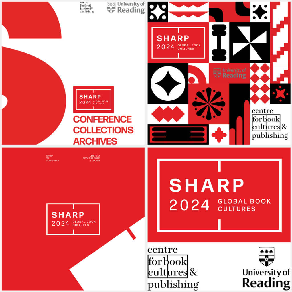
The SHARP 2024 conference would take place in July 2024, in which the conference will explore how books and texts are produced, distributed, and read in global contexts today and in the past. The conference requires branded material in a range of formats to communicate information and promote the event. This material needs to remain cohesive with the current ‘SHARP 2024’ & ‘Centre for Book Cultures & Publishing’ branding to create a cohesive brand design throughout the entire conference. From this we were quick to establish the main goals of our design work: to create physical/digital methods of communicating times, dates, locations, and events. To help identify attendees of the conference through physical material and to find ways of promoting the SHARP 2024 Conference through physical material.
Deliverables
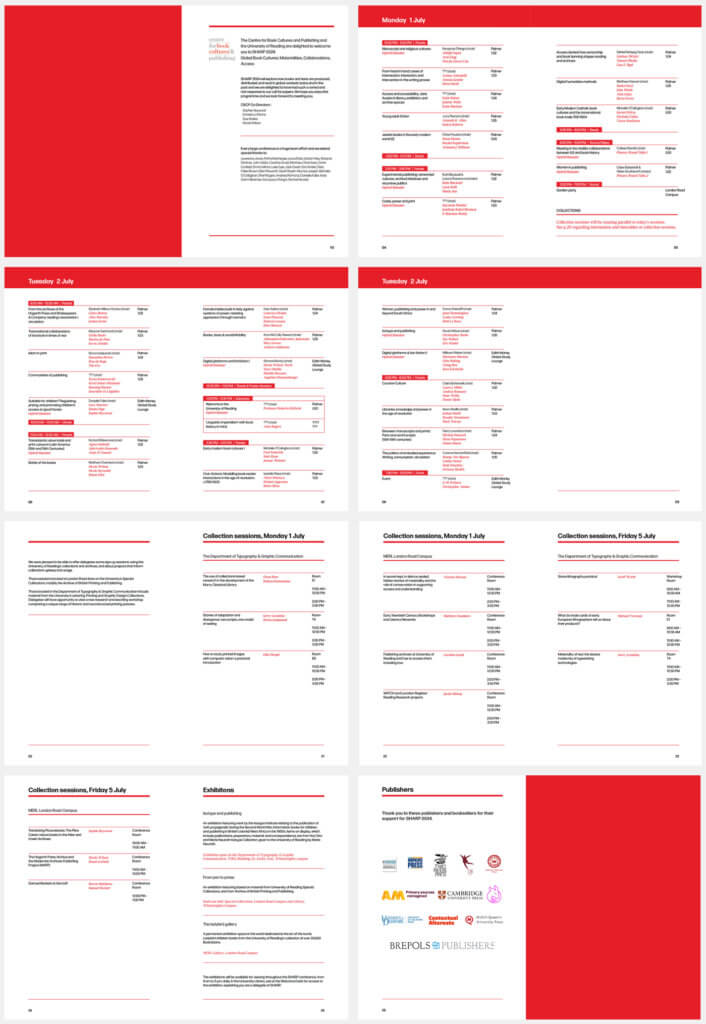
Printed conference programme:
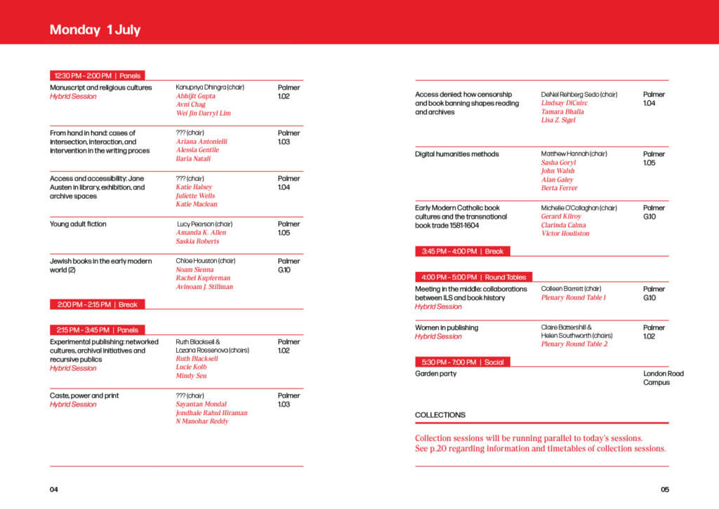
A printed programme for all attendees of the event that will communicate the time, date, location, and any other important information required for the conference. It will act as a schedule for the attendees, allowing them to navigate between the multiple locations over the course of the conference. The programme will be an A5 booklet, allowing it to fit inside of the tote bag (Deliverable 3).
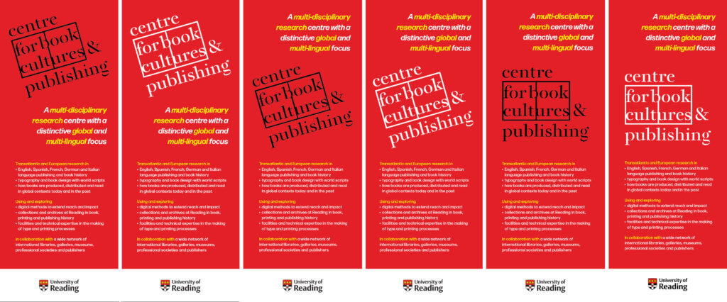
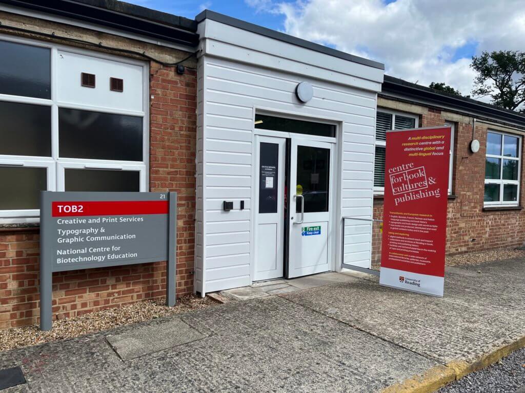
Pull-up banner:
3 banners were requested from Sue directly; these banners would be placed in the 3 locations the conference took place in, allowing all attendees to have a ‘landmark’ to know they are in the correct location of the conference. Additionally, the banner would be designed to promote the SHARP brand after the conference has ended. Since the time of the real job, the banner has made appearances in the opening of the new print workshop in the Typography Department.
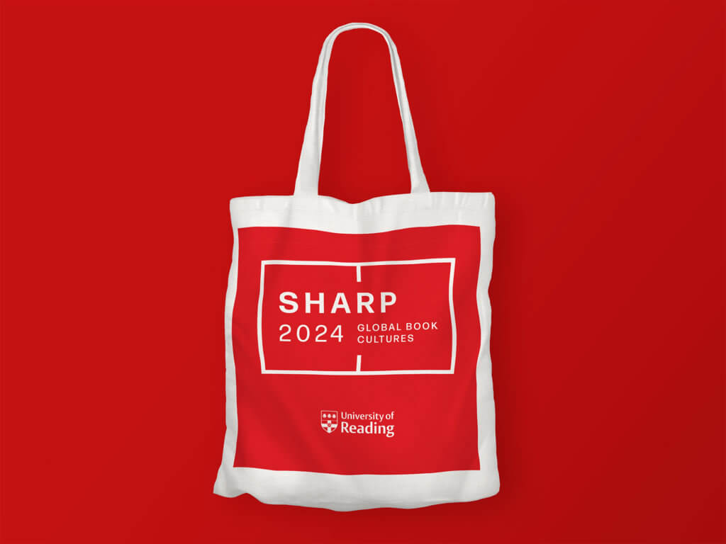
Tote bag:
The tote bag would be used as a way to show off the SHARP 2024 logo and brand colour, allowing people to identify attendees of the event. Additionally, the tote bag will be able to hold the conference programme (Deliverable 1) and any other material that attendees pick up during the event.
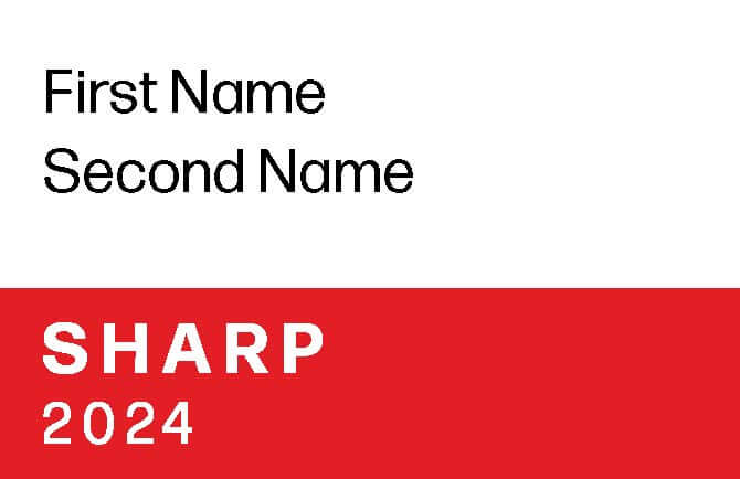
Name tag:
Used to help identify other attendees of the event alongside naming guest speakers during the conference. The event had people attend from all over the world; the name tags would be beneficial to help with socialising and recognition of speakers and guests.
T-shirt:
Designed to promote the SHARP 2024 branding, these t-shirts would be worn by volunteers of the conference.
Programme Design
Stage 1:
We received a version of the conference table and started designing some page layouts on how we wanted a spread to look. Our most important goal with these was to separate out the information in a clear and accessible way.

Stage 2:
We gained some initial feedback from our client regarding certain design choices in our concepts; the rotated days of the week were something the client wanted us to stay away from for legibility reasons. Alongside this, our client liked the rule approach we took into separating out our information.
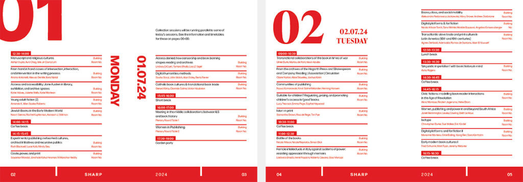
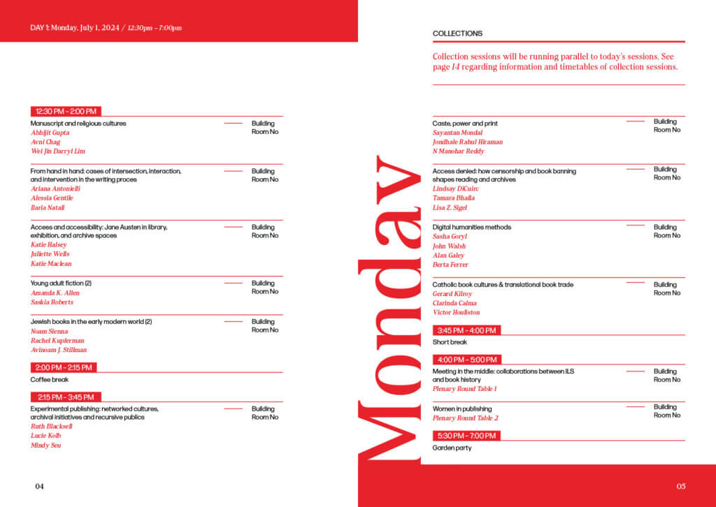
Stage 3:
After the feedback, we refined what the spreads looked like based on multiple rounds of client feedback. Some of the major changes were the spacing between information, the running head and folios, and the introduction of new information that our client wanted in the programme. With these changes, our client was happy with the overall design of the programme. From this point we had to make many small adjustments to the spacing and typography of the programme pages, as the conference table would constantly be changed and updated from the start of the designing to the end of the project.
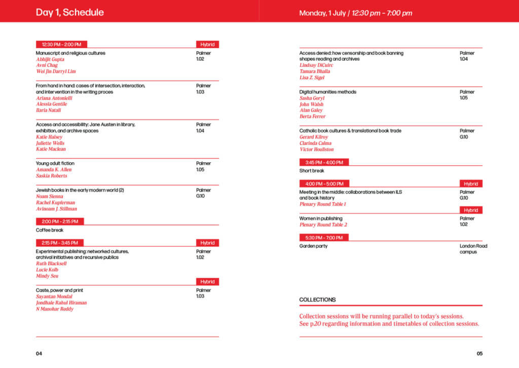
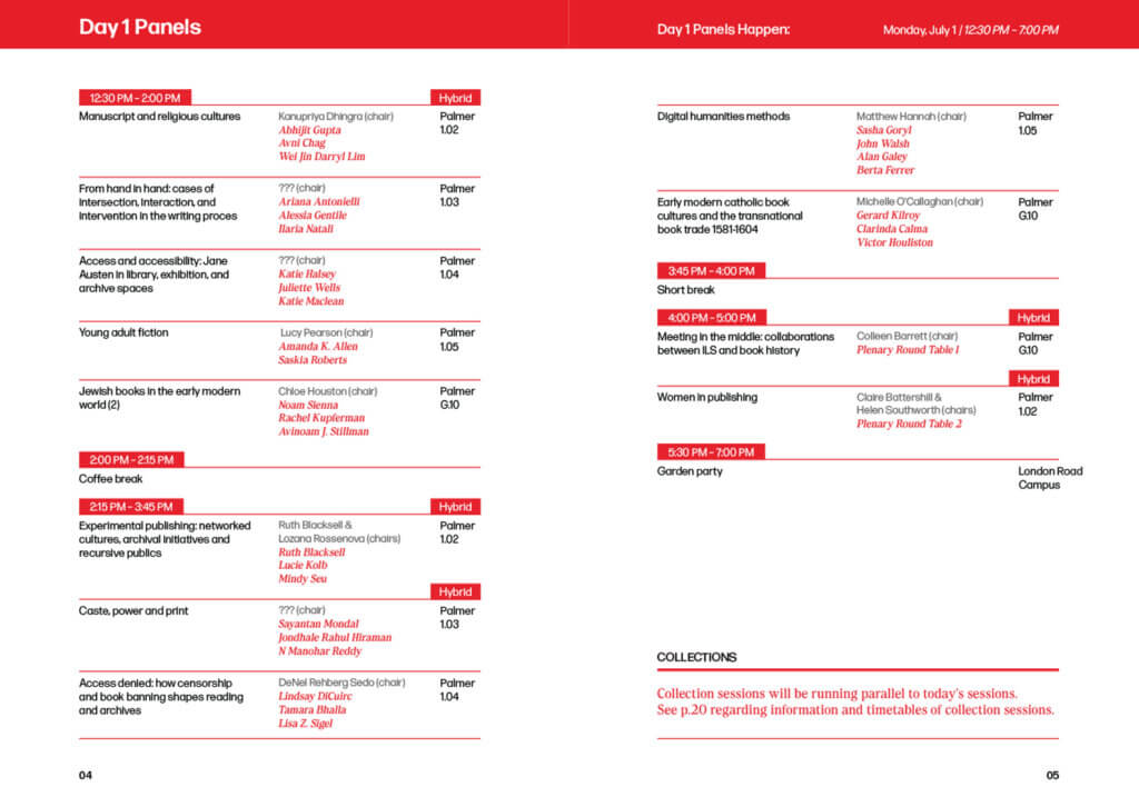
Stage 4:
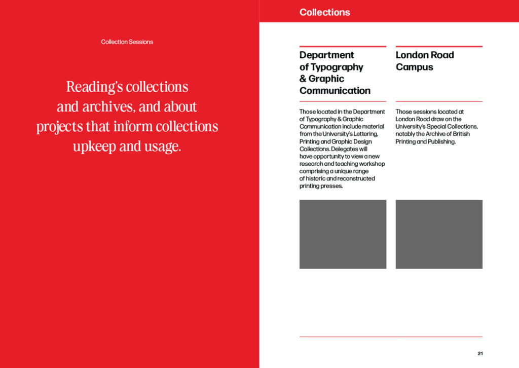
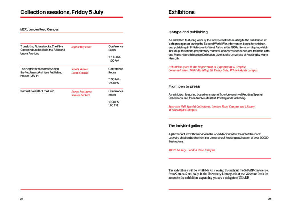
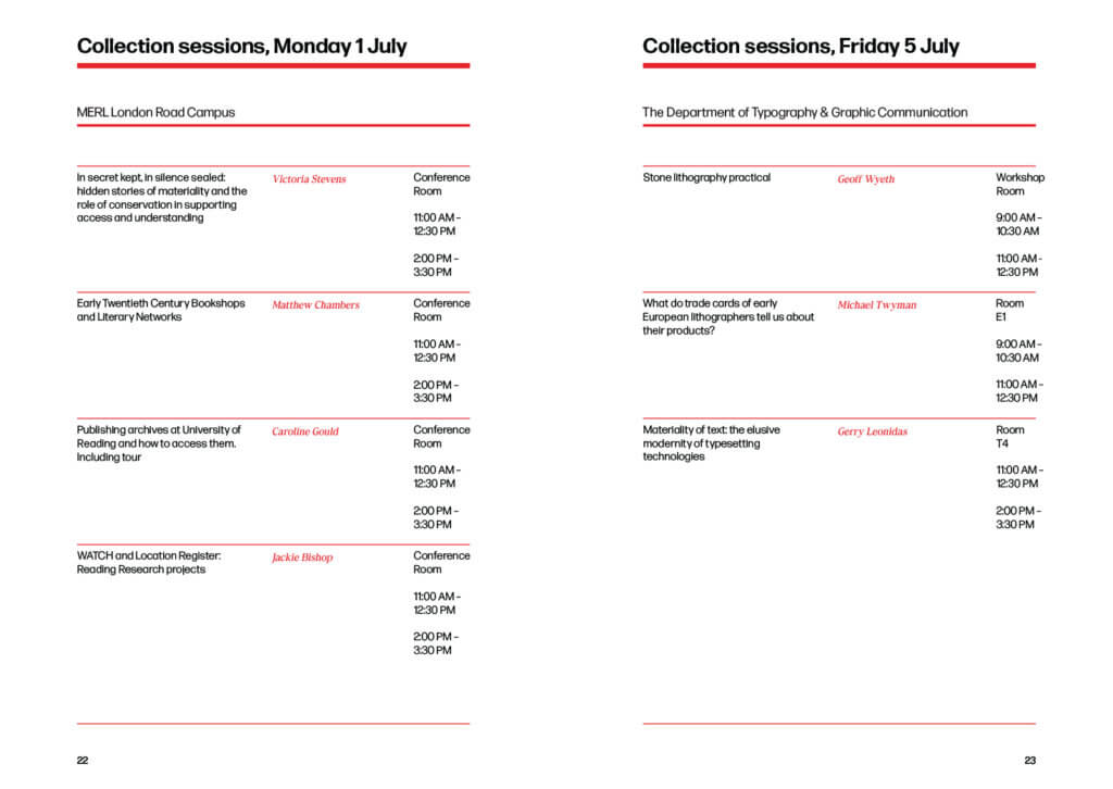
The collections pages were the last aspect of the programme that we needed to refine and adjust before our client was happy with the finished designs. The main issue we found was the repeating information throughout the day alongside the names of certain locations that would not fit into the grid system. After multiple adjustments, we settled on a system to present the information with the client and utilised it for the collection pages.
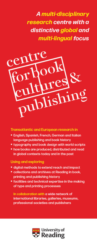
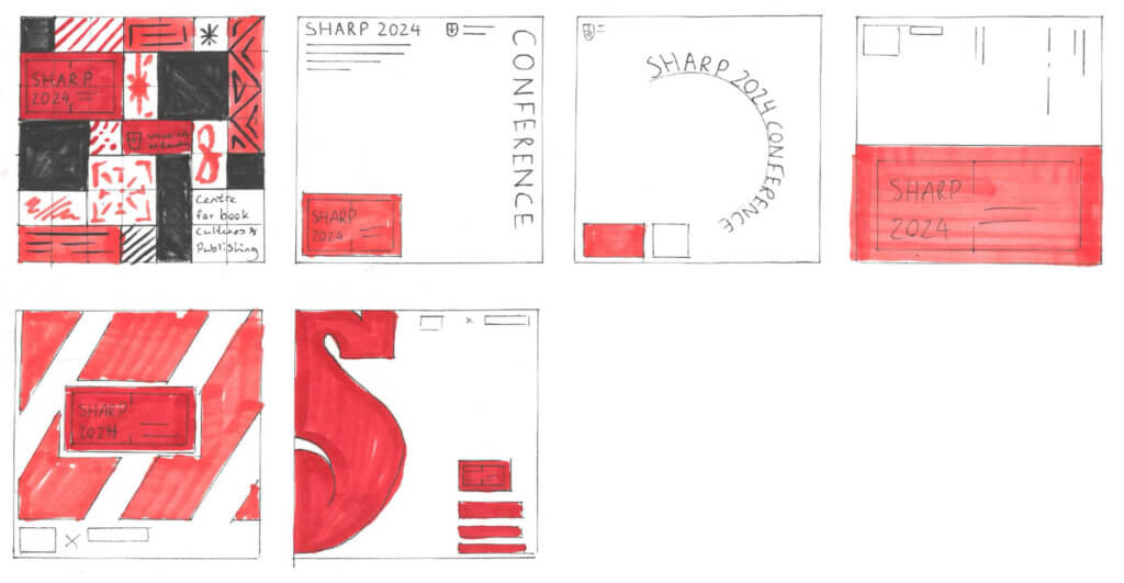
Banner Design
Stage 1:
The banner designs were a little different from the rest of the branding as it wanted to be linked to the SHARP 2024 Conference but not use any of the branding assets. Instead, it wanted to show off the Centre for Book Cultures and Publishing (CBCP) brand, allowing it to be utilised after the conference ended. We created some initial ideas to show our client.
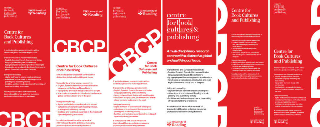
Stage 2:
The feedback from the initial concepts was good; however, the client was not fully sold on some of the concepts. We were fortunate enough to gain some insight from Paul Luna, who created the CBCP logo, on his own spin on the banner design, which our client loved when we presented it to her.
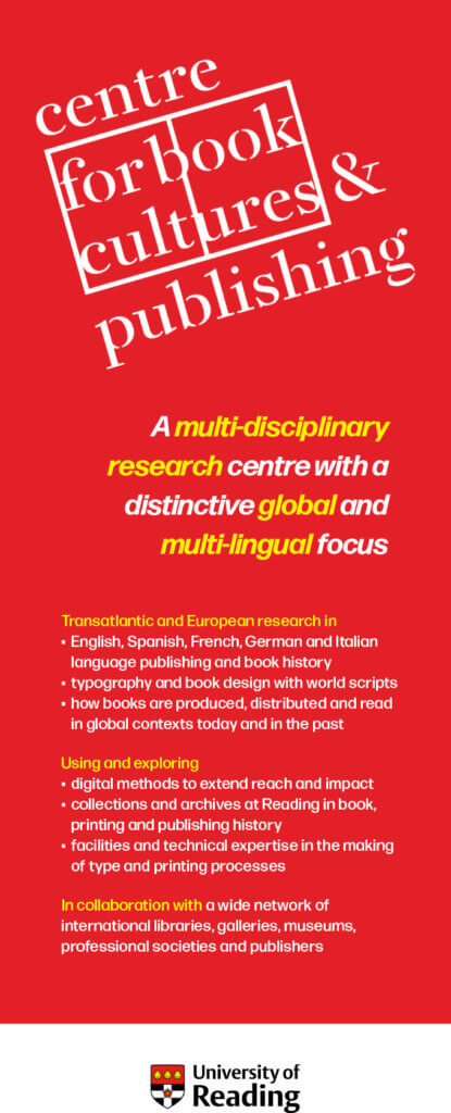
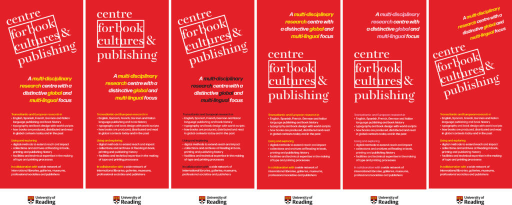
Stage 3:
From Paul Luna’s help with the banner, we made some final refinements to the typography, layout/colour of the logo and some of the body copy before the banner was signed off by our client.
Tote Bag Design
Stage 1:
With our initial sketches, we wanted to push the boundaries of how creative we could be with the design of the tote bag. This was with the understanding that this deliverables purpose was to show off attendees of the event who would be walking around the University of Reading campus rather than providing information.
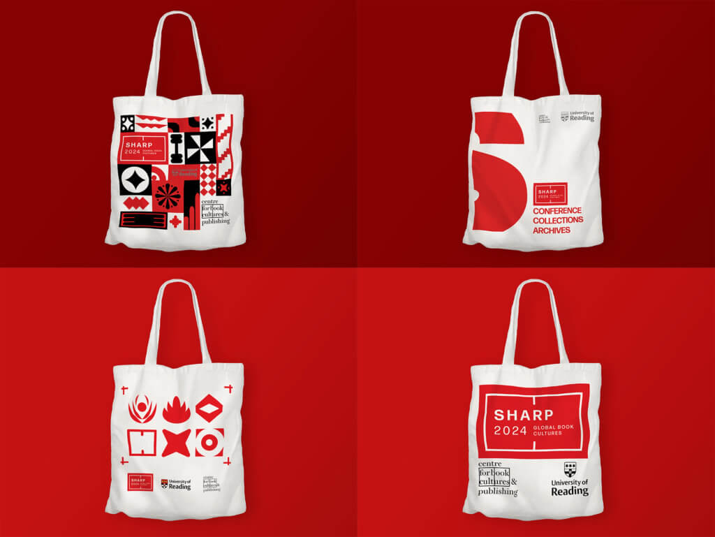
Stage 2:
The previous designs were rejected, and we then took a simpler approach with how we would create the tote bag. We attempted to utilise the shape of the SHARP 2024 logo; however, this was also rejected. We found that just showing off the SHARP 2024 logo on the punchy red background would be the best way to show off attendees and the brand.
Stage 3:
The tote bag gave us some issue when looking at the manufacturing. We initially agreed to show off the SHARP 2024 logo along with the University of Reading and CBCP logos. To stay within the budget for the conference, we had to drop the CBCP logo as they only had a black logo in the brand guidelines. This would result in us printing in two colours, driving up the price.
Name Tag Design
Stage 1:
When drafting some concepts of what the name tag would look like, we had the appraoch that the design would be a lanyard that would be seen at other conferences or passes at music events rather than a nametag. This idea was discussed with our client before any design work was started. Our concepts took a different approach to the rest of the branding, trying to incorporate some images that our client provided.


Stage 2:
Understandably, the designs were rejected for not fitting in with the other branding of the event, so we simplified it down to mirror the other deliverables created. The next issue we faced was the cost of producing 400 lanyards + plastic tags with the design. Unfortunately, despite all efforts to reduce costs of the deliverable, we had to pivot from the lanyard into a name tag to meet budget restrictions.
T-shirt Design
Stage 1:
The T-shirt design was straightforward. The client wanted a red T-shirt with the CBCP logo printed on the front so that they can utilise the T-shirts for any future events.

Conclusion
We believe the project was a great success in terms of meeting the brief and what our client was expecting. Our client was very happy with the outcome of the deliverables, and the conference ran smoothly. As our first real job, it was a valuable experience working alongside Sue, who had a great eye for typographic details, elevating the outcome of the work produced.
While we were happy with the final outcome, there were some areas within the real job that gave us some challenges. Firstly, both us and the client were waiting on confirmation for the wanted deliverables for this project. This ran down the amount of time we had to create and produce all 5 deliverables, making the final month stressful to meet the final deadline. Secondly, the constant updating of the programme schedule on behalf of SHARP led us to have to change and make adjustments to the programme constantly and long after the design was completed, taking time away from other deliverables. Finally, we found that budget restrictions were a big issue in the decision-making for multiple deliverables. This led us to feel that we had to simplify some deliverables to meet the restrictions.
As a result of this real job, we both believe that we have become better designers in working alongside clients but also better at communicating our intentions and ideas, which will be a great skill to have experience with for any future jobs we partake in. We have both found enjoyment within this branding project and would be open to more branding opportunities in the future.