
Background
Kate Sandford, also known as katemustsew, is an award-winning quilter who specialises in using bold colour and improvisational piecing techniques, matching her outgoing and enthusiastic personality. She has a huge passion for quilting, empowering individuals to push their artistic boundaries through her online and in person workshops, encouraging her students to not rely on pre-existing patterns and borders. Kate therefor needed a brand to reflect not only her work, but who she was a person.
Restated brief
We initially held a meeting with Kate to gain an idea on what she wanted her brand to look like. She asked that her brand reflect her fun and creative personality while also being professional as she wanted to use it when presenting her work to clients and potential buyers.
We first gained information on what deliverables she wanted and agreed on:
- Logo
- Business cards
- Video into
- Website
We then asked questions to find out what type of style she wanted. She made it very clear that she did not want any sewing cliches, for example, a sewing machine or a needle and thread in the brand identity, she wanted something unique and personal to her. One way we thought we could execute this was by including her work in the brand, for example, using images of it in the logo. Another was by using the 80s era as it was a direction that she wanted this project to go down as it’s bold colour and patterns matched her personality and work well. This coupled with her favourite colour, hot pink, was a fantastic place to build off to create her brand’s visual identity.
Research and ideation
There are many artists with similar businesses to Kate and it was for us to use them as inspiration for our work. We came out with a few points that we would use throughout the project to look back on, so we keep a consistent visual identity, these include:
- Having a logo which represents the business and one that can be used across multiple devices and deliverables.
- Using a consistent colour pallet across every platform so the brand becomes identifiable among other similar products.
- Using large images of work to show it off while keeping a minimalistic background so not to distract from it.
We also took into count what Kate’s target audience would be as we would want to design something that would be best suited for it. Kate had stated that most of her customers were over the age of 60, meaning that most people would find her through her website rather than her Instagram. This is also a great way to give more reasoning to the 80s style as a lot of her customers would be able to recognise it and relate to it.
Design development
Logo
Once we designed several sketches, we developed the strongest ones digitally and presented them to Kate to see if she would like any of them. Going into this we knew we wanted to use her name as the main identity and then include the colour hot pink and her work. Below are the designs that we went into the meeting with.
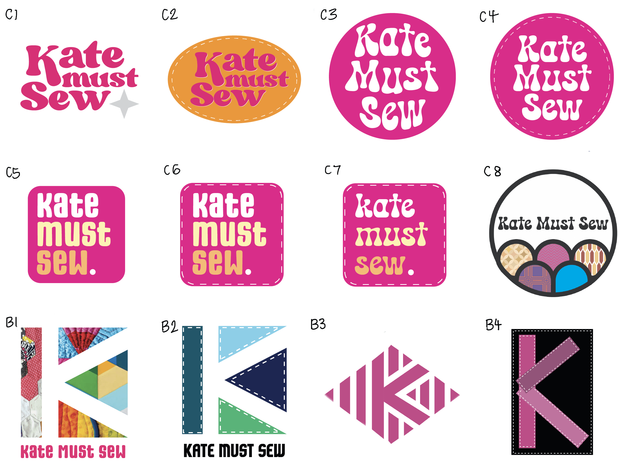
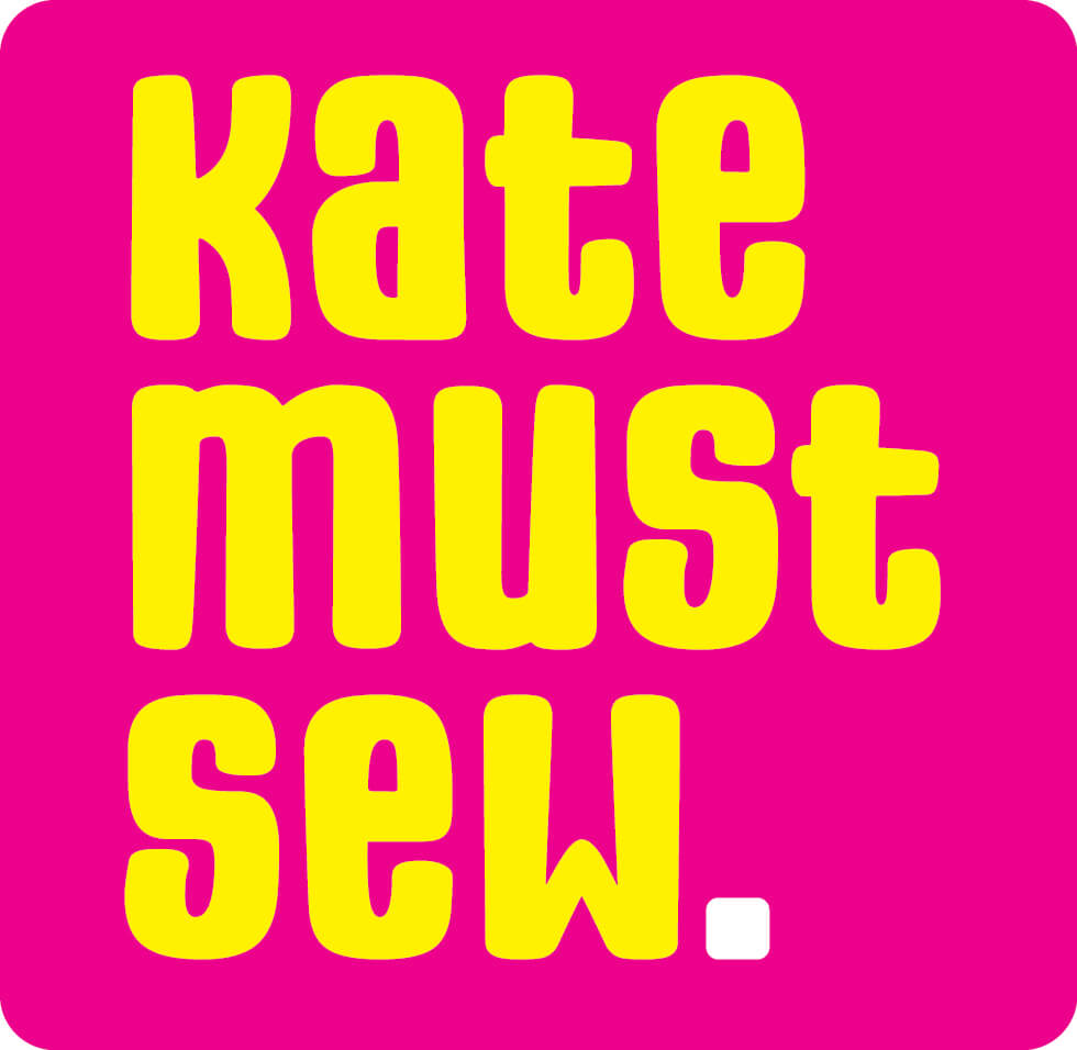
Kate particularly liked C5 as it focused a lot on the name of the business while using all the stylistic elements, she was insistent on having. The 80s bubble typeface coupled with the bright colour pallet symbolised the playful and creative side of the brand while the uniformed and square layout gave it some professionalism.
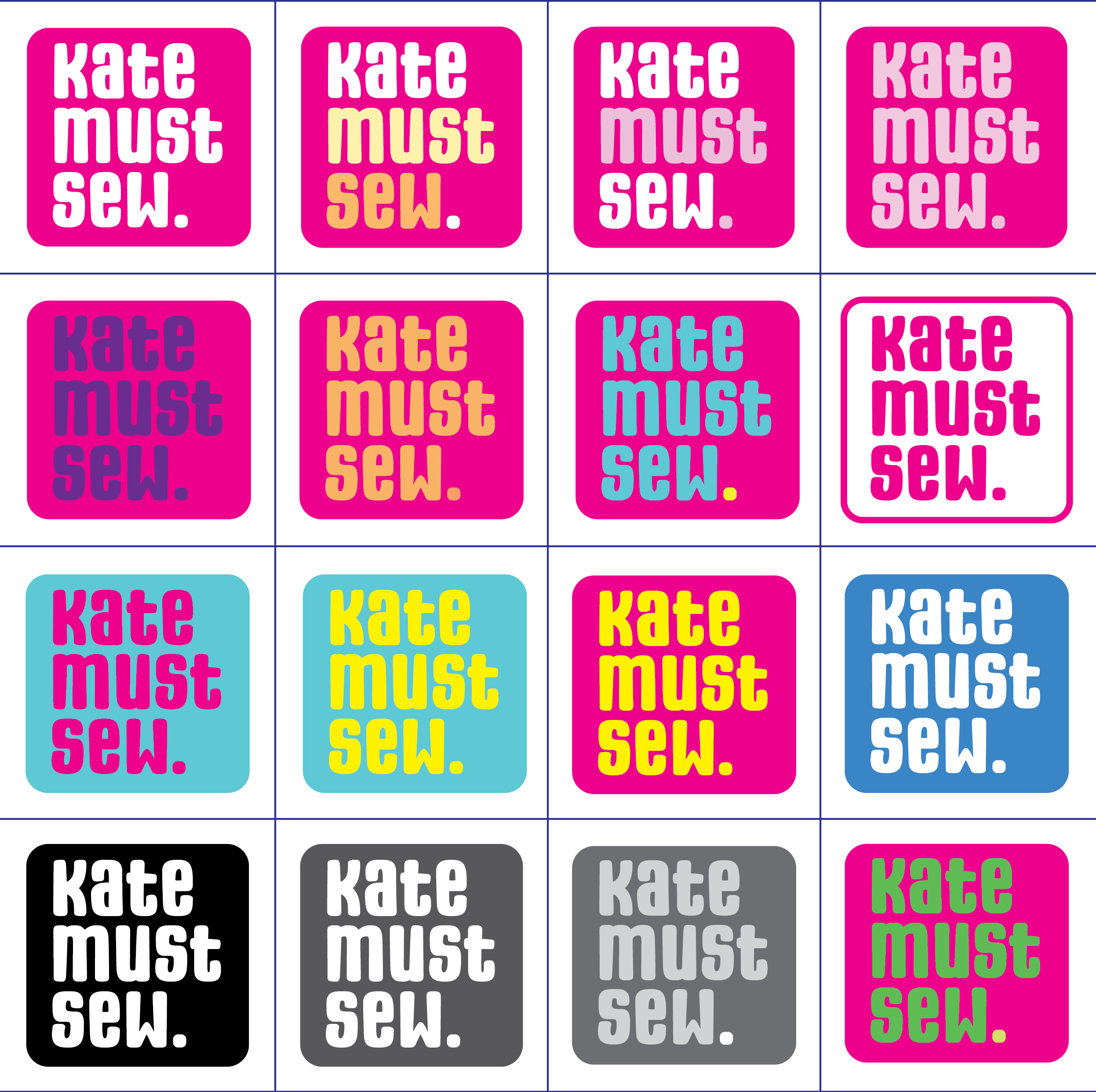
There was still some work to be done with the colour pallet however so designed some exciting colour ways. Below are the designs we took to Kate. We felt the strongest was the pink background with yellow text as the yellow is practically on the opposite side of the colour wheel to pink, so works extremely well to stand out from the background. Also, the use of two neon colours creates a good visual consistency.
Kate was very fond of the pink background with yellow text, but she still liked the white full stop from the original design so implemented it into the final logo design, shown below. This creates a great visual ending to the statement.

![]()
![]()
We also designed a second and third version of the logo so it can be used across multiple platforms, for example, most profile pictures, the main one being Instagram, uses a circular profile picture. Also, websites tend to use headers so the horizontal logo can be used in that situation. It doesn’t just have to be used digitally however, it can also be used when creating merchandise, for example, the horizontal logo may suit a T-shirt better than the square one. It is all so Kate can get across her brand easily and legibly.
Business cards
As we now had a visual identity to follow, we would now design business card for her to give out at exhibitions or any other event she attends.
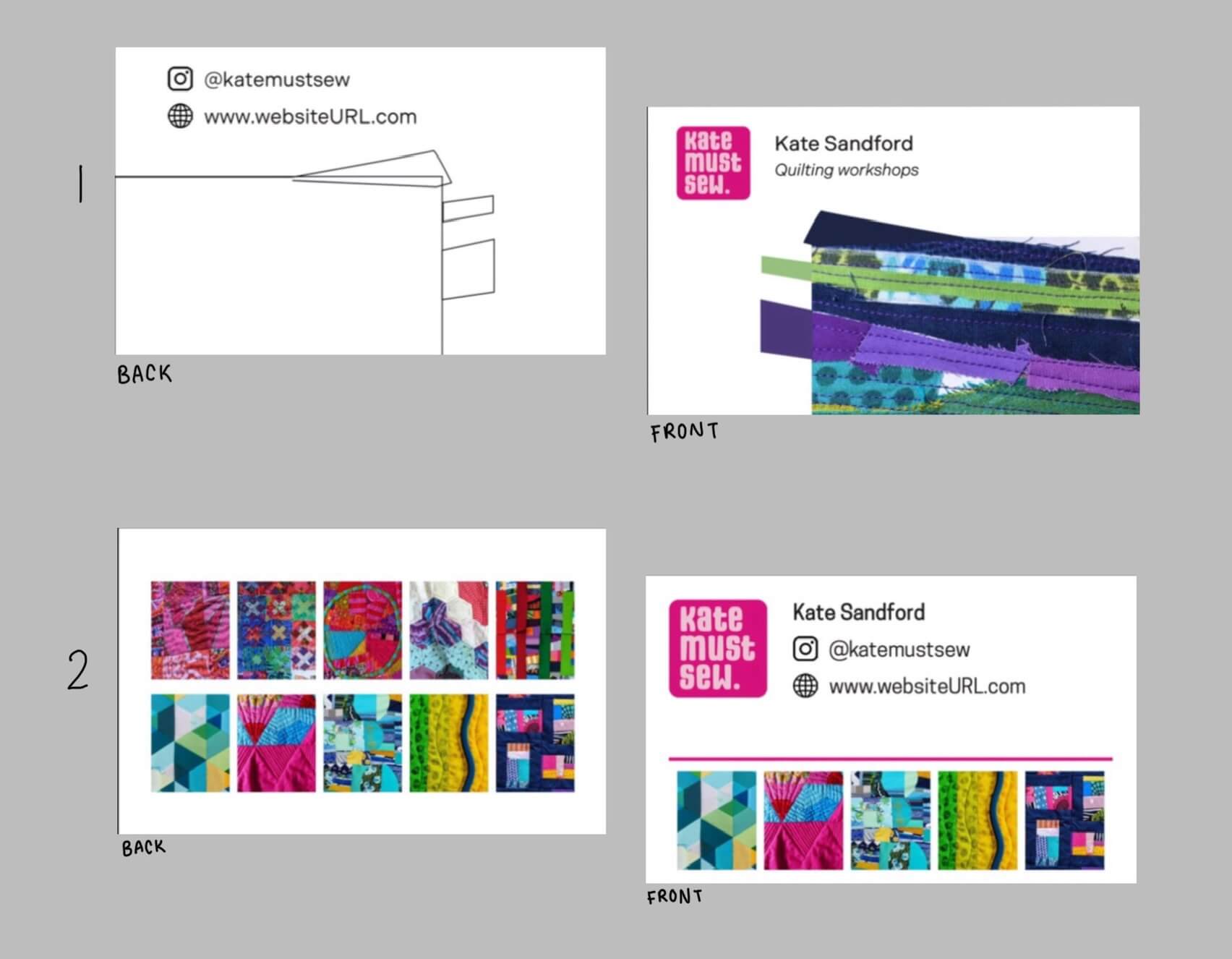
Above is the first designs of the business cards that we took to Kate that focused on showing off multiple pieces of her work along with her instagram and website. However, as the cards are small the multitude of images when printed wouldn’t be legible. Also, once we had our first meeting with Kate, she stated that using a full bleed image of her work on one side of the card was imperative as it meant that there could be several designs using different images of her work. This is in keeping with the brands visual consistency as it links to the point, we made in the research stage of using large images of her work.
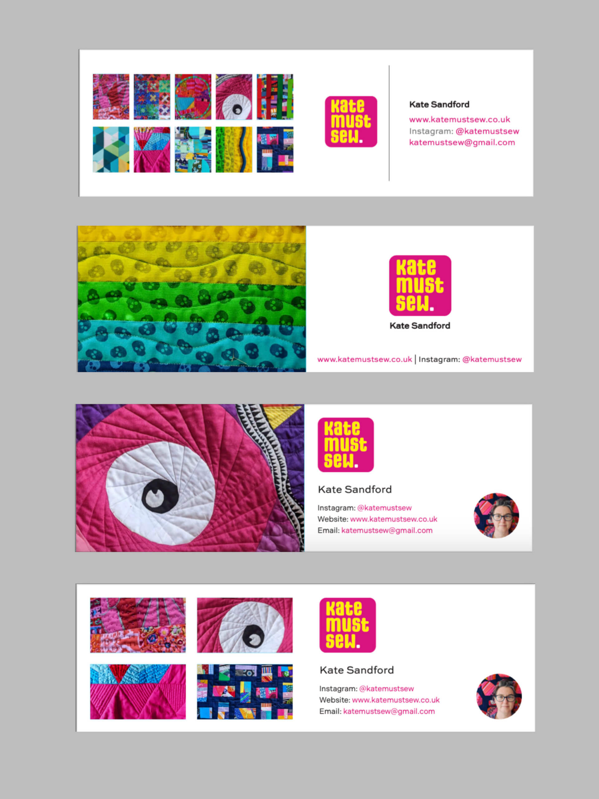
Above are the second designs of the business cards which has taken the feedback and implemented it. Kate liked the third design the most, however, there was still some features that needed changing, for example, the profile picture wasn’t needed as the brand is more about her work rather than herself. Also using pictograms to represent the contacts would be more inclusive for other languages and quicker to read.
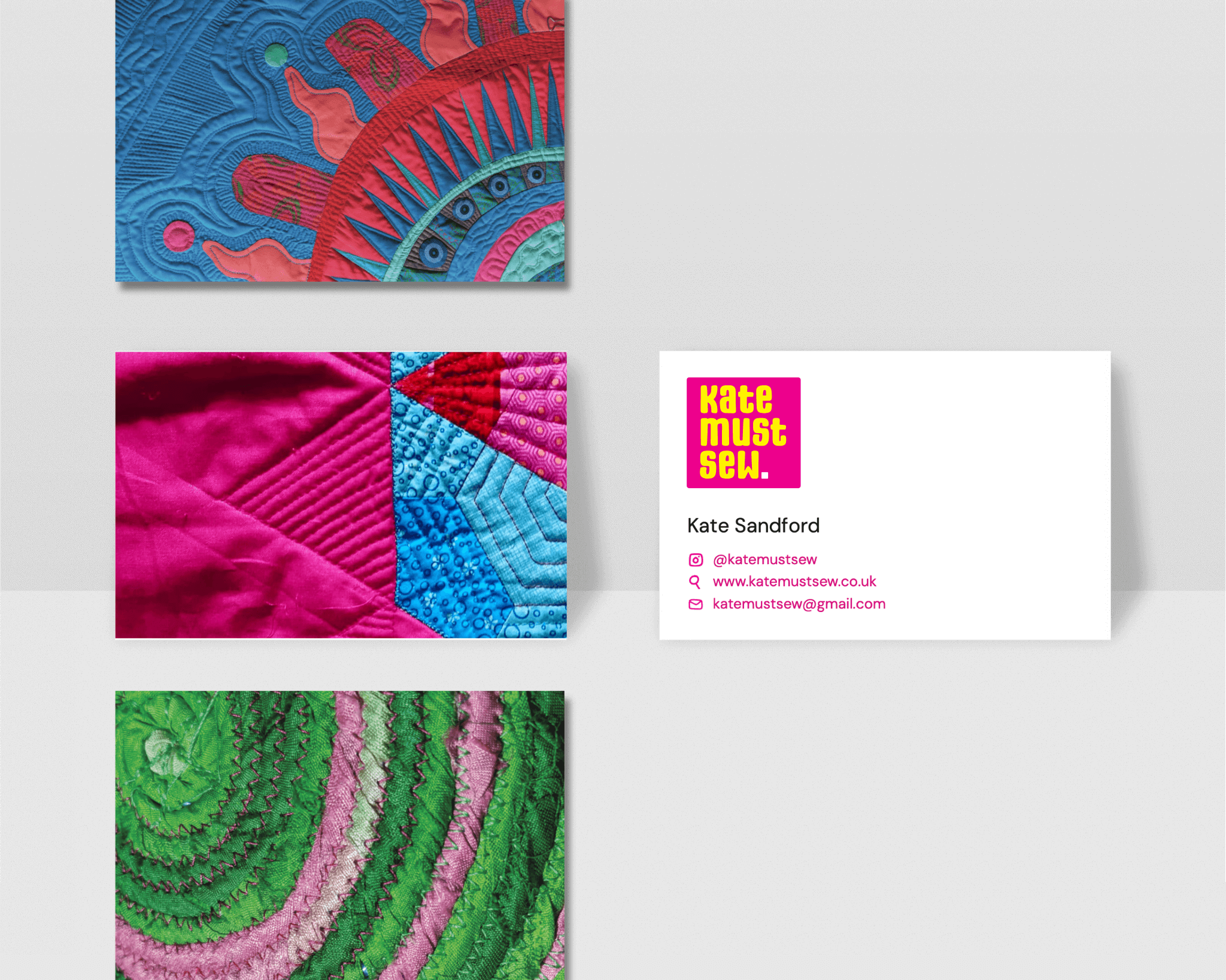
Above is the final design that looks a lot more professional and links well to the use of white space point stated previously. This is something that is ideal for business cards as these would be used in a professional environment where she would still want to get her personality and work across to potential clients while still being serious.
Video intro
The third deliverable was a video intro for her videos on instagram and youtube to quickly and clearly show her brand off before the actual main body of the video starts. We decided the best visual indicator was her new logo so we each set out to create a few 5 second clips which animate the logo coming onto the screen.
Above was the final video intro and uses the sounds to have a beginning, middle and end as it starts off softly with the pushing sound, also signifying a piece of material being rolled out to be worked on, then builds up to a loud middle with the sound of the sewing machine, and then ends with a faint ding, which is what a lot of machines use to tell you when its process is done.
Website
This was the final deliverable and would bring everything together, using the brands visual identity to create a fun but professional place where people can find buy her work, sign up for courses and find out more about Kate.
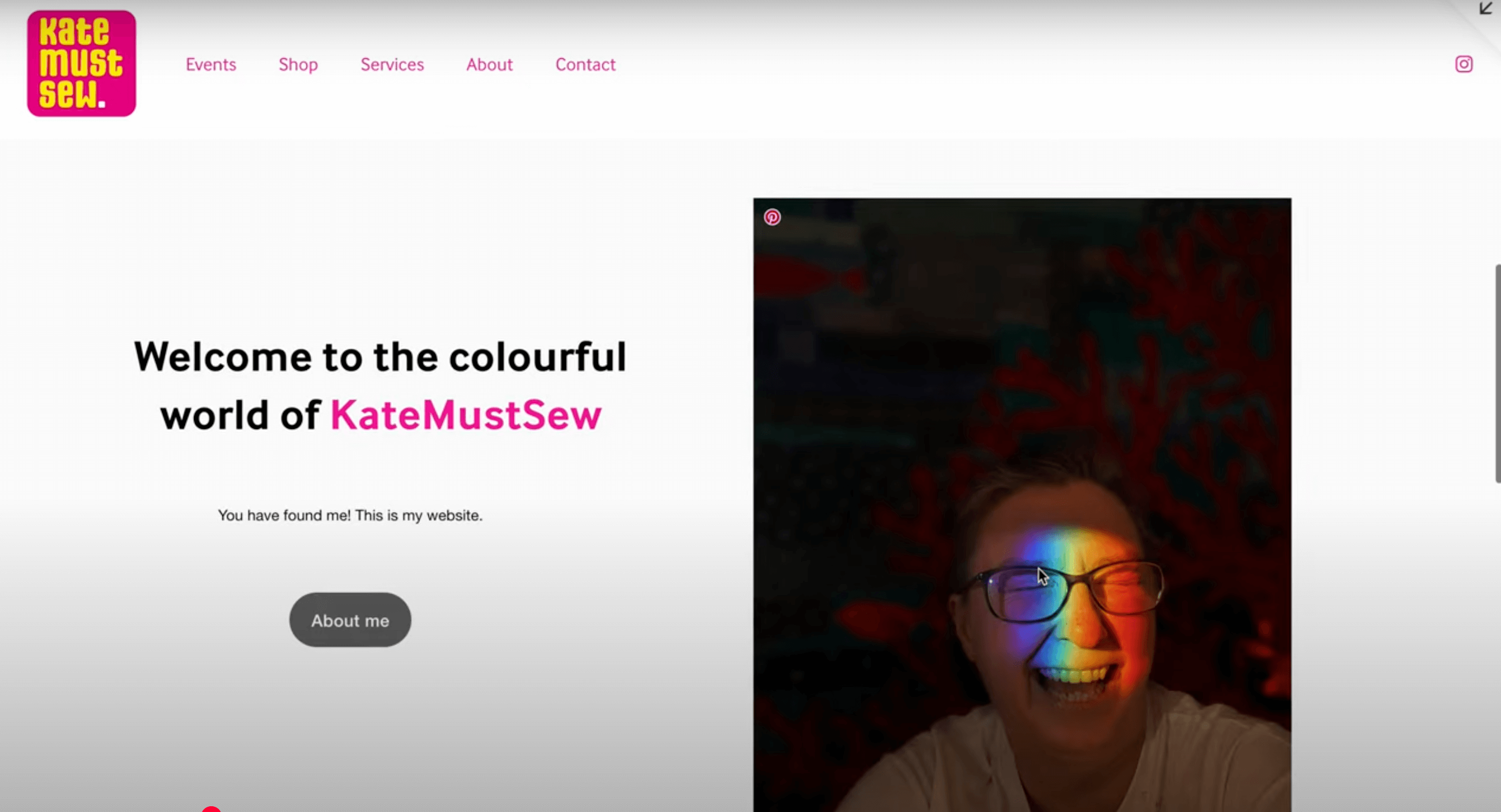
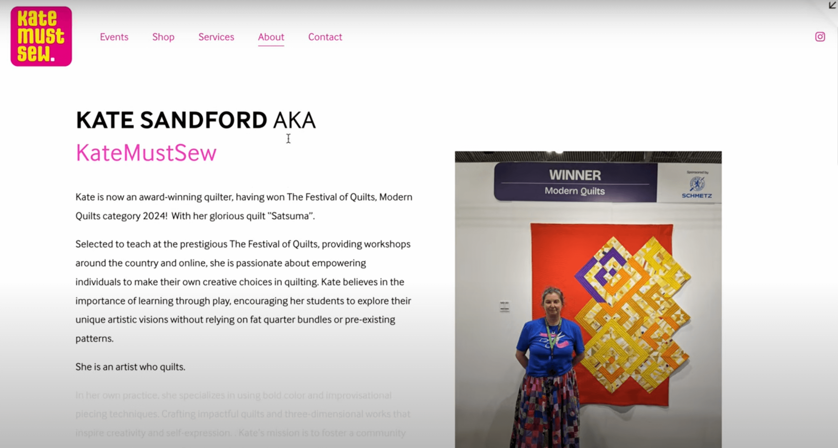

Above are a few pages from her website which use the points of having large images against a minimalistic background coupled with the faint brand identity with the use of pink text across the website. The use of the logo is to again show this identity but also keep a visual consistency across every deliverable as they all include the logo.
Reflection
We believe we have created brand identity that clearly represents not only Kate’s work but also her as a person. The deliverables that we have designed allow for flexibility across a multitude of platforms, allowing her to reach new audiences, therefor broadening her business. She can now feel confident when attending art events as she can now show off her own unique brand.
The job did however take a lot longer than expected to complete and was a great learning device to have when going into other real jobs. We know we have to be on top of client communication and not be afraid to call them if we need something urgently. we have also learned that it is always better to ask too many questions than too little as it is imperative that the client receives work that is what they have envisioned, if we walk away from a meeting without knowing what the next step is then we have done it wrong.
Overall, while there were a few delays and small miss communications, I believe this project to be a great success and is one that we are most pleased to have designed.
Ben Sturgis & Celeste Clift