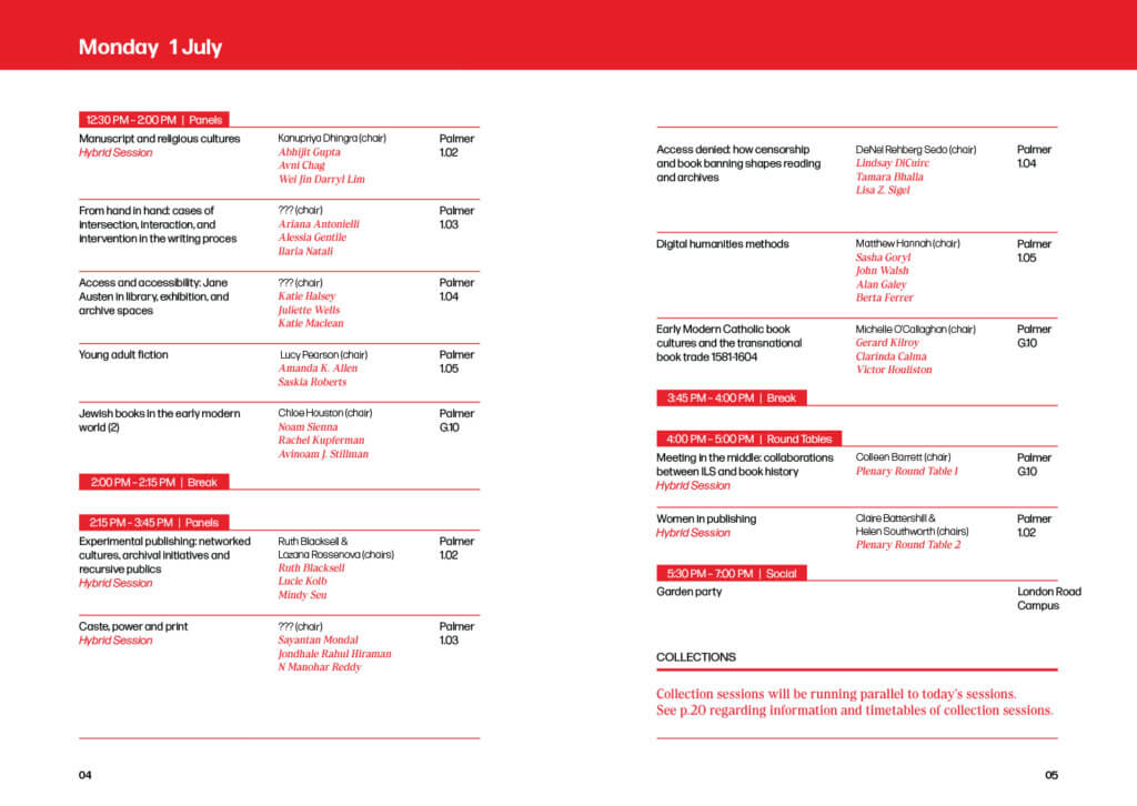
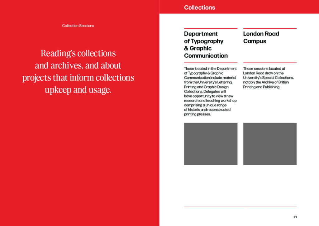
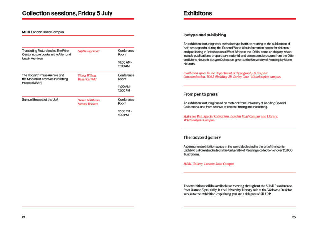
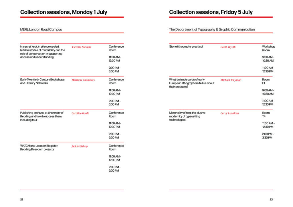
Context
The client is part of the (University of) Reading Arts Committee and has commissioned a public art trail for Whiteknights campus. The trail will consist of four ‘World Globes Re-imagined’ sculptures which are placed around campus and one existing abstract sculpture. There will be additional artwork added to the trail. Please visit The World Reimagined for more information.
Restated Brief (as of the first phase)
Aim of the project
The client aims to create a more inclusive community surrounding the exhibited artworks around the University campus through a trail that can be accessed by all.
Objectives
Research will be undertaken to explore successful existing maps and leaflets, and to understand the community the project is being aimed at. This will shape the design of the leaflet to enhance the experience of the trail and encourage an inclusive audience.
Deliverables
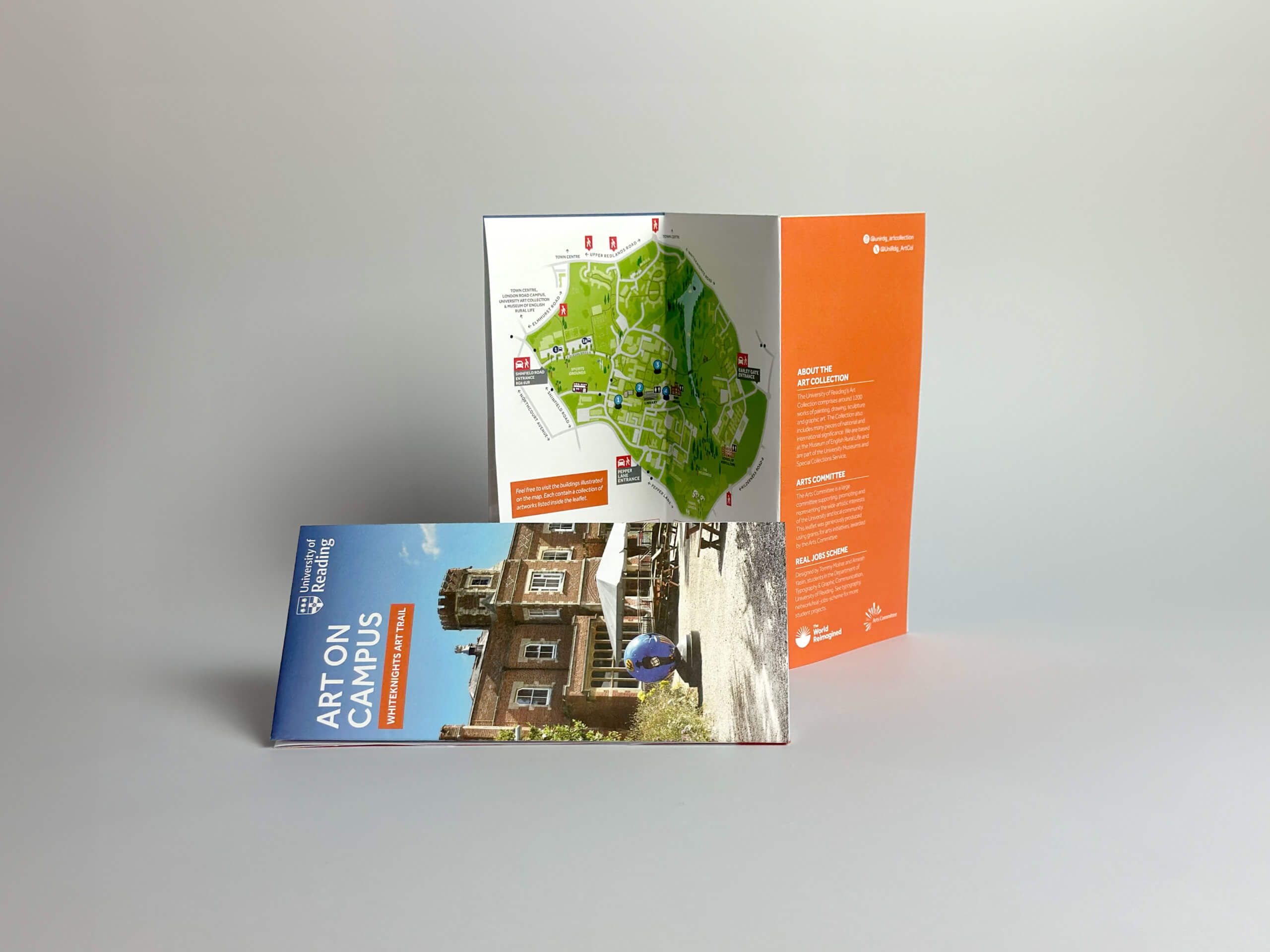
A print-ready leaflet containing a map of the trail and relevant information.
How the deliverables will be measured
Prototype leaflets will be produced, and a range of users will be asked to test the trail to measure the effectiveness and clarity of the map. Consistent feedback will be given by the supervisor and improvements made throughout the process.
User needs
The map must be easy to read with a clear structured route and only the most relevant information so as not to confuse the user. The leaflet must be suitable to be displayed in standard leaflet stands at museums, and similar public locations. As there is no specific target user, or age range, the interactive web map must be both accessible and easy to use. Accessibility needs must be considered within the leaflet design to ensure that it is clear which areas are accessible to all and which are not.
Notes from initial client meeting
- The University wants to collect public artworks to display around campus (e.g. sculptures, paintings, etc.).
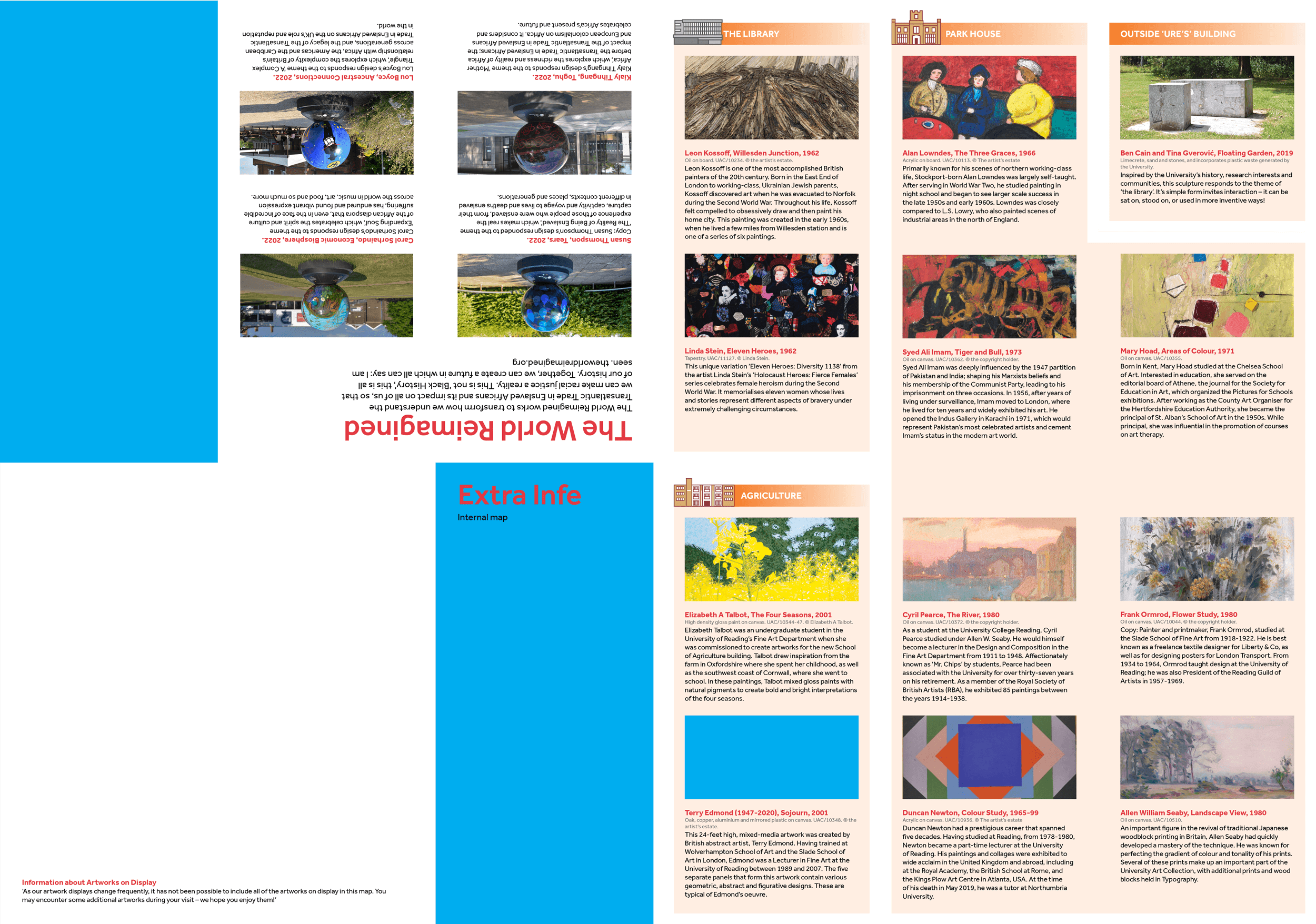
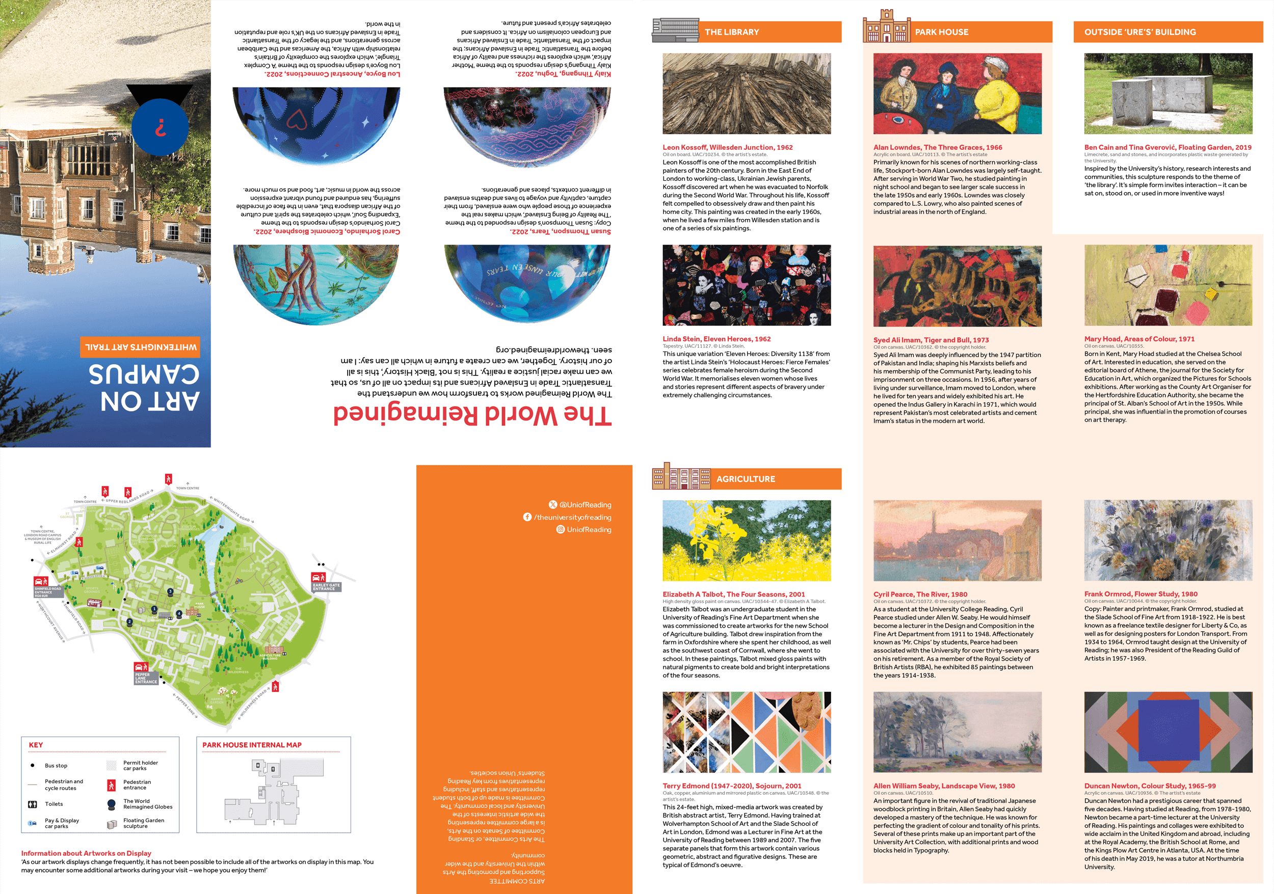
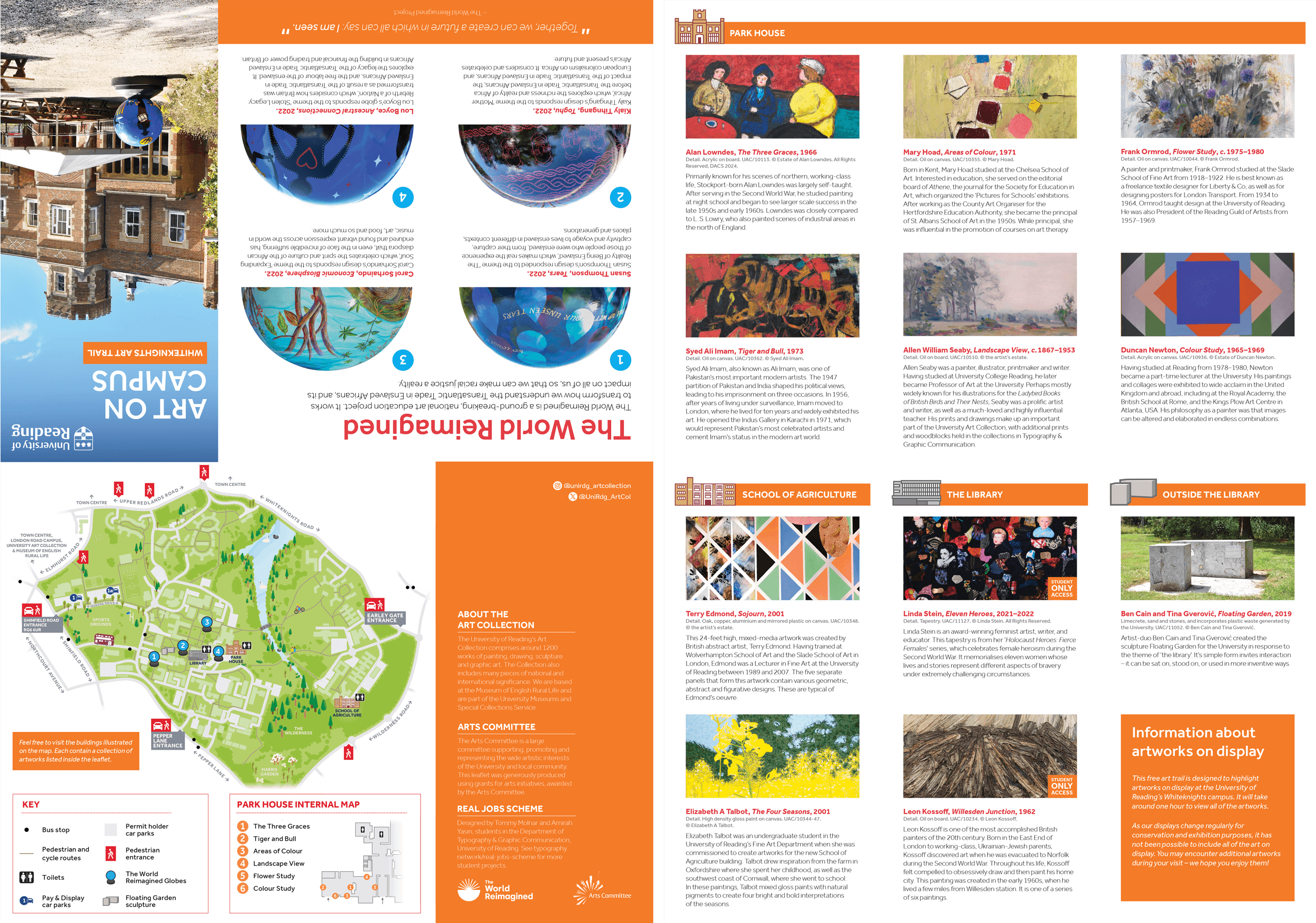
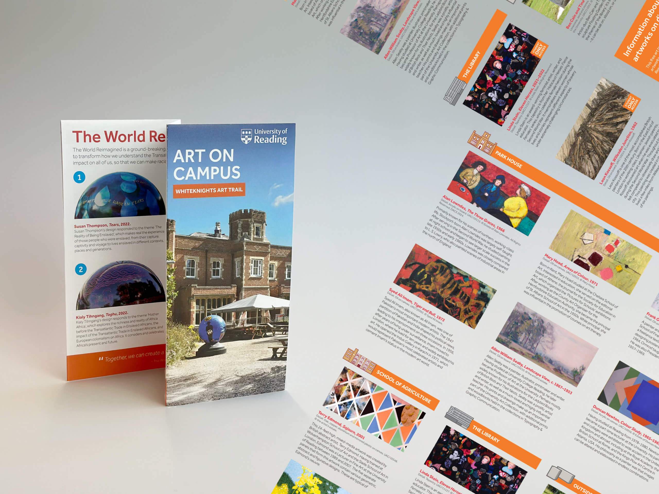
- The Arts Committee have acquired four ‘World Globes Reimagined’ sculptures to be placed roughly in greenspaces surrounding: the library, Park House, the URS building (near the reflective pool), and the Henley Business School.
- One of the sculptures on the trail, is the abstract sculpture titled ‘Floating Gardens’. The client has stated that this exhibit needs more representation as it is often overlooked due to its unclear nature as artwork or unconventional seating.
- The client mentioned the possibility of including some subtle signage to make the map and trail itself more cohesive.
- This project is expected to grow in the future, developing more iterations as the trail gets larger. There is already a commission underway for another public sculpture set for 2026.
- This is designed for the whole public not just students, however, confirmation is still needed regarding public access to university buildings.
Schedule
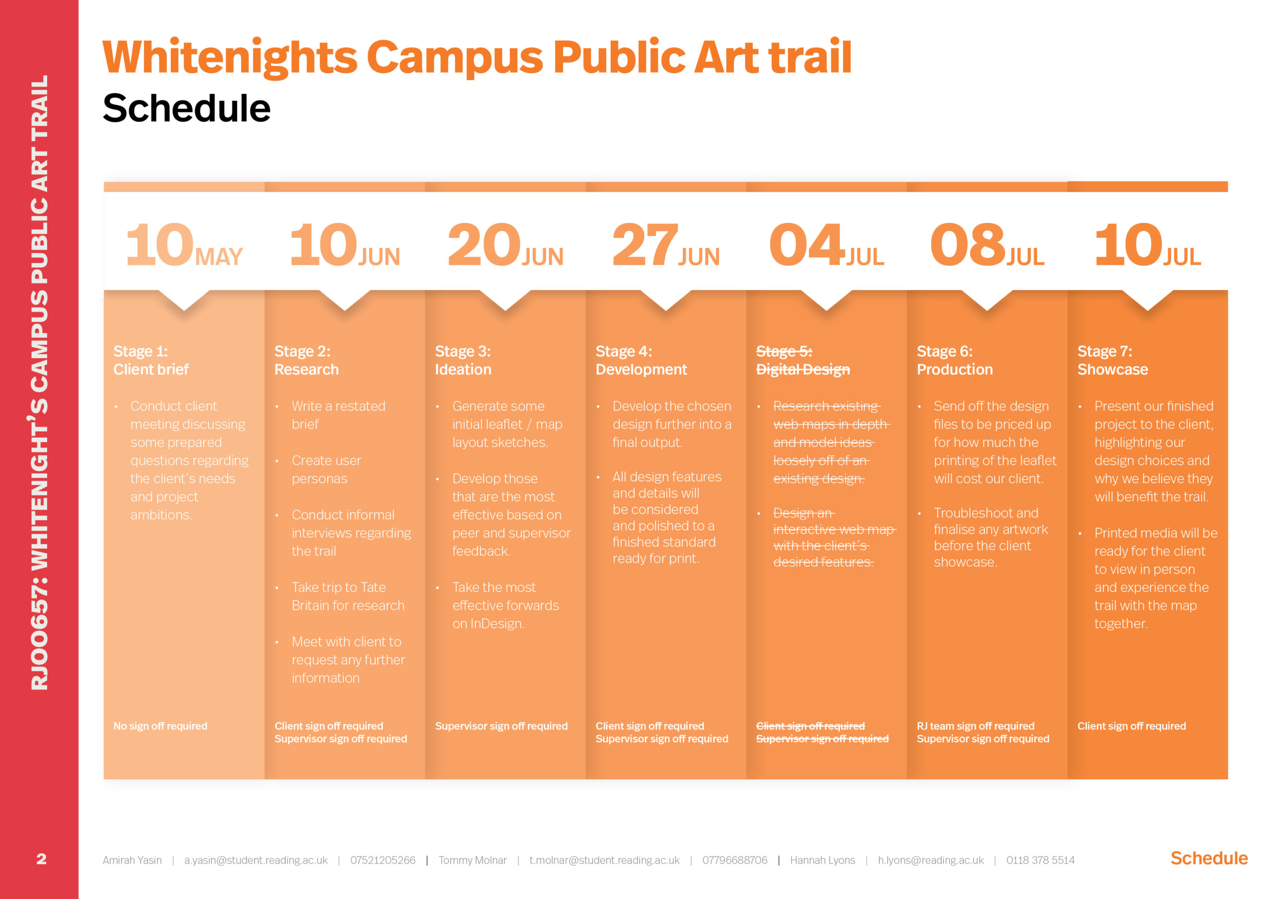
Research
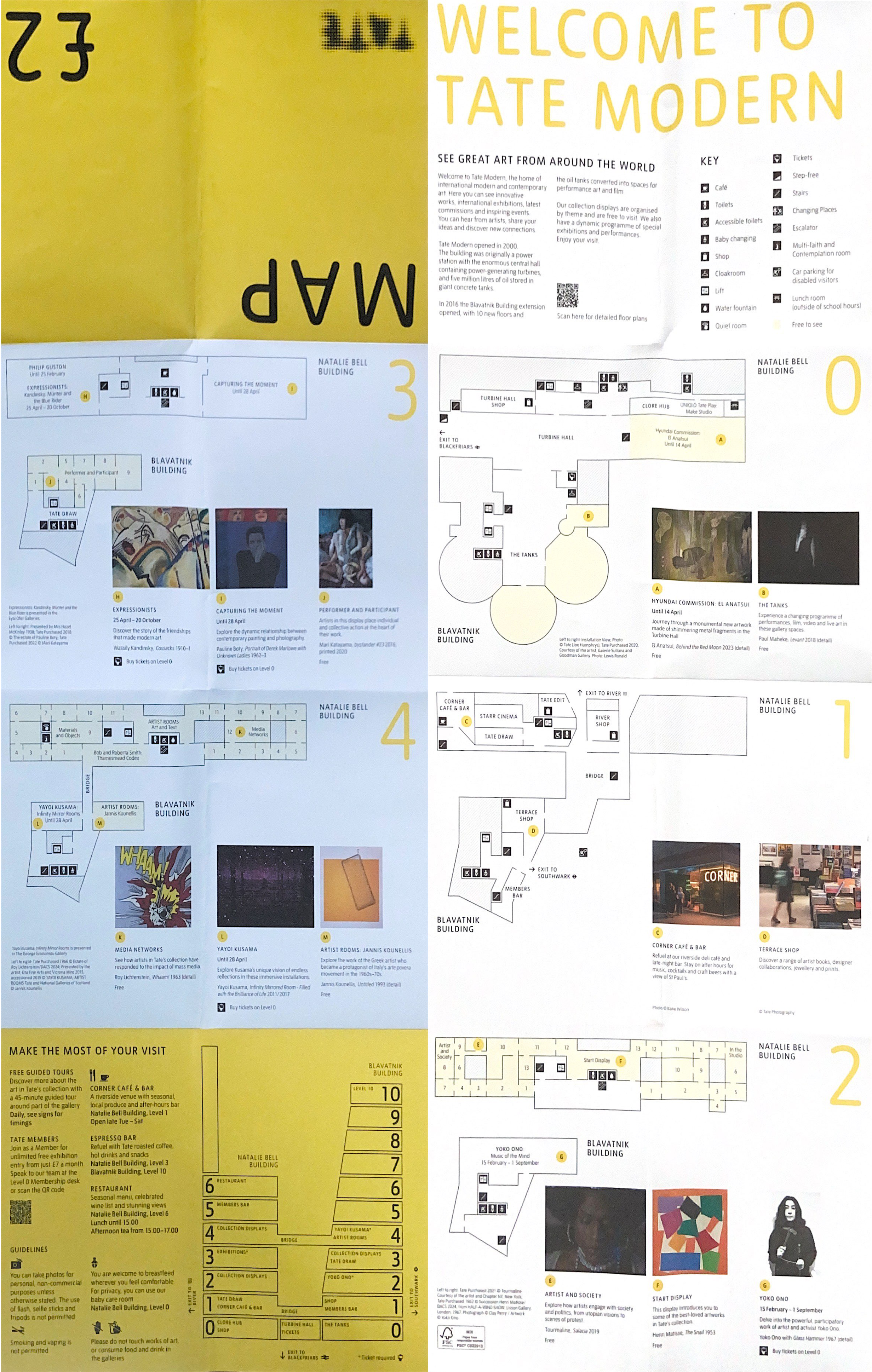
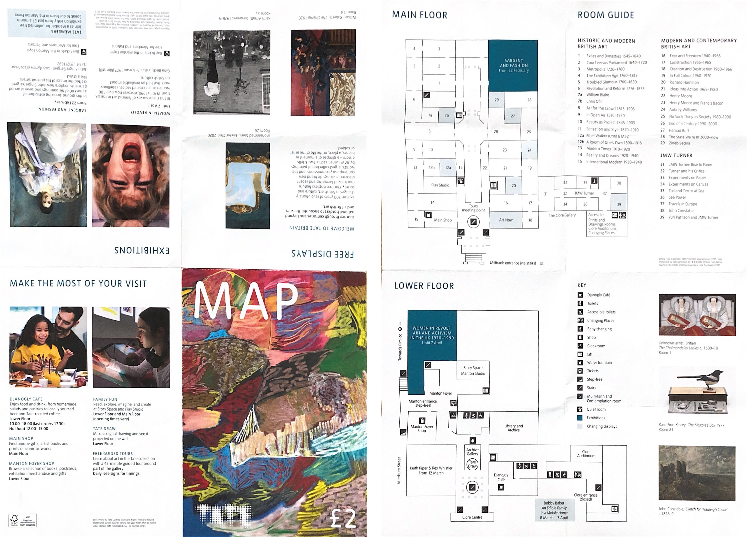
We began by asking our client if she had any existing points of inspiration for the leaflet/map. Our client found the leaflets used in Tate Britain and Tate Modern (figures 02 and 03) particularly inspiring and organised for us to travel to London to do some field research and understand what about the leaflets made them so memorable/inspiring. The true benefit of researching these existing examples was not simply looking at the finished product but using the map in context to explore the museums. This helped us better our understanding in learning what creates a clear leaflet and the techniques that could be used to differentiate different levels of hierarchy within the information displayed. It was insightful seeing the levels of detail needed for an internal map, and how the artworks could run alongside this in our own printed leaflet.
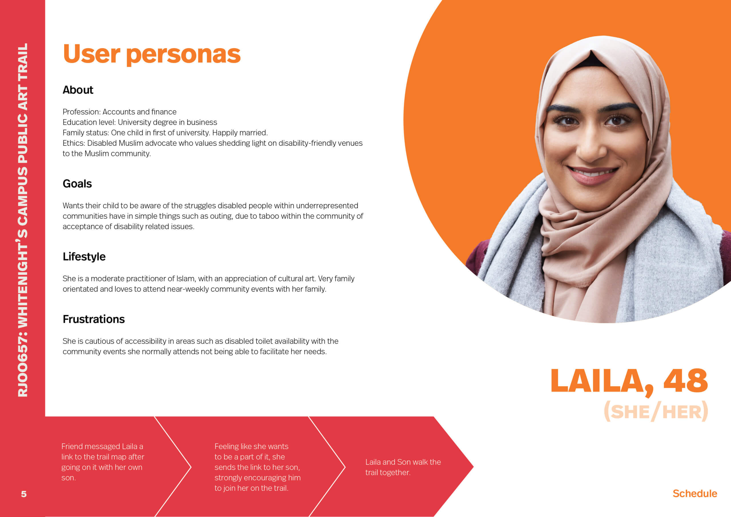
After this visit, we initiated further research by creating four user personas, specifically considering their lifestyles and frustrations as well as their journey that would lead them to the ‘Art on Campus’ trail (figures 04 and 05). This was an enlightening activity, perfectly illustrating the range of audience that we have for this project. From this stage of research, we found that potential users struggle to understand the information when it is overly busy, specifically for users that are neurodivergent can find overcomplicated designs overstimulating. This was an important consideration to make when designing our leaflet as we aimed to design for all users rather than just the neurotypical able-bodied. Continuing this path, we identified another user that may potentially struggle due to their physical ability, someone who is partially visually impaired. Due to this, we intended to consider the type-size and experiment several times by printing prototypes.

Ideation
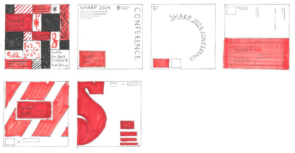
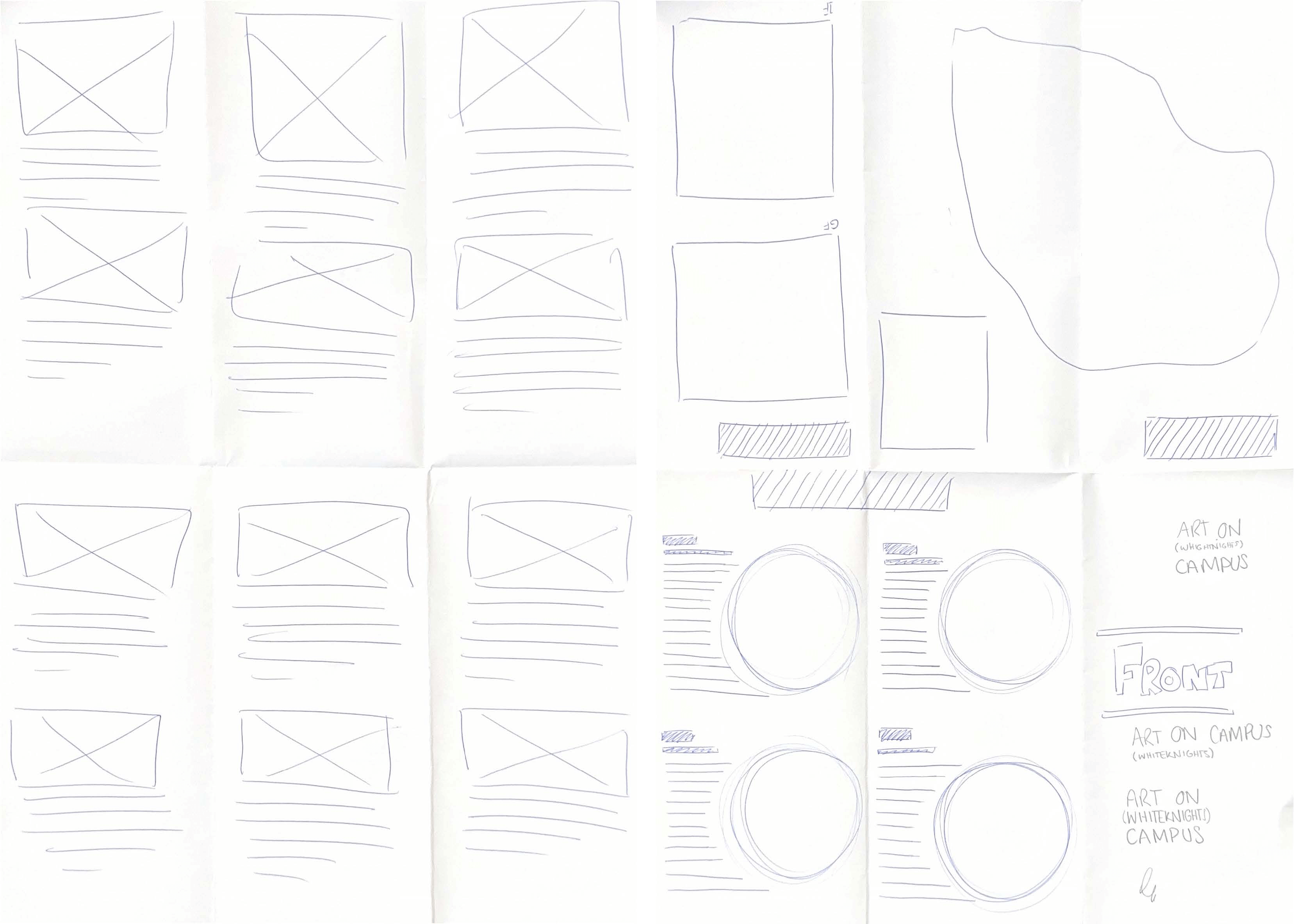
We began with sketching and folding multiple layouts using scrap pieces of paper (figures 06). This way we were not spending too long making the sketches/prototypes aesthetically pleasing. Along with testing out multiple folds, we also experimented with where the different areas of information would be placed within these layouts, where we were torn between a cross-fold leaflet and a three-fold leaflet. Once we were happy with a few chosen layouts, we sketched them neatly on samples of the paper stock that we were planning to use (these would be the copies that we passed onto our client for her to approve the layout), as seen in figure 07. Our client was keen for us to work with a cross-fold leaflet and was happy for us to use similar placements.
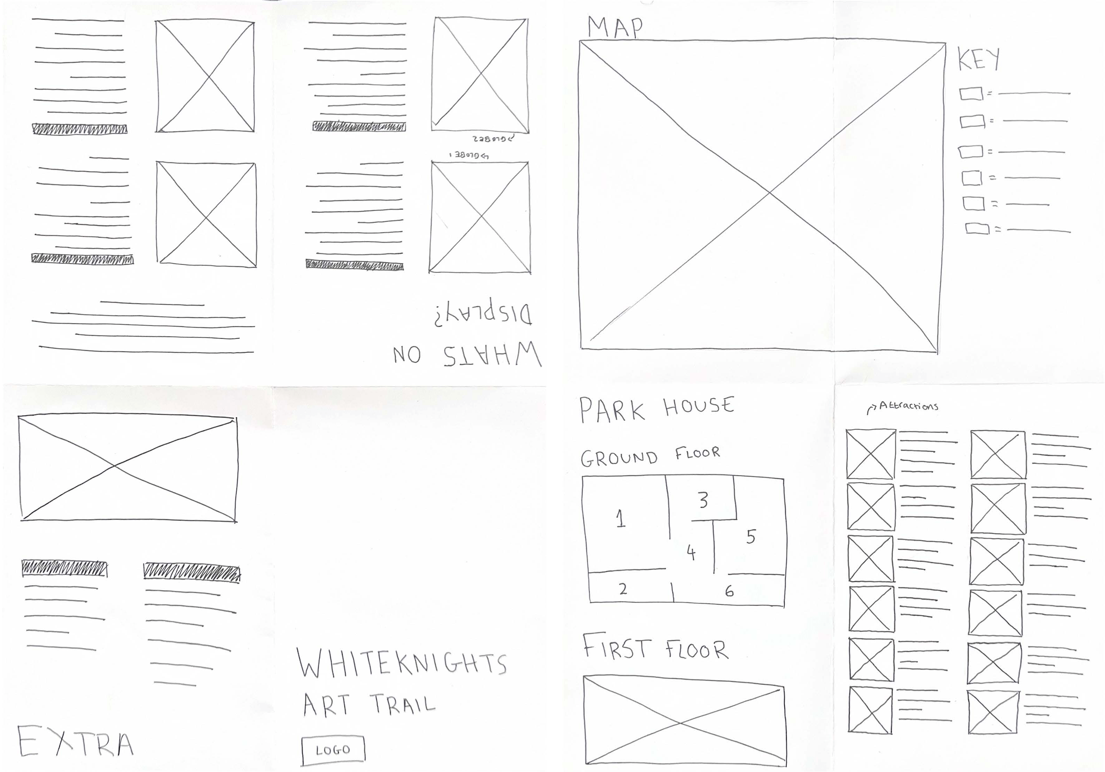
Once a rough design layout and fold had been agreed on, we started laying out very simple wireframes with placeholder images in InDesign. We split the design work between the two of us, with one of us focussing on leaflet typesetting and layout, and the other focusing on the design of the map.
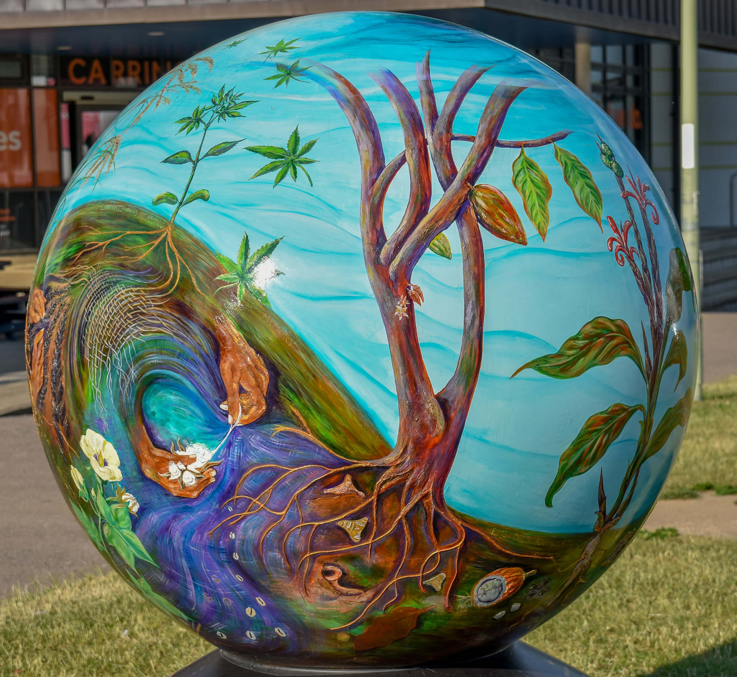
Part of the process involved taking our own photos, so we made a trip into the University, borrowed the professional camera and took some pictures of the artworks and the four globes (figure 08). These photos then required a significant amount of light editing, achieved across both Adobe Lightroom and Adobe Photoshop which was relatively new to the both of us and a great learning opportunity.
Development
To begin our digital design phase, we decided we would adopt a system where we would work on separate InDesign files as to limit any problems happening with the files, and would come together and create a new, updated document with the other person’s work. Upon completing the separated areas, we worked together trialling different styles of inputting imagery and how, for example, the rounded shapes of the globes would work against our rectangular grid.
We used each other’s honest critique and improvements to refine our digital design, along with booking in an extremely valuable feedback session with James to review an early-stage print. Once we were happy with a digital design, we showed it to our client along with a short presentation for review and received some changes to the copy and a proposal to change the layout of the page containing the artworks. Initially, this took us back as a lot of work to do, however, we systematically went through the changes, highlighting them as we completed them in a shared doc. We went through several iterations throughout the development process, as seen across figures 09–11.
After making our client’s suggested changes, we went back to our supervisor and asked for some final critique, and the level of detail that was looked at was eye-opening. In the final feedback, it was suggested that the image on the front cover was a little faded due to the light editing, so we went to Geoff for a quick personal tutorial on light editing in photoshop and achieved a look that we were confident with for our hero image on the title page. We learnt a lot from this experience down to the most minute detail of changing thin spaces to hairline spaces.
Production
The production phase of the process was eye opening as communication was the main skill required here. When discussing the production spec with the Real Jobs team, we were not clear enough on the type of fold required which led to the incorrect fold (a roll-fold) being sent to CPS for the spec. As the both of us were keen to deliver what we had proposed to the client, we refolded all 6500 copies by hand to ensure that they were in a Z-fold format. This taught us both how important it is to be clear with the spec and to specify things like this in writing before sending them to print. This also taught us to request printer proofs before going through with the final print to ensure that the standards and requirements are being met.
An art working problem we came across was the outcome of the colour in our final printed leaflets. Due to exporting a pre-existing map from a .pdf and importing this into the Illustrator file we were working on, the colours when printing our leaflet were not as we expected due to the importing of the map altering our version of the file into RBG whereas when printing we needed CMYK programming. We did change various settings to achieve this, however upon printing, it turned our darker than expected. It was unclear here whether this was just down to the printing settings, or the following issue discussed of paper choice.
A final issue we encountered was the paper choice we settled on. We set out to print on 115gsm silk coated paper which was agreed upon with our client however due a last-minute alignment with university brand guidelines, this needed to be changed to 150gsm Evolution Business meaning we were only able to print 6500 leaflets as opposed to the 11000 we set out to deliver.
Outcome
Feedback
Client feedback
“We have only been getting wonderful feedback for the map, so I think the thanks are down to you both entirely! …I was really pleased with the whole project from beginning to end and I have nothing negative to feedback. It would have been great if we could have had the paper that you had initial chosen for the maps rather than the University approved one, but that’s an issue for us to discuss with CPS for future iterations of the map.” – Client
Supervisor feedback
Our supervisor was impressed at the quality of work produced by two first year students, and although he mentioned that there were still some areas to improve for future iterations if we get the chance such as detailed alignment issues or print quality, overall, he believed that the design looked in accordance with the brand guidelines, professional, and fit for purpose.
Reflection
Our key take aways from this project were:
- Always request proofs from the printer.
- Ensure that important information regarding the spec is written an email chain.
- Understand the brand guidelines you are required to work within from the start.
- Seek out original file types as opposed to exporting from a .pdf.
- Ensure everything is in CMYK or RGB depending on the project.
- Maintain constant communication with all parties not just the client.
By Tommy Molnar and Amirah Yasin