Background on the project
RSG is a local charity in Reading supporting refugees. They recently changed their name from RRSG (Reading Refugee Support Group) to just RSG (Refugee Support Group) in order to receive more funding from all over Berkshire, not only Reading. They required a profile-raising social campaign to raise awareness of their new name and to receive more funding from statutory sector organisations.
Restated brief
In writing the reinstated brief, we used meetings to define our client’s needs and target audiences. However, this was our largest hurdle. Our client knew they wanted to bring recognition to the charity’s new name, but didn’t have a brief to give us beyond that. Instead of letting the lack of brief hold us back, we took the initiative to write our own brief. This gave us the advantage of working to our own strengths. We used client research to identify where the charity’s social media was lacking and this informed us of what the client actually needed. We proposed to create six Instagram posts which highlighted each of their generous services. Our client agreed that by shedding light on how successful their services are, we could attract more donations from statutory organisations, thus achieving their goals.
The agreed deliverables were:
- 6 posts dedicated to each service provided
- 1 video/animation
Research
Before the ideation process began, we underwent a period of research. This included researching RSG as a charity; their goals, audience, identity, but also researching how other successful non-profit organisations promoted themselves on social media. We looked to charities such as Amnesty International, World Relief and Refugee Action to analyse what the norms were within this sector. We also spent time analysing how RSG represented themselves within their platforms; reading through the contents of their website, Instagram and Facebook. Through this research we discovered that RSG’s social media posts lack cohesiveness due to inconsistent representation of their brand guidelines.
Reading City of Sanctuary
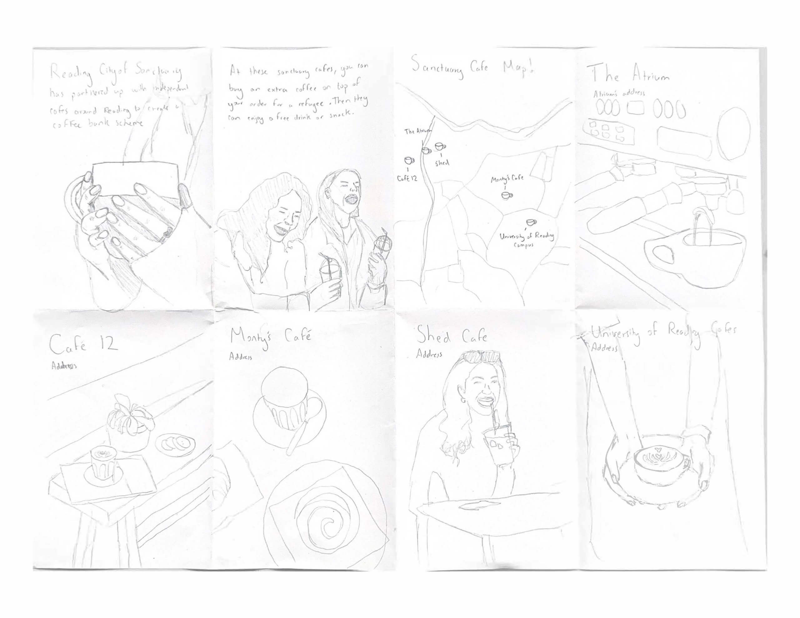
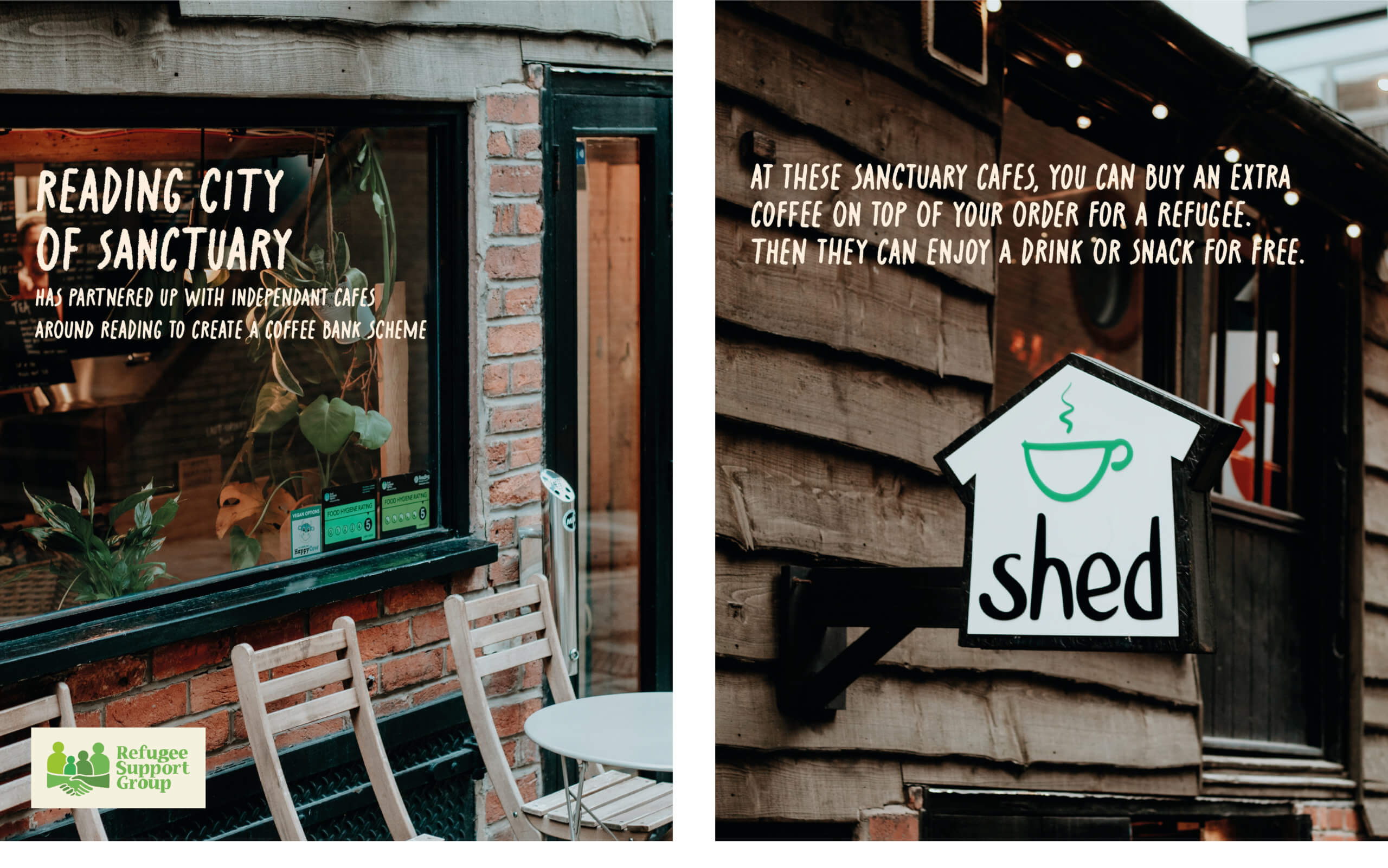
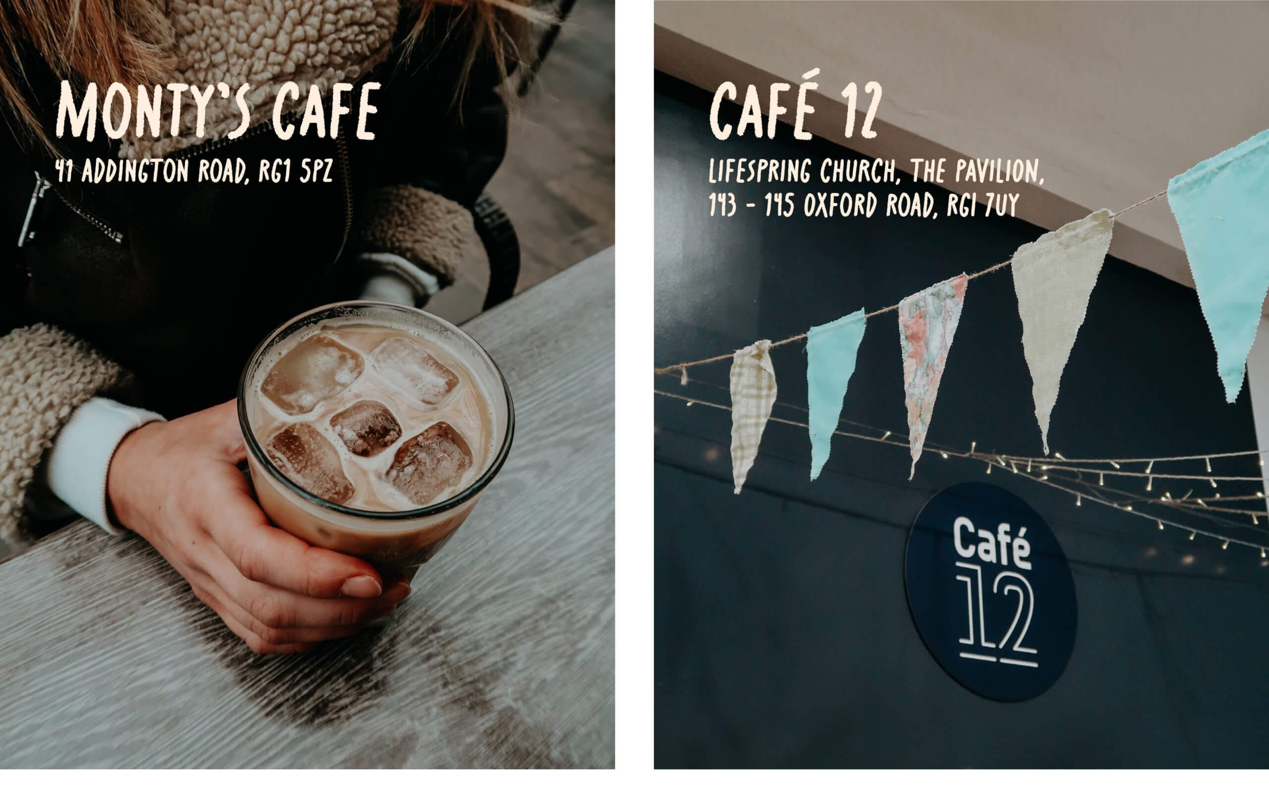
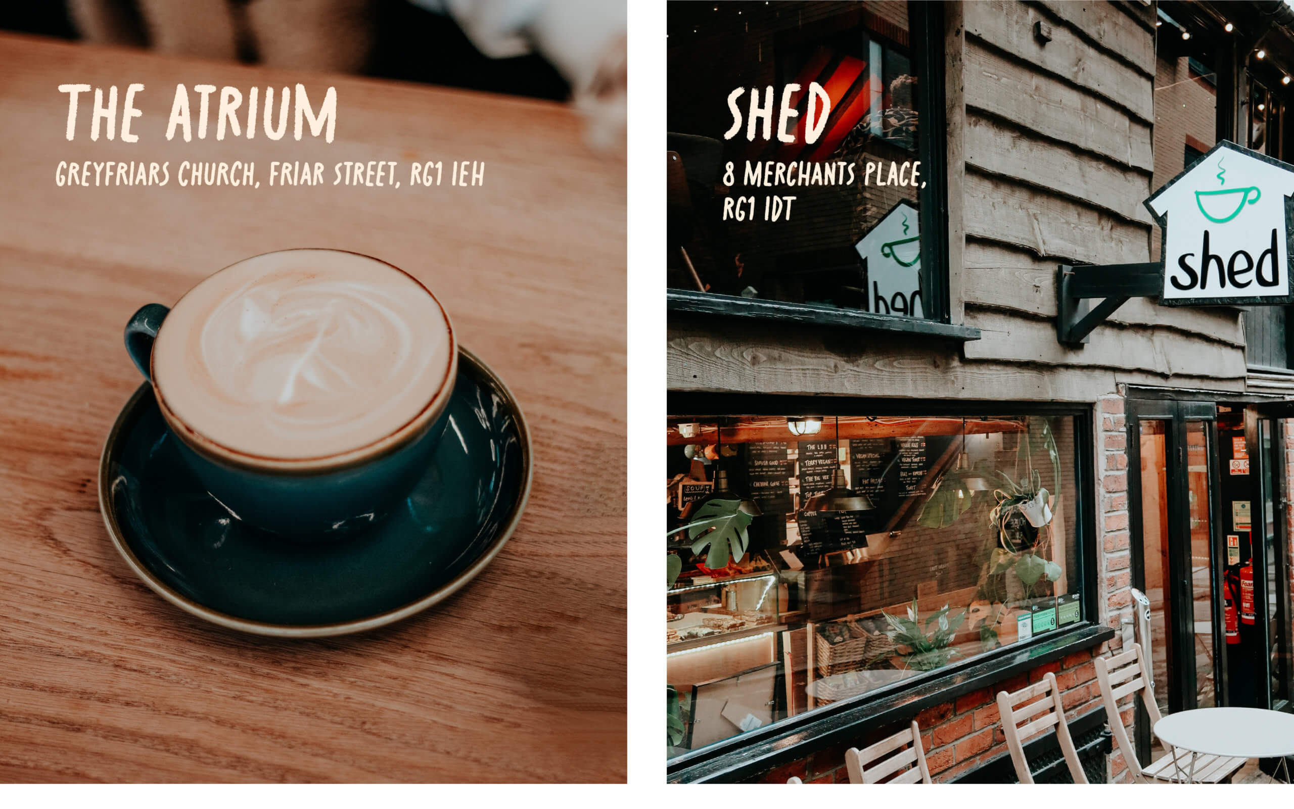
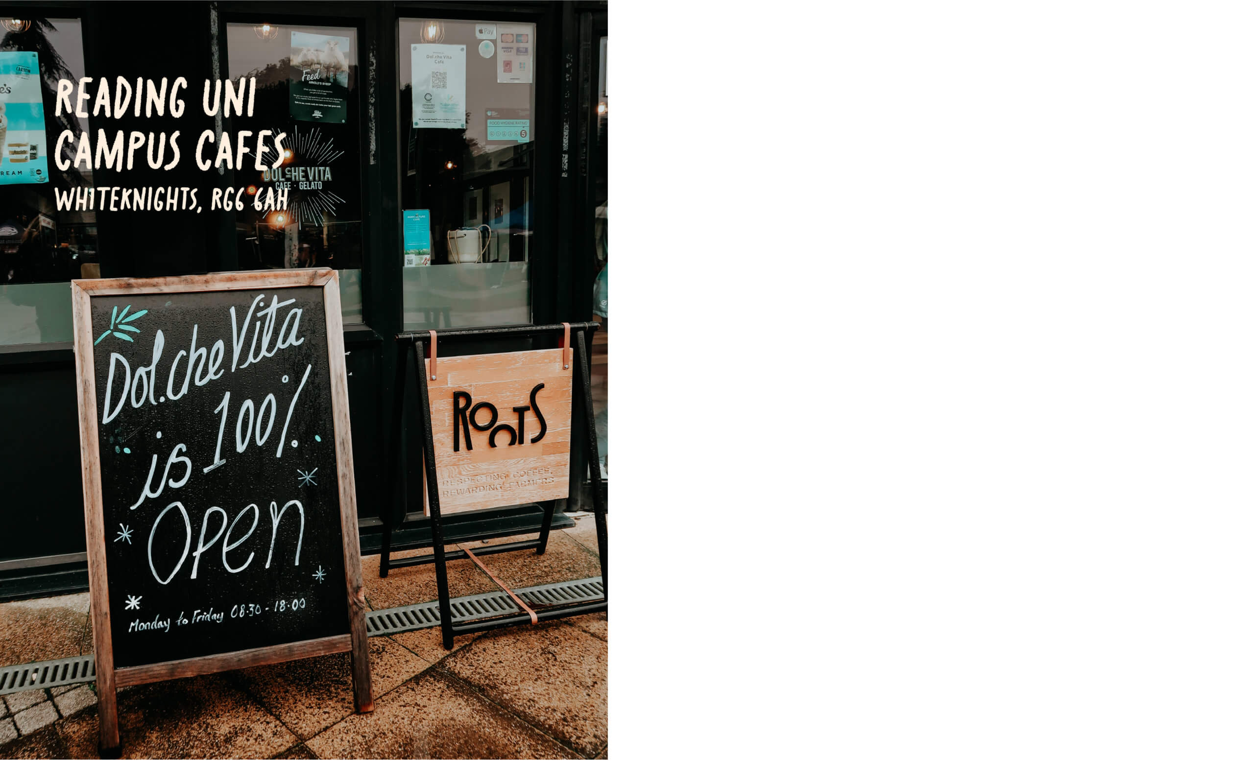
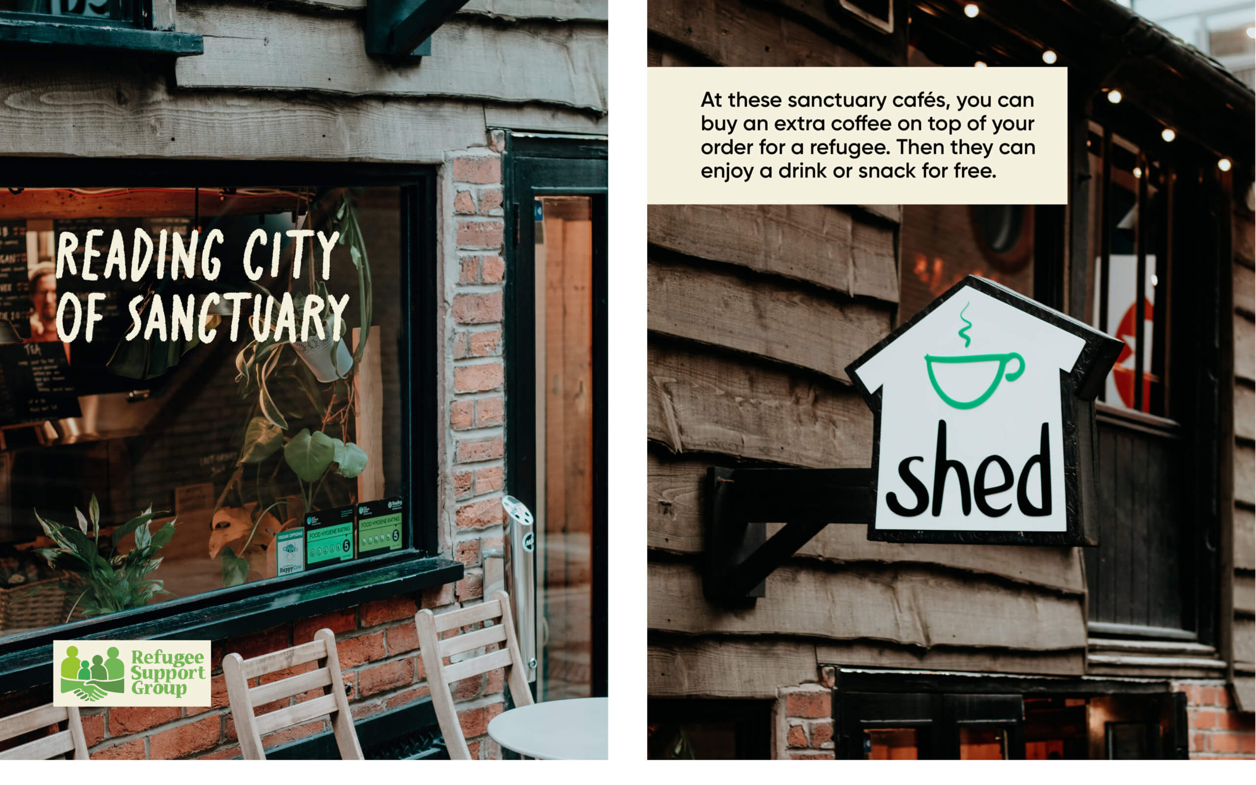
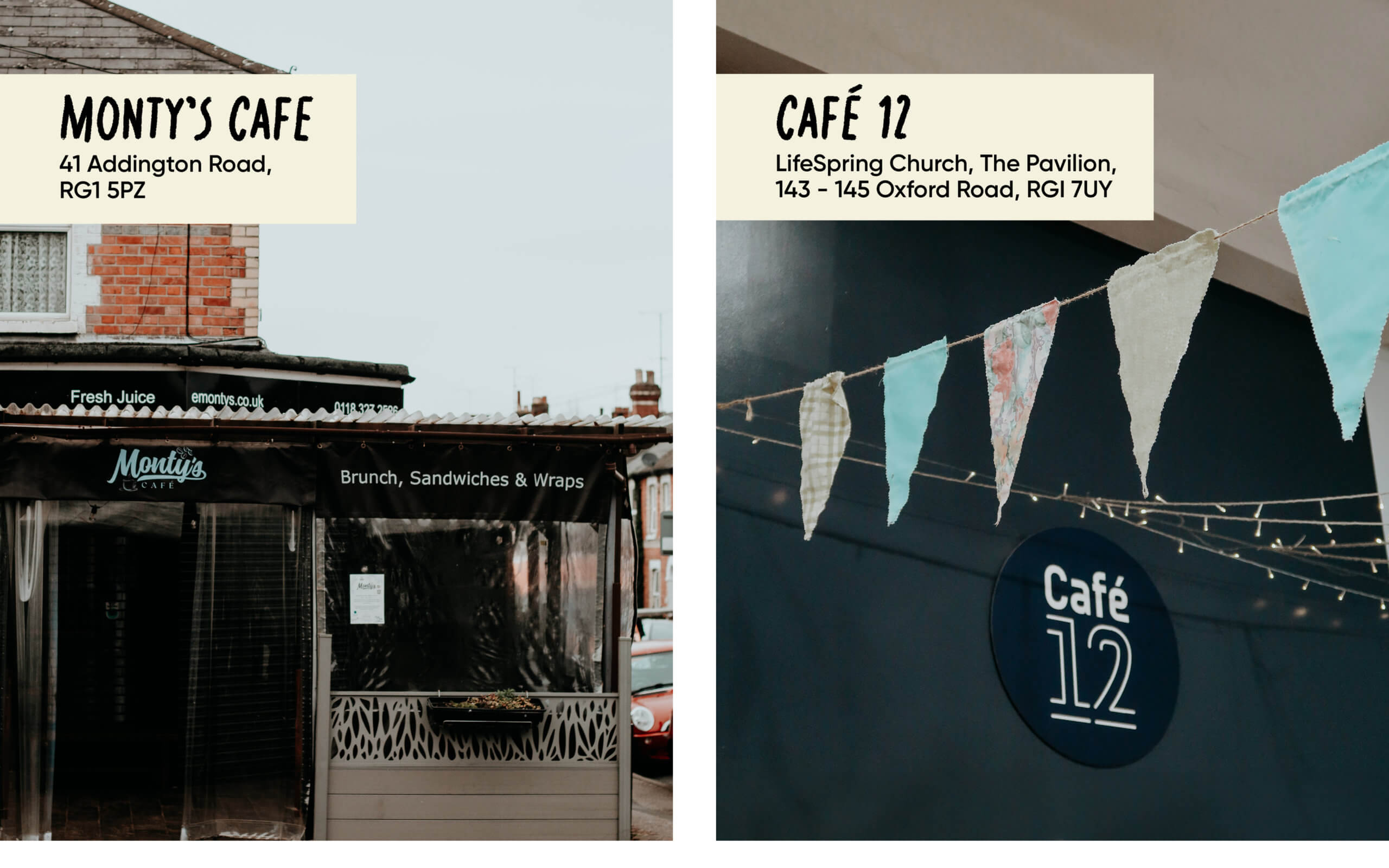
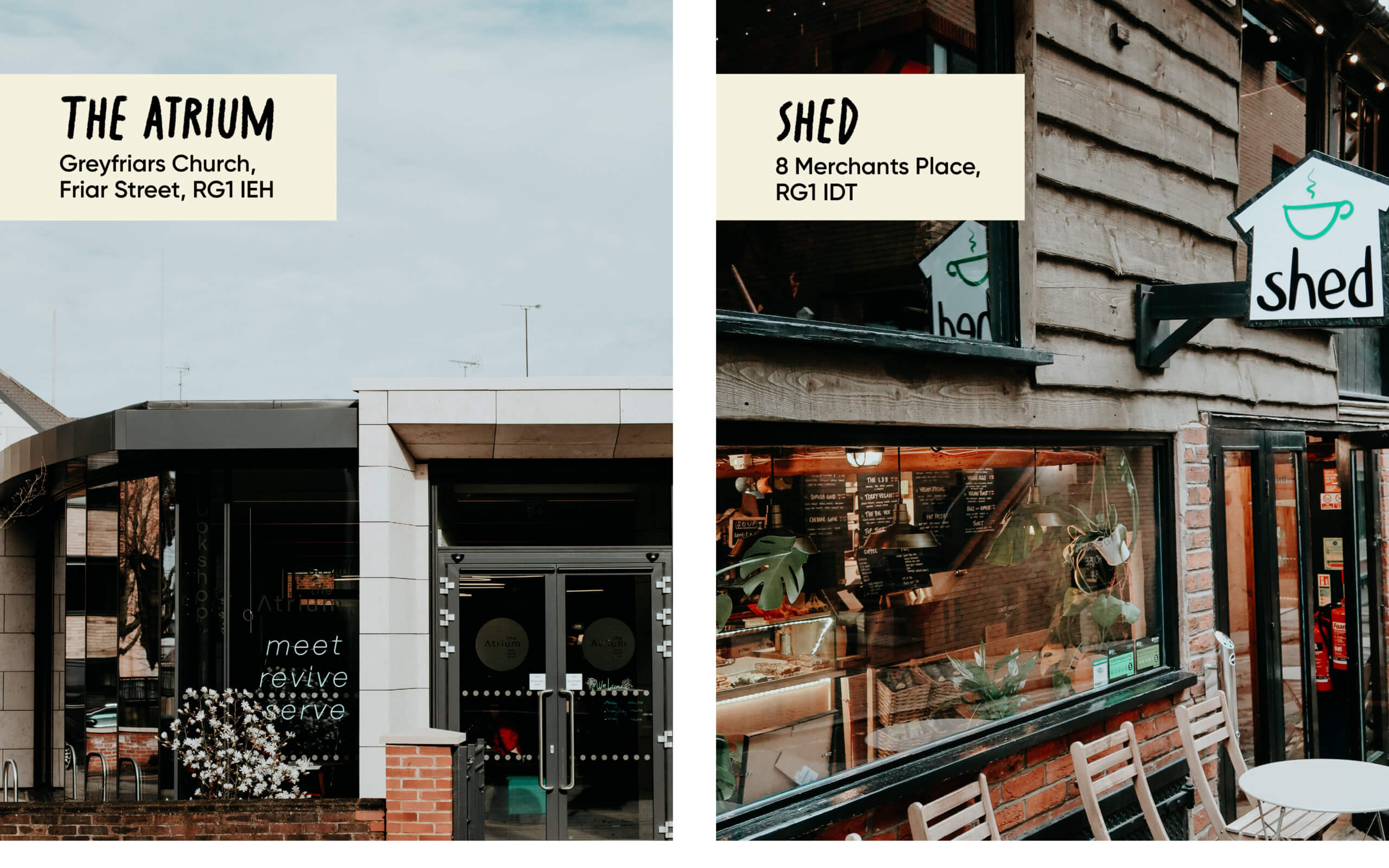
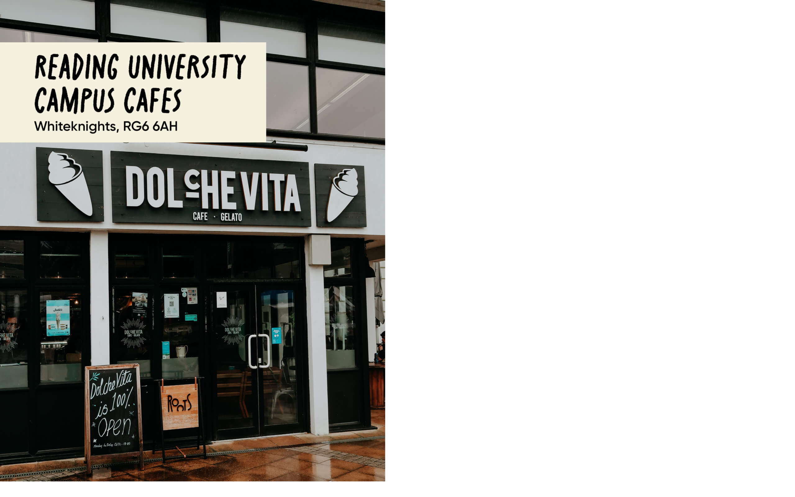
RSG runs a coffee bank scheme where refugees can get a free coffee in a selection of cafes across Reading. We took photos of each café, meeting the owners and talking about their experience partnering with RSG. These photographs were used to create an Instagram carousel, with each slide displaying a photo of the café along with its address. This was an exciting chance to learn more about using photography and Lightroom in combination with InDesign. Furthermore, interacting with the partners of RSG and the work they do provided us with more of a connection to their audience. A difficulty we experienced with this post was placing type upon photos in a legible manner. Often the type became problematic as it began to blend in with parts of the imagery. To resolve this issue, we placed a colour block behind the type to prioritise legibility. Upon client feedback, we also returned to the cafés to replace images of coffee with images of the outside of the cafés, so that the audience would be able to recognise the cafes when in Reading.
Final visuals
Settlement scheme
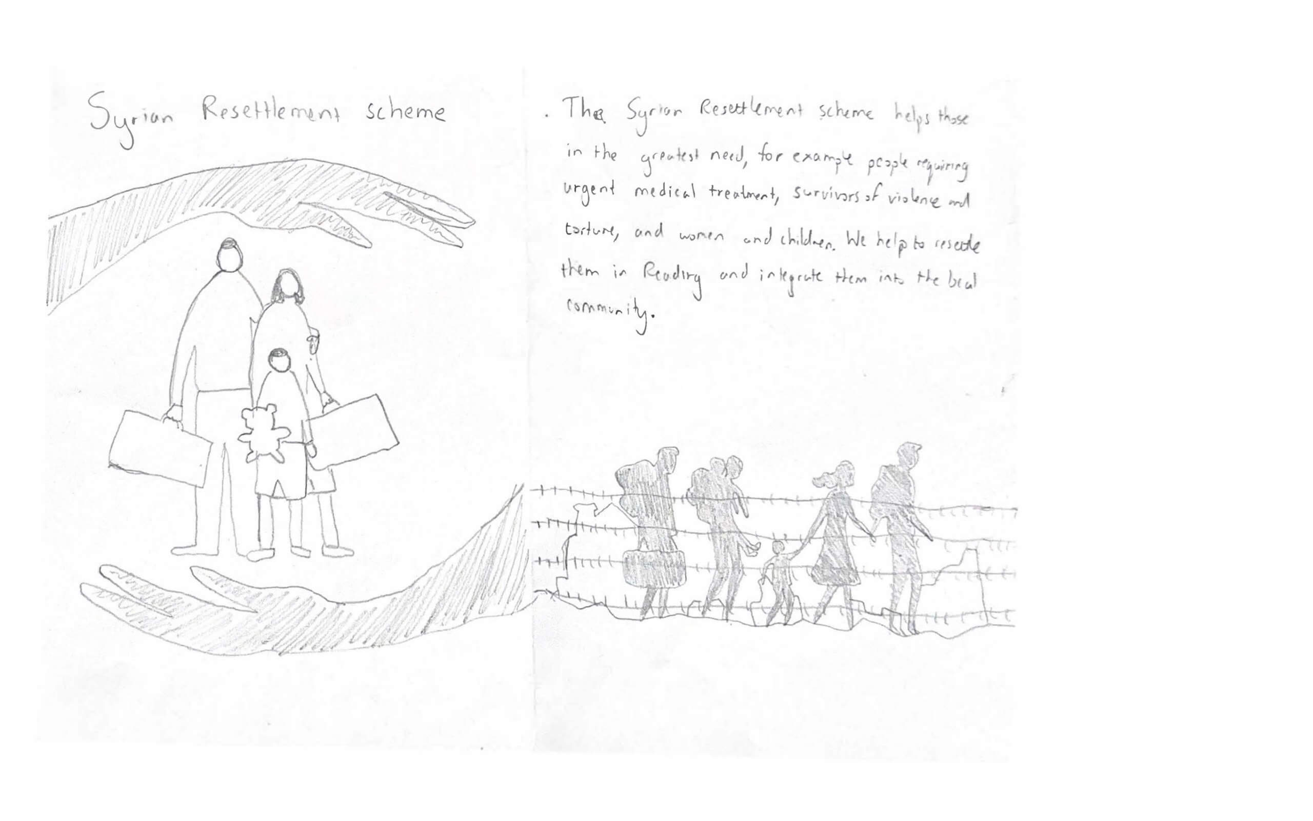
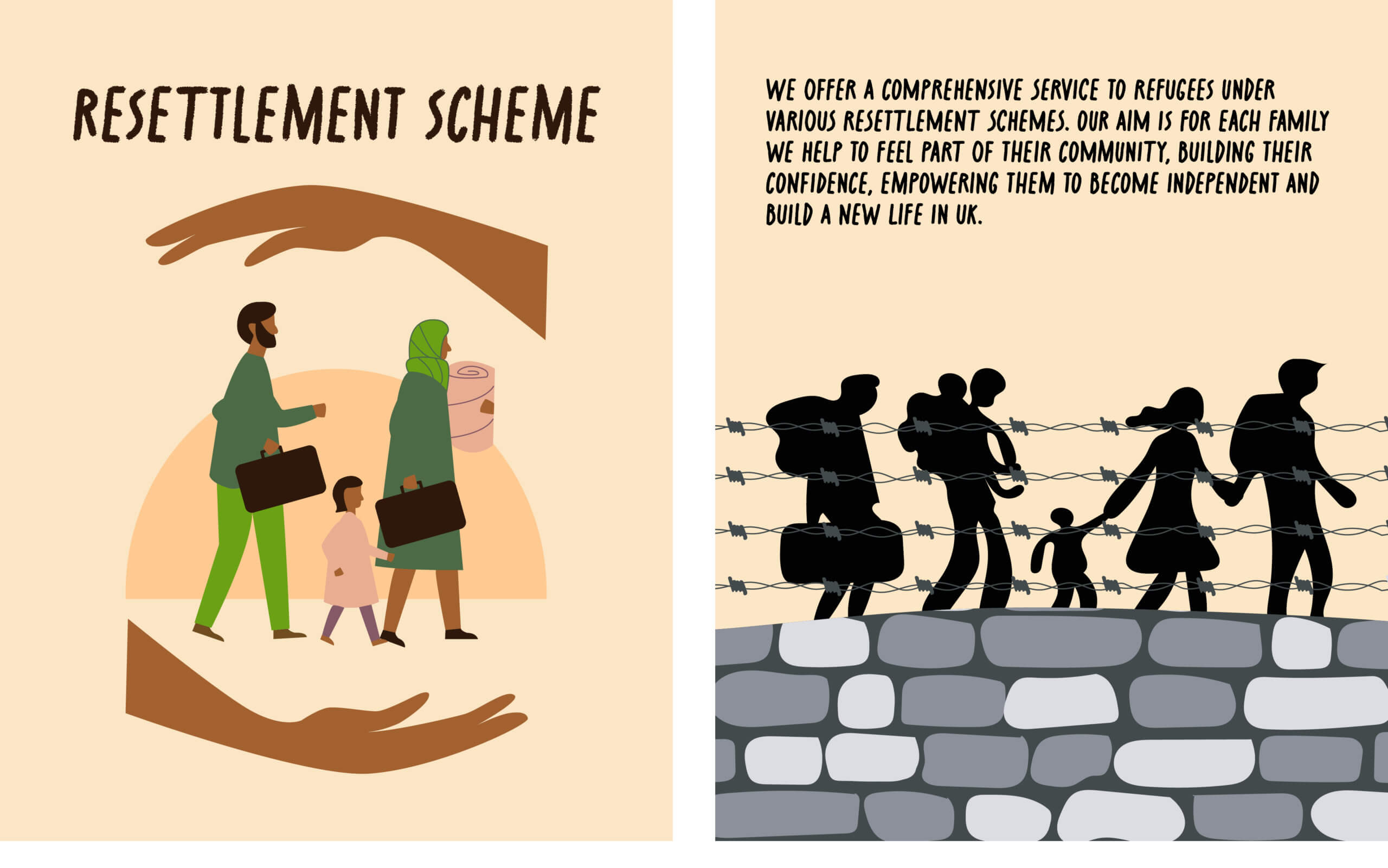
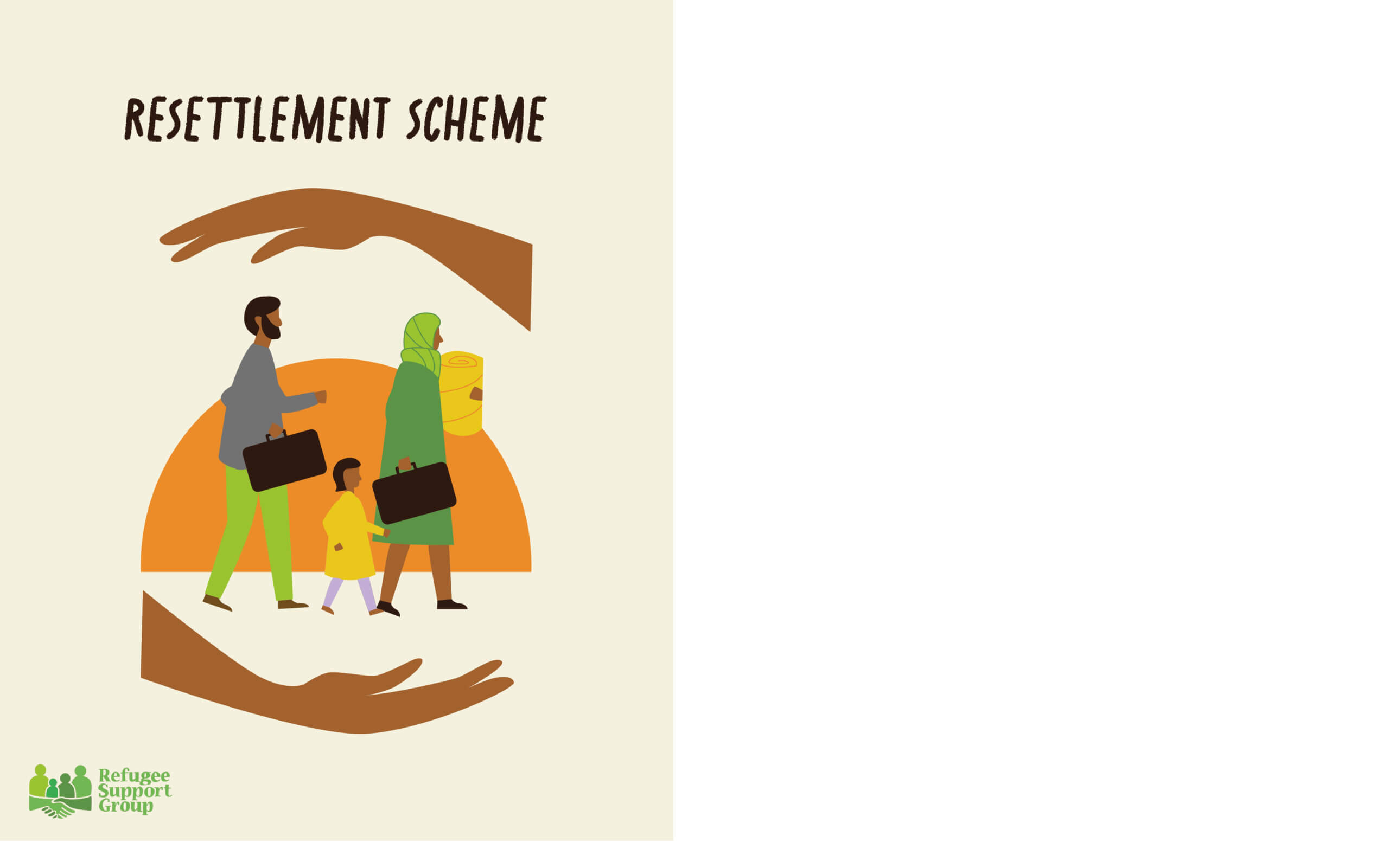
In creating the resettlement scheme post, it was important that we kept in tune with RSG’s brand identity. Therefore we made sure to present people of different cultures, religions, and backgrounds to demonstrate RSG’s diverse audience. Using their specified brand colour palette, our posts felt cohesive with their website and previous social media posts. We originally had planned to have a second slide, which illustrated a refugee family travelling to the U.K. However, our client advised not to use this slide, as much of the information about the resettlement scheme was currently changing and the body copy may not reflect the scheme accurately when it was time to post the slides. She gave feedback that it would be more useful to have a title and illustration which embodied the values of the scheme, and that body copy about the scheme would be more suited to being in the caption of the Instagram post.
Final visual
Befriending
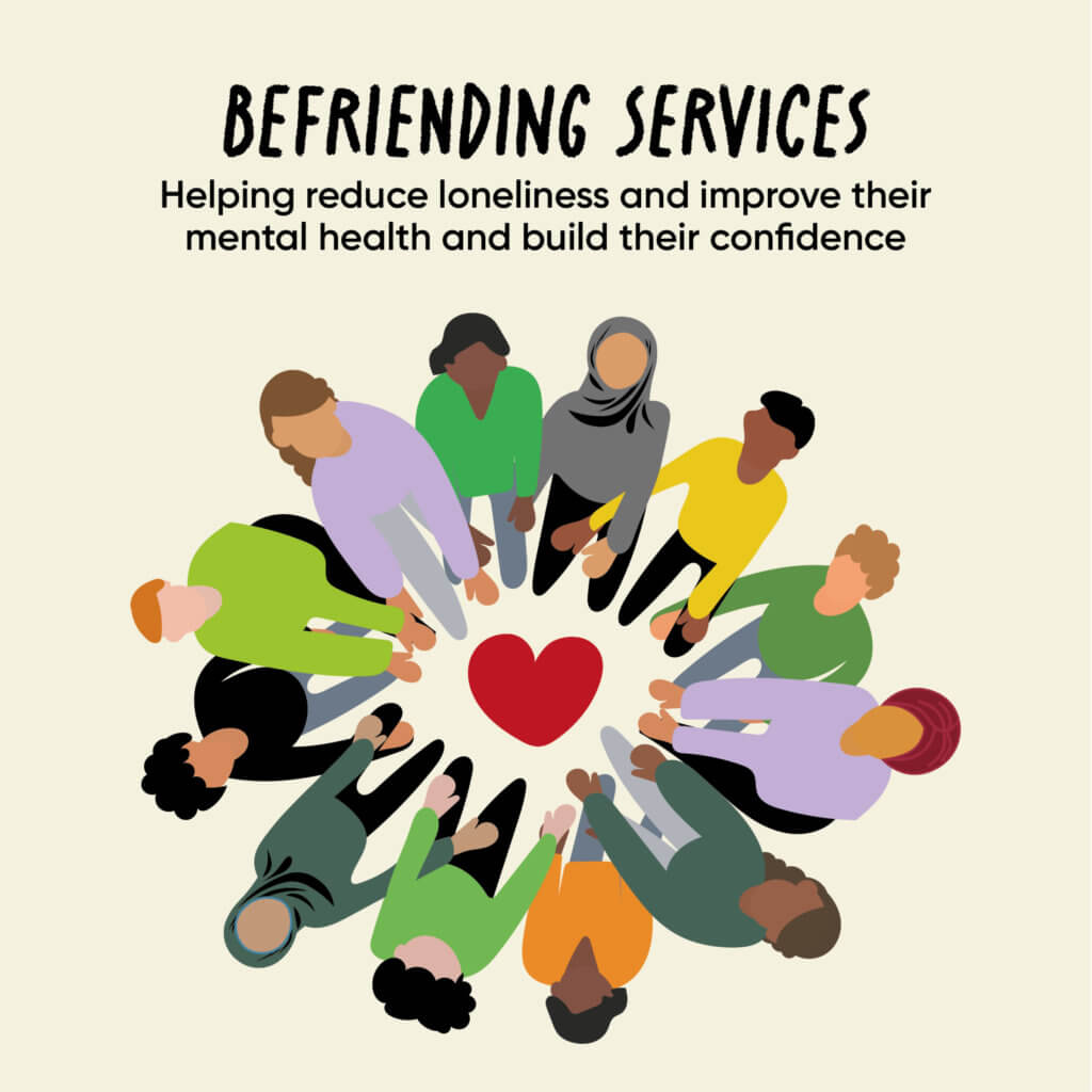
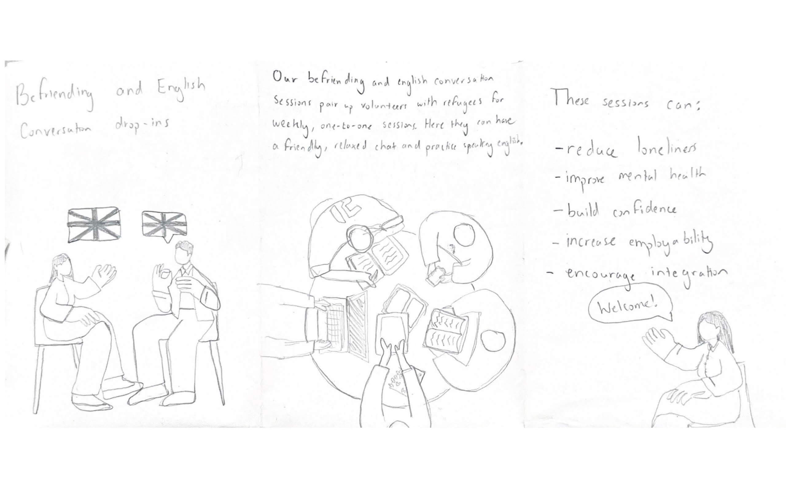
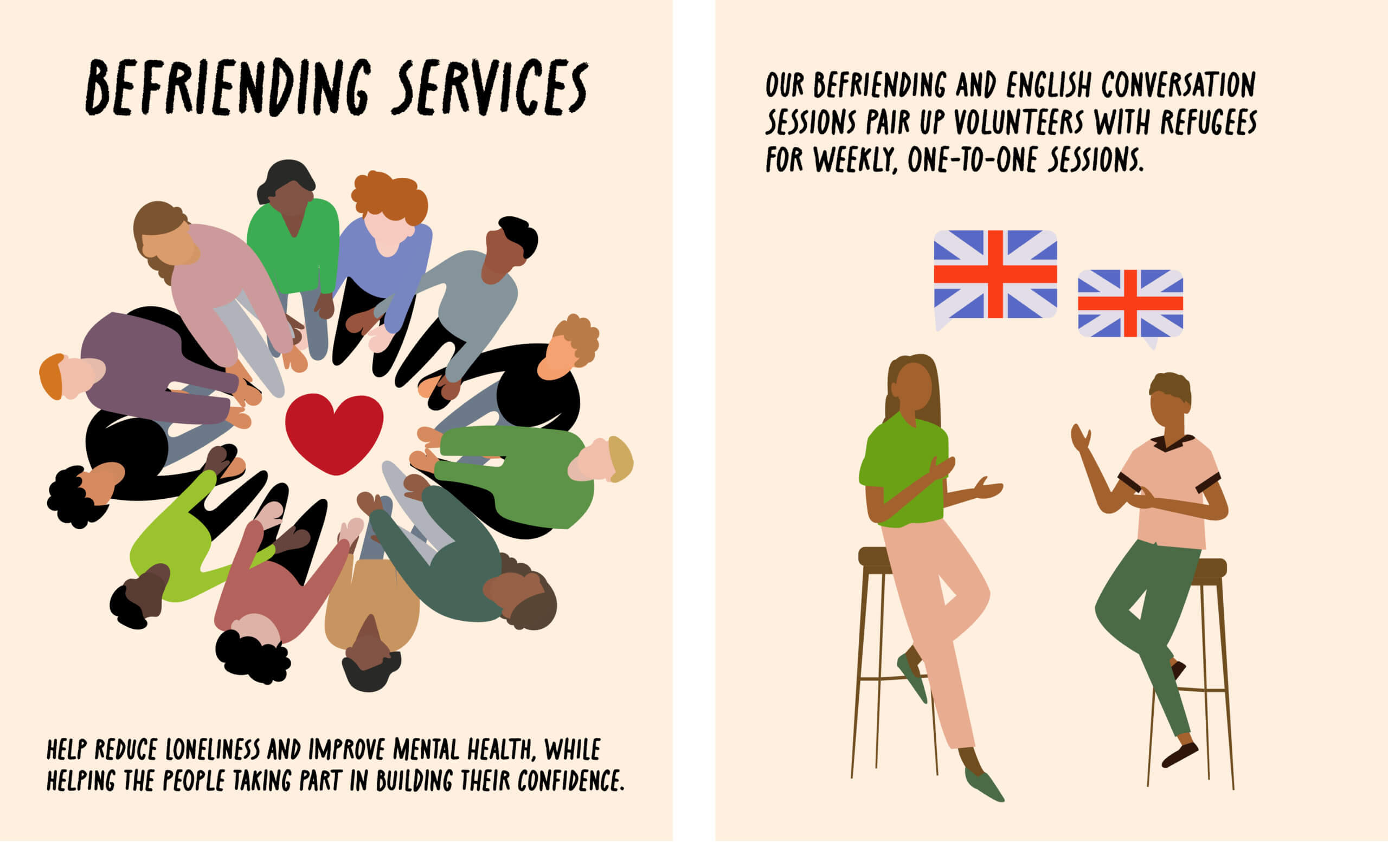
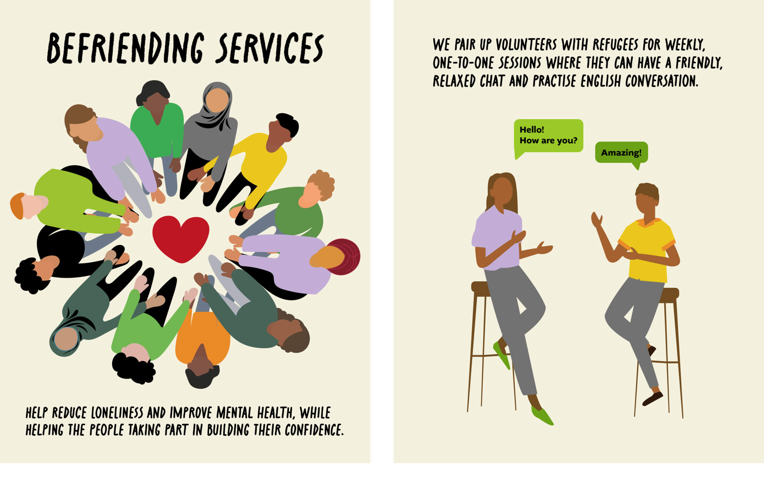
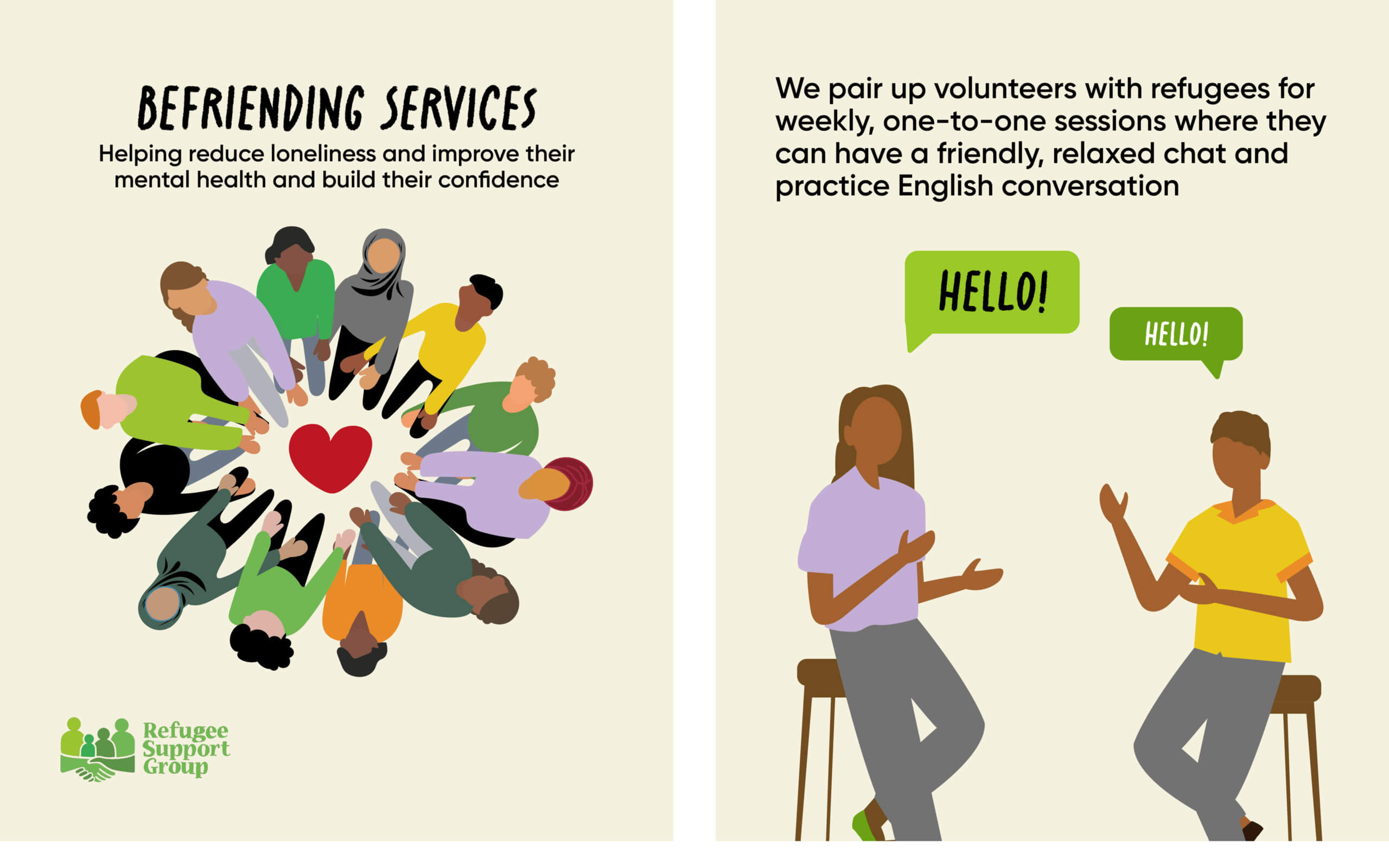
RSG’s ‘Befriending and English Conversation’ sessions are a service which helps refugees to improve their English skills, confidence level and reduce loneliness. We decided to demonstrate in this post how RSG builds a community and assists refugees of all ages, genders and religions. For this post we chose to create two illustrations as this would give us the freedom to experiment with colours, shapes and layout. When creating the befriending service illustration, we digitally drew a circle of people joining hands together to present how RSG unites refugees together. After feedback from our supervisor, we recognised that our design needed to be more inclusive to all cultures and religions. We adapted the illustration to include some people wearing hijabs and turbans, as well as altering the colour scheme of the illustration to follow the specified brand colour palette. In the second slide of this post, we wanted to represent an English conversation class between a volunteer and a refugee. Originally we executed this concept by illustrating British flags within speech bubbles, however feedback from our client advised us that using the British flag could carry unwanted connotations. Therefore we iterated this illustration to represent English conversation through informal text in speech bubbles.
Final visuals
Advice Support
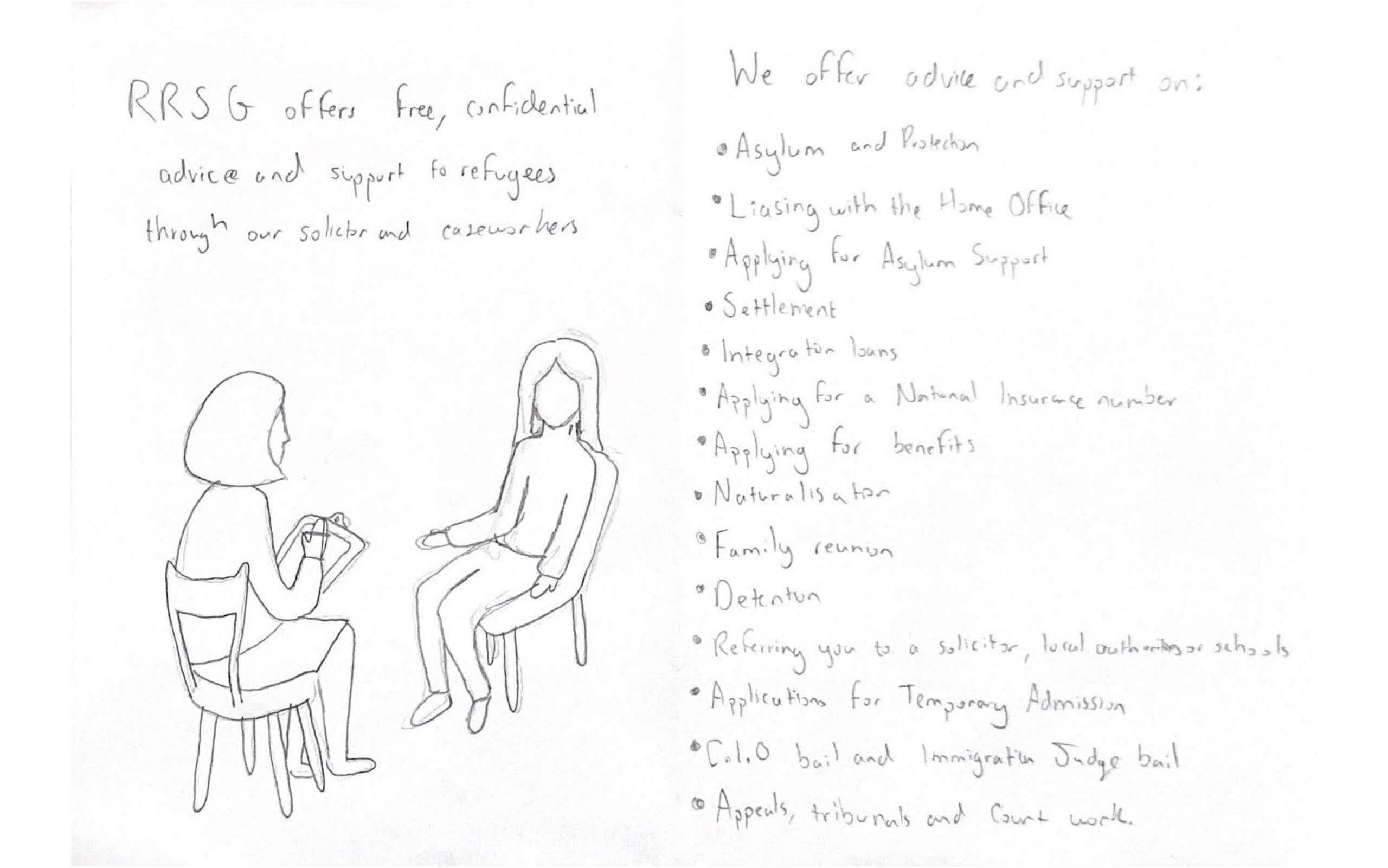
RSG’s advice support covers many different areas, including advice on asylum and protection, and advice on signposting you to a solicitor. Their website offers a substantial amount of information on this service, and we felt that implementing all of this information into a post would result in something which is overwhelming. We felt it would be more effective to create a post which could highlight this service in a visual way. This post contrasted with the other posts, but through using the same typeface and RSG’S branding colours, the post showed a level of consistency with the others. The idea of drawing an outline of hands connected was effective due to it clearly demonstrating how advice support at RSG works. It gives a helping hand in situations where refugees feel abandoned. When experimenting with this post I tried the hand illustration in black and the background in light beige, but this reduced the overall impact the post had. A inspiration for this post was the RSG logo which includes two hands joining together underneath a simple 4 person pictogram. This similarity with the logo brought us closer to our aim in bringing engagement to what RSG’s identity is.

Final Visuals

The Strikers
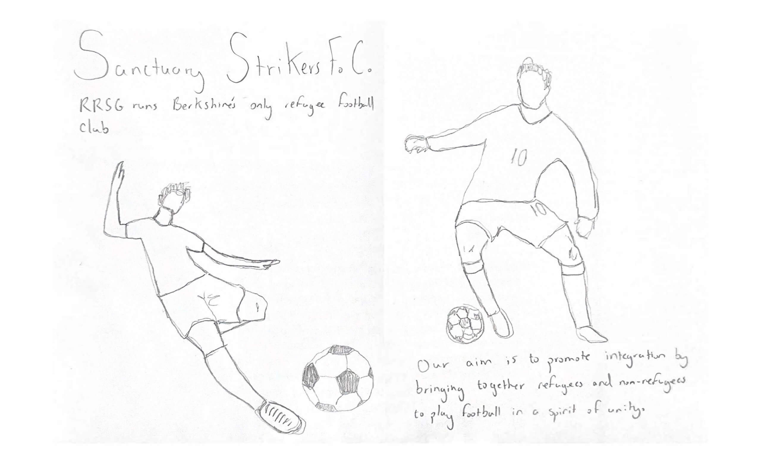
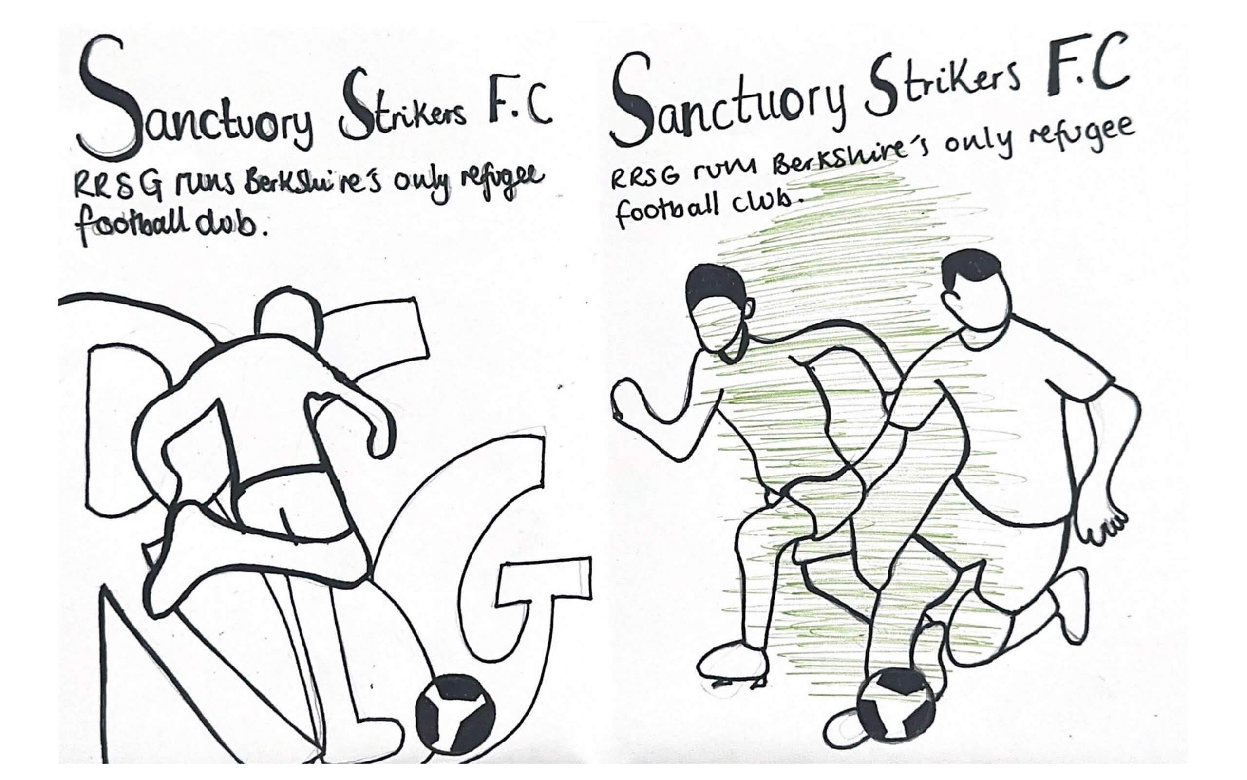
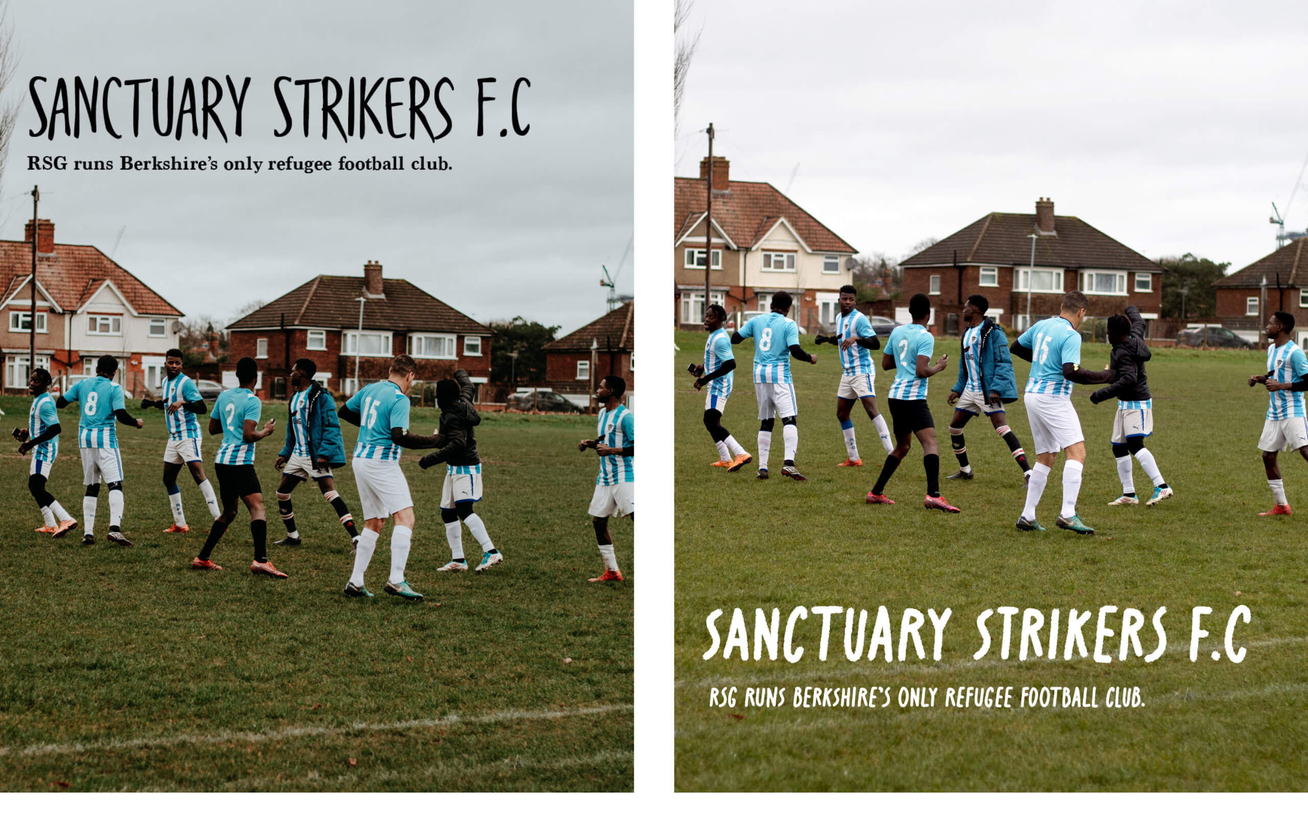
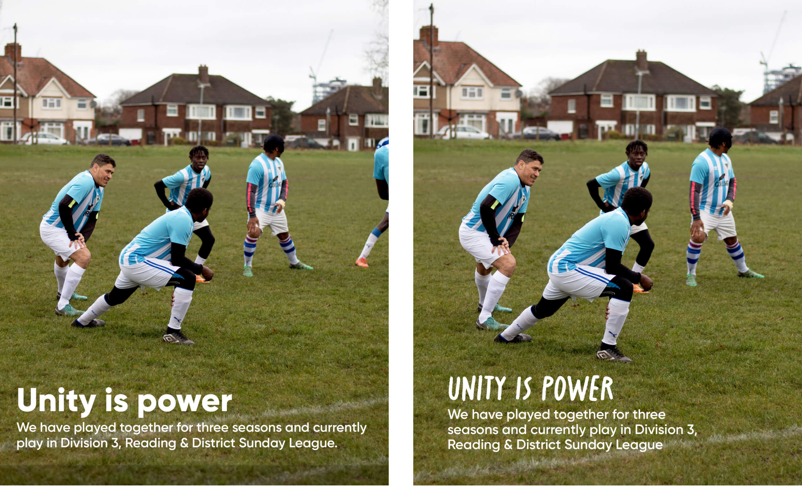
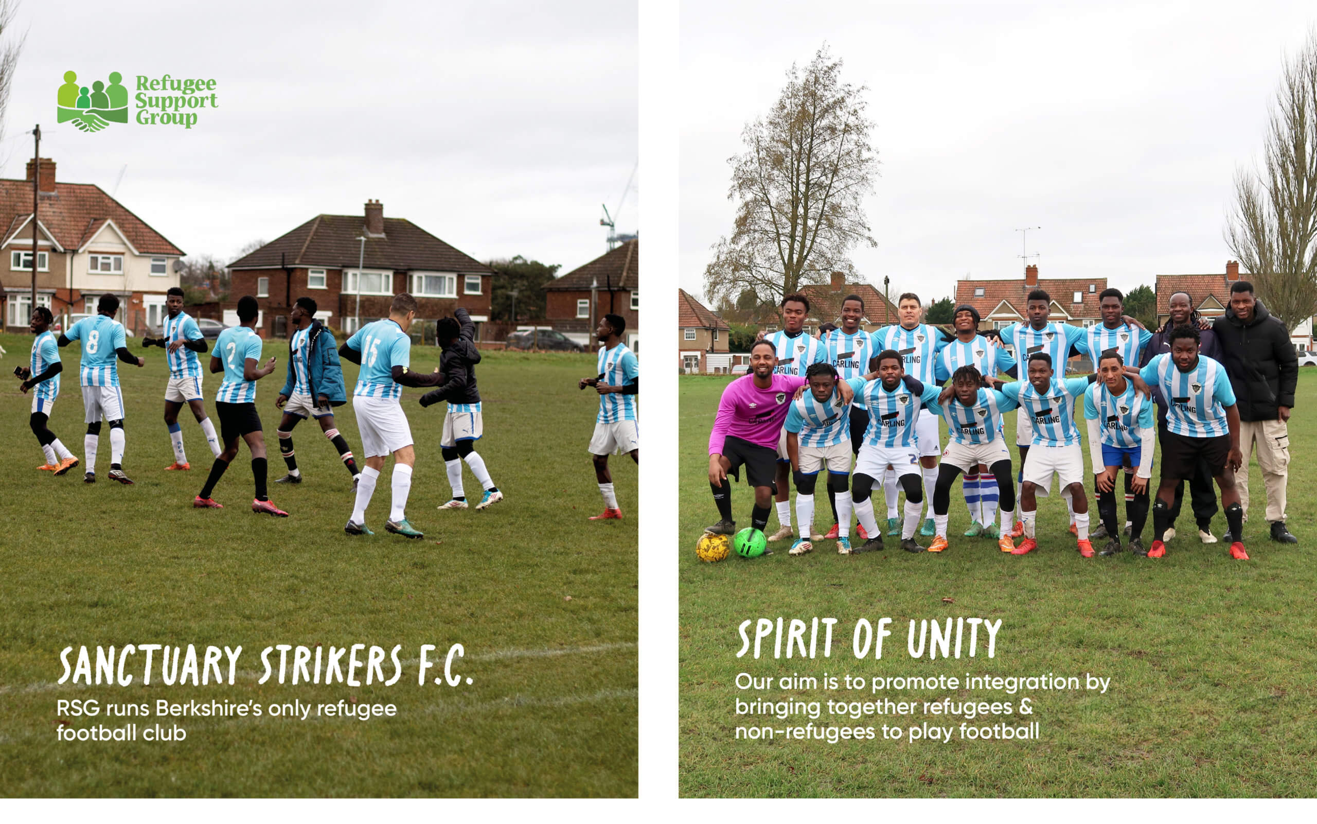
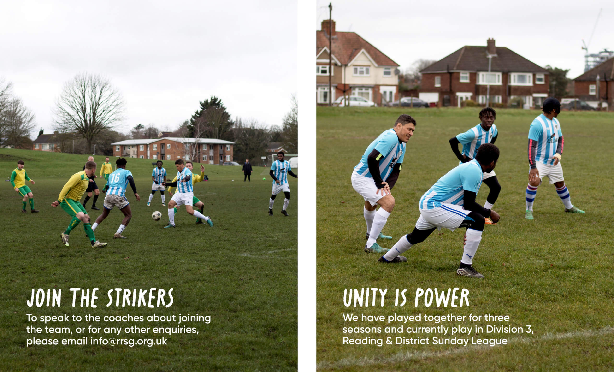
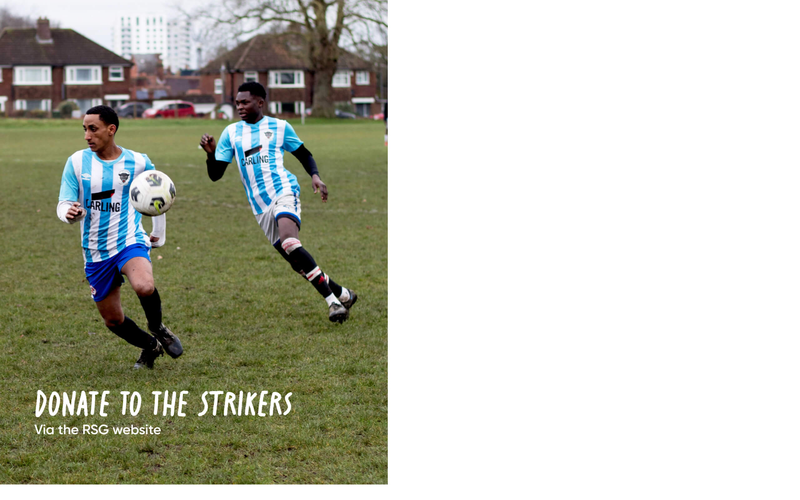
The Sanctuary strikers are Berkshire’s only refugee football club. When reading about the club and their aim to promote integration by bringing together a combination of refugees and non-refugees, we were inspired to capture how the team encouraged unity. We reached out to our client inquiring whether we could photograph the team playing and both the client and the football team were elated by the idea and agreed. On this photoshoot we were able to talk to the team and ask what the club meant to them. Through these discussions, we realised how important it was to communicate the message of teamwork and show unison. This experience enabled us to practice our skills using the shutter settings to capture action shots. We also took some team photos, showing the diversity of players within the team. After photographing these images came the challenge of selecting the correct images for the post, and editing the images to ensure the text laid on top of the images was legible for readers. A few difficulties we came around were brightening up the image to focus on the strikers playing on the field rather than the grey sky. We accomplished this through using the levels, brightness and curves tool within Photoshop. This post met our clients’ aim of raising awareness of RSG in a striking and engaging way. Once finalising these posts, we realised we had remaining images which further captured the teams ‘spirit of unity’ so we created a reel of the remaining photos which could be posted on an Instagram story alongside the physical post to engage a more modern audience which RSG may not be reaching at the moment.
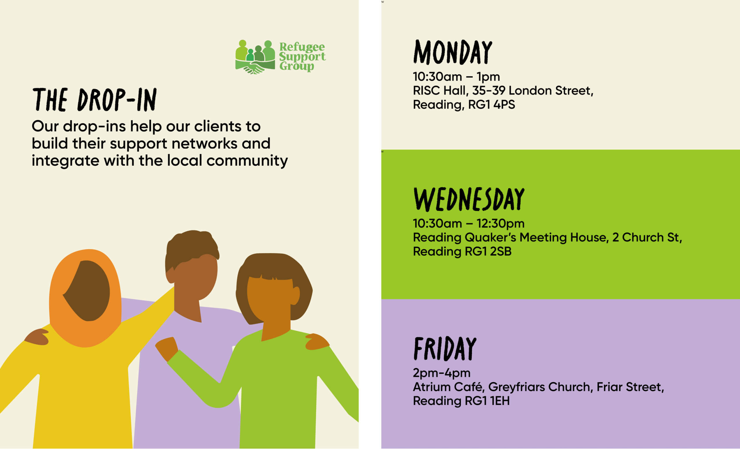
When using RSG’s brand typeface, Gilroy, we felt it was affecting the message of our designs. This typeface felt formal, serious and academic, whilst we wanted to produce something which was friendly, welcoming and approachable. We presented our client with two posts; one which used RSG’s brand typeface; Gilroy and one which used our choice of typeface; Crayonize. After reviewing this comparison, our client agreed that it was the right decision to make an exception to the brand guidelines, and opt for Crayonize.
Final visuals
The Drop in
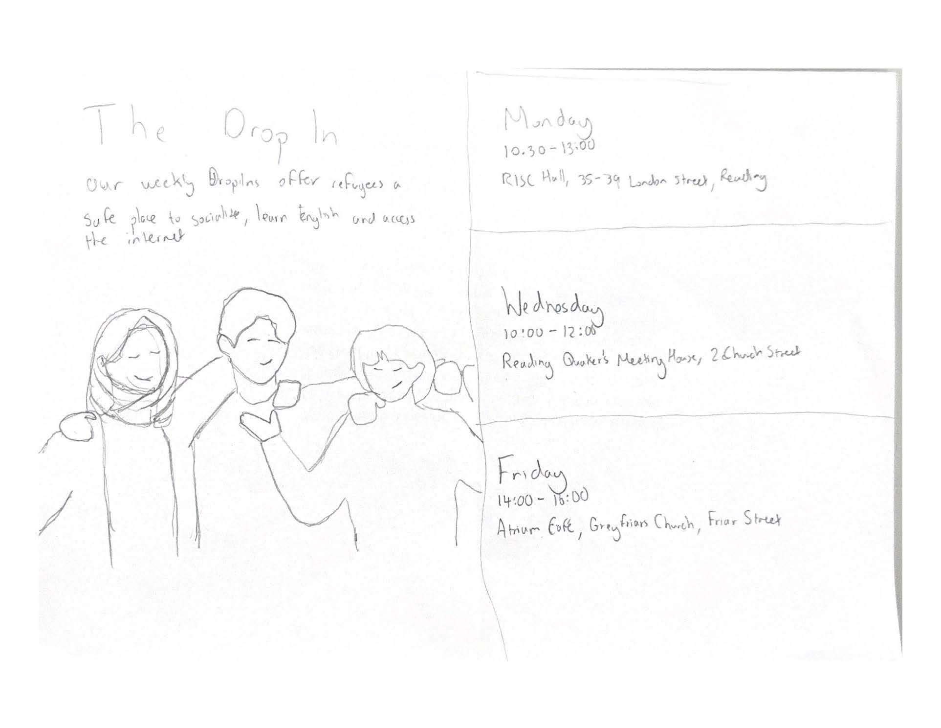
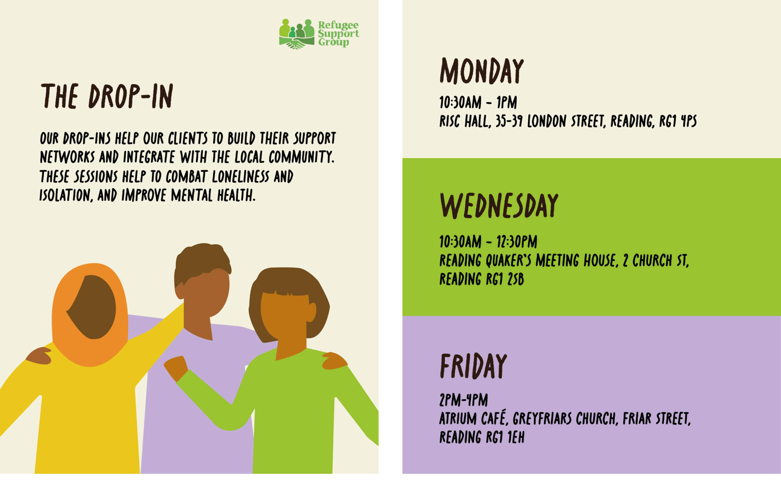
RSG offers a drop in service three times a week in various locations across Reading. Here refugees can socialise, learn English and ask for advice. It was important to keep in mind when designing these posts that many of RSG’s audience have limited English. We used simple language and large legible typefaces to accommodate those with lower English levels. Having empathy as a designer is a lesson often taught in class, and this project was a true opportunity to practice this. Whilst the client had agreed upon using Crayonize for the headings, instead of their brand typeface Gilroy, we realised that it would be beneficial for RSG’s brand identity and legibility if we used Gilroy for the body text. This was also particularly useful for this post, The Drop-In, because it contained essential information.
Final visuals
Mockups
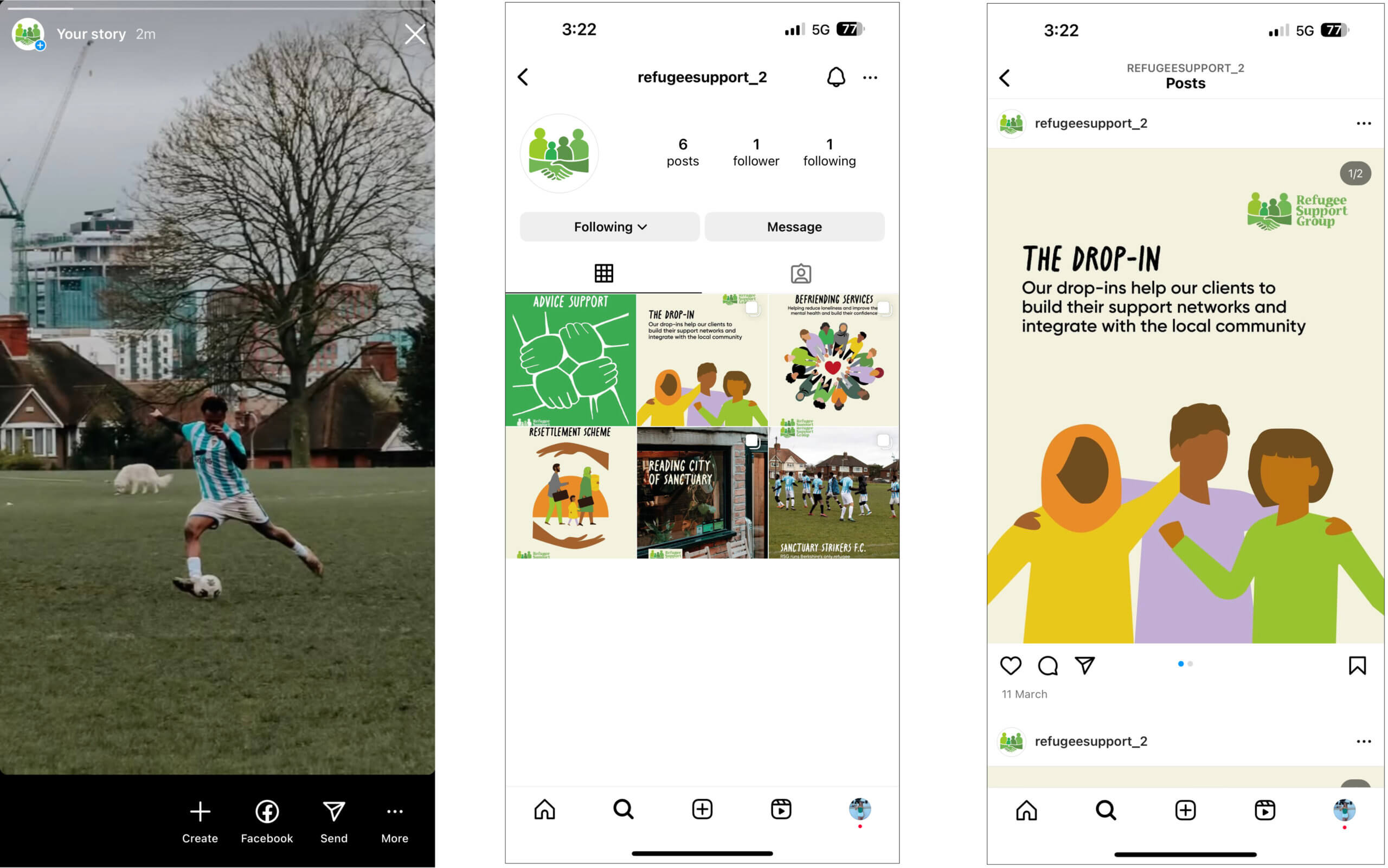
Link to mockup walkthrough: https://youtu.be/PQigwXNOitg?si=b95rOm4g9UY9IkdK
Reflection
This real job started off with a hurdle, however overcoming that initial hurdle lead to real assets in our design careers. We flourished both within our team and our relationship with RSG. Meeting with the Reading strikers and café owners of RSG’s coffee bank scheme was an honourable experience, generating a personal connection with our audience. This rapport between ourselves and RSG lead to a closer alignment between our designs and their goals. This job has enabled us to push the boundaries of our design skills, branching out into areas outside of our comfort zone such as videography and photography. When approaching this Real Job, RSG’s penultimate goal was to raise awareness of their new name and receive more funding from statutory sector organisations. Tackling this goal from the perspective of highlighting their services means that statutory organisations will recognise the charitable work they do and thus feel more inclined to donate. Learning how to navigate professional relationships within the circle of design was initially daunting, but ultimately the most valuable part of this journey. We grew in confidence, developed real connections and gained skills that could not have been reached within the classroom.
Written by Tilly Dobson and Amy North

