Attached is some research that I compiled into moodboards before starting my logo design task. I wanted to draw inspiration from the 70s aesthetic of smooth curves and very colourful palettes. The warm tones of orange and yellow are prevalent, and typography was also very colourful, with accents of blues being popular too.
I started by sketching out some motifs and patterns that could aid my design process![]() : IMG_0060.HEIC IMG_0061.HEIC
: IMG_0060.HEIC IMG_0061.HEIC
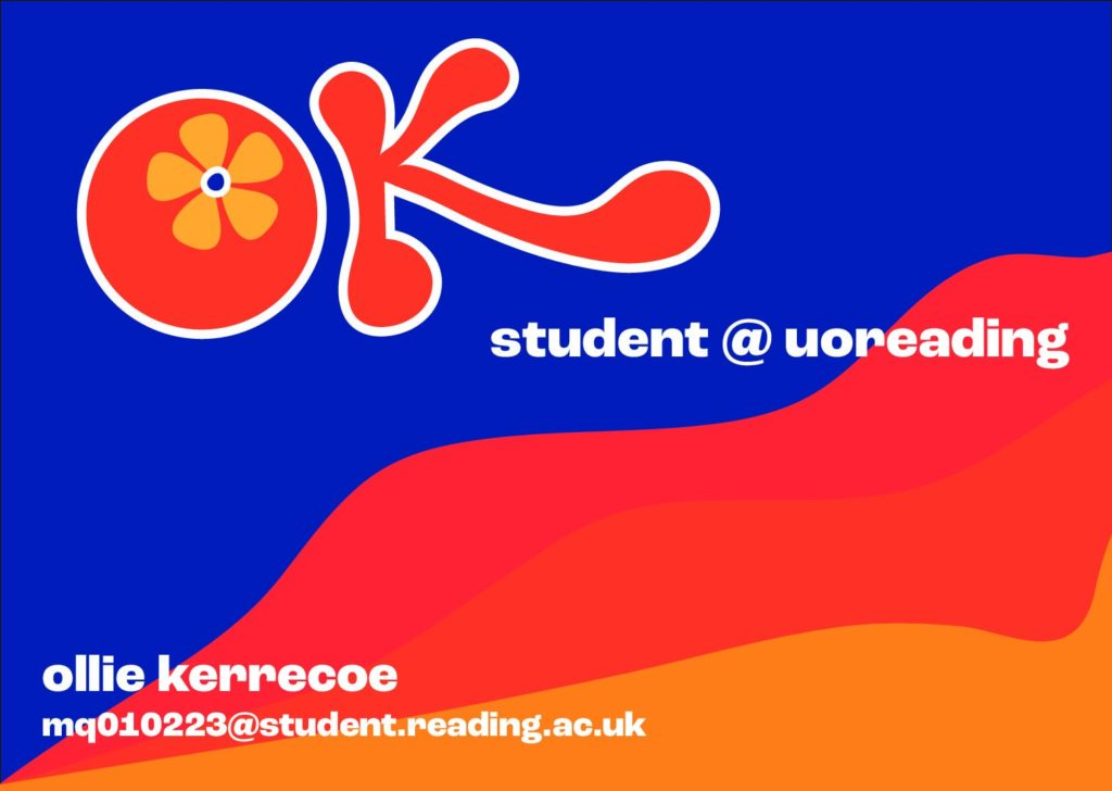
In these sketches, the model of a “K” became the focal point and I developed it into a vector on Illustrator, which was then matched with an “O” I drew. The counter of the “O” was comprised of the flower motif I drew as a response to the research and my own personal knowledge of the decade. 70s retro logo
I laid out the business card in a few configurations to see how text-heavy I wanted it to be. The final design contained my name, my email, and my logo design. The design behind it was a simple wavy design in 3 different colours to match the colour story from my inspiration.

