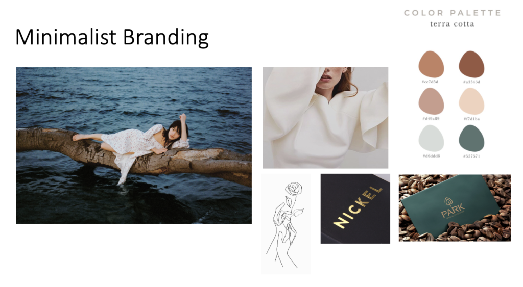
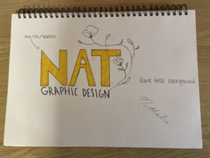
For this project, I decided to go with a minimalist branding approach. I love how clean this style is, and with the right color combinations, font, and graphics, you can create something that is eye-catching, yet simple. I feel as though a lot of “minimalist” brands these days look the same, so my goal was to keep these elements by adding texture and unique colors. The font I decided to go with was a bold Sans Serif that was all upper-case. The reason I decided to go with this instead of something thinner and lower-case was because the goal would be to use a gold foil/gradient effect for the letters. Additionally, I love the look of line drawing, so to add something extra, I decided to incorporate a flower that would frame the entire logo. As for colors, I think the gold foil details would look great with a dark teal background as featured in the mood board. The combination of all of these elements give a natural and organic look which is what I wanted to achieve with the photographs that I included as well.


