Green, Nature inspired logo

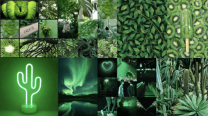
The theme that I chose for this project was “green” because I liked the simplicity of it and the freedom to take it any direction.
I started off grabbing pictures from online of anything green and just throwing them together to see common themes amongst the colour, obviously nature and leaves cropped up quite often so i decided to use that.

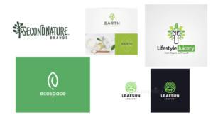
I then created a second mood board of nature inspired logos or logos to do with nature to see common themes used or styles chosen for these logos. It was from these logos that i decided on the style of font that I’d like to use, because i saw it was quite a similar font used between all of the logos i’d picked out, so i decided to go with a bold blocky font.

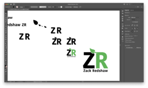
I then started on ideas for the logo and settled on the use of a leaf in the design, once i’d created the leaf i decided i wanted it to sort of grow out of the R to tie into the theme of nature, i moved the leaf across created some cutouts on the R to make it seem the leaf was coming out of the R and then pushed the Z and R together to have the leaf sprawling over the Z aswell. my final decision was to change the R colour to green to tie back into the original theme of the logo.


