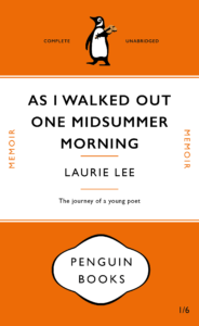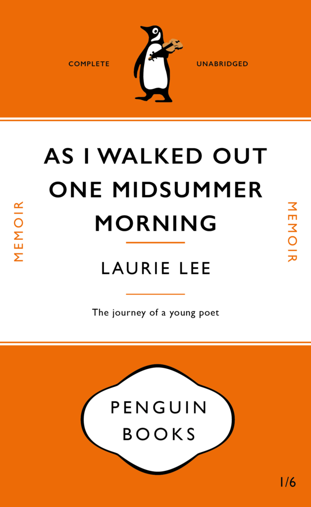
This is my messed up version for the Penguin Book Cover brief. ‘As I Walked Out One Midsummer Morning’ by Laurie Lee was my book of choice. My first edit to the original cover was to shrink the size of the title to make room for the longer title – this created more space around the type which makes it slightly easier to read without your eyes running off the edge of the cover. I kept the layout of the text the same but played around with other elements of the design. I swapped around the Penguin Books logotype and penguin illustration as I thought the logotype made the cover look top-heavy (it looks more balanced being bottom-heavy). To add to this effect I decreased the height of the orange space at the top. This also makes the design look less centred. My final tweak, to link the cover to the content of the book, was to change the penguin illustration. In my vector graphic version of the penguin I changed two things: I made him appear to be walking to represent the long journey Lee embarks on, he is also carrying a violin – an iconic item Laurie Lee took with him.
PDF version: Penguin Book Cover Laurie Lee Version
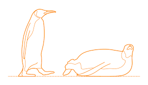
Reference Images for penguin:


