
Design Ideas and Design Process
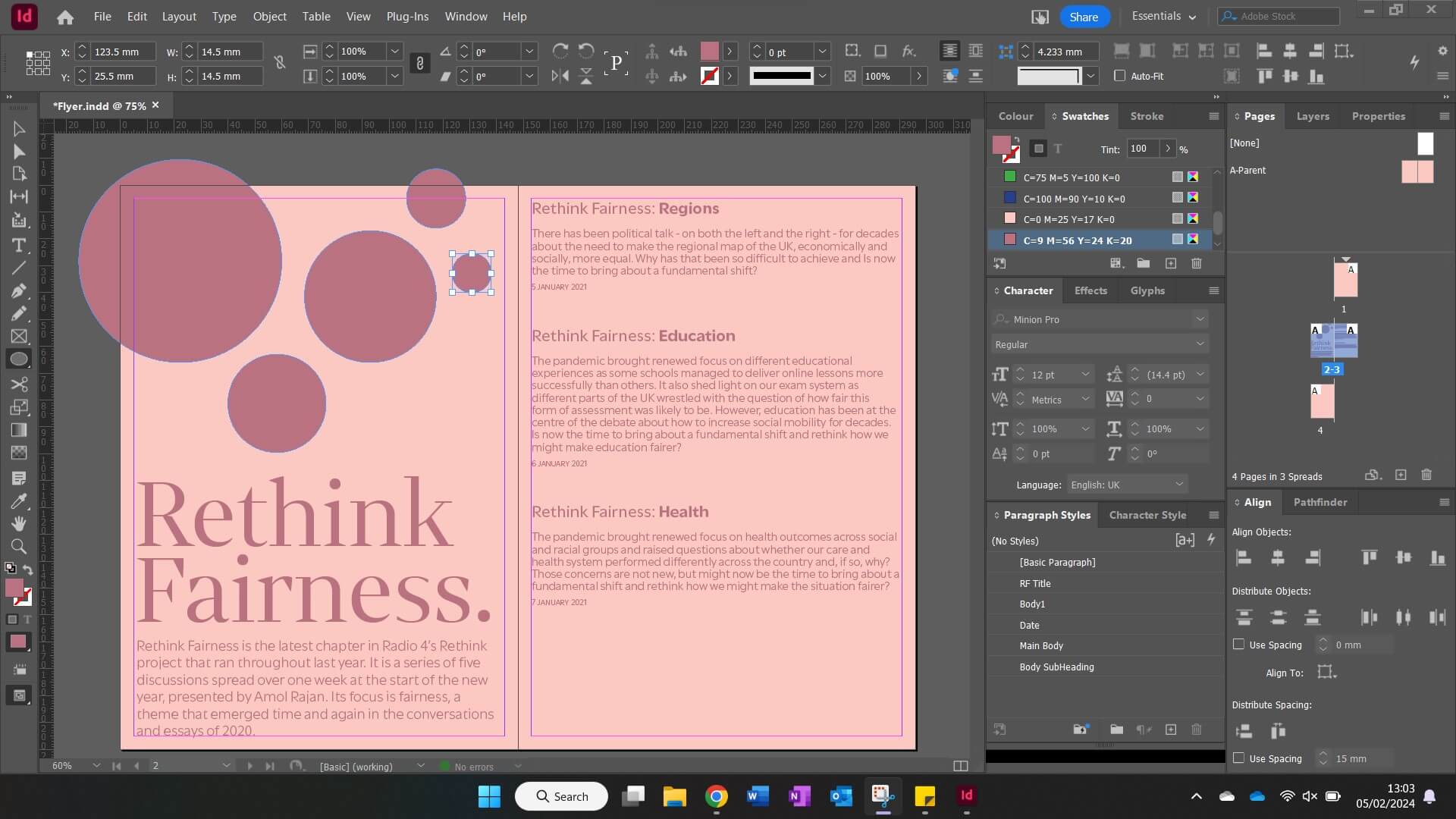
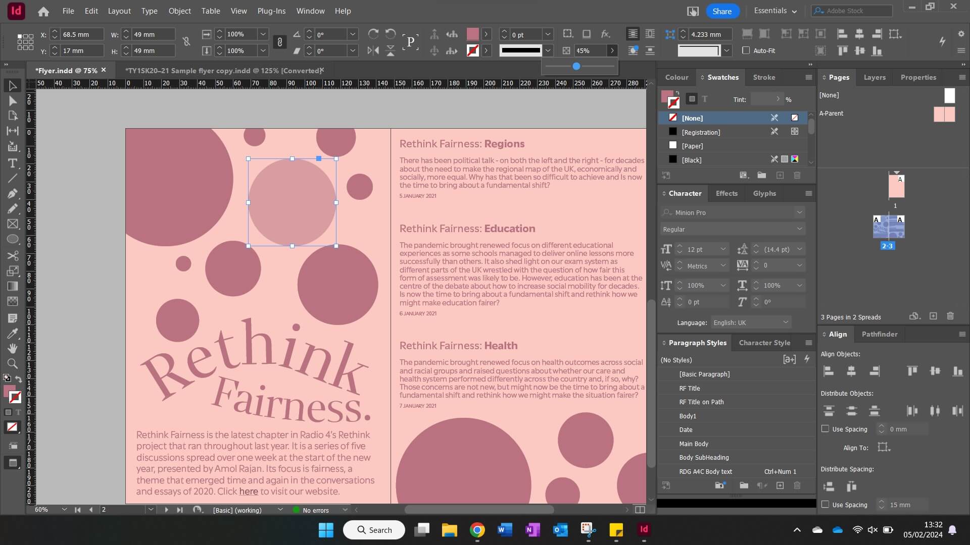
Since the Formatting Text task only briefed me to create one final outcome, it was a challenge for me to narrow down my expansive design thinking into a single concept! Pictured above is my finalised flyer, and I truly believe in creating this, I have learnt valuable skills for the future when using InDesign.
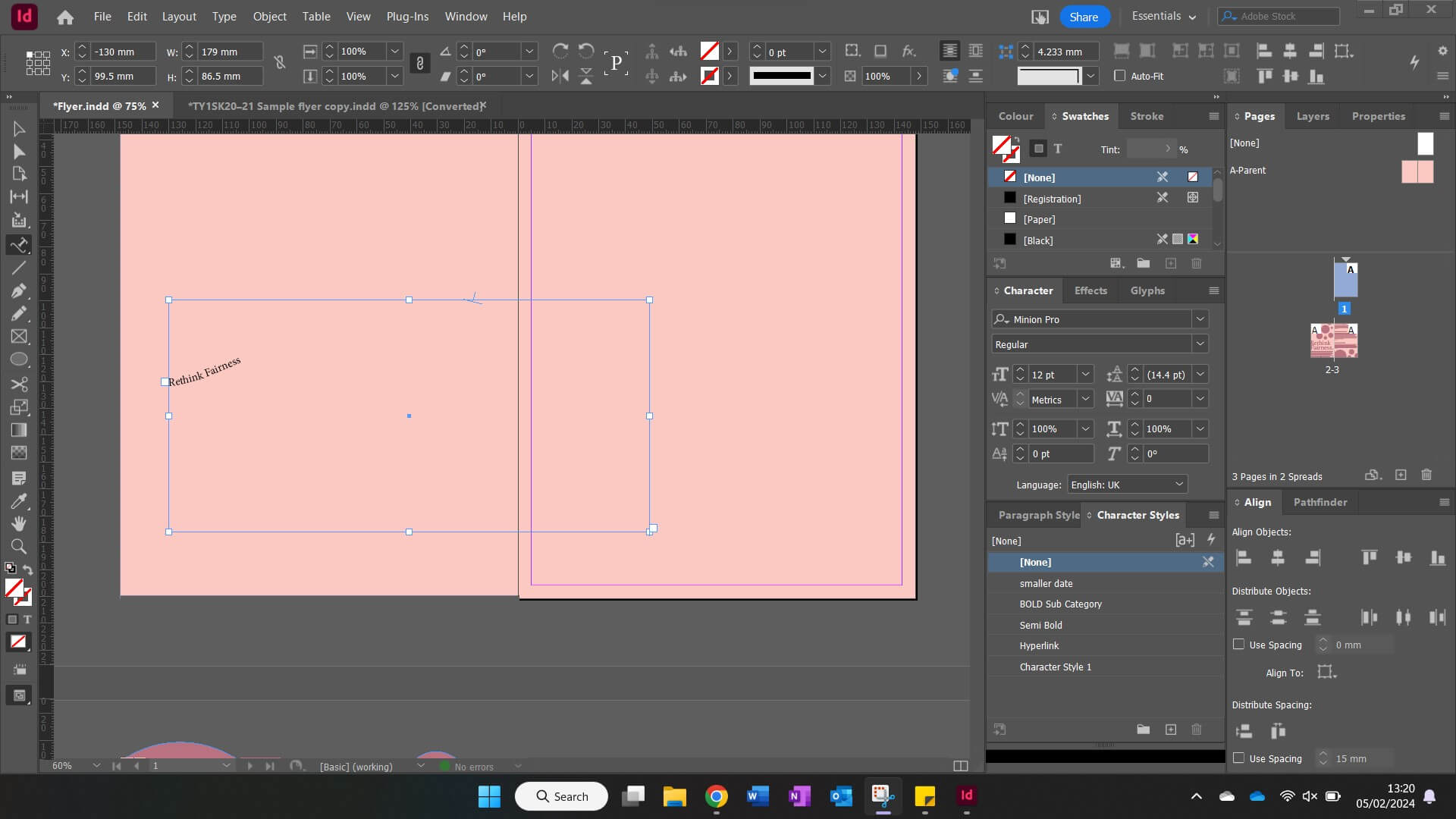
In starting this task, I applied colour to the parent page to formulate the background. I decided to make this a fair shade of pink since I felt like it reflected the name of the Radio 4 show – Rethink Fairness. Swiftly moving forward, I copied the assigned body into my text frame and started to apply paragraph and character styles. This stage was very important for me since it helped to create a textual hierarchy within the flyer, highlighting important elements by using different sizes and weights. One of my character styles was for a hyperlink, so it was crucial for me to link the Radio 4 show correctly to my ‘click here’ text. When applying my stylesheets, large amounts of white space were generated, and I struggled to tackle these initially. However, I quickly overcame this challenge and thought to experiment with the ellipse tool to create a decorative pattern using circles. To add contrast within the pattern, I altered the opacities, and this proved to be effective. I finished the flyer by changing the titular ‘Rethink Fairness’ text. Originally, I had made this sit on a straight line, (as seen in some of my screenshots below) but I felt that this wasn’t as exciting as it could be. Instead, I opted to use the ‘type on a path tool’ to curve the text, and I feel like this makes it work well in conjunction with the roundness from the circle pattern above.
Software Tutorials
For most aspects of this flyer, I felt confident in exploring InDesign at my own accord. This is because I have recently become very familiar with using paragraph and character styles in particular due to work from another module. However, I struggled with setting my ‘Rethink Fairness’ text in a way that was interesting, so I followed this helpful tutorial on how use the ‘type on a path tool’ effectively. In the video tutorial, I was initially prompted to use the pen tool to create a curved line. This took me several attempts since I wasn’t pleased with how some of the strokes appeared, but eventually I drew out two lines which were ready to be used. At the left edge of each line, I clicked using the ‘type on a path tool’ and entered the titular text. (‘Rethink’ on top, ‘Fairness’ on bottom) At this stage, I could play about with modifying new paragraph and character styles until I was satisfied with my final outcome. The tutorial I watched was simple, easy to use and helped me in learning a tool I hadn’t yet used in InDesign.
Design Resources and Articles
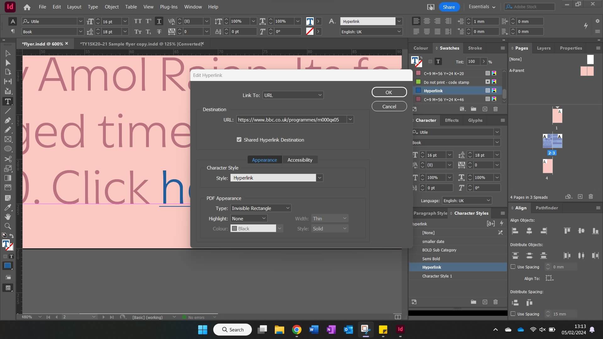
In my previous experience with using InDesign, I hadn’t needed to hyperlink any content before, so I was initially unsure of how to tackle this when needing to link the Radio 4 content for this Rethink Fairness flyer. However, I found this article which guided me through the steps on how to achieve this successfully, and how to stylise it properly. Firstly, I was prompted to select the text I wanted to hyperlink, and in my flyer, this was simply a ‘click here’ feature. I then navigated to Type > Hyperlinks & Cross-References > New Hyperlink, with a dialogue box appearing shortly after. Here is where I inputted the link for the ‘Rethink Fairness’ website. Submitting the changed settings in the dialogue box created a new character style for the hyperlink, so I altered this in order to make the text bolder, allowing it stand out from the rest of the body.
Not only has this article aided me in this task, but the knowledge I’ve learnt from it will come in very handy for the future, especially when formatting bibliographies that include online resources!
Learning Throughout the Module
Throughout the Spring term tasks, I feel like I have hugely increased my confidence when working with Adobe programs. Although my quiz results from Autumn and Spring have remained the same, it shows that the volume of information I know hasn’t decreased by any measure. I believe these results aren’t a pure reflection of my learning within TY1SK because they highlight my general knowledge, rather than the valuable in-program skills that I have developed and prioritised in this module.
Nevertheless, my skills have improved vastly, particularly when working with InDesign and Photoshop since these were the two programs I knew the least about prior to the tasks set. From mastering stylesheets in InDesign to perfecting image editing in Photoshop – I am in a very comfortable position to use these effectively in the future! On the other hand, I have also grown my After Effects and Illustrator knowledge throughout doing these tasks. I already knew quite a bit about these programs, so I thought it may be a challenge to expand my pre-existing skills. However, I was able to learn new shortcuts and utilise effects I hadn’t before in the past within both programs, and it was super helpful!