
Background
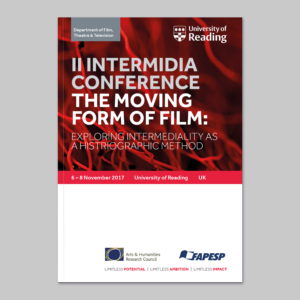
A brochure containing the full programme, abstracts, bio notes and other information for the II IntermIdia Conference ‘The Moving Form of Film: Exploring Intermediality as a Historiographic Method’ was needed. The client was Professor Lucia Nagib, who was the conference organiser.
Restated brief
The brief was to design a brochure that would hold all the key information for the visitors to the conference. The brochure was required to hold a large amount of information whilst sticking to the clients tight budget, for the 100 copies they would need. Many of the conference visitors would be international, so it was iterated that the information must be clearly laid out.
As the conference was organised by FFT, and the limited budget would influence the production and printing costs of the brochure. After discussion with the client, A5 format was decided for the brochure as due to the lower production costs and usability for the visitors. From the first meeting with the client, it was iterated to them that there would have to be an eight day design turnaround, to allow for the print time. The only requirement from the client was to use the image from the predesigned poster for the conference as the image for the front page of the brochure. In terms of the text layout inside the brochure, there were no set criteria and the client was happy for judgements to be made by the designer. The brief didn’t change throughout the project.
Initial designs and ideas
From the initial information provided by the client, it was envisioned that the brochure would come to 50-60 pages. After discussing with the client what she wanted from the brochure, and providing the necessary text and images via email, it was then time to assess the various levels of information and discuss how these may be presented.
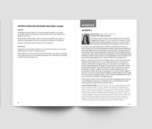
The first necessary inclusion was a map of the university of Reading, where the three key locations had to be highlighted. The second was all the chair and panel information, of which a lot of literature was provided for. Initially a two column layout was used for the large amounts of text, to help reduce the number of pages and thus the printing costs, but due to the small format of the brochure, the line length was too short so a single column was decided. In order to minimise the number of pages it was decided that the text would flow from one page to the next providing that it adhered to orphan/widow rules. as there was little specification from the client in terms of design decisions, there was free reign over the type choice for the brochure, so it was decided that FreightSans Pro should be used due to being a clean sans serif, with high readability and modern aesthetic. FreightSans also includes a wide variety of weights which, due to various levels of information, would be needed. The third and final requirement was a contact list at the end, which would have to display the name, institution and email address of each of the conference speakers and organisers.
Developments
As the main design decisions of this job would be typographical treatment, the client was happy for judgements to be made by the designer on the typographical treatment, as long as the document remained professional. So much of the development was adjusting the paragraph style settings applied to the different levels of information to create a finished visual.
Initially a new page was given for each new panel, but this created large areas of white space, so it was decided to have the panel information running as continuous text, which helped to maintain an attractive layout to the brochure also helping to keep the number of pages used to a minimum.
Once approved by the supervisor, the client was sent a PDF of a finished draft of the brochure. Unfortunately, many of the book titles were meant to be in italics, but the style had been lost in InDesign so the entire brochure had to be edited so book titles were displayed correctly, this happened very close to the print deadline so the absolute priority was ensuring that the brochure was sent to print with all the information displayed correctly. The clients wish was to have the map of the University spanning a spread, which was what was designed, however in the test run by DPS the alignment of the lines highlighting the three key venues didn’t match, so last minute is was changed to the map being on one page with the key being on the other. Unfortunately there wasn’t time to run this by the client, due to the print schedule, aside from this the set up of the document was fine, and the brochure was sent to print for 100 copies, with the clients thanks and praise for the commitment taken to ensure the brochure would be completed in time for the conference.
In regards to the brochure cover, we decided that with the limited time scale, creating a refined design was unlikely and so using a university template along with the image that was used in the conference poster. This would provide a professional layout to the brochure cover, the use of university branding was not inappropriate due to the conference being organised by a university department.
Overall thoughts
This job has developed my confidence when interacting with people in a professional environment. My organisational skills have drastically improved due to this real job having to be completed in a week as well as working on my other design projects. Utilising InDesign’s style sheets was also a key improvement through this job, as due to the large and complex levels of information, properly set up style sheets were needed, and to also set up an InDesign document for professional printing. Liaising with DPS for the printing was a key part of this job, as the print run through highlighted an issue with the printing of the map, so the design had to be altered last minute to allow the print to run in time. Working to a tight print budget forced me to think about the text hierarchy and ways in which the information could be economically grouped together. This project has allowed me to exercise my professionalism and develop a suitable tone when engaging with my client over email, correspondence that we had regularly, due to the quick turnaround of the job. Engagement with the supervisor was key during this project as the quick turnaround meant that the normal process of a Real Job did not fit with the schedule, so developing a sense of when it was important to show the supervisor the progressing brochure was key, which allowed for more constructive feedback, as the visuals provided were more finished.
Final deliverable
The client was happy with the final deliverable and its design. If I were to complete the project again, my main wish would be to have more time to complete the job, to allow for more feedback from the supervisor, as there was room for more refinement of the brochure, especially with the map at the front. However, considering the quick turnaround of the job, I am pleased with the design and the brochure is finished in its visual with a clear text layout is clear. Upon receiving the finished brochure, my only concern was that the margins at the spine were slightly tight, something, that if more time was available would have been amended.