Author: Raj Bhogal

Typography Publicity Student Team

The brief

Publicity was a real job within our department and consisted of myself, Laura Marshall, Elliot Ellis, Jess Downie and Jason Yung. As a team our task throughout the year was to increase awareness and attendance of events happening in the department. Our roles were to achieve this through promotional posters placed around the department, and depending on the scale of the event even some areas of campus. Events such as guest speakers and past alumni talks were held and scheduled to link with our current projects and give career advice for the future. Blog posts of each event included photography, friendly, positive articles of the event and speaker interviews. The blogs were a reflection of the event from a student’s perspective and aimed to be as accessible as possible to those interested in what happened. Knowledge on promotion and social media was a useful tool throughout the job on order to engage with the audience on a closer level and make each event as well known as possible.

Re-design

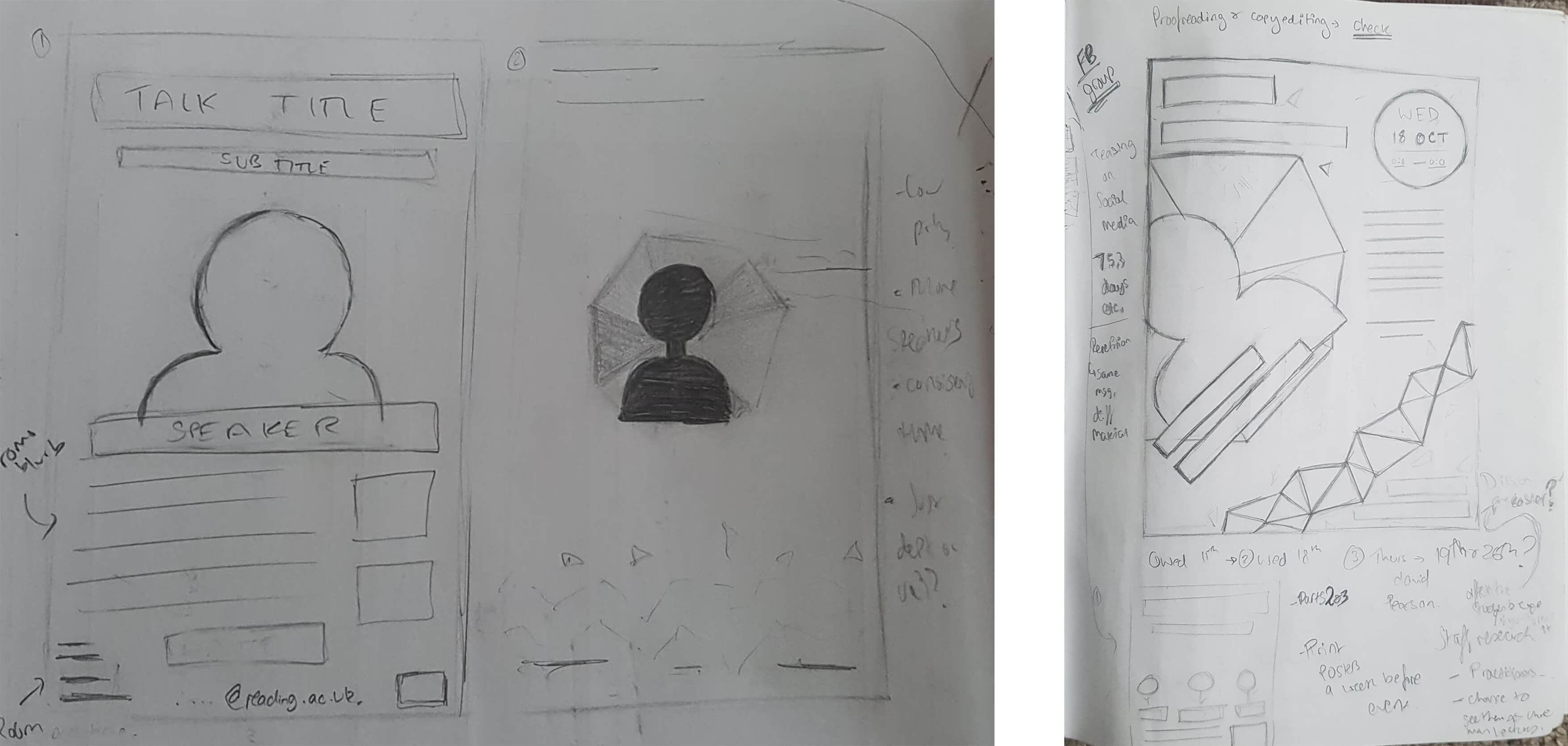
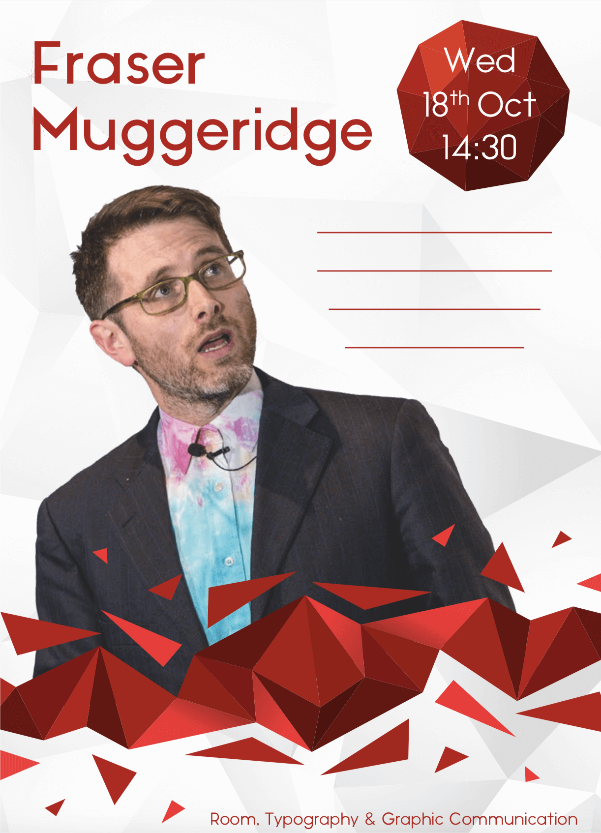
One of the first major talks was given by Fraser Muggeridge and is where I initially attempted a redesign to the poster layouts. Sketches of possible layouts were drawn to highlight the speaker and their work. A new design was attempted to refresh the aesthetic of the publicity promotions, which would in the following year become ‘Baseline Shift’. An alternate version was also proposed to accommodate space for multiple speakers for an event. A low-poly style was trialed to bring a contemporary feeling top the designers and their work. For the posters to be a success, each one had to be recognisable as an upcoming event within the department from the design alone, and using the theoretical knowledge on how to create a series of similar designs helped portray that. This was a main goal for the project and benefitted the users greatly. We explored lots of possibilities so that we could come to an informed decision on which design would be the most appropriate.The proposal was unsuccessful however, as the feedback suggested that even though each speaker should feel unique the posters should be focused on reproducibility, with each poster needing a fast turnaround in order to generate maximum awareness for the event. This meant that a simpler layout in the long term would be more successful for the goals of the project.

Publicity - Poster Sketches
Sketches of layout approaches for the re-designed posters, with annotation from Client feedback for any further changes
Poster re-design proposal
Layout re-design proposed for the client for feedback

Learning and Experience

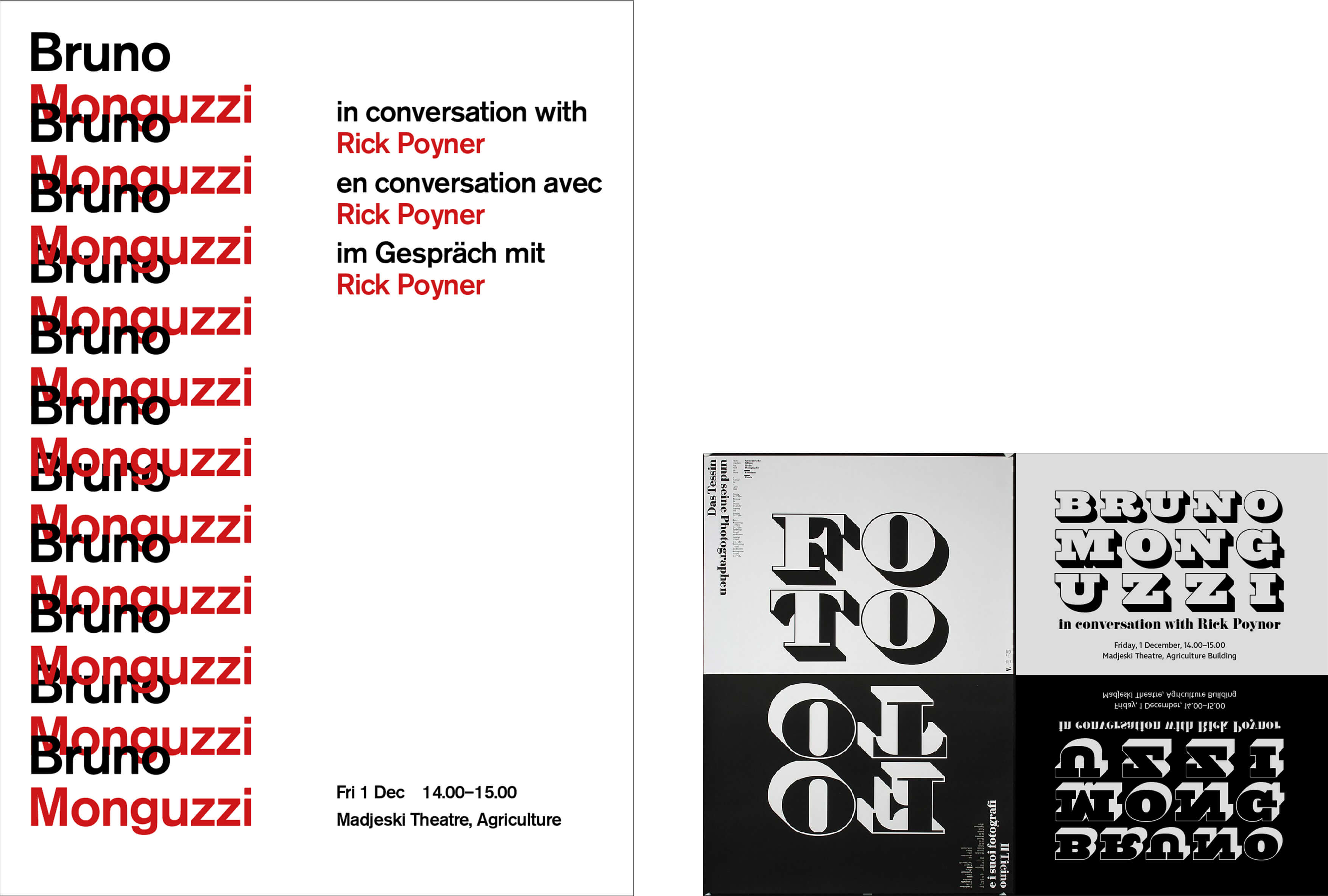
Bruno Monguzzi gave an inspiring talk about his career and life as a Swiss Designer during our time on the project. As a team we brainstormed and discussed that the poster should be a tribute to his design work and reflect his style neatly. This was a challenge as we did not want to negatively imitate his style of design or replicate it too closely. Also our goal was to not stray too far from the original poster layout to maintain a level of consistency, even for a special event. Several concepts were produced from different areas of the team and reviewed by our client and supervisor. They agreed that the use of 3 languages to reflect the style of Swiss design further was an appropriate approach. Also, the considered margins and limited colour palette furthered this theme. The positives from each poster were then taken forward and displayed around campus.

Poster Concepts for Bruno Monguzzi's Talk
Our initial concepts for Bruno Monguzzi’s Talk

We also had the privilege of seeing him for an after talk interview where he discussed semiotics and his philosophies on design in depth. He explained the different processes of him receiving a brief and the technical terms behind each stage. This was something I valued greatly as we all got to see how international clients worked as well as see the level of complexity some briefs can have.

Notes on Semiotics
Notes on Semiotics from Bruno’s after-event interview

Will Stahl-Timmins from the British Medical Journal (BMJ) also visited the department for an event and led an interesting discussion on the Information designs he creates and its actual use within the NHS. This sparked some interest in the field for me personally and I was fortunate enough to turn his visit into an internship working alongside him. It was a great example of how guest speakers can inspire students into areas of design they may not have even originally considered.

Organisation and Teamwork

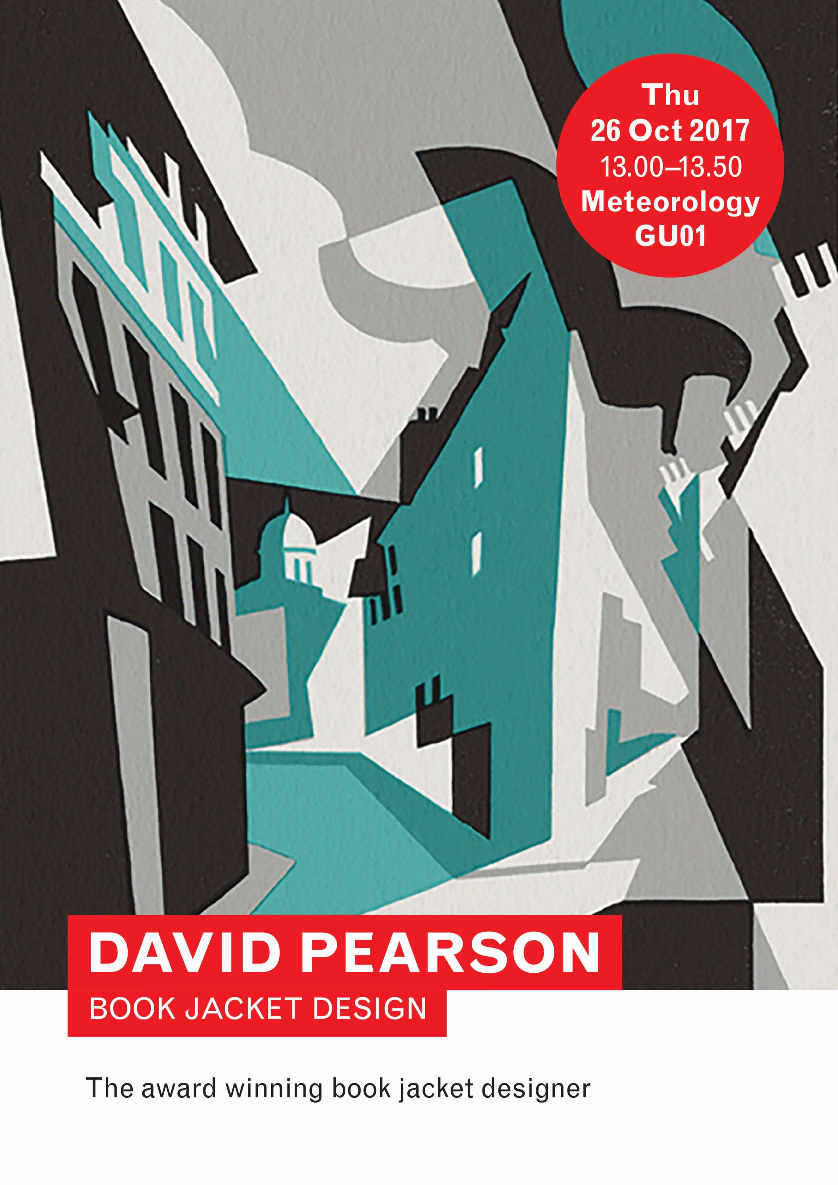
Staying organised within the project was crucial to keep on top of upcoming events and making sure enough time was given to advertise each one. A message group helped us stay in contact and quickly respond to each other regarding new information or deadlines. We divided our tasks initially and planned to rotate occasionally, so each person in the team would be responsible for some part of the event at each time. The template created consisted of the department’s traditional red circle displaying the information, with a featured image taking up the majority of the poster. Once a template for the main event posters had been agreed, they were distributed amongst us so that any member could quickly produce one at a moments notice. Throughout the process we also kept in contact with our main client, and due to the nature of the project, communicated with several other clients and supervisors in charge of organising each event. This project was made easier due to our freedom with how we wanted to pitch each event publicly, but conversely this meant we had little time to experiment with each event, as they were often so close to each other.

David Pearson - Event Poster
The printed poster placed around the department for David Pearson’s talk

Reflection

Overall, whilst this project mainly consisted of testing and experimentation in terms of poster design, role allocation and how the department handled guest speakers, it provided the foundation for future publicity teams to enable them to know what elements of the procedure where successful and which others that needed streamlining. Hearing notable speakers that you would not normally get the chance to was a fascinating experience to learn from, allowing us all to understand design in the industry from different perspectives and cultures. I am pleased that I spent my time working in a group to achieve goals that aren’t normally a focus within straightforward graphic design, and over the process I had discovered that good communication with the client is essential to producing the best possible outcome, and the best ideas can formulate from mass conversation and brainstorming to meet a better solution. 

Microbiology animations: The Good, The Bad and The Ugly

The Brief

Anastasia Rattigan from the Online courses team at the University of Reading develops Massive Online Open Courses (MOOCs) alongside the FutureLearn platform to expand the University’s portfolio of online courses. She had proposed two academic animations to be used by the Microbiology department, and have them catered for two different user groups, those studying with the online courses or those on the undergraduate degree in microbiology. The animations themselves were asked to encourage prospective students into microbiology, stimulating recruitment and be used as revision material for first year students on the course. Therefore, they had to be succinct and effective in delivering their messages. Also, the client wanted to communicate that University provides a fun and engaging but also academic approach to the learning available amongst the courses.

Research

Client Meeting

Anastasia approached us asking to discuss the parameters for each animation and meet the rest of the team of clients. At the first meeting we delved deeper into the scope of each animation and gathered viewpoints from both Anastasia and members of the Microbiology department. It was a great discussion where they presented their goals for the project and asked what would be professionally achievable in the time frame given. We also discussed the contents of each animation, ‘The Tree of Life’ and ‘Microbes at War’. Both animations were vast in content and the clients expressed how they wanted each part to have purpose and not waste time. The latter animation required an amount of scientific knowledge that neither of us could really put into practice, however we agreed with the clients that they would supply this difficult content and explanations where appropriate. Understanding these specifications meant that we could achieve the animations with the client’s perspectives in mind allowing a more successful outcome in the long run.

Tree of Life Diagram
The massive extent of ‘The Tree of Life’ demonstrated by the clients

Style of illustrations

The illustration style of the animations was crucial to determine for both us and the client, in order to keep consistency across the animations and other MOOcs across the FutureLearn environment. The general consensus was that they should be biologically accurate without being too detailed, but also not too far into the other side of the spectrum being too cartoon-like, stressing that they were against the idea of characters for each microbe or bacteria. They favoured the idea of hand drawn images at first, stating that this style reflected the scientific diagrams usually associated with the course. We reassured them however that digitally produced vector illustrations would be more fitting for the kind of animation we were delivering, as well as being easier to implement and animate. We researched different existing illustration styles used for microbiology and decided on flat vector images.

Bacteria Illustrations
Our initial Illustrations based on the described style

Design Process

Scripts

To ensure academic accuracy and to cover everything necessary, our client provided us with a rough written script highlighting what needed to be in each animation and the order in which it needed to flow. These scripts were detailed and roughly timestamped, providing the foundation for us to produce corresponding storyboards.

Storyboards and Illustrations

Storyboards allowed us to visualise the key frames of the animation, and these were sent to client incrementally for approval. Using scientifically approved representations of the images, we sketched the layouts for each section of the script. To maintain a level of consistency we contacted the client regularly to receive feedback in terms of how well the images matched the script, the narrative of each scene and whether it was matching the goals they had in mind.

When designing the illustrations it was vital to ensure that they were not only visually engaging but also biologically accurate as they would be used as a learning aid. It was important to consider how each illustration would be moving in the animation so that they could be easily manipulated when animating. In terms of colours we were informed that pink or blue bacteria were only these colours since they had been stained to be visible under a microscope, and they wished to reflect this in the final images.

Storyboard sketches
Examples of our developed storyboards, with sections of the script in each caption

Animation Process

In order to animate to the best of our abilities and fulfil the client’s needs, as a team we had to do quite a lot of self-directed learning of Adobe After Effects. At the time it was new software to the majority of our team and using it appropriately would help both parties out in the long term. When we wanted to create a specific effect or transition on our images we researched videos and forums to find the best way of achieving it. This practice not only gave us valued experience of a new software, but also helped us develop our skills at self-directed learning and independent work.

After all the required illustrations were created, we began bringing them into Adobe After Effects and animating them. This involved altering the prepared illustrations individually, giving each one micro tweaks in ‘frames’ to simulate movement. We then began assembling the illustrations into the desired composition and applied the transitions appropriately. During the animation process in order to test timings of each scene, the script had to be recorded and played over the animation. Assessing the playback this way allowed us to make changes to the times according to the tone and delivery of the script. Once a good level of progress had been achieved, we sent our current developments through to our clients. On the topic of feedback, we received several changes ranging from minor alterations to major composition tweaks. This resulted in some complicated adjustments that eventually paid off in positive return feedback. Animation files can be fairly large and one issue we encountered was lengthy rendering times to video files. This was a laborious setback that prevented smaller changes to be made at a time, costing up to 12 hours for some instances. Whilst long this did allow us to be more vigilant as a team, making sure less mistakes were made and each scene doubly checked before its render.

Tree of Life - Animation Frame
A still frame from the first animation ‘Tree of Life’, showing the built up tree
Microbes at War - Animation Frame
A still frame from the second animation ‘Microbes at War’ running through a biological process

Reflection

Organisation and Teamwork

Our team communicated through a messaging group, allowing us to delegate tasks and troubleshoot any technical issues quickly and easily between us. Staying organised was efficient this way, however the collaboration aspect on each animation became tough. This was due to the difficulties of sharing large files between us and After Effect’s disadvantages of collaborating on large scale animations. We overcame these by working in the same spaces and agreeing on changes before they were implemented.

Client Communication

Since we had a team of clients, sometimes messages became lost in translation as they were passed from team to team. Multiple channels of communication and pathways meant that feedback had to be gathered from separate parties and then sent back over, delaying the process. As our clients were also working as full time lecturers, it was hard to find times when everyone was free for meetings and it also meant that production was quite slow while we waited for scripts and voice overs from the educators. Client communication was consistent however, with them expressing their sympathy with the large files and slow rendering times needed to produce their deliverables.

Overall impressions

The final feedback was positive, explaining how each animation had been successful in terms of smooth compositions and conveying their original goals. The clients expressed their gratitude and were receiving positive feedback from their users. Our collaborative efforts meant that students could revise using these sources and further their learning experience for their own education.

“Thank you so much for sending the animations through, they are looking great! We’re all really pleased with them.”

– Anastasia Rattigan, University of Reading