Background
Often, Ronald Smith was told “You have led such an interesting life, you should write a book”. The memoir consists of Ronald’s life experiences, from the War to COVID-19 and his family and personal life. Working with his daughter Liz, the intentions of this memoir was to give his family and friends an insight into Ronald’s compelling 92 years, and continued, of life. We were asked to design both the interior and exterior of the memoir, whilst deciding on typography and layout decisions and having the chance to edit personal photos from Ronald’s extensive collection.
Deliverables
- Print ready PDF of interior and cover
- Family tree design
- Final printed memoir
Design Process
Format
The first decision made was the overall formatting of the memoir. This involved deciding on page sizes, text justification, typeface choices, as well as the overall style of the project.
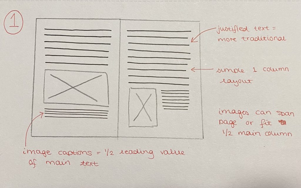
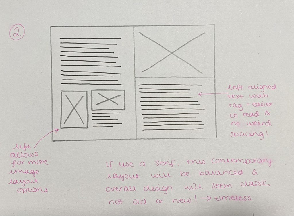
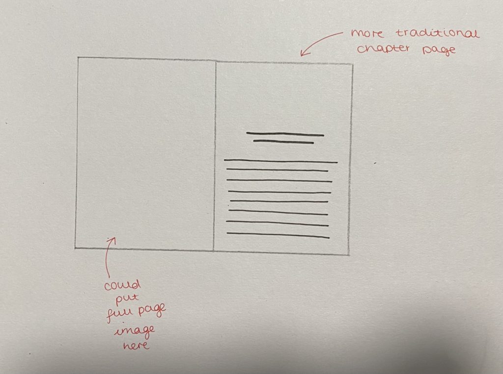
initial ideas
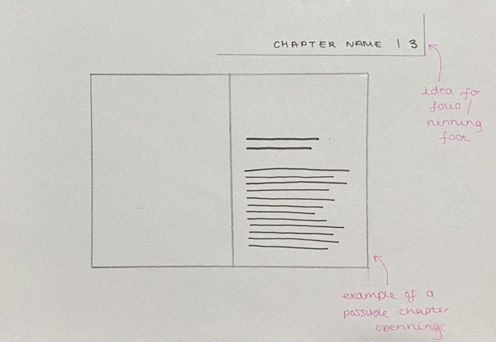
To present the client with a range of ideas, we mocked up different styles of text, as well as presenting different pages sizes that are considered suitable for memoirs. The overall aim of presenting the different mock ups was to gauge whether the style would eventually be considered as modern or traditional. After presenting our initial mock ups, our client decided on an A5 size, and initially they were set on having the memoir in a traditional style, with justified text, serif type, and indents. However, after showing our mock ups, the style that the clients began to favour was what we called, a traditional-modern hybrid style, as they insisted to combine a justified text block, with left aligned chapter headings (in a traditional serif), with a sans serif body text typeface.

Cover initial ideas
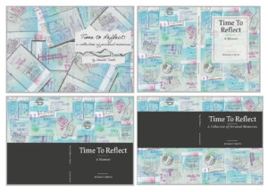
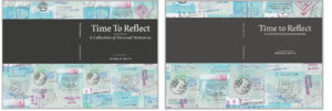
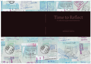
In terms of the memoir cover, the client wanted to explore one of two ideas. Due to the client’s background these ideas were either a music score that was sentimental to the client, or the use of the stamps in his passport from his travels abroad, both of which are a main feature within the client’s life story.
Initially, we wanted to explore the use of the music score, however there was scepticism with this, due to copyright issues, therefore we guided the client towards the passport stamp concept, which is when we presented them with our initial ideas for this. We were provided with scans of the passport, which we edited, and experimented with different ways to collate them all, which led to the client being in favour of a collage style of background. The design the client favoured is the bottom right, which was eventually developed to be a part of the final print.
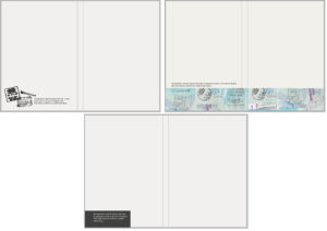
Later on in the project, the client suggested some text on the inside of the front cover explaining the concept of the cover design in a few words.
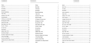
COntents page initial ideas
As our client wanted a contents page, we felt as if we should also give them some options for the design of it, based on the design decisions they had chosen so far.
Family tree design
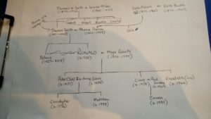
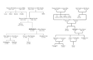
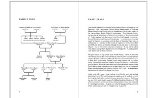
One of the deliverables for this project was the design of a simple family tree, which we designed from a quick sketch done by the client, seen below in figure 9. The client wanted it to be placed at the beginning of the memoir, and initially wanted it to be landscape, however we designed a portrait orientated one in order to fit the format of the memoir better, and to make the flow of reading easier.
Development
After going back and forth with the client, and our supervisor we made several improvements and additions to the memoir. The biggest change we made was to the margins, where we made them wider to ensure there was enough space around the outer and inner margins. Furthermore, we adjusted the chapter headings to create more space around them in order to make them stand out slightly more. In addition to this, we were advised to edit the cover ever so slightly, making the grey band slightly lighter, as well as removing some of the rules, in order to place and break up text more efficiently.
Production and Print Finishes
As our client wanted only a small number of copies, the printing of the memoir was done on campus with CPS. In terms of paper finishes, we showed our client several examples, as well as them showing us an example of a book that they were keen on. In the end the client chose white silk coated paper, and this was also recommended by Geoff because it aided with giving the images some lift, as they are an important feature of the memoir.
In terms of the print finish, the client’s example was a laminate finish, however due to the choice of silk coated paper, laminate finish was not possible, as well as it being a much more expensive option. Considering this, we guided the client to a more suitable finish, being a spot UV across the band of the front cover to give that section a subtle lift from the background.
Final Deliverables
digital MOCKUPS
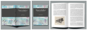
Prior to sending the memoirs to print, we felt it would be beneficial to the client to see a digital mockup of the memoir.
PHYSICAL Object
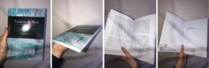
Figure 16 shows our final printed book. After seeing it on screen for many months, it was very rewarding to finally see all of the design components pieced together for this final outcome.
Reflection
Our client got back to us once she had picked up the printed books and said “We are delighted with the results – thank you for all your hard work”.
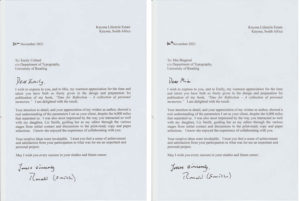
Having finally received the printed book ourselves, we were so pleased to be able to hold our design in our hands! We were so excited to see how the print finishes looked and also to see our design as a physical object, rather than a flat image on our screens. We were initially rather sceptical about how the format would look once bound, as we were unsure whether our margins were too small or not, but in the end they were a good size. Furthermore, it was also really rewarding to have a written letter from our client all the way from South Africa, as well as from his daughter saying how pleased they are with the printed product.