
To visit That Marketing Blog, go to: http://thatmarketingblog.com/
Background
That marketing blog began as an idea of a collective place of resources for students. It grew from ideation and research to include more useful information to a larger group of audiences. ‘That Marketing Blog’ is now a webpage with regularly updated posts, career tips, university advice resources and fun marketing updates. The main goal is to provide information to prospective students about the route of learning, but also to discuss marketing devices used in real life for students already studying. The project began with a marketing student who felt the resources she had found were lacking and was inspired by other students studying marketing who had produced blogs on the subject.
Primary deliverables:
- Website
- Branding
- Illustration
Secondary deliverables:
- Social media content
- Client-facing videos
- PDF templates
The aims were:
- To allow the audience to use the site to gain general knowledge or find study material.
- To be functional so the user can find the information aimed at them.
- To be functional so the client can continuously update the site with new content.
- To provide an appropriate brand identity that is informal enough to show a ‘personality’ so marketing is not portrayed as ‘robotic’. The personality must also represent the feminine side of the client but maintain a professional appearance.
- To present the brand accurately and in an appealing way through social media and aid with the production of templates for future posts on these sites.
Research
Target audience
From initial meetings with the client, we had detailed conversations about the specific audience that they wanted to aim at. The primary audience was students studying marketing who may be interested in the content as an additional resource outside of their degree. Since the client is a university student herself, she drew from her own experience and conversations she had with colleagues to evidence the users. It was decided that the blog site would be a resource for:
- University students studying marketing
- Graduates and ‘up-and-coming’ professional
- Prospective students looking to study marketing
The overarching purpose of the blog site is to support extracurricular reading around the subject area with the sharing of course content and key learning outcomes. For prospective students, we decided to include ‘uni advice’ content so that advice can be given retrospectively from the client who can give information based on her own experiences.
The client also stressed that they wanted to target women more than men as they wanted to produce content about women in the marketing industry and have the brand being woman empowering. We took this on board and researched competitors with this in mind and built this user group into our design work.
Competitor research
When researching existing marketing blogs, two direct competitors focused on women in the industry of marketing. These were Pretty little marketer and Girls in marketing. After studying both these brands’ content, we gained a good understanding of the conventions of independent blog sites, types of engagement and activity on social media and how content was grouped and structured within the website. We also looked at the stylistic way that they marketed themselves to the target demographic. As we researched this, we found norms that lay beneath the surface, most notably the use of an approachable visual style that was engaging and ‘girly’ while remaining classy and ‘business casual’ in aesthetic.
Visual style
Since the target user would be using the blog as an extracurricular activity that is closely linked to their subject area, we felt that it was necessary to make the designs seem lighter-hearted and fun rather than heavy and serious. This seemed important to engage the user by creating a more humanistic experience.
Primary Deliverables’ design Development
Information architecture
For the design process of the website, we began by discussing with the client and analysing what content needed to be included (this information is shown in fig. 1). Once this was confirmed, we drew various iterations of a site map to decide how would be best to structure the information, so that it logically made sense and could be found with ease. For this, we considered two potential user flows; browsing for leisure and researching for specific content. Taking into account both of these, we made sure the navigation headings were self-explanatory in their naming. A problem that we came across was that the client wanted to fix the uni advice and career tips information. But after having some discussions we settled on having two separate pages as the sections, although similar in content, catering for 2 different user groups – prospective students and graduates.
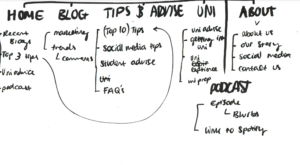
Fig. 1 First version of the site map
Ideation
Once we finalised our information structure, we began to brainstorm ideas for how to best target the demographic and the types of styles that might work best. For this, we created a series of moodboards (shown in fig. 2-5), each focusing on the various deliverables to look at how we could span a visual style across all outcomes. Again, with the moodboards, we thought a lot about how best to capture the type of message and user group. After discussing with the client, the two main stylistic elements to be decided from the moodboards was the use of contrasting thick and thin strokes and the use of irregular shapes to create sectioning. An idea to further this concept, which was eventually discarded, was the use of the irregular shapes in the illustration style too. Another illustration style that we considered was the use of photography with graphically drawn enhancements to create a balance between professional and casual through the use of contrast with a more professional photography element.
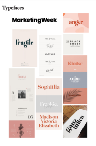
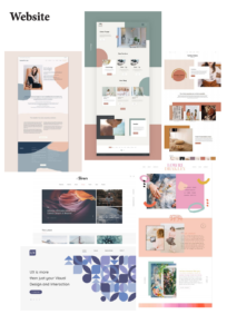
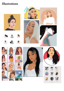
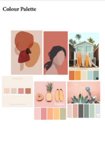
Fig. 2-5 images of moodboards
Low-fidelity designs
Based on our finalised site map and moodboard ideation, we produced some diverging wireframe idea (shown in fig. 6-8). Through this, we explored different ways that we could layout the information that was to go on each page as well as playing around with rough ideas for the user interface. The main focus for the wire-framing state was to decide how we would lay out the website and where the information and images would be placed. One thing that we didn’t take into account, that should have been considered was how the layouts would transition to mobile and tablet versions. This was something, that we had trouble with later in our design process and upon reflection should have been thought about at this stage.
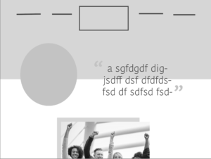

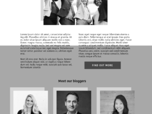
Fig. 6-8 A selection of the initial wireframes
Identity design
Following on from our exploration of graphical styling with our moodboards, we began the identity design by discussing how the logo and illustration would work together. From this, we decided to have a typographic logo to complement the illustrations and shapes. With a typographic logo in mind, we drew up sketches of layout and arrangement ideas based on the name ’That Marketing Blog’, (shown in fig. 9). The logo was then iterated in black and white as we wanted to ensure that the contrast worked before experimenting with colour variations. The client suggested that they wanted a neutral colour palette heavily featured with shades of beige. While we experimented with this, we thought that some more contrasting colours would work better and achieve the more ‘neutralised’ look by muting the tone.
For the logo, we initially produced the logo (fig. 10). However, we found that when testing the legibility, due to the great contrast from thick to thin, the thin lights become invisible and smaller sizes and so we had to make adjustments. To solve this issue, we increased the size of ‘that’ and ‘blog, which we think was effective (fig. 11). In addition to the main logo, we produced a circular logo variant that just included the ‘MB’ initials for social media profiles, where the space is rather limited. For this, we struggled with whether to include the initial ‘T’ as well since it seemed counterintuitive to leave it out, but after testing with users and discussing both at the real jobs meetings and with the client and supervisor, we decided that the ‘MB’ alone worked best and was most suitable.
The second element of the identity we designed was the illustration of the client and the shapes that were to feature on the website background as well as the social media content in the end. While we did not have an exact idea of what needed to be drawn, we finalised the general concept of how the shapes would be used and how they aesthetically would work within the brand identity. While this seemed like a more secondary idea at the time, this came to be a strong aspect of the brand as it is more unique and creates a recognisable quality and fluid atmosphere to all the deliverables.
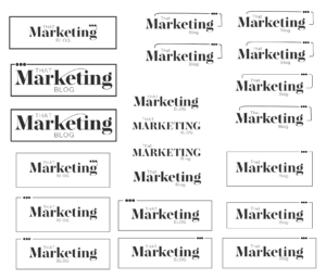
Fig. 9 Initial sketches of logo

Fig. 10-11 Before and after of adjusted logo
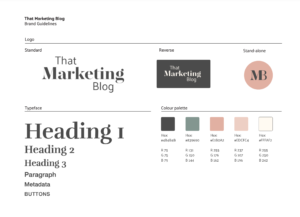
Fig. 12 Brand guidelines
Overcoming technical barriers
Previously to building the site neither of us on the project had any experience with WordPress or how to go about constructing a successful site. We, therefore, began by watching a variety of tutorials to get the best outlook on where to start. After a few failures by going in the wrong directions with free templates and plugins, we found that to achieve a strong design the Elementor plugin would be the way to go. By going down this route, we needed to weigh up the pros and cons based on cost and other achievable ways to present to the client. We decided that to achieve the various elements required, Elementor pro was a useful solution.
Later down the line, we found we had a significant issue when applying the shape backgrounds to the site. We used trial and error to find a solution that would place the shapes behind the right sections, including changing the background colour to an image that included these shapes, adding background images to certain sections, and placing them as individual shapes behind other elements. There were various problems with all of these solutions, but the most significant is that we hadn’t found a way to make the shape grow with the text and fit a mobile screen. After troubleshooting, we found a solution to separating the parts of the shape into a ‘top’, ‘middle’, and ‘bottom’ section (shown in fig. 13). The middle would be a square set to the background of the element, with the other two set as shapes that would sit above and below it. This allowed the shape to grow with the text and avoided shapes moving in awkward places when applied to mobile.
We also reached difficulties when it came to applying the designs on mobile. As well as the shapes rescaling (which was fixed in the solution above), the text needed rescaling for different screen sizes and the margins too. We have learned from this issue, the significance of the transforming of information, and how it is essential to go into the production knowing how these will affect the designs. If we were to do this again, we would consider working with percentages of element sizes – so they scale automatically.
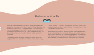
Fig. 13 Shape backgrounds applied
Website design
When designing the site, we had a strict list of elements that needed to be included based on the site site maps. We added this based on what was available via the Elementor plugin and styled them with our branding choices already previously decided.
When making choices around the blog posts, there was a lot to consider in terms of pages, number of posts and how each would relate visually to its section. We began with the main blog posts and sectioned them by their categories. These would sit on the main blog post page. We decided each category would highlight the most recent three posts and keep the remaining in its’ sections archive, which could be viewed by clicking the ‘view more’ button. We decided on this number as it allowed the overall blog page to not become too difficult to navigate through, which would be much easier for the user to browse. After trying out different numbers of posts on a single line, we came to the conclusion that three gave a good size to balance out nicely with the rest of the site (shown in fig. 13). Posts on the ‘uni advice’ and ‘careers tips’ pages needed to be distinct from the regular blogs pages, as these were set to be ‘extras’ that are separate from the regularly updated blogs page. These were therefore styled in a two column grid, of which the posts were much wider individually.
We added pictures for mock up to give the client a recommendation on how the types of images that work with the colour scheme and the effectiveness of well chosen photographs. As these are only placeholders and the client will be replacing them, we recommended that images like the ones chosen would be ideal and talked through how to find good quality material (image placeholders shown in Fig. 14). Though we cannot be sure this advice will be followed, we felt it was important to have this discussion and felt it was well received.
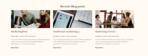
Fig. 14 Post widget previewing three most recent posts
When making choices on how to present certain information, we looked carefully at the elements available from the Elementor plugin. Sometimes, particular elements would be a more user-friendly experience than placing the information naturally. For example, the carousel being used for introducing highlights from the site was more engaging than to use text alone (shown in fig. 15). This was due to the short snippet of information it gave, with it changing at a regular pace. The ‘FAQs’ element (shown in fig. 16) allowed us to use information in a way that is interactable, as the section could be clicked on to reveal the answer. Although this could be produced in an alternatively engaging way, the interactivity certainly gave a strong impression to receiving information.
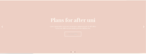
Fig. 15 Image of the carousel section
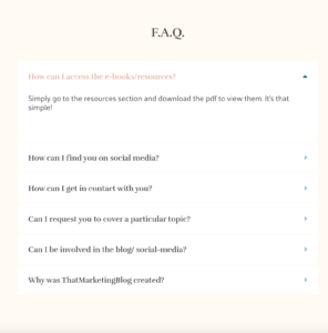
Fig. 16 Image of the FAQs section
After deciding on the blog posts styling, we kept the layout in groups of three where applicable. For example, the PDF download section under ‘resources’ has a similar weight to it from these blog posts (shown in fig. 17). The footer text was also similarly positioned in this way, but with the key difference being size of text to balance with the small amount of text, as well as achieve a lower hierarchy.
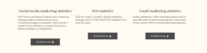
Fig. 17 Image of the downloadable PDFs
When introducing the blog creator on the ‘about’ page, we decided it would be essential to use the illustration effectively with some strong introductory text. This would be important to capture a users’ attention that they may otherwise not be interested in viewing otherwise. The ‘about text’ (shown in fig. 18) that follows from this needed to be similarly short, to keep engagement with the user. We decided to use two text boxes balanced in weight which fit neatly all on the screen with the shape background. By placing the social media links on this section with the description, a more personal connection was created in representing the blog creator as an individual who runs the pages.
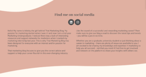
Fig. 18 Image of the ‘about text’ section
Forms needed to be functional and friendly. We applied it as the Elementor plugin allowed us to and styled it with the branding. Having the styles applied to this and being able to keep it minimalistic really helped to keep a nice balance with the style (shown in fig. 19).
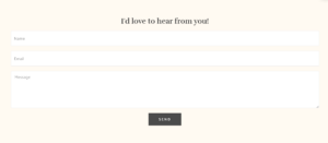
Fig. 19 Image of a form
Extra elements such as social icons, buttons and the search bar needed to be consistent with the branding. This was done by making choices that fitted with the overall feel of the site. For example, we began by using squared social icons in their original colour. After revisiting, we decided when set as rounded, they fitted with the curves on the site, and the colours being in line with the site’s made the overall appearance more fluent with the site visually.
Introductions to the content on each page seemed needed once reflecting on the quick jump into various elements on most pages compared to the necessary introduction on the ‘home’, ‘blog’ and ‘about’ pages. This, although functionally not necessary due to the underlining reminder on the header, allowed consistency visually, with a more natural user flow into the content.
To ensure our colour palette didn’t need altering and was suitable for colour blind users, we checked our website designs on a colour blindness checker to ensure we had enough contrast (shown in fig. 20).
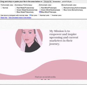
Fig. 20 Example of the colour blindness tool applied to the site
Secondary deliverables’ design development
Social media content
A part of the project’s goals was to maintain the style across other platforms, such as Instagram and LinkedIn. This included creating styles for the banners and highlights. We decided to take our shape styling and apply this to these sections as this met the goals of consistent branding and being appealing for the social media sites (shown in fig. 21).
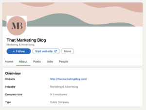
Fig. 21 Image of shape styling on social media sites
To maintain the brand identity, we started the client with a set of templates to use for all social media sites. We produced these on adobe sparks as the client had access to this programme. Later in the project, she decided to take the production of the posts in a new direction. She wanted to use already produced templates on a different programme, Canva, as this gave more creative flexibility. We decided as a group to continue in this direction but it would not be practical for us to apply these styles to every post going forward in the future. We, therefore, decided to give her the information of colours, margins, typefaces, alignment and logos to be able to apply the identity herself (shown in fig. 22).
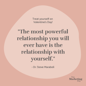
Fig. 22 Example of a later template used
PDF templates
A part of the project involved creating a template for the client to use to create PDF resources for a section of the blog. This involved breaking an example of a document into a simple hierarchy. This needed to be clear for the client to use, as the aim was to allow ease of consistency. We decided Word would be the best programme for this as it was easily outward-facing for the client to access (shown in fig. 23 and 24). A big aim of the template design that the client needed solving was to apply the branding styles to the document. This was applied so the client would not need to change any values independently.
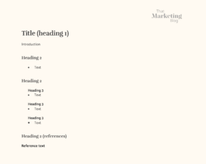
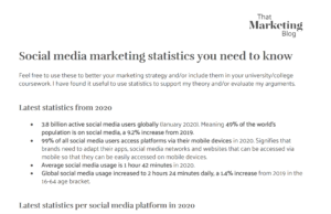
Fig. 23-24 Image of the template given next to a document that uses this information
Client facing videos
For the client to continue with the site independently, certain aspects would need to be updated within the Elementor pro plugin, separate from the blog post area that would be used as standard regularly. We first wrote steps with accompanying screenshots for uploading a blog post, as this was mainly information-based. For the technical areas within the site design itself, we felt explanatory videos would be most effective for the client to follow the information. This is because most processes were relatively simple, but would be most difficult to follow the positioning of the information. A video successfully solved this problem as the user could follow along easily.
Reflection
It has been a great experience to work with the client on this job. We have both learnt a lot from it, especially with the technical issues that we encounter along the way. Through a lot of troubleshooting and research, we were able to solve all our issues and find effective solutions. Overall, we believe that we have produced a strong visual brand that is flexible enough for the client to use on the various platforms while remaining consistent and standardised for maximum recognition. The target user group was carefully considered throughout and we believe that our designs have successfully struck the balance between professional and casual as we set out to do. Our client was very pleased with the deliverables and her ability to weigh in on the design process and put her ideas across, which we always worked through and experimented with. The collaboration was very helpful for us and our working relationship with the client as we were able to glean information from the client with her extensive knowledge of the user group to optimise our designs for our target audience.
Reflecting on the design process, the most challenging obstacle for us was the conversion from desktop design to mobile. We realise now that this should have been a part of our early considerations, but regardless we overcame this issue and produced a website that was versatile for all screen sizes which we believe to be very important for the times we live in with such diverse technology from one person to the next.
Supervisor review
“@isobeladcock and @emilybagnall1 produced a really good first draft of the restated brief. One of the most professional and comprehensive ones I have seen for Real Jobs projects. Well done both.”
Client review
“I am really happy with the designs and website that Emily and Isobel produced. The website is really well put together and looks great! The design process and meetings with them went well and was smooth sailing for the whole duration of the project.”