
Introduction
The brief was to create a logo and brand identity for the newly funded Natural Flood Management Reasearch Programme headed by three major universities here in the UK. The task was to create a programme logo as well as three subset project logos as well as branded deliverables such as newsletters, letterheads, powerpoint templates and blog sites in four sets corresponding to each logo. This project began during the second semester of this year and was chosen for the opportunity to continue honing my branding skills. The branding project took place the previous semester and proved to be an area of design I felt that I particularly enjoyed and excelled at. I wanted to continue improving these branding and marketing skills I had gained from the module. This job initially was for a single person but after the first client meeting, my supervisor and I agreed the job was more suited for a pair. Camara, my colleague from second year agreed to take this real job alongside myself, a deliberate decision to encourage collaboration across years and work with others inside the department.
Research
Joanna Clark, our Reading based client here at the university wanted a brand identity and subsequent print and digital deliverables for a government funded environmental programme focused on natural flood management. Joanna was the head of the Landwise project, one of the three projects that comes under the overall programme with colleagues in other parts of the UK who headed the other two projects. With so many stakeholders in the project, from the advice of James Lloyd, we chose Joanna as our main point of contact as she was Reading based – organising contact and feedback with the other directors through Joanna.
From the first client briefing meeting, Joanna detailed the nature of the programme and projects to us. The clients field of study is based in the environmental sciences so a lot of topics and subject details were quite complex and foreign to both Camara and I which led to an extensive research phase. Joanna and the other two project leaders, Emma Shuttleworth and Nick Chappelle did give us a lot of information via resources such as project proposals, manifestos, text books and academic studies. Upon request, they also put together mood boards of their visual elements they felt represented their projects or appreciated for it’s design, giving us a better sense of what directions their visions were going in and finding a way to match and improve upon that. We knew that to accurately capture the essence of such a large programme in our new brand identity design, a deep understanding of the topic of natural flood management would be essential.
We began the research phase looking at two areas that would influence the new brand – the technical, academic side of the programme as well as the design and branding side based on the visual styles used by partner projects, organisations and competitors. Reading into the topic of flood management, we became more aware of the geographical areas these issues take place, the ecosystems surrounding these areas, the people and places they effect and the studies taking place to help prevent such issues. We also assessed other government funded programmes, non profit organisations and environmental associations to see how they interpreted their fields of study into their branding, giving us a better idea of what visual styles were common in this sector and how we could improve on those to create something that was unique but still consistent and synonymous with the environmental sciences.
Client Meetings and Feedback
Compared to other real job and freelance projects I have undertaken; this was the first time I have worked with a client who was a scientist by profession on a project based in the sciences. This was important to bring up as this influenced the ways in which we interacted and presented work to our clients. During our client meetings with all three project heads, we found that giving feedback and design opinions were more minimal due to this misconception that science and art or design are on two polar ends of a spectrum, that being a scientist negated their design opinions. We also realised in this project, that detailed design aspects like typeface differences and colour swatches which are noticeably different to designers or typographers were not as noticeable to clients who have never had to consider or assess such concepts before.
We decided to combat this by encouraging an atmosphere of complete comfort and honesty when expressing feedback and ideas – that no idea was too unreasonable and that the more feedback we could get, the better we could improve on our designs. Because of the variety of stakeholders based across the UK resulting in minimal face to face contact, we decided to present all work for feedback in simple pitch like slides with annotations and blurbs to explain design decisions (use of a font, colour changes, placement etc.), putting into context why we chose to do what we did for better understanding, comparison and feedback. This approach was well favoured by our clients, who felt it was easier to make design decisions on well annotated work that gave insight into a process they were not as familiar with, stating it was a very professional way to have work presented to them.
Branding
This project posed quite a challenge as the branding task not only required one logo and brand identity, but four – requiring careful choice in form, colour and typeface to create an effective, consistent and cohesive set of visual identities and sub-brands. All brand logos and identities would not only have to meet the client requirements of being vibrant, exciting, visual and professional but would also have to work alone as separate brands and alongside each other on programme deliverables when needed. We took a look at famous brands and their sub-brands, assessing the various ways in which they create visual singularity while staying consistent with its “parent” brand.
Colour Pallette
Colour was naturally the first tool we thought could help differentiate the different project identities. A carefully selected colour palette would allow us to create a set of multi functioning swatches that work well on their own as separate sub-brand swatches and that match well with each other to create a larger multi coloured palette that was symbolic of important project aspects. This was my own interpretation of the brief, incorporating the research into a meaningful colour palette that could allow for easy sub branding.
![]()
Logo work
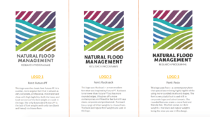
We wanted to stray away from the text heavy logos common in this field of science and create a visual and iconographic logo. The next course of action taken was applying the colours to its appropriate symbolic imagery. The client’s description of the “constant movement of flowing water” when describing the topic of water management inspired the use of line work and colour blocks to symbolise not only water, but crop rows on farms that are affected by flood and the waving lines of rolling hills in the moorlands (which are also the ecosystems and geographic locations where these three projects target). The clients were very receptive of this symbolic patterned line work and colour blocking, noting how impressed they were with the attention to symbolism and imagery as well as the high quality of of work. This concept of colourful line work continued to be developed, playing with shape, symmetry and form to create several sets of logos that were eventually narrowed down to a final programme logo and its corresponding sub logos. This logo was ultimately chosen for it’s ease of recognition on both print material and online sources like social media profile pictures due to its bold lines and bounding shape.
![]()
![]()
![]()
We knew the client specifically requested the use of a sans serif font so a small selection of a variety of sans serif fonts that were geometric, condensed and rounded were selected for the logos. The typefaces had to be both clean and professional looking but work well with the varying widths of wavy lines in the logo imagery. The clients collectively agreed that their preference for the classic, bold and clean Futura PT outweighed the others, taking the more corporate approach to logo’s typeface.
Templates and Stationery
Camara’s role in the project thus far was being in charge of applying the logos, brand identity and brand guidelines to the deliverables specified by the client. The newsletter, letterhead and powerpoint templates applied the colour palette and simple flowing wave design to create a clean and consistent set of templates. The logo was kept the focal point of each design with simple colourful accents to complement the clean and minimal visual approach.
Project Management
Project manager has been a role I have been volunteered for by my partners during group projects and real jobs throughout my degree even though I struggle with maintaining a consistent time management schedule. Over the course of this degree that became more apparent in both my real jobs this year, as I was placed in a role of leadership and was expected to not only keep my group on task and in high morale while simultaneously producing quality work and being the main liason with the client. I have always enjoyed leadership roles but have always struggled with time management. Thus this role was a challenging job, but was a skill I was determined to improve on by acknowledging my struggles and trying to combat them.
Moving Forward
During the course of this job, I realised that dealing with multiple stakeholders and larger clients can be challenging as feedback can sometime take longer to receive, or video conferencing can be difficult to schedule with multiple clients. We tried to keep everything as organised and as professional as we could with scheduled feedback meetings, development presentations and minute taking to ensure we did not miss any key information or instruction. Unfortunately, branding can be a long process of trial with feedback from various levels of your client’s organisation, with many “back to the drawing board” moments. This project has been one of those moments but has given us invaluable experience for the next time around. The set of finalised logos I have shown here will be reworked in the next few weeks as part of the ongoing process of design and feedback. I hope to pursue branding in the future as my discipline, so this experience of reworking and trial and error will be something I am prepared for now and can even take steps to lessen or avoid. However, Camara and I are continuing and determined to get this brand right for our clients as we believe so deeply in their program and have been grateful to have had this opportunity to produce work for such clients. We are already in the midst of developing the idea into new territories and are excited for how much further we can take this project. Luckily, our clients have been extraordinarily flexible with the schedule and have given us a lot of creative freedom to experiment. A revised set of logos, branding and deliverables should be completed well within the next month.