
Overview
Summary of the project
For this real job, Cristele Saric and I worked collaboratively for Sue Walker as part of the CoRAY Project’s production partners. The CoRAY Project is working to produce evidence-based resources for young people aged 11–16, to support them with mental health issues, based on the effects of the Covid-19 pandemic. As part of the production partners team, we worked with colleagues from BBC Bitesize, Fully Focused and Headliners UK to produce resources in response to the research summary that the CoRAY research psychologists carried out.
This project was untraditional, in the sense that there was no set deliverables or outcomes. We produced briefs as the project developed: the research we carried out informed the deliverables we went on to make.
What is the CoRAY Project?
The CoRAY Project recognised a lack of evidence-based resources that are easily accessible and digestible to those who need them. The Co-RAY project set out to bridge this gap and produce trustworthy resources for YP (young people aged 11–16). Participatory design is part of the CoRAY project research methods. It recognises that effective design is designed with the intended user instead of for the user. The logo (figure 1) was designed in this way by Sue Walker and Josefina Bravo; Cristele and I also utilised this method in our work.
Communications
Since we worked as a part of the larger project, various communications were in place. Large meetings with all of the partners were used to explain the research findings and receive feedback. Production partner meetings were regularly scheduled to feedback on the progress of each other’s work. In addition to this, Cristele and I commonly met with our co-supervisors – Rachel Warner and Sue Walker, to discuss our contributions and project progression. Cristele and I also used Trello as a management tool.
Initial steps
The initial research carried out created the groundwork for the project. It helped us gauge an understanding of the CoRAY Project, the work done before we joined the project and the YP we were designing for. We produced some User Personas but in hindsight, these only provided surface-level information of our users, and we found our later workshops and interactions with the YP infinitely more valuable. The discussions at the beginning of the project – since the deliverables were unknown – were very concept-driven. I found it hard sometimes to understand and therefore contribute to these types of discussions about what should be achieved socially. As the project progressed I was able to input more on these types of conversations and reflecting, I can see the development of this skill. The production meetings focused on resources that could be made to present the evidence-based advice for the YP. The researchers inputted that they wished to have some infographics for this. An important role of ours was to creatively think of how best to present this information, in ways that the YP could engage with it. While also existing in the eco-system of the other resources: a series of short films by Headliners, a webpage on BBC Bitesize and accompanying animation, an art exhibition and podcast by Fully Focused.
Brief 1: Research Workshop
As a natural progression of our research, Cristele and I organised and led a workshop with a group of YP to understand types of infographics that appealed to them, aspects that they found useful and elements that caught their attention and kept them engaged. This was the first brief that we restated and carried out.
Collecting examples
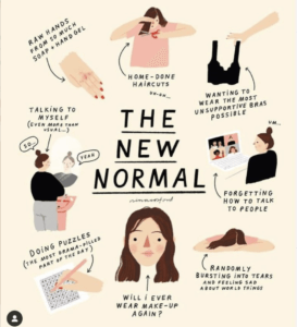
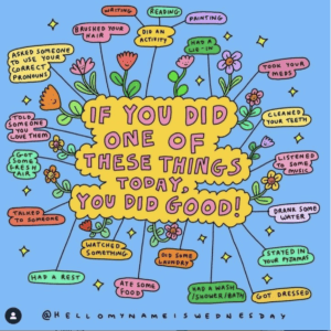
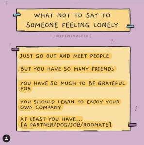
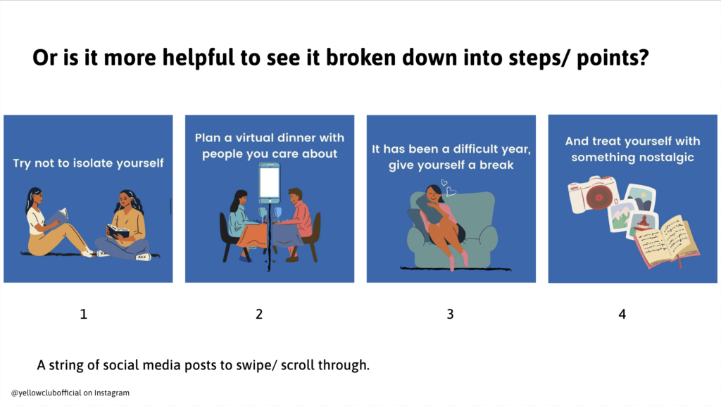
Finding a diverse range of examples to discuss was challenging. A lot of the examples that we used were from social media platforms (figures 2–5). We found when collecting examples that it was common for the examples to be aimed at specific genders so we decided to make our designs neutral. Recognising this was important as we soon realised, by talking to our workshop participants that 11–16 is a large age range with widely different interests and opinions (figures 2–5). Reflecting on this, it would have been better to account for this in our examples in some way. Perhaps if we split the audience down into smaller groups, we could have more effectively communicated the information to each age group, but there were limitations to what we could do as the audience was predefined in the research.
Preparing for the workshop
The preparatory work for the workshop was not overly challenging, though it was a fast turnaround between getting confirmation of the workshop and the workshop itself. We produced a slideshow with examples and prompt questions to initiate discussion – we found including questions on screen were effective as the participants could reread and comprehend the questions better (figure 6). With more time, it would have been ideal to release the prep work for the workshop earlier to give the YP more time to provide an example of an infographic that they thought was effective.
Running the workshop
The workshop itself was a big learning curve. It was challenging to encourage the YP to engage in discussion with us about the examples. Since we were working with children as young as 11, there were lots of prolonged silences and one-word answers. This made it difficult for us to gain the answers we needed for our research. By the end of the workshop, I had gauged how long to wait after asking a question. It was surprisingly difficult to make the judgement on whether the YP were thinking of a response or didn’t know and weren’t going to answer. I thought it was important not to move on in case someone would eventually answer, especially since sometimes the best answers came after long pauses.
Overall the workshop was successful and as participatory research, it provided us with a good understanding of how to design infographics that would be effective and useful for the YP.
Brief 2: Look and Feel guidelines
After discussion with the production partners, it was suggested that we should create a ‘look and feel’ for the CoRAY resources, so the project had an identity. We interpreted this as a set of guidelines to build upon the existing brand they had. This was our second restated brief, where we used evidenced points from our infographic workshop research to form a document outlining recommendations and a general look and feel to the CoRAY brand. A summary of our recommendations based on our research is as follows:
- YP had a preference for numbered lists over paragraphs
- However, lists should be on positive mental health topics only, as numbers make lists feel exhaustive even if it’s not.
- Bulleted lists, short statements and mindmaps are other preferable layout options
- The amount of content is important. Too much content can feel overwhelming.
- Long carousel posts can feel ‘never-ending’
- Keeping mental health topics lighthearted is important as it shouldn’t feel daunting
- Some use of humour can also help keep topics lighthearted
- Illustrations are best if abstract, instead of realistic
Creating recommendations
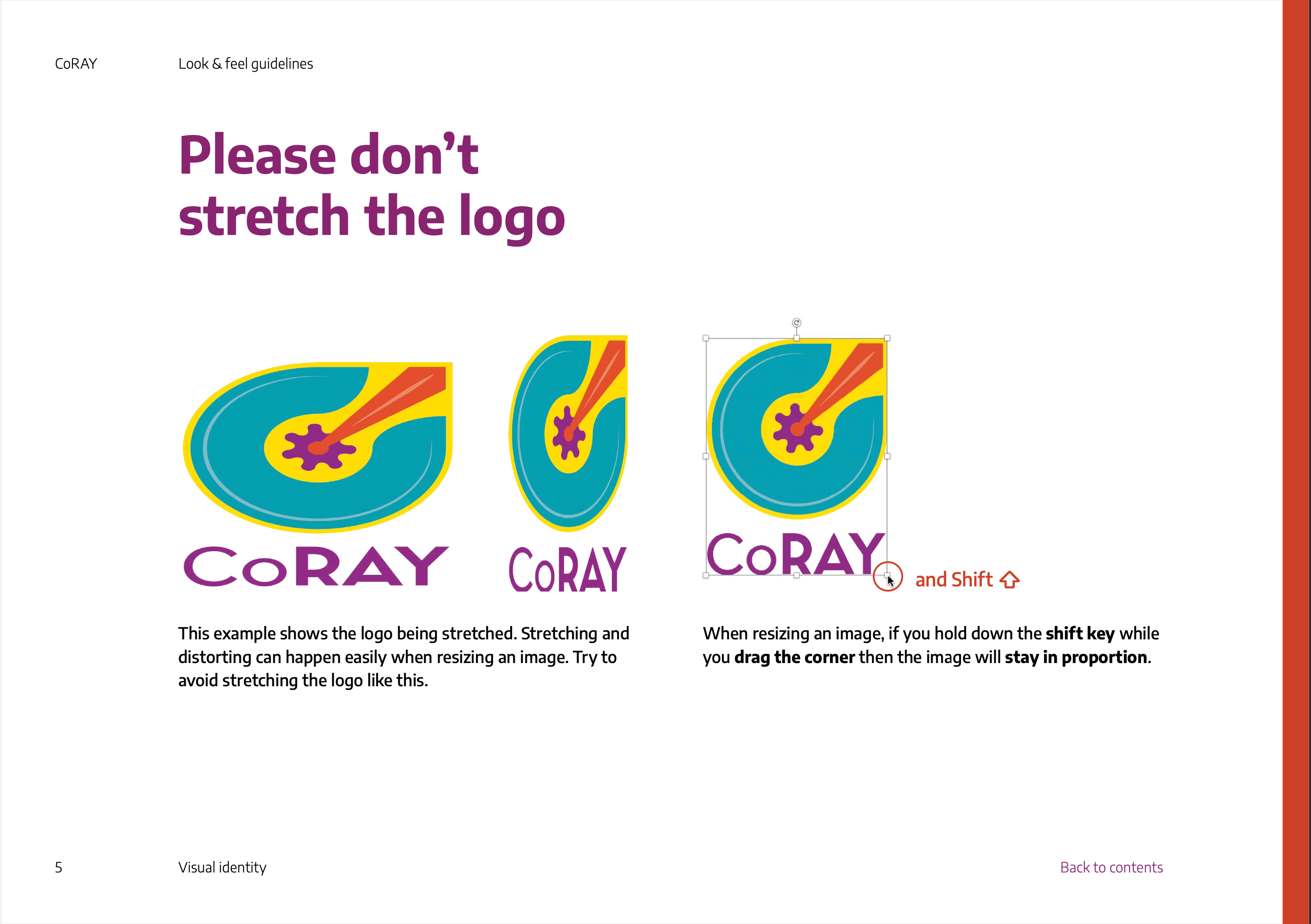
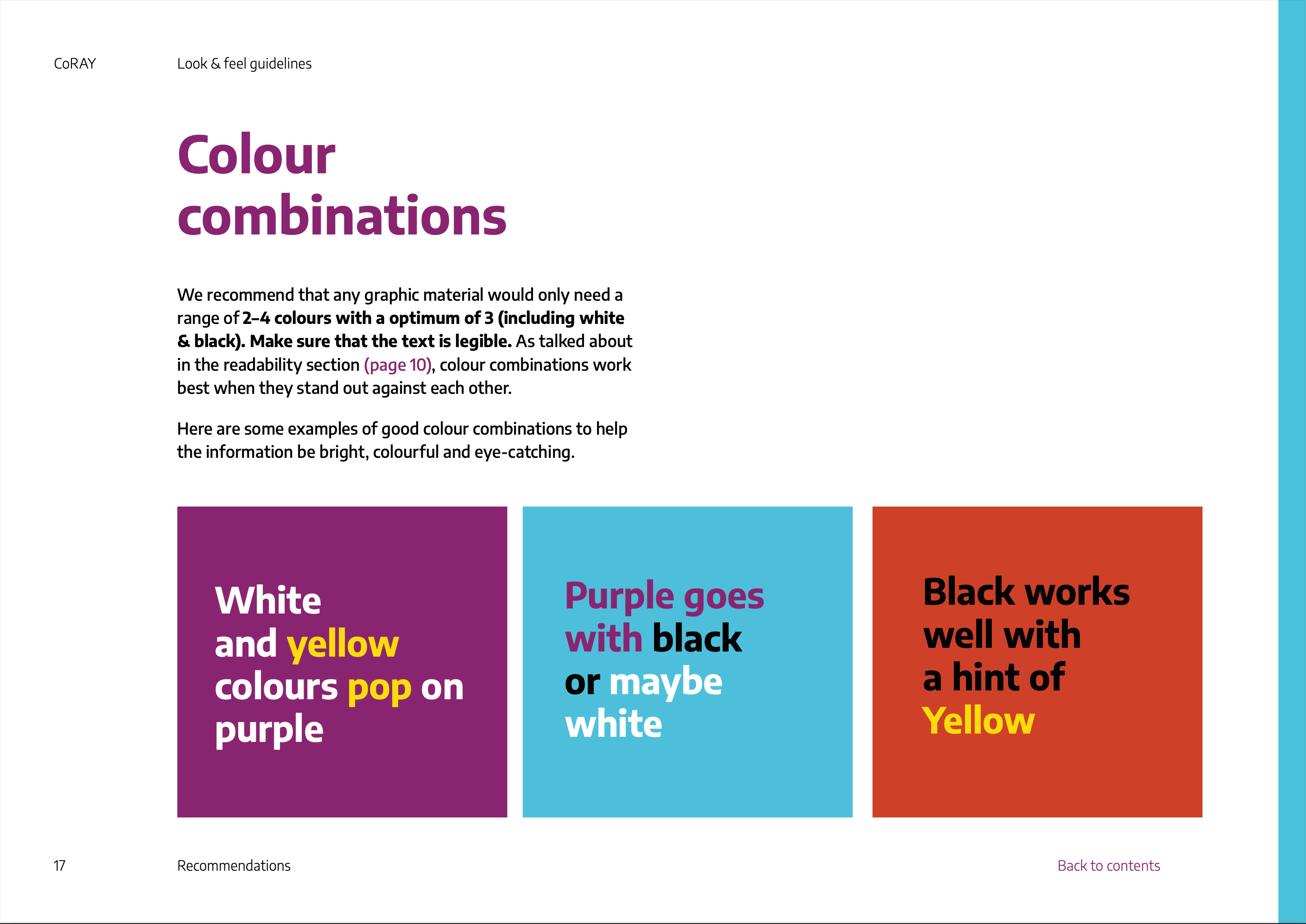
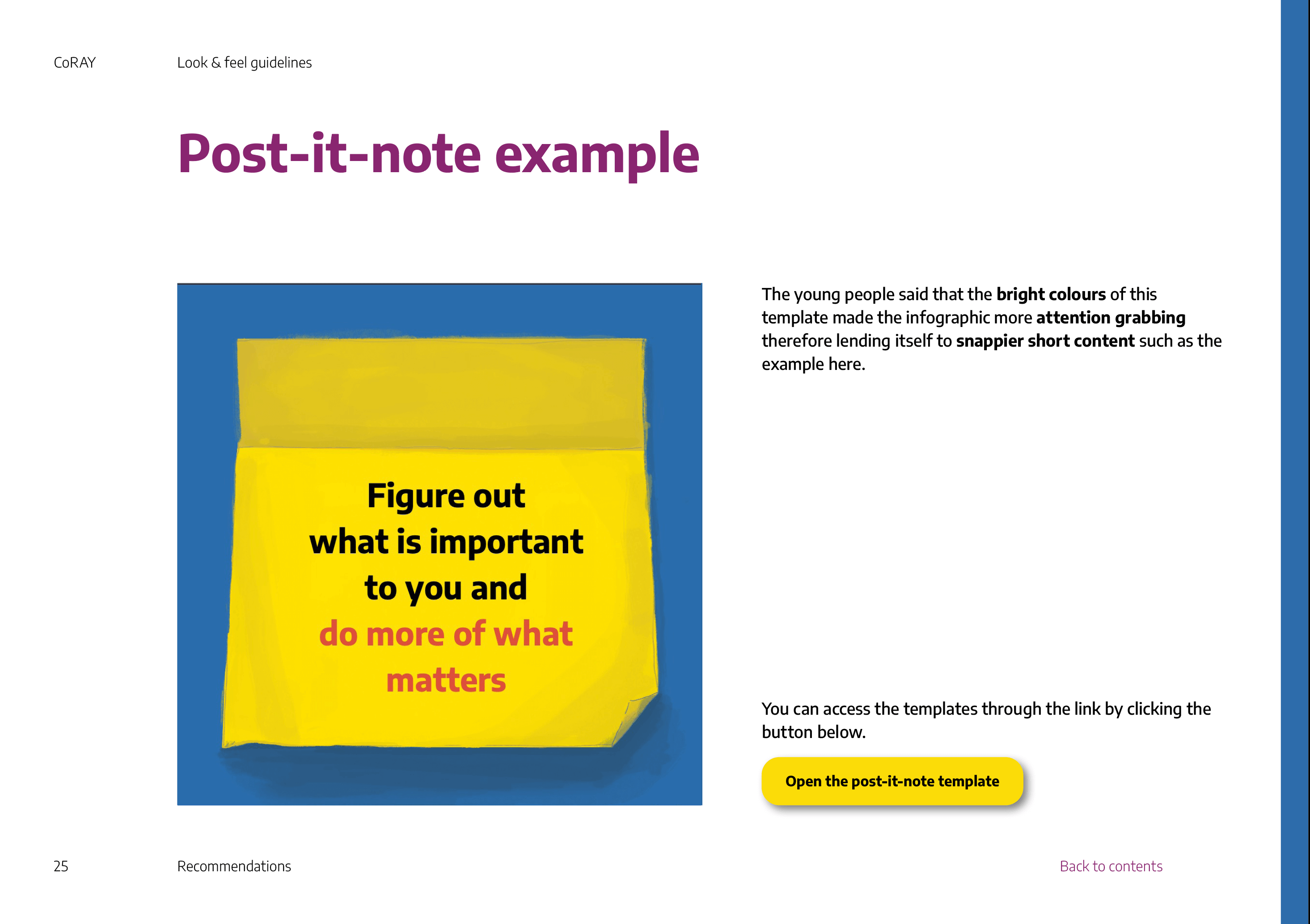
An interesting challange that we worked on was that our client didn’t want us to be too perceptive with our guidelines. Despite all the examples we used as inspiration, showing clear ‘dos and don’ts’, our guidelines had to be phrased as recommendations and suggestions based on research. This was difficult as we needed to ensure the guidelines were strict enough that they could be interpreted by different colleagues and still followed in the same way, while carefully formulating the language to frame the guidelines as recommendations (figures 7 and 8).
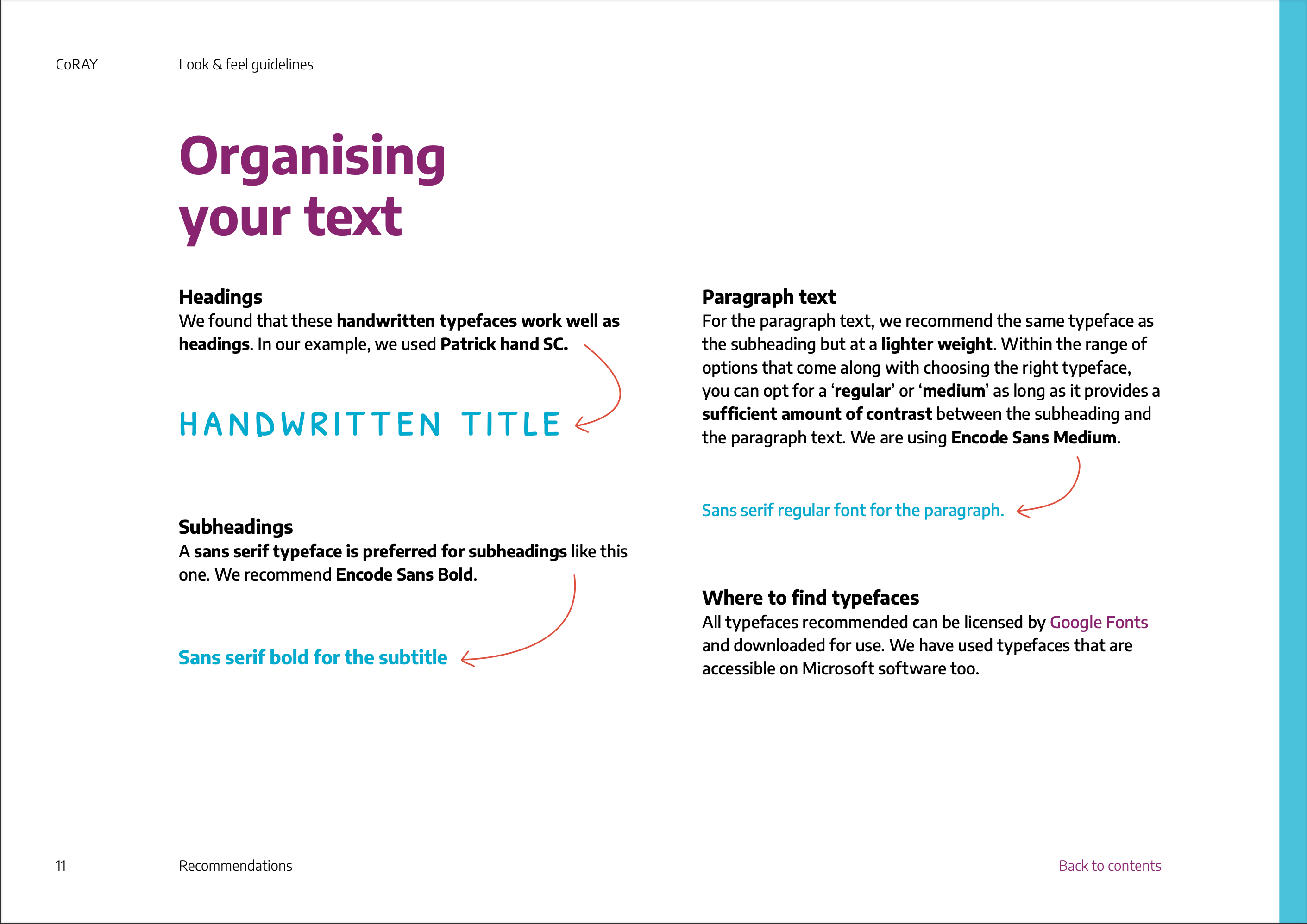
Building a robust document
Working on these guidelines with Cristele meant that quickly I realised we needed a document that was easy to share. I found the best way for us to produce visually cohesive work was through regimented paragraph styles, object styles and a grid. However, this took some trial and error as we used different techniques and needed to be universal. For example, we disagreed on whether to have multiple line breaks or two separate text boxes for more complex shaping. This took some time and looking back, it would have been more effective to have a conversation directly about how we used the adobe suite instead of sharing files with different techniques until we naturally found a compromise.
Another way that we developed our guidelines to be more effective for our users was by making the document interactive. We added a clickable contents page and a ‘back to contents’ button on each page (figure 9) to aid user navigation, reading strategies and general usability.
Figure 9: Interactive feature of guidelines
An iterative document
The workstyle of this project was different from what I have previously experienced. We produced iterative versions of the guidelines. Each version was sent to the client, shared with colleagues and put into practice. Once the guidelines were in use, we reflected on what could be improved and identified sections that were being ignored. This allowed us to fix the problem areas and add new sections as felt necessary. In total, we had three distinct versions of the guidelines that were published. This work style was interesting and a valuable experience as it taught me to evaluate my work in a new light – putting myself in the perspective of the user and finding the gaps in the work. The more we did this the more confident I felt at identifying potential gaps in the work before rolling the new version out.
Brief 3: Social media templates
Establishing the appropriate deliverable
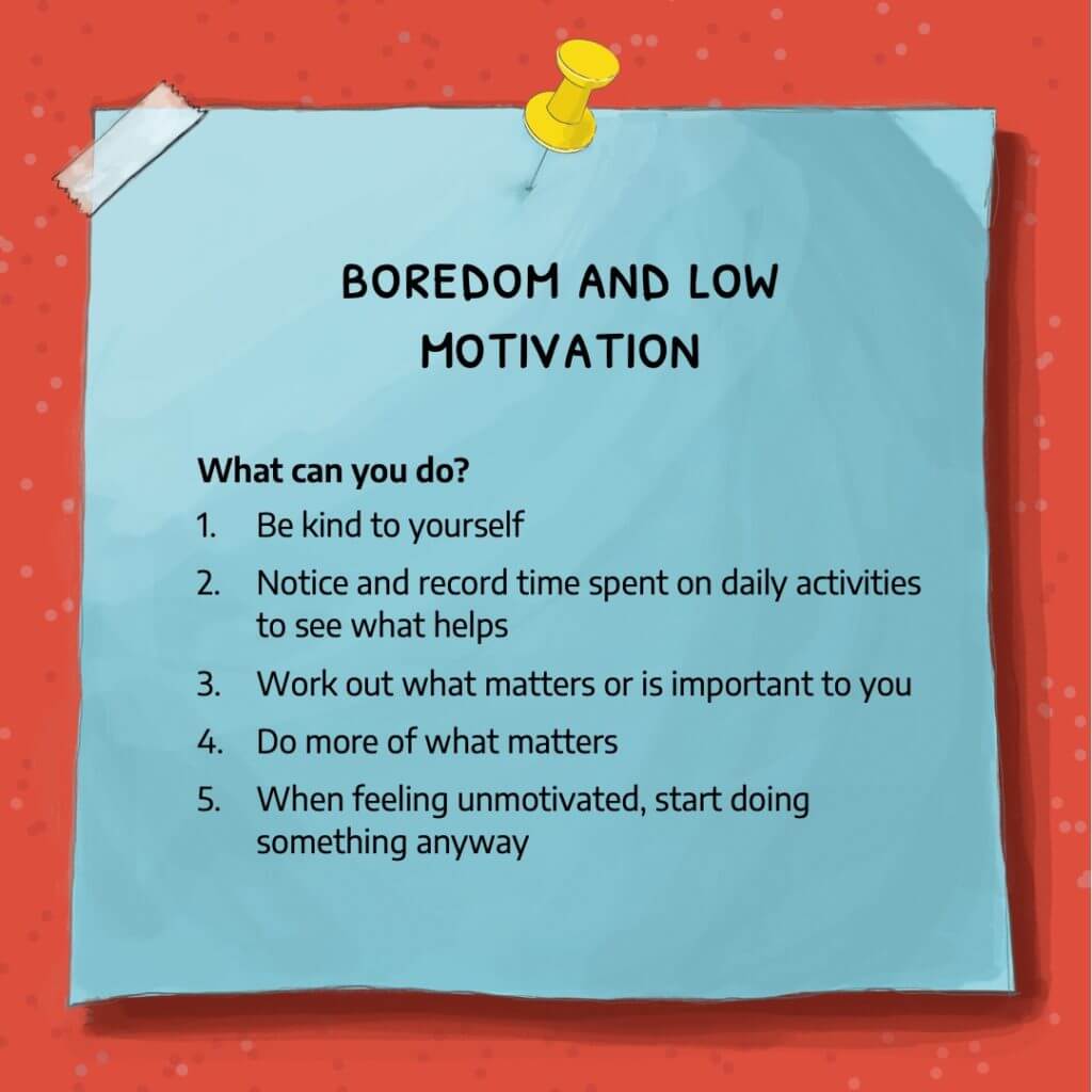
The final brief that we restated was for the infographics themselves. Initially, we produced a brief to design an infographic for YP on the topic of boredom. However, after some further discussion in the production meetings, we proposed that a template set would be more useful. We decided that this was a better solution as it allowed the researchers to write their copy for the infographics. It also meant they could produce as many infographics as they wished. This was important as we had time restraints, and producing the infographics themselves with the researchers would have been a longer process. I learnt while working with psychology researchers, it was important to always establish what was meant by specific terms. This was important for, and would have been detrimental if we hadn’t established what was meant by an infographic. Since infographic is such a broad term, we refined what was needed for the project. After discussion, we restated that they wanted a set of social media templates to help them in the social media campaign they were disseminating, to accompany other resources produced by CoRAY production partners.
Producing a design template
Another challange for this brief laid in the restraints of software colleagues had available. We needed to establish early on what type of software our audience had, and since we were sharing our templates with a wide group of users, we had to remain as accessible as possible. It was also important, however, to make sure the templates maintained flexibility for the user. In response to this, we used PowerPoint, setting the slides at the most universal social media size and using the master slide settings to create editable templates. Though we presumed that most of our users would have a general understanding of Powerpoint as a software, we had to ensure the templates were easy to use and as self-explanatory as possible. To combat this, we produced a subsection of the master slides with prefilled instructional information to guide the user (figure 10).
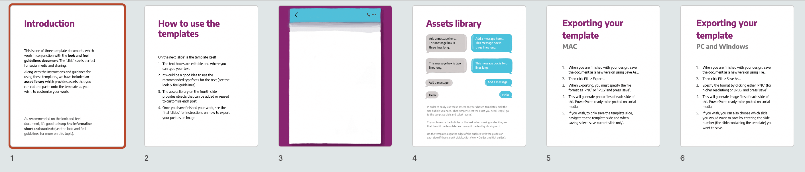
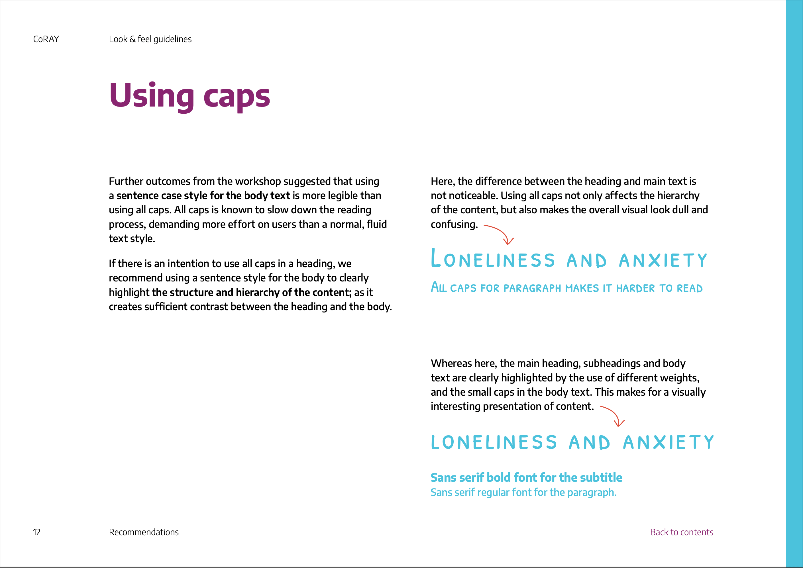
We struggled to make our templates robust typographically. We hit a lot of limitations of Powerpoint custom typographic presets. We utilised our guidelines document to try and give the users guidance on typographic detail and styling. However, we quickly found our recommendations were not detailed enough when the small-caps font we suggested was used excessively in sentence case. To improve and prevent this in the future, we added more detailed typographic guidelines with accompanying examples of the templates in use (figures 11–13).
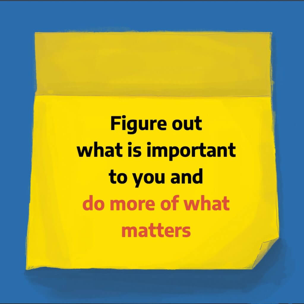
In the end, we produced three templates (examples of these in figures 14–16), each able to produce different types of content layouts. This provided variety and flexibility to the social media resources. These were all based on our look and feel guidelines that we previously designed. It was a really good exercise for us to design using our guidelines so that we could ensure they were usable and flexible enough to create varied outcomes.
Designing for multiple users
The templates were complex in terms of user experience as we were designing the templates for researchers to use – meeting their user needs of navigation and execution of the template production. All the while designing for the consumer as the template designs themselves needed to be visually and typography designed to appeal to the YP.
Navigating design consultancy
Another learning curve for me was navigating how to provide feedback on design topics for laypeople. This was difficult because through our guidelines we had to provide recommendations with soft language, so none of the recommendations were too perscriptive. Moreover, once our templates were in use, we adopted the role of design consultants for the project, giving feedback for work produced with our template designs. This was challenging as on the one hand, the researchers wanted the social media content to be designed to a professional standard, while on the other hand, the templates had limitations to how far they could be pre-designed. This was interesting for me as it taught me that the feedback people are looking for – even within the field of design – is highly dependant on the context in which they ask it.
User testing workshop
An amazing opportunity for this project was the chance to run another workshop as further participatory design. This took place once our templates had been shared with the researchers, used and we had provided feedback on the resulting social media content. As a team, we then ran a workshop to get feedback from the YP. Retrospectively this was more valuable than our first workshop because as designers we had the opportunity to test the functionality of the designs that were originally based on the initial participatory research, with broadly the same group of YP.
Overall, the YP were positive of the designs and little change was needed. The main feedback we received was more to do with the fine details of the examples rather than the overarching designs. These amendments fell into the execution of the templates. This felt frustrating as the fine details could have been polished before the workshop – allowing us to have potentially received more informative feedback. A lot of the fine details were typographic and could have been fixed quickly if the content was designed directly by us or if we had ideally worked closely with the researchers using the templates. However, realistically this is not feasible. Perhaps more robust template designs could have achieved the same level of typographic execution, but we had limited access to template software and PowerPoint had some limitations.
Improvements to guidelines
Following the second workshop, we amended and updated our look and feel guidelines to add a section focused on recommendations for using the templates. We had the idea of improving our interactive guidelines by adding a button to the template files (figure 17). However, we weren’t able to do this as the project wasn’t able to host the templates in a universal location.
Overall
This job was a big undertaking and therefore both exciting challenging at times. Reflecting on the project as a whole, I have learnt so much about, not only designing functional brand guidelines and social media templates but also much more diverse skills of running workshops, carrying out user testing and how large projects can function with varying levels of communication and work with different colleagues. I enjoyed the complexity of the design solutions and being involved in the conceptual ideation of developing what needed to be designed. It was an interesting new position for me to be a design consultant, which felt frustrating at times, not being able to do it myself but it taught me valuable skills of how to give feedback and is definitely something I wish to develop further. Looking forward, I am interested in further developing skills in information design for evidence-based research.
Feedback
Supervisor feedback
“Emily and Cristele – this is a really comprehensive and well organised set of guidelines, well done, they have really come on and I think rival many professional guidelines I have seen/used before! …[the] Links to contents page and back really help the navigation & usability. Plus, it’s a well structured and well-written document. Should be proud of this work!”
Dr Rachel Warner
Lecturer | Department Director of Academic Tutoring
Typography & Graphic Communication
University of Reading
Client Feedback
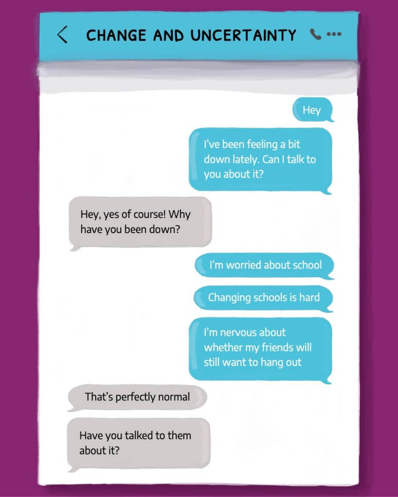
“Thanks Emily and Cristele for your work on developing these templates and guidelines. We really liked the text message template as this allows for a more informal / natural interaction.”
“Thank you very much for all your great work on the project!”
Dr Rebecca Watson
Postdoctoral Researcher
The Oxford Psychological Interventions for Children and adolescents (TOPIC) Research Group
Departments of Experimental Psychology and Psychiatry
University of Oxford
User testing Feedback
“[the text message example] Gives a good example of how you could talk someone over text rather than socialising. More personal feel, instead of just preaching advice”
“[the text message example] it’s like you’re talking to someone on the other end”
“for feeling unmotivated the post-its work because you could put some of the tips up on your wall or something, so it’s something practical you can do”