Author: Becca Burlow

Ecosystems Photobook

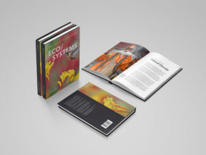
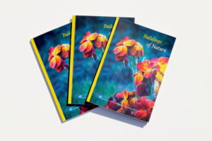
The Ecosystems photobook was a collaborative project, between a photographer, an ecological economist and the Department of Typography and Graphic Communication at the University of Reading. The photobook was designed to illustrate different ways communities connect with ecosystems around the World through the eye of a camera lens.


Briefing and Research

We were approached by James Lloyd, real jobs coordinator, to design this photobook. After reading the brief and researching the client, we were immediately attracted and believed our combined knowledge of photography and science would give us a good foundation to work from.

Our client, Dr Stanislav Shmelev was eager to begin the project, so an initial Skype conference call took place only a few days after. During this call, we gathered more information about the project, asking questions to enable us to develop a creative proposal. It was during this call that we discovered Stanislav had already began work on this photobook and had a clear vision for the final product. He had influential books to show us, paper samples from interested publishers and text written by an ecological economist, Dr Joachim Spangenberg. It was clear that we would need to meet in person to discuss these visions for the book, and work together to select the best photography to convey his message. Therefore, we organised a meeting in Oxford shortly after.

The first meeting with a client is essential to develop a good working relationship, so to prepare for this meeting we explored Stanislav’s photography, gathering images as instructed for each chapter. We undertook some further market research, exploring what else has been published in the field, investigating book formats, topics discussed, and the handling of text and image. This enabled us to arrive at the meeting prepared, ready to initiate further discussion and the brainstorming of ideas to enable Stanislav to achieve his end vision.


Design Process

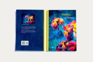
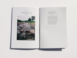
We began the design process by exploring book formats; creating a range of layouts on different sized pages, as this was the area in which our client was uncertain on what direction he would like to go in. We discussed the pros and cons of different formats, experimenting with landscape, square, and multiple portrait formats. We tried where possible to keep to standard book formats. We sketched layouts on paper, before translating these digitally, to allow us to generate compositions quickly and efficiently. After showing these to Stanislav, he was certain of one thing: he wanted to use a whole double page spread per image and wanted the book to be portrait. We used this to inform the decisions to follow.

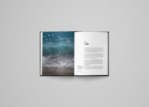
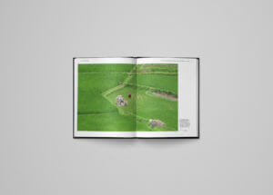
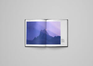
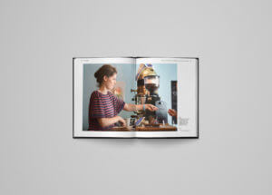
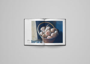
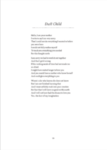
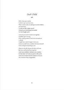
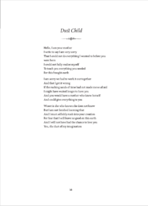
Stanislav’s photography varied, but the photographs were mostly 3:4 in proportion, so we worked with this to develop our layout concept. Originally, Stanislav wanted each photograph to occupy a spread and be as big as possible on each page, preferably bleeding off the page. His explanation for this preference was that he did not want some photographs to be seen to have more importance than others. His preference for full bleed images was a worry to us; we believed many of the images required captions and without captions, the book would soon get repetitive and uninteresting. We proposed a different solution that allowed for the introduction of captions with a flexible layout to add interest from spread to spread, that solved this issue to a certain extent. However, we were aware that having images span across a spread could result in some of the photograph being lost in the binding. To accommodate for this, we had to carefully consider which images were chosen and where to include them. This proved a challenge when designing a book heavily photography based.
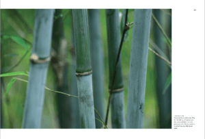
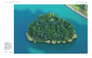


Image Selection

Image selection was fundamental to the effectiveness of the photobook, and this was something that occupied a large amount of our time. Stanislav had a few images that were to be essential to each chapter, but many were still up for debate, and with hundreds of images to choose from for each chapter, it provided a real challenge. Originally, Stanislav wanted us to select from his images ourselves, choosing what best represented each chapter, whist still being a ‘beautiful’ photography. However, after realising we had different opinions on this, we thought it best if to do this together, which led to lengthy meetings discussing the best and the most important photographs to include. In retrospect, it would have been helpful for us, for the client to have chosen these images in advance of the project and not leave it mostly down to us.

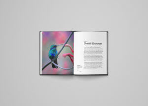
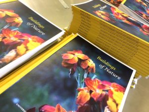
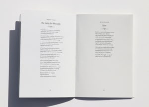
Once the photographs for each section had been chosen, and the text provided, the main job was inserting each photograph and its caption in the correct order. Although, at first we thought this would be an easy task, it proved to be a lot more time consuming than we had imagined, and this is where we encountered the most problems. Each individual page contains a photograph with a caption alongside it, and every chapter opens with a photograph, a caption and an introductory passage that is about a page long. Maps were also designed and included to give geographic context to each image, proving another element to be created. Overall, a very time consuming process, which required lots of toing and froing between the client and ourselves, selecting images, organising captions, copy-editing and photo fixing. Feedback from Stanislav and his connections, as well as the real jobs team was invaluable throughout this stage, enabling the photobook to progress to where it is now. With over 300 pages in the photobook, and the deadline just around the corner, we are set to finish on time, with only a few final checks to complete and a final hand-over meeting with our client.


Reflection

Over the last six months, we have had both challenging and rewarding moments, and it is finally nice to see it all coming together. It is sure to be an invaluable addition to our portfolios, and we are honoured to be apart of such an immense editorial project. We have gained knowledge in ecosystems and the world we live in, developed skills in copy-editing and in handling word and image. We have experienced working with large amounts of photography and text, improving our organisational skills. Finally, we pride ourselves in our good client communication, and without the excellent working relationship we have developed with Stanislav and ourselves, this project would have never been finished in time. This project will no-doubt improve our future projects, university and beyond.


Creative Arts Anthology 2018 – Buildings of Nature

Brief
I was approached by James Lloyd, real jobs coordinator, to design the eleventh edition of the University of Reading Creative Arts Anthology; an annual publication that brings together poetry, prose, art and photography by students and staff at the University of Reading and local residents. The Typography and Graphic Communication department have been involved in the design and production for many years, and I was honoured to be chosen to design this year’s edition.

Although this was my first-time text-setting poetry in InDesign, my background knowledge in complex text-setting during this course and my interest in book design, put me in a good position to approach a new type of verbal content. Fortunately, I was provided with several earlier editions of the Creative Arts Anthology that I could refer to, and with Eric Kindel’s supervision I was confident to begin the design process. I promptly contacted both my clients, Jerome Cox-Strong and Peter Robinson, for a meeting. The editors of this year’s anthology were also present during the initial meeting, and I organised to discuss the design further with the editors after the meeting. It was clear that they had little to no vision for the end result, however, they did express a preference for central left-aligned text setting, common in poetry books and in earlier editions of the Creative Arts Anthology. Their explanation for this was: when text is left-aligned to the margins, and the poem has short lines, it can seem as if the poem is falling off the page or into the spine, which is unpleasant. This influenced the final design of the inside pages considerably.


Design Process
As designing poetry books was unfamiliar territory, I took the opportunity to research past anthologies and poetry collections to explore different approaches to poetry text-setting. The content varied immensely, from poems to prose, and from paintings to photography, providing a particular challenge. The design and the margins had to be flexible enough to accommodate a wide range of verbal content. The editors aided the process of designing considerably, by providing the sequence of poems in a single word document, along with the accompanying images. Not only did I have the verbal and visual content within the book to juxtapose, but I also had to consider the editors preface, contents, and biographies. These were designed after the main book in order to echo the inside verbal content. The editors also specified the image to be on the cover – an untitled photograph of flowers in a garden. This limited to some extent the composition of the text on the cover as I was limited to areas that did not obstruct the focal point.

From the initial meeting with the clients, it was made clear that a left-aligned central design was preferred. I did experiment with both central and fully left-aligned but agreed the central was more fitting for this poetry book. Generating a layout that accommodated several types of verbal content, as well as images, was challenging and time consuming. But, I am pleased with the outcome. The suggestion of centred alignment means text is always visually centred on the page, but the margins offer restrictions for prose and longer line lengths, as well as giving boundaries to images. This was effective, however in reflection, I could have found a simpler solution to the setting of text centrally, for example through a script of some sort.

A major decision during the design process, was the choice of a typeface. Due to the nature of the content, and the theme of this edition, I wanted an elegant typeface that had ‘life’ to it. I thought as this was a University of Reading anthology, what better place to look than at the MA Typeface Design typefaces. After a discussion with Eric about usage rights, it was decided to find one freely available to me from the department or from Adobe Typekit. Many typefaces were tried and some in combination, but it was decided upon to use the typeface Edita, designed by Pilar Cano, a 2006 graduate of MA Typeface Design at the University of Reading. Edita is a contemporary book typeface with a softness and fluidity, designed to be used alongside photographs and other graphic elements. The italic was used predominantly for titles, small caps for author’s names, and book for the body text. To play on the theme of the edition, I also made use of the discretionary ligatures within the italic setting available in the typeface, which added an element of connectivity to the titles reinforcing the theme of ‘life’. I believe my experience from previous editorial projects over this course, made this process much easier.

Rules were originally used below the heading, but these weren’t fitting for the poetry content and theme, therefore with Paul Luna’s suggestion, I replaced it with a decorative element. Paul recommended several typefaces with glyphs and printer’s flowers, which I explored. Eventually deciding upon the glyph, from the typeface Kepler, which is reminiscent of a printer’s flower, to play off the theme of ‘life’ and ‘nature’ that ran throughout this edition.

Feedback from both Paul and Eric was beneficial throughout the process, enabling me to achieve aesthetically pleasing inside pages. In reflection, I would have found the same scrutiny in the feedback for the cover beneficial. Towards the end of the design process, I contacted the Real Job’s team, who showed me how to approach registering for an ISBN and generating a barcode. This provided a useful insight into the editorial process that I didn’t know previously.


Production
The production process was fairly straight forward, printed by DPS as it is every year. The client liaised with DPS themselves, meaning I had very little involvement. I provided a production specification, which was in line with the client’s specification taken from last year’s anthology. Due to my experience working in a production house, the preparation of files was straight-forward. I prepared the file as instructed by DPS, completing the art working checklist, and communicating with the Real Job’s team throughout.

I caught a glimpse of the books hot off the press and was pleased with the result. I was impressed with the finish quality, especially of the inside pages and the typeface and decorations. The editors were also very pleased with the final design and expressed this during the launch event. Unfortunately, my client informed me that DPS had made a mistake in the production by printing several copies in black and white. But, this has since been resolved.


Reflection
Overall, I am pleased with the finished book and it has proven to be invaluable addition to my portfolio, but also to my knowledge in text-setting unusual texts and handling the production of an editorial project. I believe the project ran smoothly, with clear and effective communication between the editors, clients and I, which resulted in a good working relationship. I am grateful to Paul and Eric who shared their knowledge of editorial design and typography. During this project, I have developed more awareness typographic detail and appreciate good copy-editing, which will no-doubt improve future design projects, university and beyond.