Background
The COVID-19 knowledge e-learning platform is a website created by the data science club at the University of Reading to help the general public stay informed about the COVID-19 pandemic as well as learning new information and reinforcing previous knowledge about the virus. The overarching idea behind the project is “for users to learn everything about COVID-19 in a better way than the news”. We were working directly with students from the data science club and researchers who were interested in the topic and this Real Job was completed as a team involving Anthony Mason and Olivia Francis and was supervised by Gerry Leonidas.
Deliverables
The key deliverable for this job was to create the UI for the COVID-19 e-learning platform but alongside it we were asked to create a logo for the platform and avatars for the profile screen where users can pick and choose elements to create their own custom avatar. Finally, for the developers to fully understand and apply the new UI styling we created a digital booklet for them to consult that outlined guidelines, typography and design rules they should aim to follow to ensure consistency. Anthony was handling the UI half of the project and creating the guidelines booklet while Olivia was creating the logo and avatar.
The final deliverables for the project were:
- UI designs for the e-learning platform.
- Logo
- Avatar illustrations
- UI guidelines booklet
Starting point
Prior to our involvement in this job there were no designers actively working on the project and all of the UI work was being completed by the developers themselves. Naturally, from their work in computer science they were aware of user experience basics but there was a great deal of work to creating a platform that could be shared with the public. An issue we faced when joining the team was that none of the developers had previously worked with designers before and it was a new experience for everyone but we quickly began to communicate and convey ideas efficiently.
Restated brief
In the original client brief they were confident in what they wanted and knew exactly how our knowledge and abilities would benefit the project. This was reinforced once we met with the clients and had our initial meeting over Microsoft Teams. They were able to clarify information we were unsure about and we laid out a plan going forward on what to do in relation to working with the developers. Additionally, they showed us what they had created up until that point, as stated in the original brief “implementation of key functions are almost there”, so our roles were clearly to apply our UX knowledge to make the site more usable and add new, modern styling to it. The only bit of information missing was a clear deadline, however as the goal of the project was to be released before a COVID-19 vaccine was fulled created and the pandemic “ended” a general deadline was set for January 2021. After our initial meeting we made a strong restated brief that both Gerry and our clients were happy to approve and we moved on to our next phase, research.
Research & idea generation
Due to the nature of the project and how quickly we had to move along we were not able to properly conduct user research to understand what people wanted in an e-learning platform on such a topic. At this point of the project the pandemic had been going on for over 6 months and most people were moderately informed about the virus and the vaccine efforts being made. We used this information as an assumption going forward but we also spoke with the clients to understand what knowledge they had about their users. This was limited but offered us an insight that was previously missing. However, we were able research current e-learning platforms, both in general and ones created for Coronavirus, which we used as inspiration for figuring out the optimal user experience. We also explored current design conventions for a website such as this to better guide our designs.
Sketches
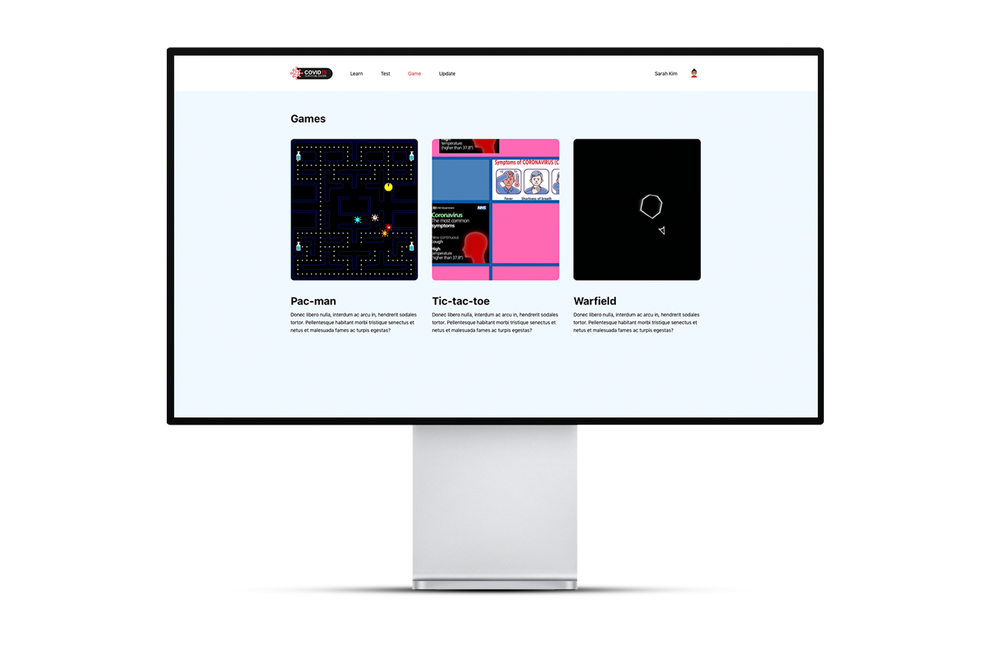
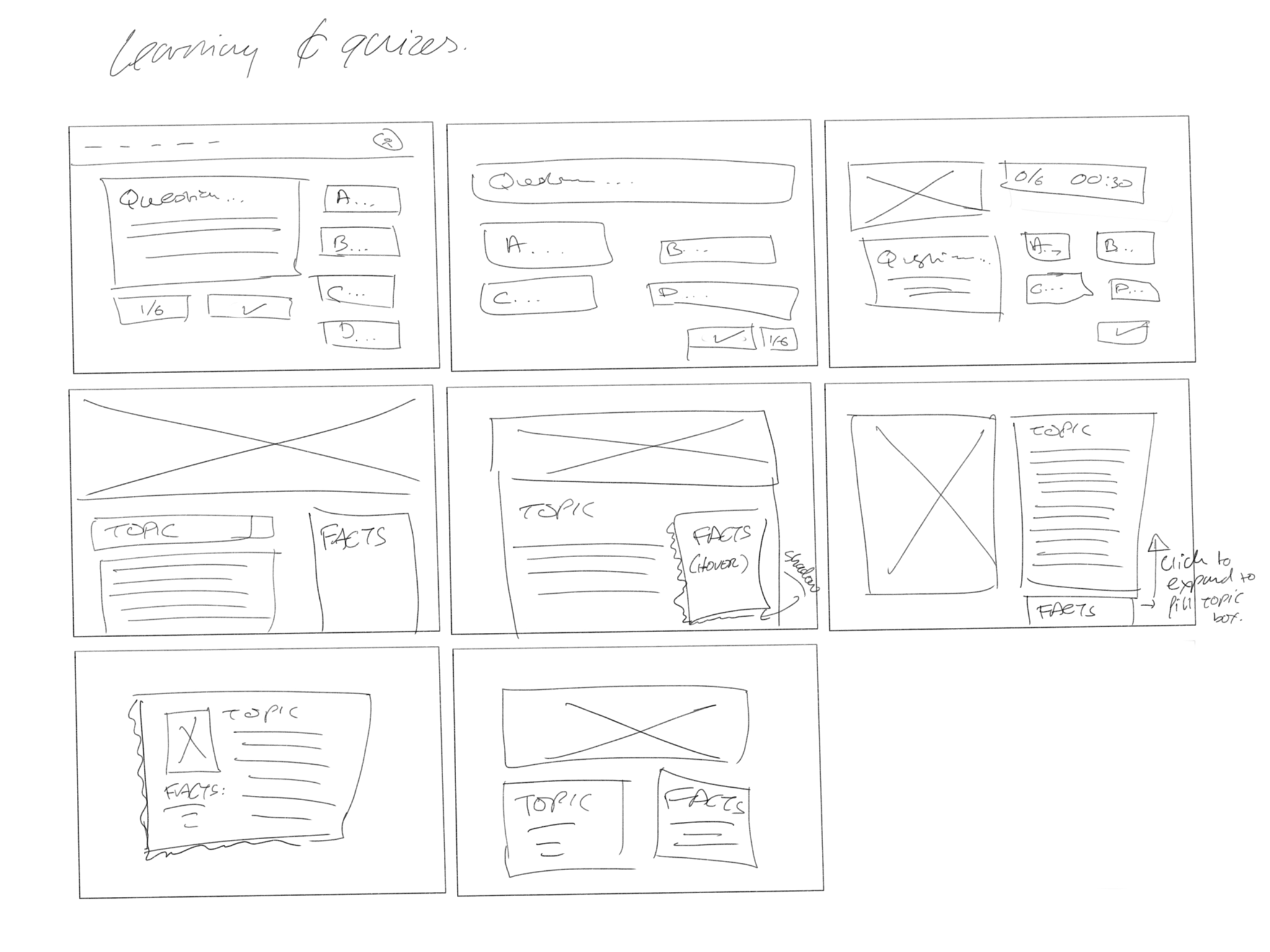
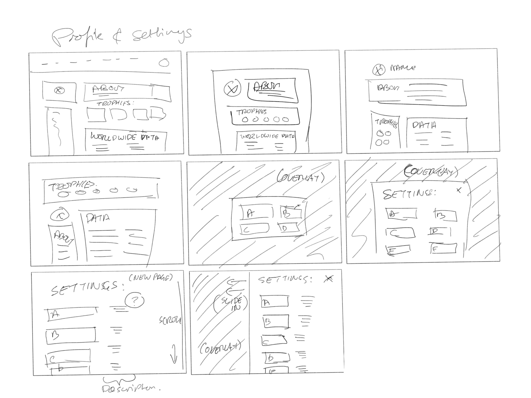
Having researched how to create the best user experience for an e-learning platform we focused on creating quick crazy 8 sketches to generate ideas and consider a range of possible approaches. As well as the research we had to keep the original design in mind as they had developed everything for that up to this point, we sketched out the 3 main sections of the website: home and information, quizzes and the profile page.

Wireframes
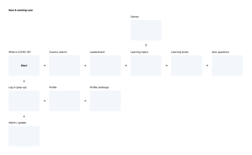
Developing upon these sketches we created low-fidelity wireframes that got the basic structure of the website and helped the developers visualise our approach and see how it differs from the original designs they had created. Consulting with the developers and exploring the original website we were able to create a user journey to visualise how they planned for the users to navigate the website. After showing them they were instantly happy with the direction we were taking and over the course of only one meeting they approved our wireframes and we moved on to further developing the visual style of the site.
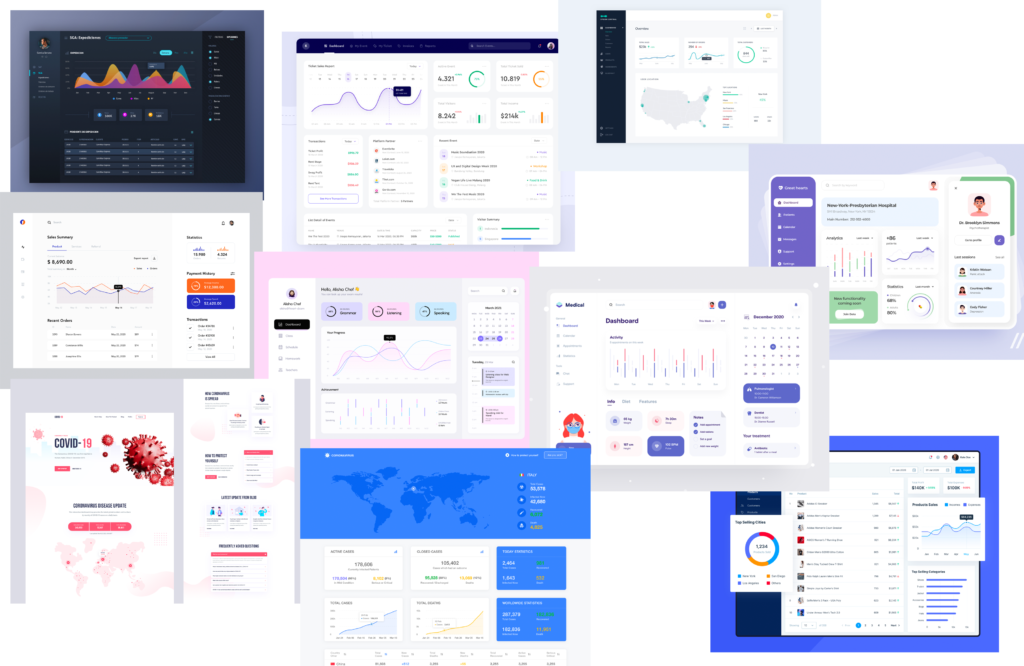
Visual design
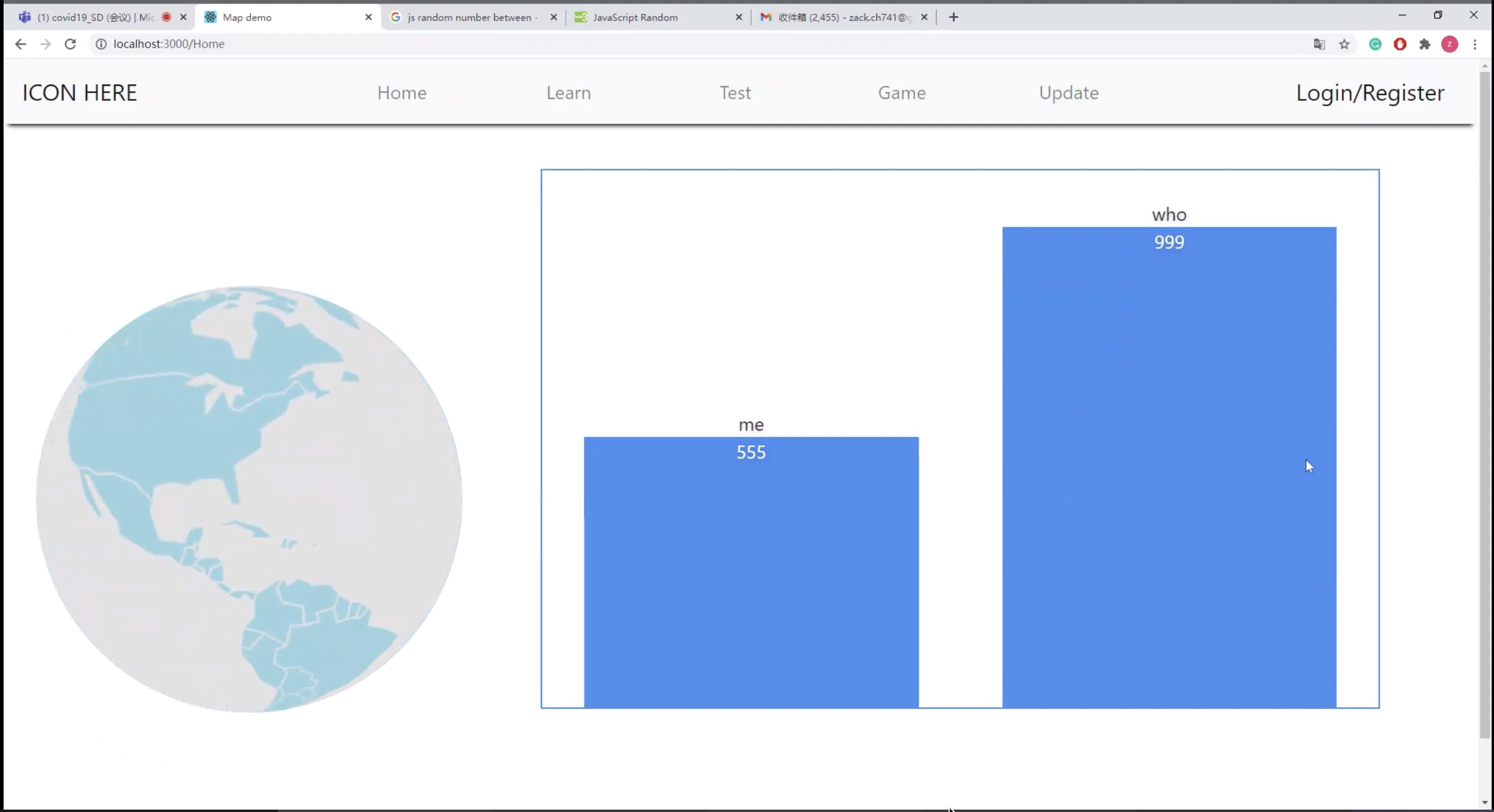
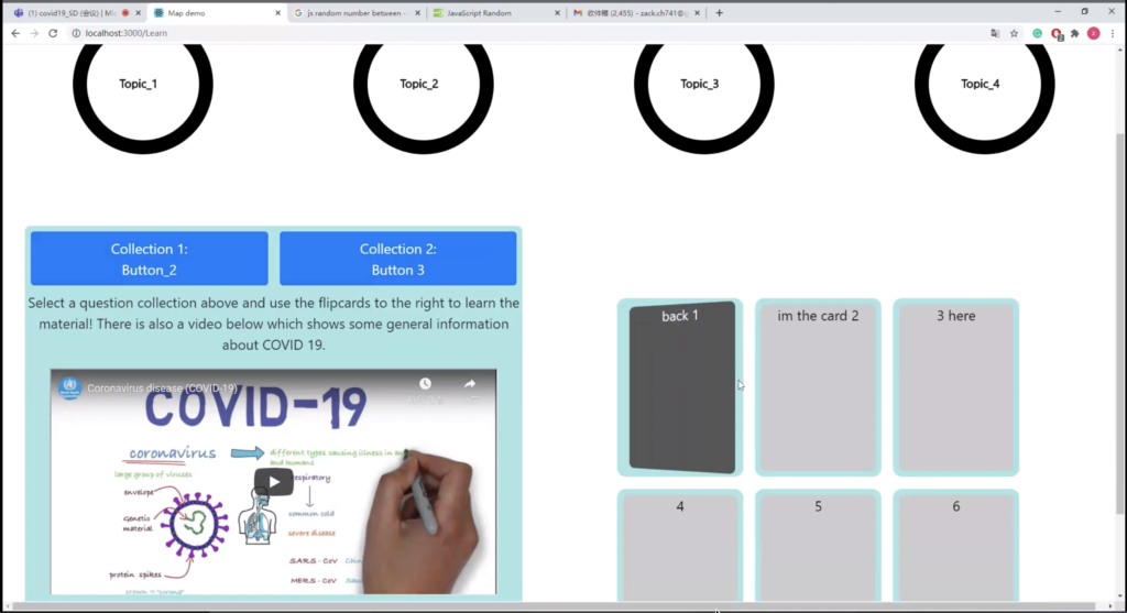
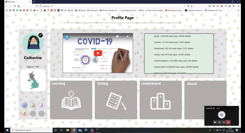
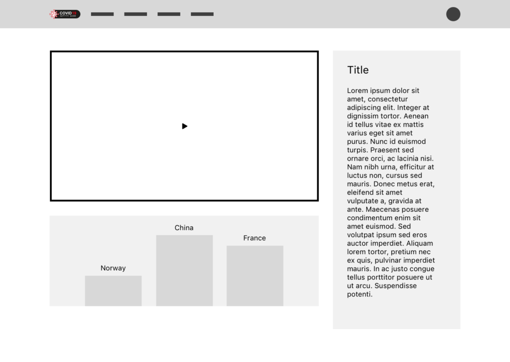
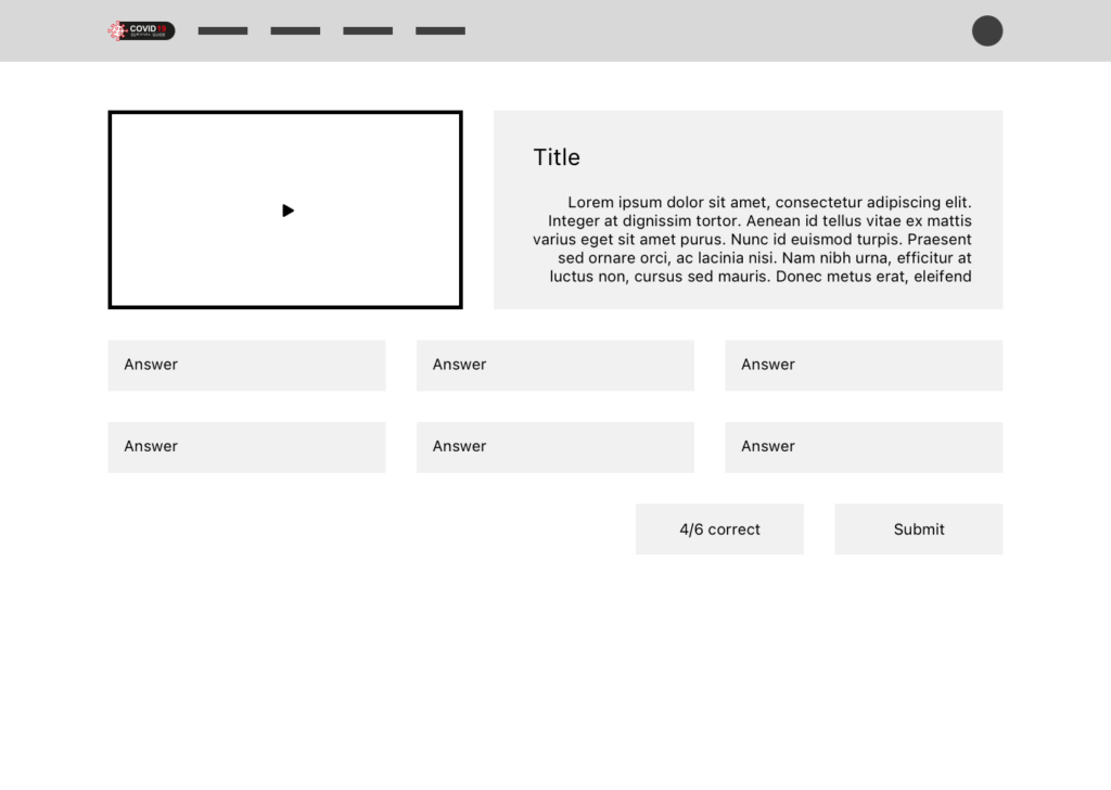
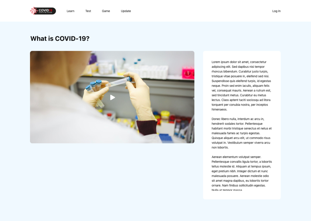
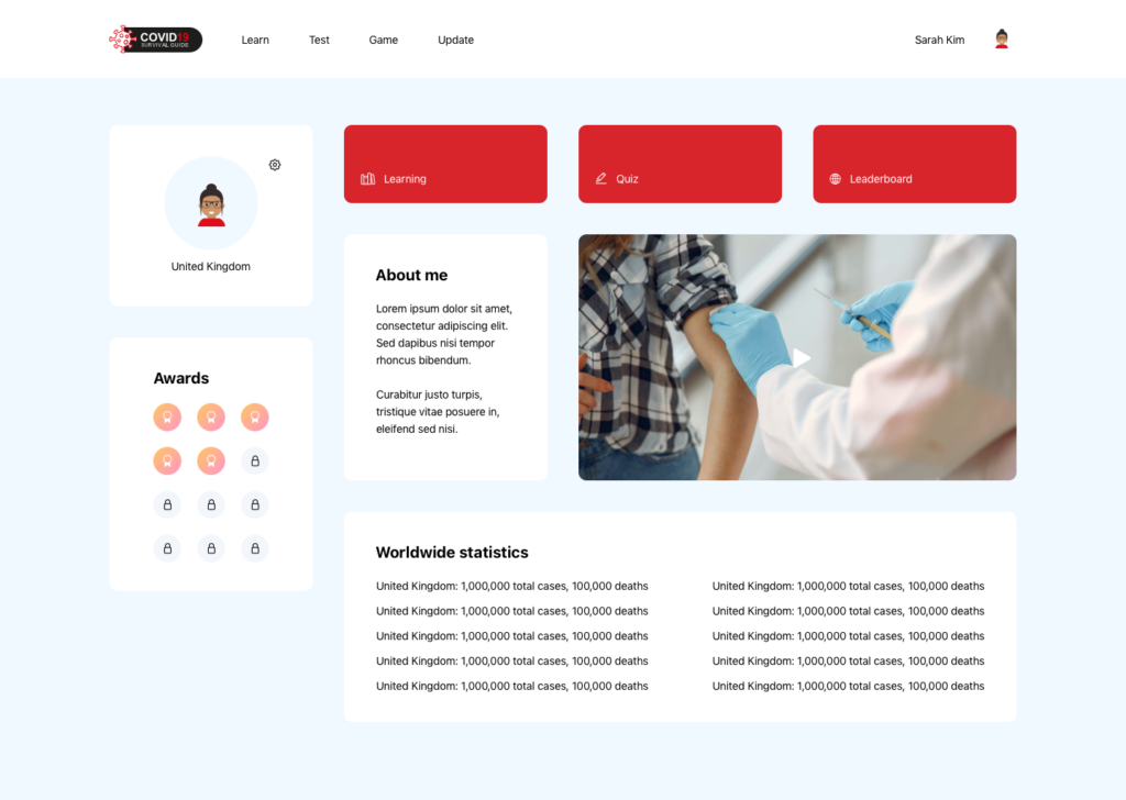
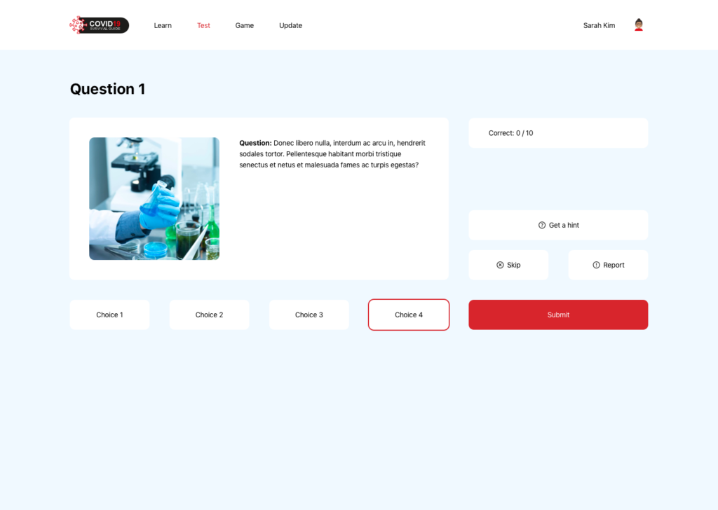
From our sketches and low-fidelity wireframes we had a strong idea of where we wanted to take the website. The overarching style for the website was modern that was inline with the visual style of large organisations like the World Health Organisation and the NHS. An important part of the website was having it entirely viewable on one screen, with no scrolling, so for this to work we took a very modular approach using tiles that allowed elements to shift across the screen as the viewer navigated through the site, however, there was still the flexibility for scrolling within tiles, for example, for large blocks of text. After showing this to our client they were confident in our ability to transform the site but there were some criticisms such as changing the layout of learning topics to showcase images and better implementing elements in the quiz portion of the site. There were also areas of the website requiring changes that were miscommunicated previously such as the inclusion of a rotating globe to indicate where in the world the user was (which was present in the original design concepts).
The meetings we had were incredibly productive as we consulted with the developers on whether certain areas of the website could be properly incorporated and similarly they were curious about the design aspect of the project and asked us a great deal of questions about what direction we were taking in terms of typography, colour, grids and branding implementation. We were curious whether they required a prototype of the website to see how it would have worked but they refused the need for one as they were confident the UI designs were enough and that they had already, mostly, figured out how the website would work and how the user would navigate it.
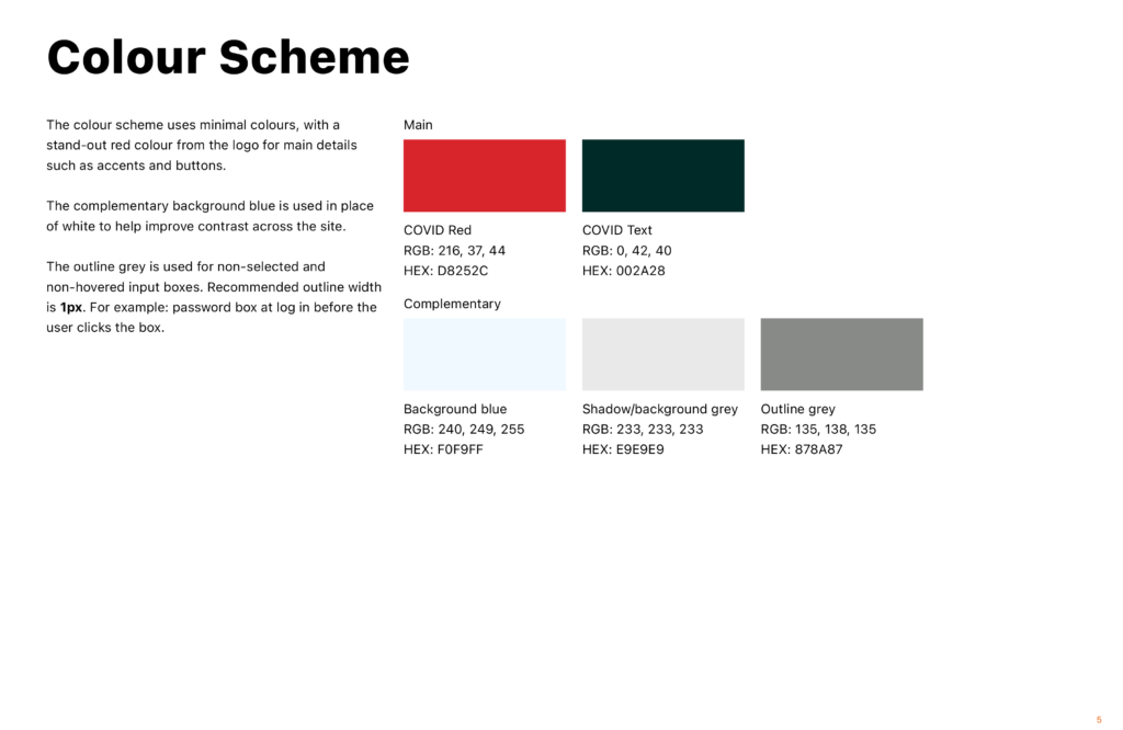
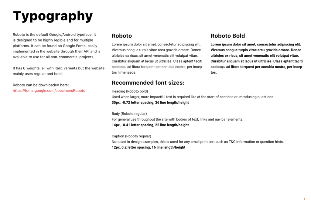
UI Guidelines
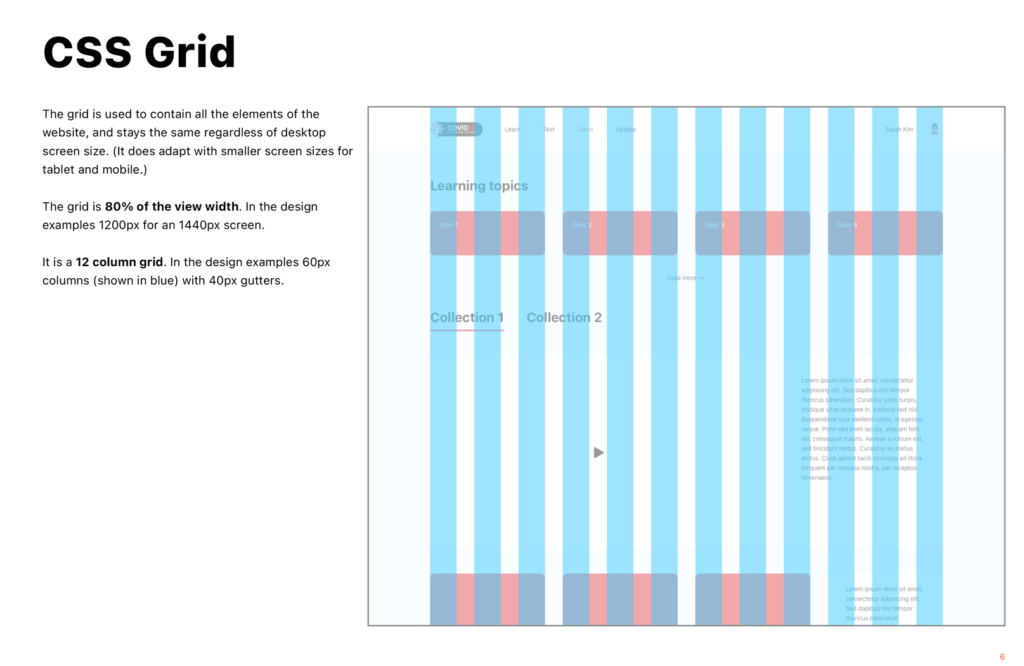
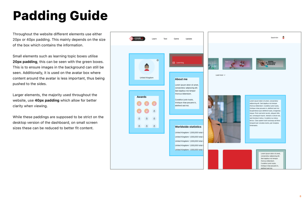
To allow the developers to accurately implement the new visual style of the website we created a digital UI guidelines booklet for them to consult as they created the site while we were not involved in the project anymore. This covered a range of topics that were important for them to stay consistent with the designs including the CSS grid we used, the colour scheme, the fonts and all the UI designs to visualise how it should look. We spoke with the clients to ensure we included everything they would have needed to make the website in its entirety.
Avatars
While only a small part of the project we spent a while making sure the avatars suited the website perfectly, beginning by exploring a range of avatars used for similar purposes and quickly began creating sketches to decide on a style that would work. We decided on including only the shoulders and head so focused on the details; eventually deciding on having customisable skin tone, hair, t-shirt, mouth and extras such as glasses. After settling on a concept we brought it to the group, and like with the UI, they were incredibly happy and we progressed to digitising them in Adobe Illustrator. The final avatars were well received after being shown to the clients and Gerry.
Logo design & brand application
The process for the logo was very similar to the avatars, beginning with sketching and moving into digitising the logos before finally being included in the website. Between sharing our work with clients, our supervisor and during Real Jobs meetings the final logo was unanimously decided upon. The colour scheme too was overwhelming agreed upon and everything was brought together.
The logo was one of the main deliverables for the website and it is featured in the fixed navigation bar of the site. The colour schemes too were an underlying element of the website being used for accents and hyperlink texts, and presumably for promotional material in the future. While part of the brand, Anthony was in charge of deciding the main typography of the website as it was previously decided upon when planning and creating initial wireframes. We used Roboto as it is Google’s default font for their brand and Android which means it is designed to be legible at any size and on any screen which is perfect for our application.
Reflection
We were incredibly lucky to have clients that were clear on their goals for the project but were flexible with the design decisions we made. This allowed us to express extra creative freedom, additionally, it was a blessing to work with skilled developers that were able to bring our ideas to life in meaningful ways. In the end the clients were very pleased with everything we created for them. This project allowed us to work on a completely new and unique website that can hopefully be a valuable part of the university’s history and allowed us to diversify our portfolios with the inclusion of such an interesting project.
Client comments
The clients made it clear throughout the project how happy they were with our involvement and what we brought to the team. Having completed the project the team leader, our client, was happy to share these comments with us:
“Olivia and Anthony had excellent communication with the team during the project! They have an excellent understanding and analysis of the design requirements of the project. The presentation of ideas were clear and convincing and the progress was also appropriately paced. The design work was completed to a high quality.”
Final outcome
We were tasked with sharing the final UI designs with the data science club which essentially ended our personal involvement in the project but it has continued development and is currently not live. The new projected release of the platform is September 2021, which should allow it to remain an essential resource for COVID-19 information but sadly vastly overshoots their original release deadline of early 2021. It would be a pleasure to work with Dr Huizhi Liang and the data science club again in the future.